You’d think this would be easy, figuring out which direction to lay your rectangular shaped tile floor. However, many people have questions about it.
Now that we’ve gone over the most appropriate direction to lay your wood floor, (and if you have wood look tile you should go to that post too, as really the wood floor direction is a more appropriate answer then) let’s now consider…
Your tile.
Will the same principles used when laying your wood floor apply to how you lay your tile?
Let’s find out. ;-)
Most people don’t have tile all over their house, from the front door all the way through. So…
The same general rule that applies to laying wood tile can’t be applied when laying tile. And, really, these are two different materials, so the direction needs to be considered in a different manner.
In many cases, where tile is used in a room, it’s located in the heart of the home or in an isolated space, usually in the kitchen or bathroom. If you’ve got square tile, or tile to be laid diagonally or in a herringbone or Versailles pattern, the direction isn’t an issue.
12 x 24 Rectangular Tile Layout
However, when working with our now ever-popular rectangular tiles (12” x 24” is currently a popular size), I like to run the tiles in the exact opposite direction I would a wood floor, regardless of whether it’s laid in a brick pattern, 1/3 offset or stacked.
Because I like for wood floorboards to appear long, and I want them to run the length of the room or in a house (front to back so that it draws you through the house), I like to lay these rectangular tiles in the opposite direction, perpendicular to the length of the room.
So in a kitchen that is 10’ x 20’, for example, I would lay the longer side across the 10’ length.
In this case, I would prefer the tiles not look so long, instead appearing in more of a brick style (just like when you look at a brick wall, the long sides of the brick are running horizontally, across the wall). It just makes for a more pleasing, harmonious layout that feels more comfortable in the room.
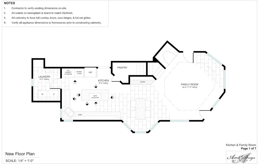
It also serves to make the space feel wider, much like in the plan shown here.
Sometimes your room is square; and, in that case, I would run the tiles parallel to the entrance of the room, so that when you walk in you walk across the pattern laid out horizontally.
12 x 24 tile floor being laid across the narrow width of the room to make the room appear wider.
Sometimes the layout has to do with how you would look at the room, or where the main focus is in room, not where the entrance is.
In this room below, I ran the long side of the tile parallel to the wood floor and entrance to the room, because of the direction one would be looking at the open kitchen from the living room and how one would be using the kitchen.
They would mostly face the sink, sit at the bar, cook at the stove, or look into the space from the living room; so, in this instance, having the pattern run the length of the space keeps the tile running horizontally, as you see the pattern most.
Whereas it would have been nice to have all one type of flooring in this instance, the slate tile blended with the wood floor much better laid the same direction as the wood floor, thus keeping a nice flow to the flooring materials.
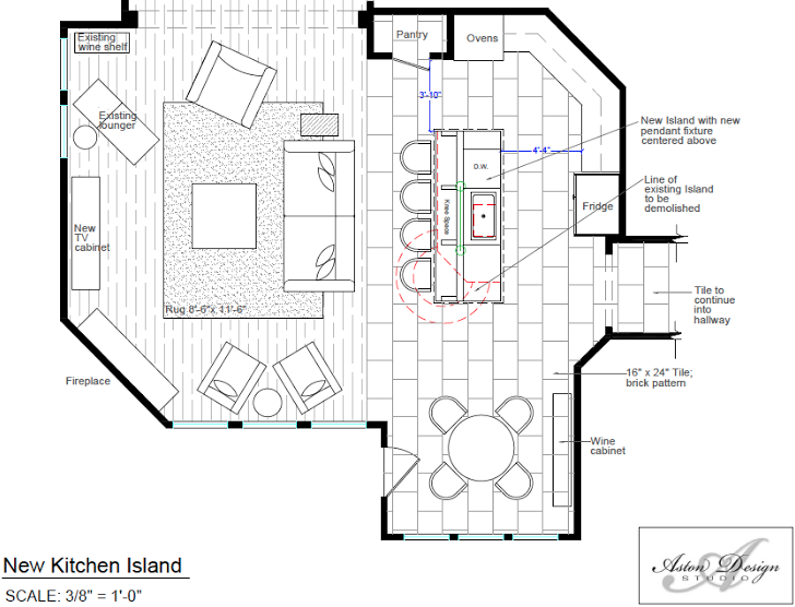
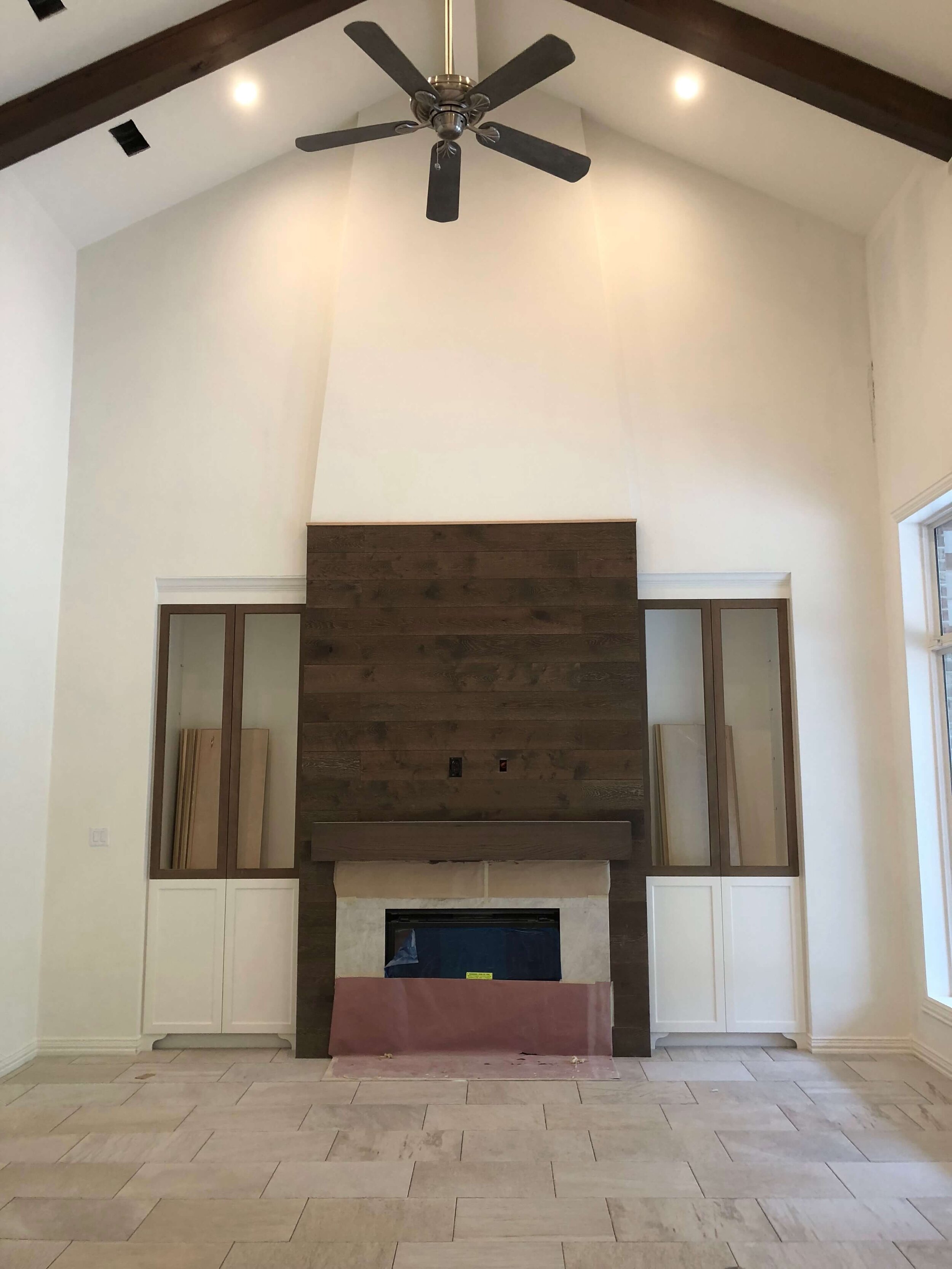
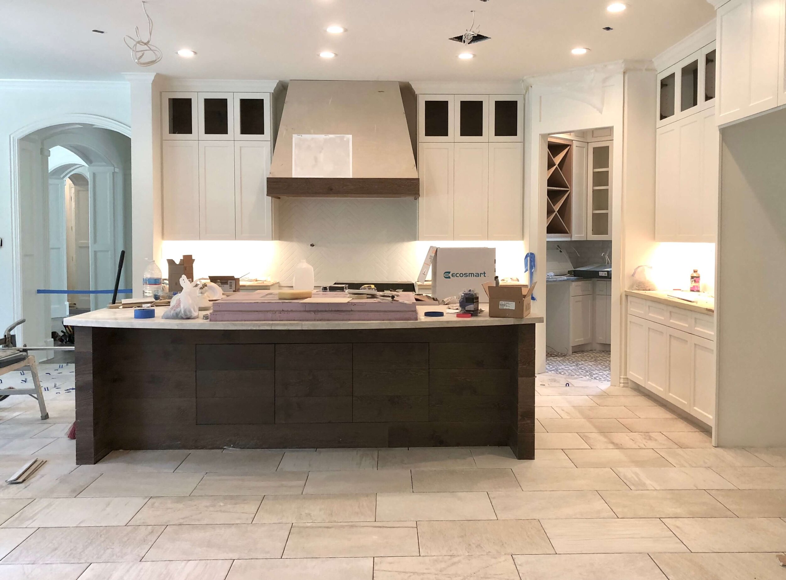
Here’s a large, open family room / kitchen area (below) where we laid the floor horizontally across the short length of the room for the reasons I mention above. We did a 1/3 offset, due to tile of this size in a big room having a tendency to have lippage or a cupping quality. It turned out looking great! (This pic was at the end of construction.)
Before Grouting - This rectangular tile is laid horizontally across the short length of the room. It makes the space feel wider and more open laid in this manner.
Before Grouting - This rectangular tile is laid throughout the kitchen and family room, just opposite this island. It makes the space feel wider and more open laid in this manner.
Update: 9/2024
While it is popular these days to use large format tile, for example a 24” x 48”, for large expanses of flooring, I recently had a project where we could not get the large format version of this tile in time for the project. We really loved the color of this tile, which was really hard to find, and we had to have tile all over the floor in this home because of a heavy motorized wheelchair that was used here.
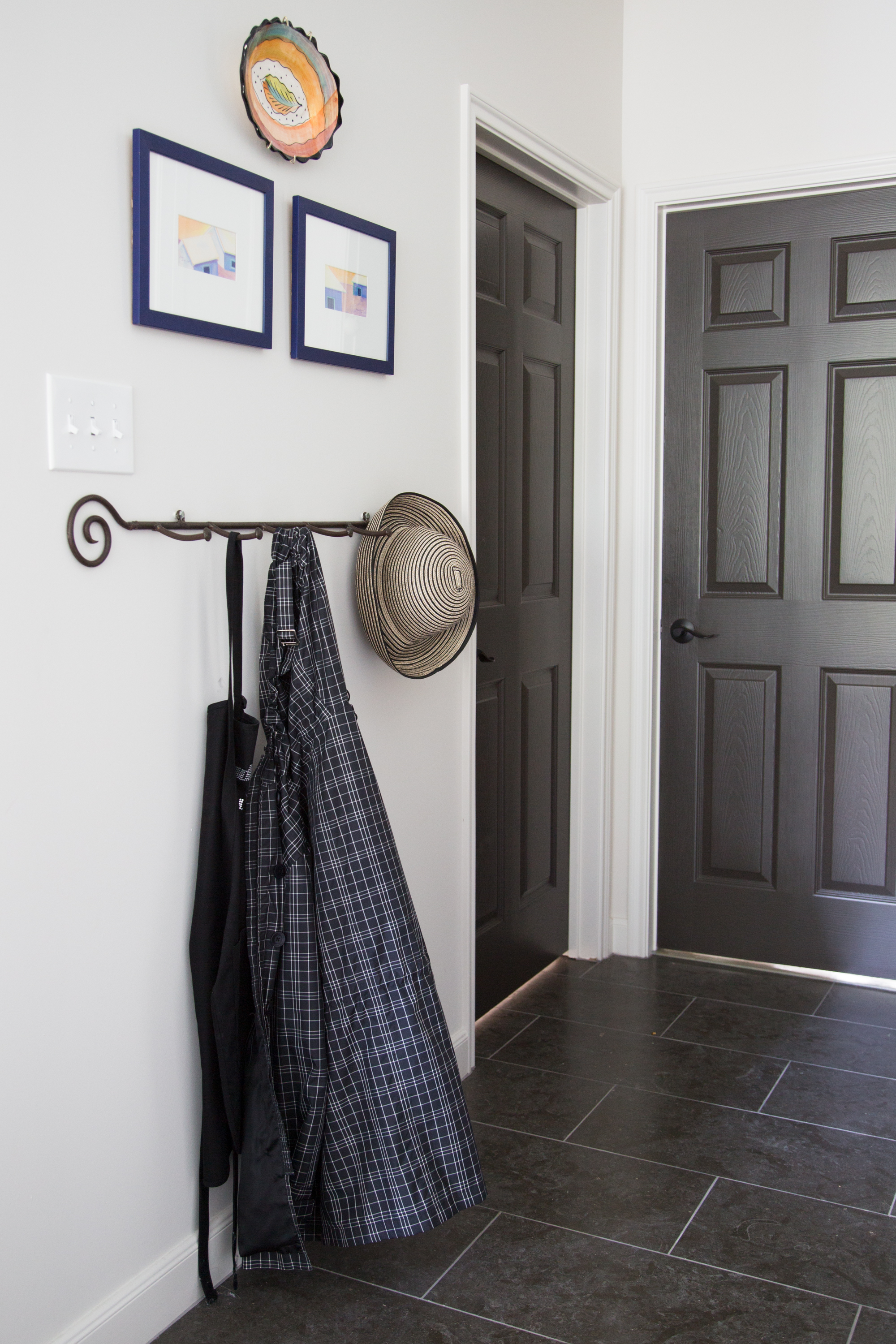
I ran the tile the narrow width of the home, which meant the main hallway that ran to the back of the house had horizontally laid 12 x 24” tiles.
Although I really wanted the large format, I ended up liking the 12 x 24” as it looked like leather tiles. The tile had such a small amount of variation, the smaller grid worked to add some interest to the floor.
12” x 24” tiles laid horizontally in a straight pattern down a long hallway to widen the look of the space.
Let’s see some examples of how to make a narrow space seem wider, with the flooring running the short width of the space.
Enjoy! ;-)
GALLERY
Beautifully Run Tile Flooring
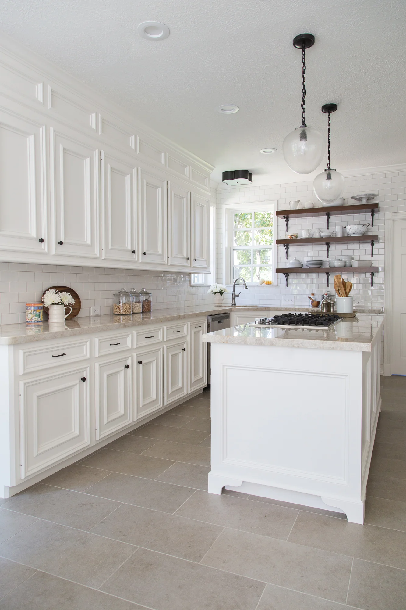
Which direction to run the tile flooring, Kitchen Remodel | Designer: Carla Aston, Photographer: Tori Aston
Which direction to run the tile flooring, Kitchen Remodel | Interior Designer: Carla Aston, Photographer: Tori Aston
Here is the layout where the tile is laid horizontally when approaching the space.
Feels good, doesn’t it?
Which direction to run your tile floors? The entry doors to this bathroom are exactly opposite this feature wall. The tile was run in the same direction on the wall as the floor, so that you walk in to the bathroom over the short side of the tile and the tile laid horizontally on the wall. Interior Designer: Carla Aston, Photo: Colleen Scott
Need more design info on flooring?
I have a compilation of all my blogposts on flooring in a $15 downloadable pdf, w/links and commentary, right HERE.

