First of all, I was running down through my posts in the back end of my blog and saw this one sitting there unpublished from back in October. I can't believe I didn't publish this! It's SUCH a good project.
Although I did share a few progress shots in this post, I think I was sort of waiting for another pic or two to make this post more complete. Most of this work was done last fall.
We still have some items coming in and finishing touches to apply, but it's looking so good and I wanted to share this post as it shows some of the progress images. When I can finally show the end results and get it professionally photographed, I hope :-), then I can link back to this one and share a little bit about the process.
I've added in a few more sneak peeks to this post that are more recent parts of the installation, so you'll see more of how things have come along.
Hope you enjoy!
There wasn't much wrong with this beautiful property, except for a few less-than-desirable features that needed some tweaking and a little customization.
There were places where upgrading and personalizing made real sense and I think they turned out beautifully and were sooo worth the time, money and work to get them done.
First up was the main fireplace wall.
Before - the room has nice height and layout, but the quality and details could be upgraded.
While grand in scale, the whole wall felt a bit lackluster. To call attention to the height of the space and give this wall more of a focal point and upgrade in quality, a beautiful honed Calacatta marble 18 x 18 tile, from MCA Systems was installed. It's a subtle but significant statement now.
The built-ins on both sides were quite ordinary. I just envisioned little books and objects cluttering those bookshelves and thought that thinking bigger with decor for this wall would make a better impact.
One of the first things we did was remove the upper cabinets. Better already, no?
Progress shot during construction - adding large marble tiles to the fireplace will give it some gravitas. #remodel #fireplaceremodel #fireplace
I could tell that since the arch died straight into the side walls, that just removing those upper cabs and applying some wallcovering to the back wall would not cut it here though.
Those arches would look like they didn't have "legs" on the outside edges and would feel sort of half-baked.
So, I had our contractor frame and panel the inside areas of that niche and then we installed grasscloth wallcovering in the backs. This now creates a beautifully framed backdrop for a tall and significant sculpture or maybe some large vases, etc. that can make a bigger impact on this large wall.
This job moved so fast as we were on a tight deadline and all I had time to do was sketch the idea and talk my way through it with the contractor. Not my preferred way to work, but luckily it did work, this time. #sketch #interiordesigner
Oh my gosh, isn't that soooooo much better?
Adding this paneling to the sides of the niches gave these more detail and added quality. #paneling #niche
Love the contrasting grasscloth wallcovering in the back. #grasscloth #niche
The homeowner wanted to upgrade the counters too and we chose a beautiful honed marble to work with the tile. The whole wall now speaks of subtle and elegant quality and really enhances the space.
Marble slab for countertops in niches and powder room
Beautiful white marble on the niche countertops #marble #marblecountertops
You can see all that beautiful marble on the fireplace and counters and then the side paneling around the niche here in this photo of our rug install.
I'm loving our new light fixture in the space too! A touch of brass for warmth and then just a hint of wavy iron to relate to some of the ironwork details in the home.
Rug installation in living room #livingroom #rug #livingroomdecor
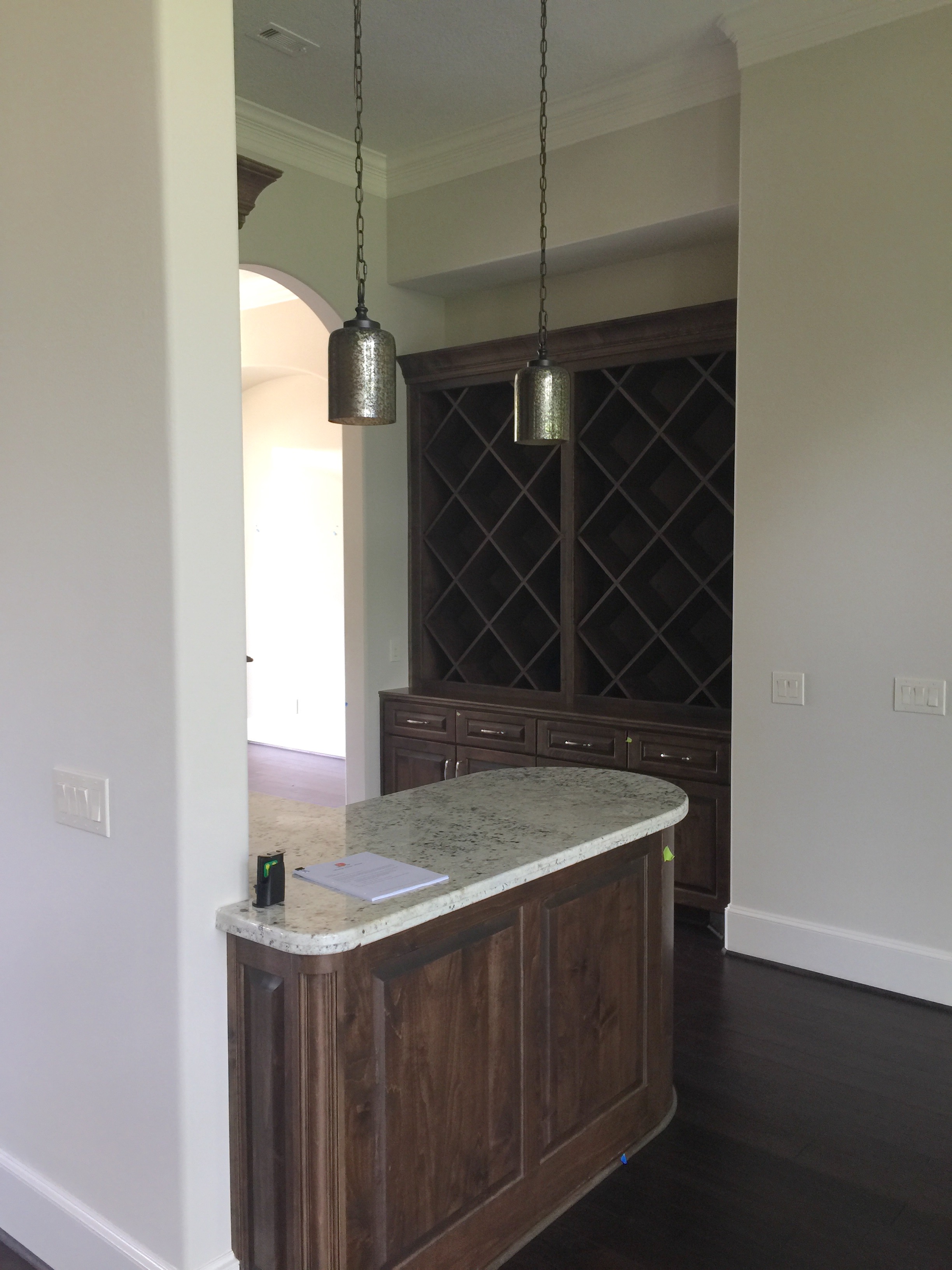
Another upgrade area for this remodel was the bar.
While these cabinets aren't really short, they are short for the space, with the ceiling height at 12 feet.
I felt like these cabinets really didn't celebrate the glorious height here and the dark cabinetry contributed to the rather dismal appeal. We wanted to brighten and lighten the ambience and add some sparkle. :-)
The upper cabinet with the awkward backsplash was removed completely to open up this space and paneling with the antique mirror insets were installed.
Quick sketch for bar cabinetry modification #sketch #mirrors #interiordesigner #remodel
Here's the demo-ed bar wall #demo #remodel
With the glass pendants and the mirrors, the light just bounces and sparkles in here now and the space is much more conducive to entertaining.
Sneak peek below to see how this little nook was transformed. :-)
After - Remodeled bar area with new antique mirrored panels, pendant lighting, and artwork #bar #mirror #paneling #mirrorpanels
On the opposite side, we painted the existing lower cabinetry and then added in new uppers with an antique mirrored panel to reflect light. We created some open shelving for bottles and glassware.
Here was the back built-in, getting it's new ceiling-height wine rack installed with it's mirrored back.
Progress shot - new upper cabinetry with wine racks added for the bar area #remodel #winerack
Another place that called for improvement was the master bath with this awkward tub surround and tile backsplash. I mean, I think the installer must have designed that, on site.
Before - built-in tub with awkward tile backsplash
We just cleaned it up with a free-standing tub, electing not to go all in with a big remodel here.
After - free-standing tub with more to come in this remodel #freestandingtub #bathroomremodel
Doing a partial change in this bathroom also included a new paint color and new taller vanity mirrors in a silver gilded frame.
We'll also be adding in some window film with a nice little detail to that glass panel above tub. I thought it still just needed a little more design. :-)
Some last-layer pieces to go, art over the tub. Coming soon! (So nice that Jitka dressed to match our art placement photo!)
Selecting art for the bathroom #art #bathroomart
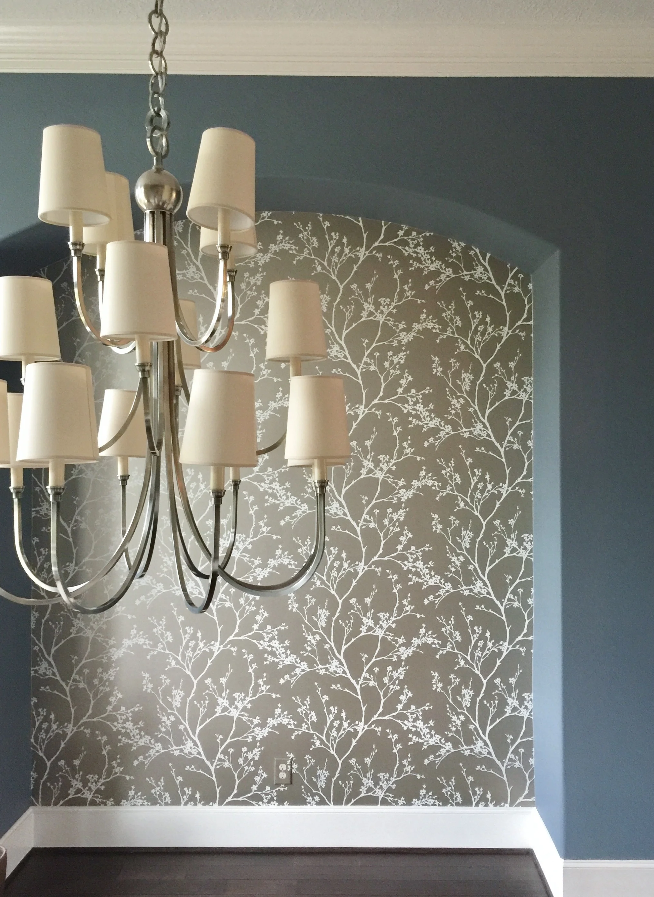
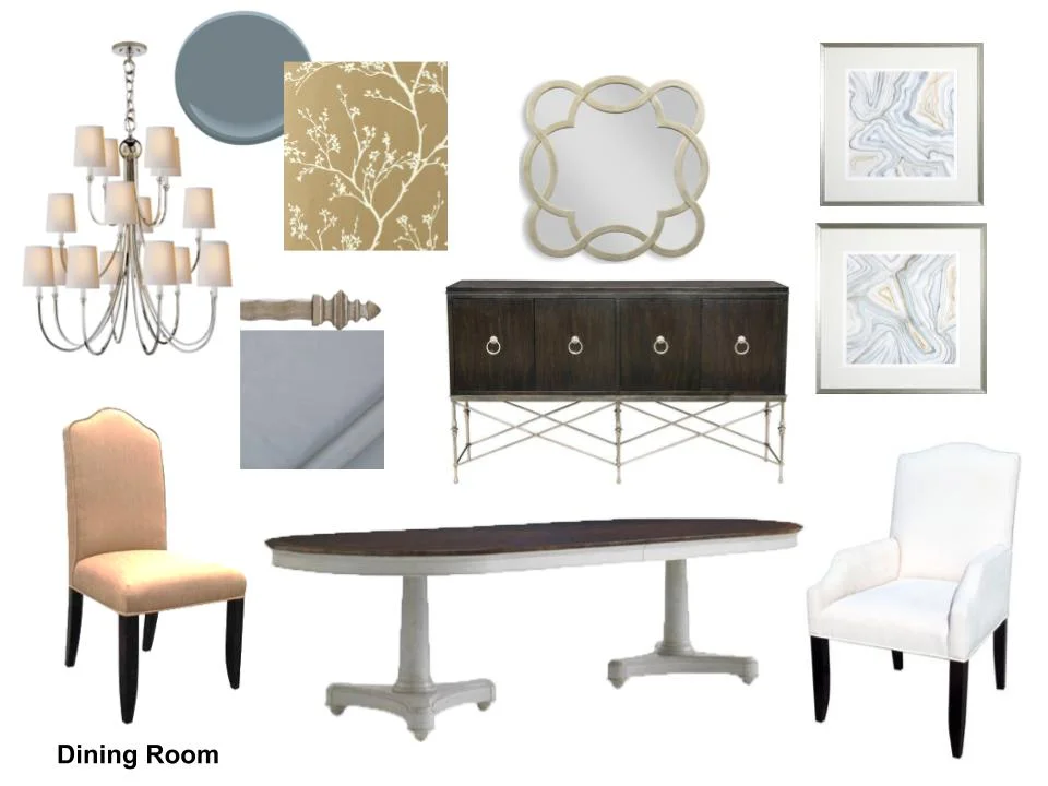
New paint and wallcovering in the dining room adds sophistication and helps create a more dramatic dining space. I love the gold tint of the wallcovering contrasting with the new, polished nickel chandelier and the blue/gray walls.
We're going for a more transitional interior in this home, but with a nod to the more traditional architecture and features. This light fixture is perfect for a cleaner trad style.
BEFORE - plain, empty space with builder chandelier
Wallcovering installed, light fixture changed out, new paint color customizes the dining room. #diningroom #chandelier #wallpaper
Here is our plan, below. Furniture is coming!
Fabric selections for dining room design scheme #diningroom #designplan
We're adding in touches of brass in this house that weren't here before and the combinations of metals, silvers and golds, promote that layered look.
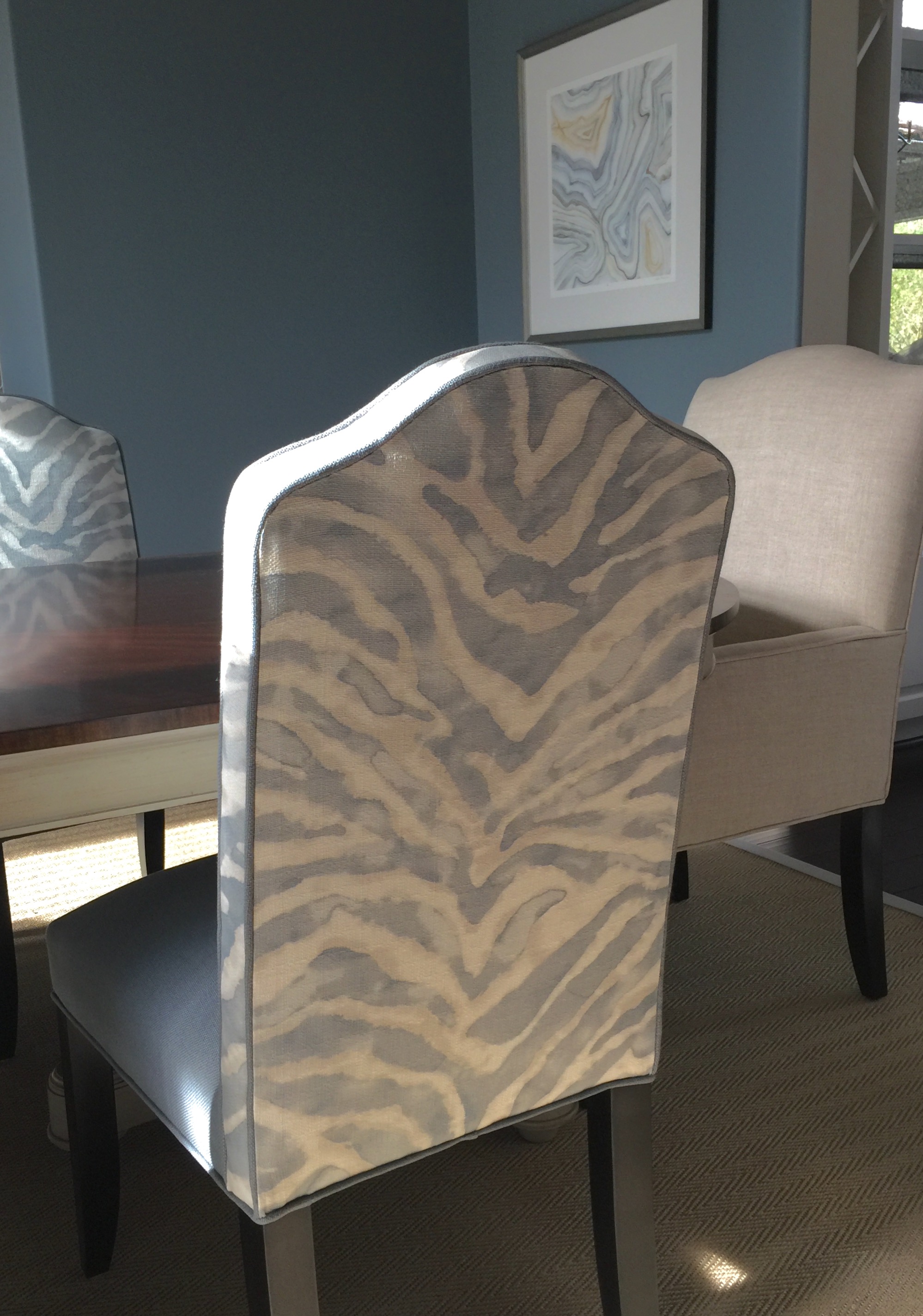
Fast forward to these sneak peek pics below, taken more recently.
Oh, this beautiful dining room. Love the customized chairs. #diningroom #diningroomdecor
Silk drapery panels in blue gray dining rooom #drapery #silkdrapery #windowtreatments
Living room glass coffee table with modern vases and onyx bowl #coffeetable #coffeetablestyling #livingroomdecor
Small table in living room space with bold patterned lounge chair #livingroomdecor #homedecor
Looking good, right? :-)


