When I was at KBIS2018 with Modenus' Blogtour, we had a special tour of two properties that were designed and built for the show in Orlando.
The property I'm sharing today is the remodel and I have to say, it looked like a brand new home!
Lots of square footage was added on to this 80 year old original structure. There were beautiful architectural features, lots of modern technology and appliances, and a spectacular outdoor space that brought this property totally up to date.
A few of the images here are my own, but our tour was at night, so some of these are from their website, credits at the bottom of this post.
I've used this lovely wallpaper before in a bathroom. Perfect blend of silver and gold. Powder room under the stairs in The New American Remodel. #powderroom
The original structure had lower ceiling heights. The main living/dining areas, entry hall, and upstairs bedrooms were original. The stairs with the powder room underneath, were also original.
Apparently the house had been added onto over the years, but those additions were knocked down and only the original structure remained as this remodeled property expanded.
Check out the photos below. It'll get you drooling to remodel, no doubt!
The New American Remodel showhome - Orlando 2018
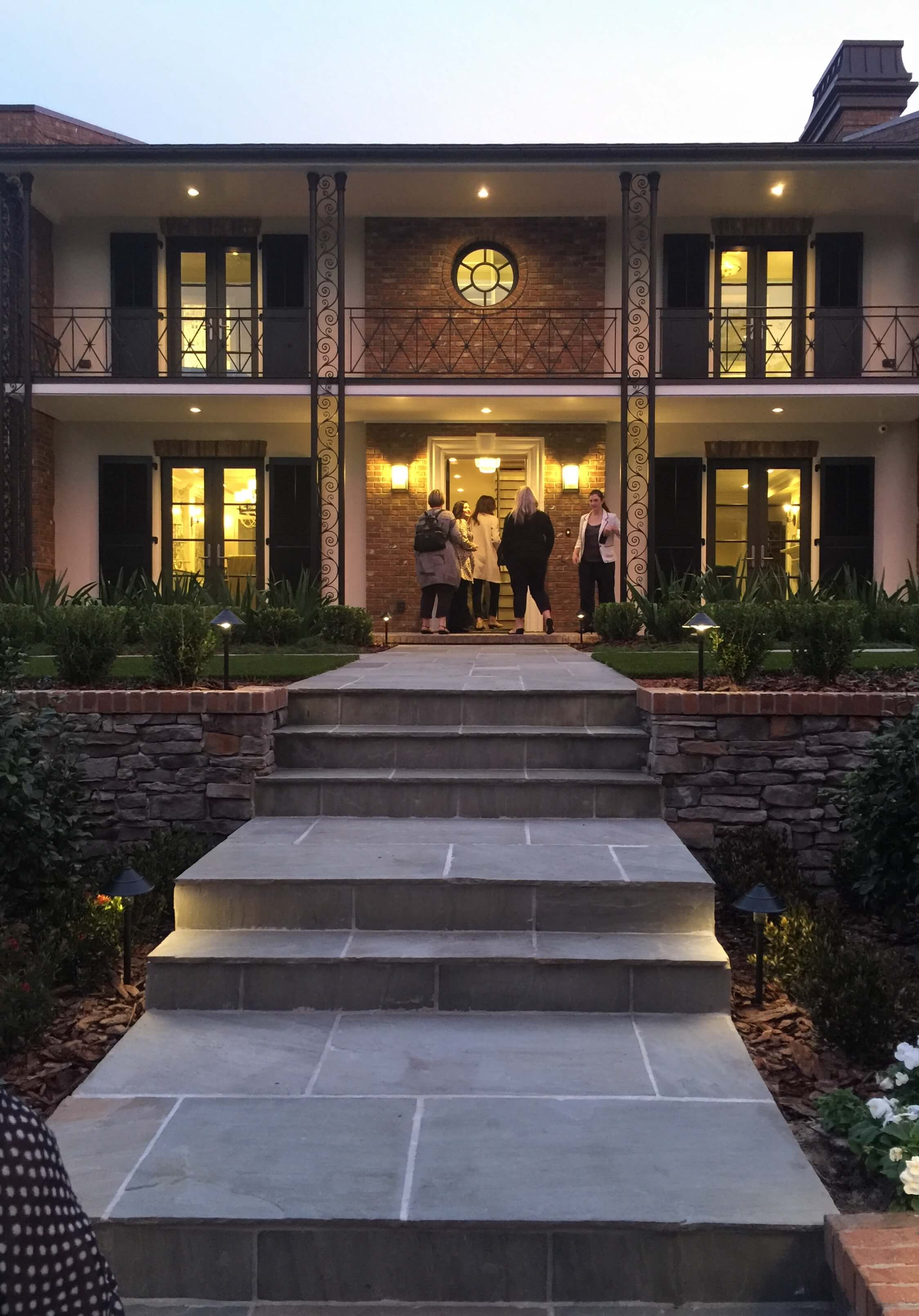
Our tour began at dusk. This home has such lovely curb appeal. #curbappeal #frontdoor #frontporch
Living room of The New American Remodel, Orlando - KBIS2018 #livingroom #livingrooomideas
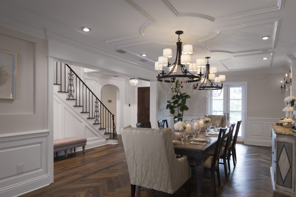
Here's a view, below, looking back at the entry hall and stair from the end of the dining room. This area retained many classic features. Love the ceiling detail and the wood flooring.
Dining Room of The New American Remodel - Orlando KBIS2018 #diningroom #formaldining
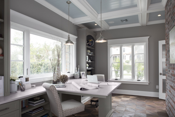
This was my favorite room in the whole house, below. A home office that incorporated the exterior brick. Love it! I could see myself blogging in here on the weekends. :-)
Home Office in The New American Remodel - Orlando, KBIS2018 #homeoffice #study #brickwall #shiplap
I captured the flooring in this room during the tour.
Wood flooring in The New American Remodel - Orlando, KBIS2018 #woodflooring #chevronwoodfloor #floorpattern
Loggia extension in The New American Remodel
This beautiful loggia was added on to the back of those original rooms. It connected the master and then the new kitchen/family room spaces.
This is a great flex space, super for entertaining and hosting a big holiday dinner perhaps.
New addition loggia in The New American Remodel - Orlando, KBIS2018 #loggia #floorpattern #cofferedceiling
Here was my pic of the floor. I loved the inlay pattern. Great way to marry the wood of the original structure to the tile that was running through the new addition kitchen/family room.
Wood flooring transition to wood/tile inset in loggia - The New American Remodel - Orlando, KBIS2018
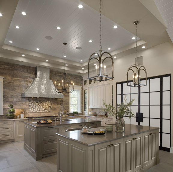
Here's the spacious kitchen with all the bells and whistles. Lovely high ceilings, an amazing hammered metal feature hood, state of the art Thermador appliances, and an eating bar in lieu of a breakfast table and chairs.
I really loved the steel and etched glass doors and panels that covered the pantry.
Kitchen in The New American Remodel - Orlando, KBIS #kitchen #kitchenhood #kitchendesign
Kitchen in The New American Remodel - Orlando, KBIS #kitchen #kitchenhood #kitchendesign
Kitchen in The New American Remodel - Orlando, KBIS #kitchen #kitchenhood #kitchendesign
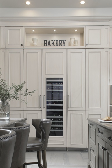
A wall of Thermador refrigeration worked beautifully for this large kitchen in The New American Remodel - Orlando, KBIS #kitchen #kitchendesign
Legrand switches were labeled and all stacked into one single switch plate. :-) Kitchen in The New American Remodel - Orlando, KBIS #lightswitch
The view from the seating at the bar, below. You can see how the covered outdoor space flows directly from the family room. This makes for a fabulous space to throw a great party!
Family Room in The New American Remodel - Orlando, KBIS #kitchen #familyroom #beams
Outdoor Living At The New American Remodel Showhome
Motorized screens make for bug-free outdoor living. The New American Remodel - Orlando, KBIS #screenedporch #outdoorliving
The lovely pool, fountain, and an outdoor kitchen was located off the side of the screened porch area.
Outdoor patio in The New American Remodel - Orlando, KBIS #pool #patio #outdoorliving
Outdoor kitchen in The New American Remodel - Orlando, KBIS #outdoorkitchen #outdoorliving
The kitchen stepped down to the mudroom, the outdoor level and the garage. This space led to the outdoor kitchen, the laundry room, and then to stairs. Those stairs and an elevator led to a loft-type bonus space above the garage.
So much space to house family and friends in this expanded home!
Beautiful cabinetry details in The New American Remodel - Orlando, KBIS2018 #mudroom #cabinetry #wooddoors
Spacious laundry room in The New American Remodel - Orlando, KBIS2018 #laundryroom #farmsink
The wing off the other side of the loggia housed the master suite. Here's a peek at the luxurious master bath.
Luxurious master bathroom in The New American Remodel - Orlando, KBIS2018 #masterbathroom #bath #bathroomdesign
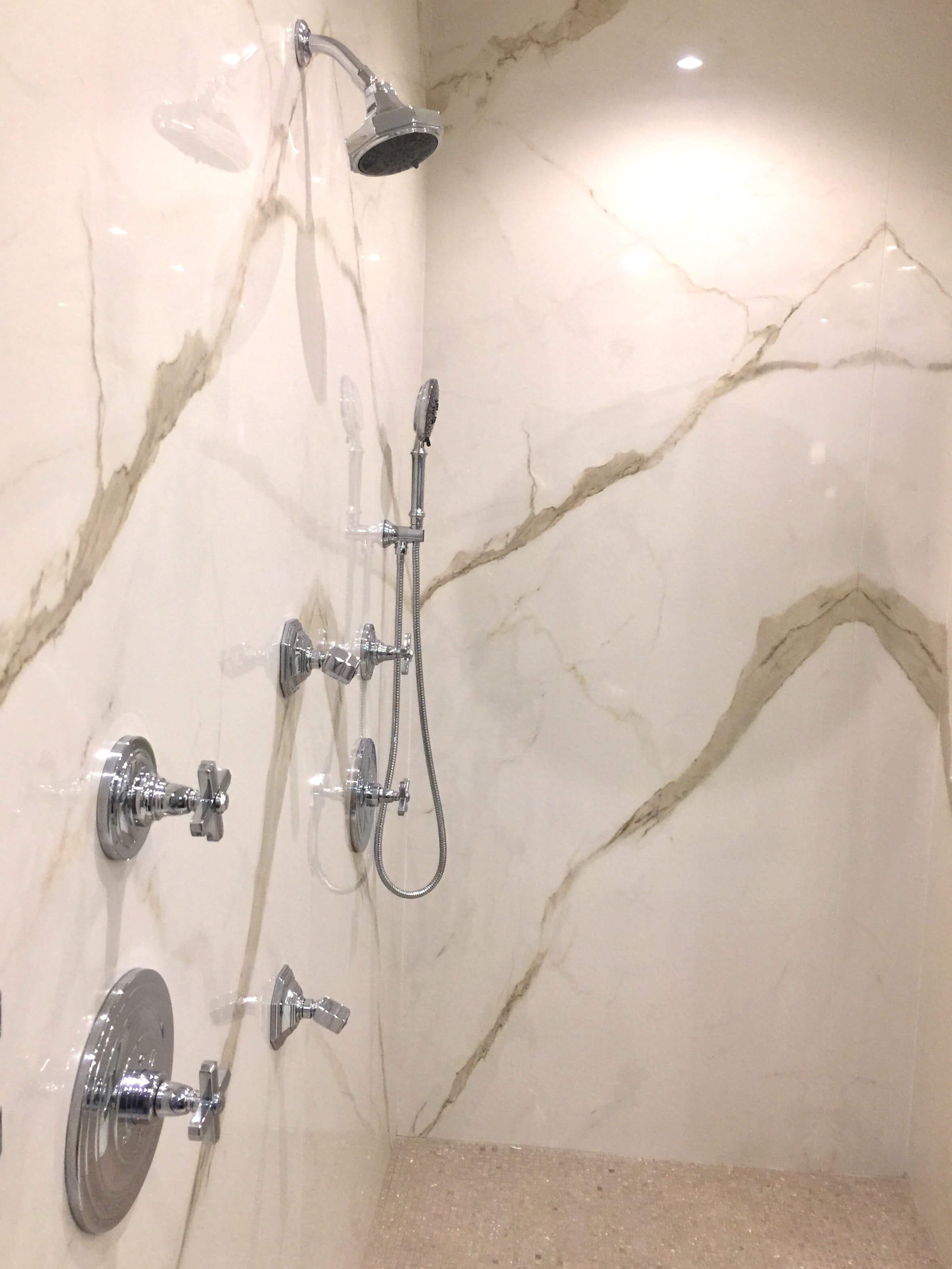
The master shower was lined with porcelain slabs, a great alternative to tile. No grout! The New American Remodel - Orlando, KBIS2018 #masterbathroom #bath #bathroomdesign #showerstall
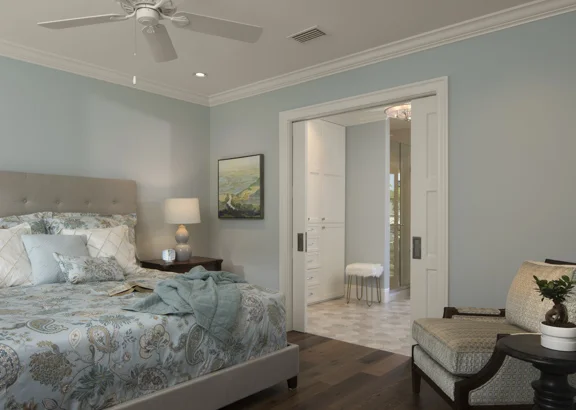
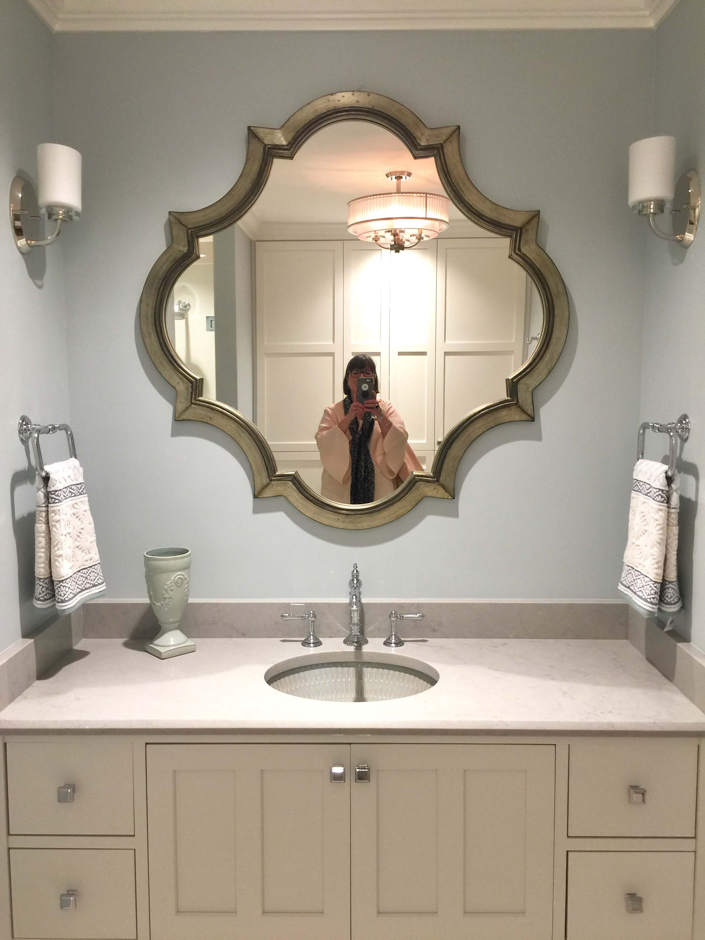
Here's one of the rooms upstairs with it's adjoining bathroom and the only type of selfie you'll ever see from me!
Guest bedroom - The New American Remodel - Orlando, KBIS2018 #bluebedroom #bedroom
Guest bathroom - The New American Remodel - Orlando, KBIS2018 #bathroomvanity #mirror
You can see more photos and learn more about the remodel at their website.
Builder was Farina & Sons, Inc. (Unfortunately, their link is not working and I couldn't locate their site on the web.)
Photos via TNAH website by Jeffrey Davis, Davis Photography
Here's another showhome tour I did at a previous KBIS in Vegas. It's a fun house geared for millennial homebuyers.









I was just scrolling back through some images on my phone and realized I never shared anything with you about the Responsive Homes we toured in Vegas at KBIS2016 while on Blogtour!