This before and after kitchen remodel I’m sharing today was one I consulted on as a local, in-person consultation. I went out first for some general questions about their living room and some upgrades they wanted to make there, then later on for the kitchen.
We stayed in touch and they shared a few in-process pics with me along the way.
Since they are almost complete, sans a light fixture for over the sink, I asked if I could come out and snap a few pics myself.
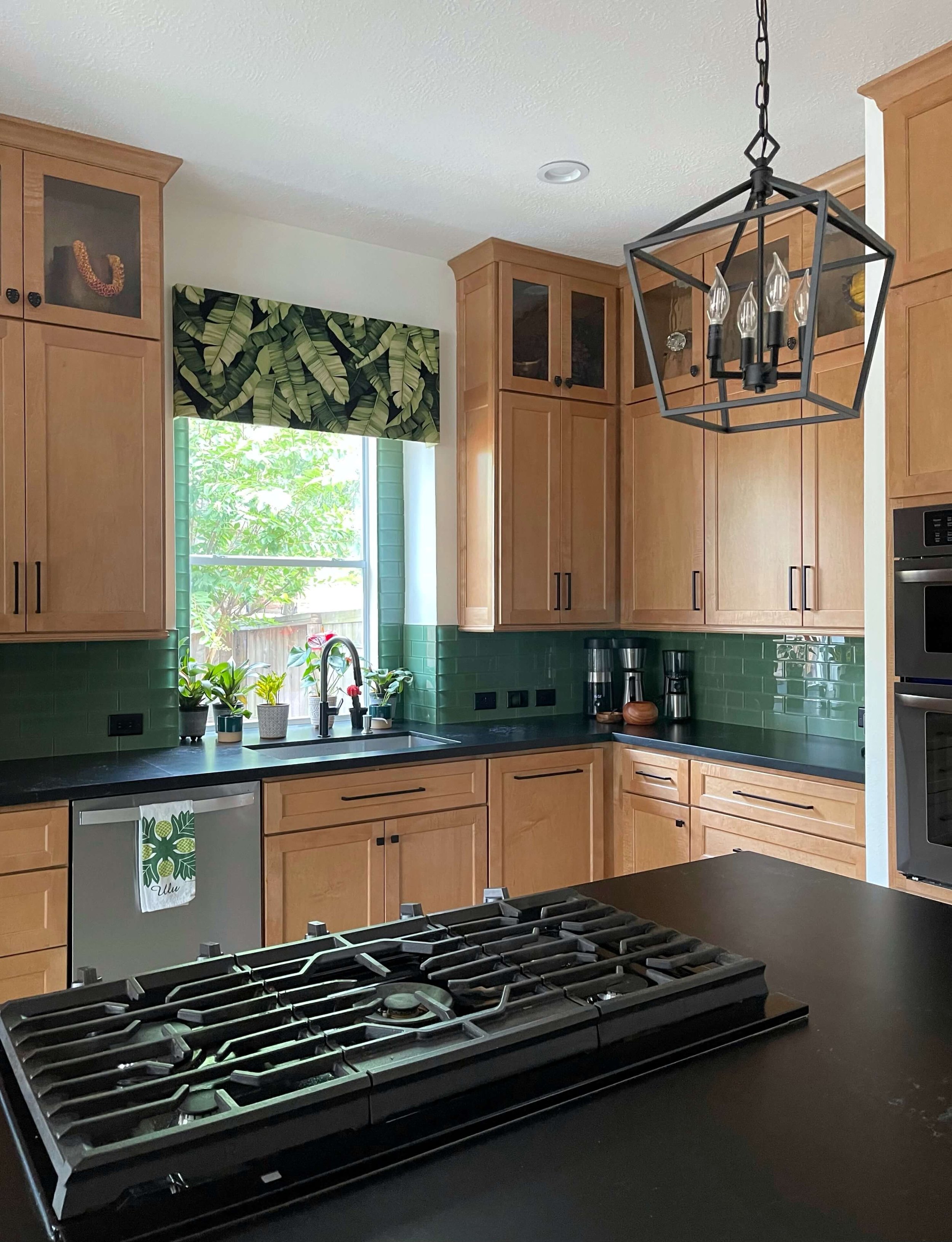
This one turned out well and I am loving the warm wood cabinetry they did with the green island. I especially love when projects defy the trends and turn out looking beautiful and reflective of the homeowner’s style and taste.
Here were their BEFORE pics.
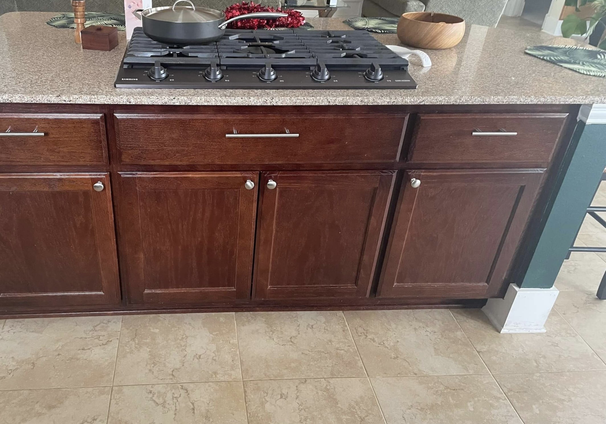
BEFORE REMODEL - Cherry stained cabinets with painted green sheetrock island
BEFORE REMODEL - Cherry stained cabinets with painted green sheetrock island
BEFORE REMODEL - The island was wrapped on two sides with a painted green sheetrock short wall.
Those cherry stained cabinets didn’t work with the look they were after and this dark reddish color is actually on my list of cabinet colors I would paint these days.
BTW, these weren’t real cherry, just a plain wood stained a dark cherry color.
They have ties to Hawaii and wanted a tropical island type vibe. The owner loves Koa wood which is a warm toned wood. While koa wood is pricey here on the mainland, I liked the idea of a warm wood though for the cabinets.
Getting a standard wood that would give a similar look was a good idea.
They were keeping the tile floors too, so wood cabinets would be good to warm up the space, and work well as a contrast.
They had done some wood paneling on the fireplace wall in this wood tone after my first visit and now we wanted to match up that look in the kitchen on the wall. This warm stained maple cabinetry from Kent Moore was just the perfect look to marry their kitchen with the family room just across the space.
The green makes for a nice color statement and works with other green accents they have in the home. The black counters and pulls add a striking modern touch.
I’m so glad they did their cabinets to the ceiling, it really echoes the paneling that went to the ceiling on the opposite wall. Doesn’t it just look more custom and high end? Whether you use them much or not, I think they are a good investment.
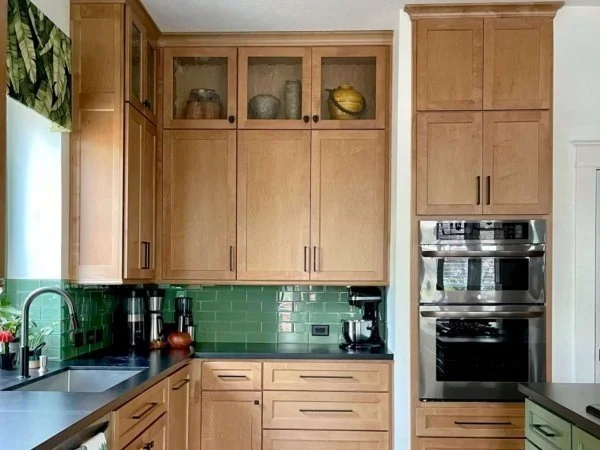
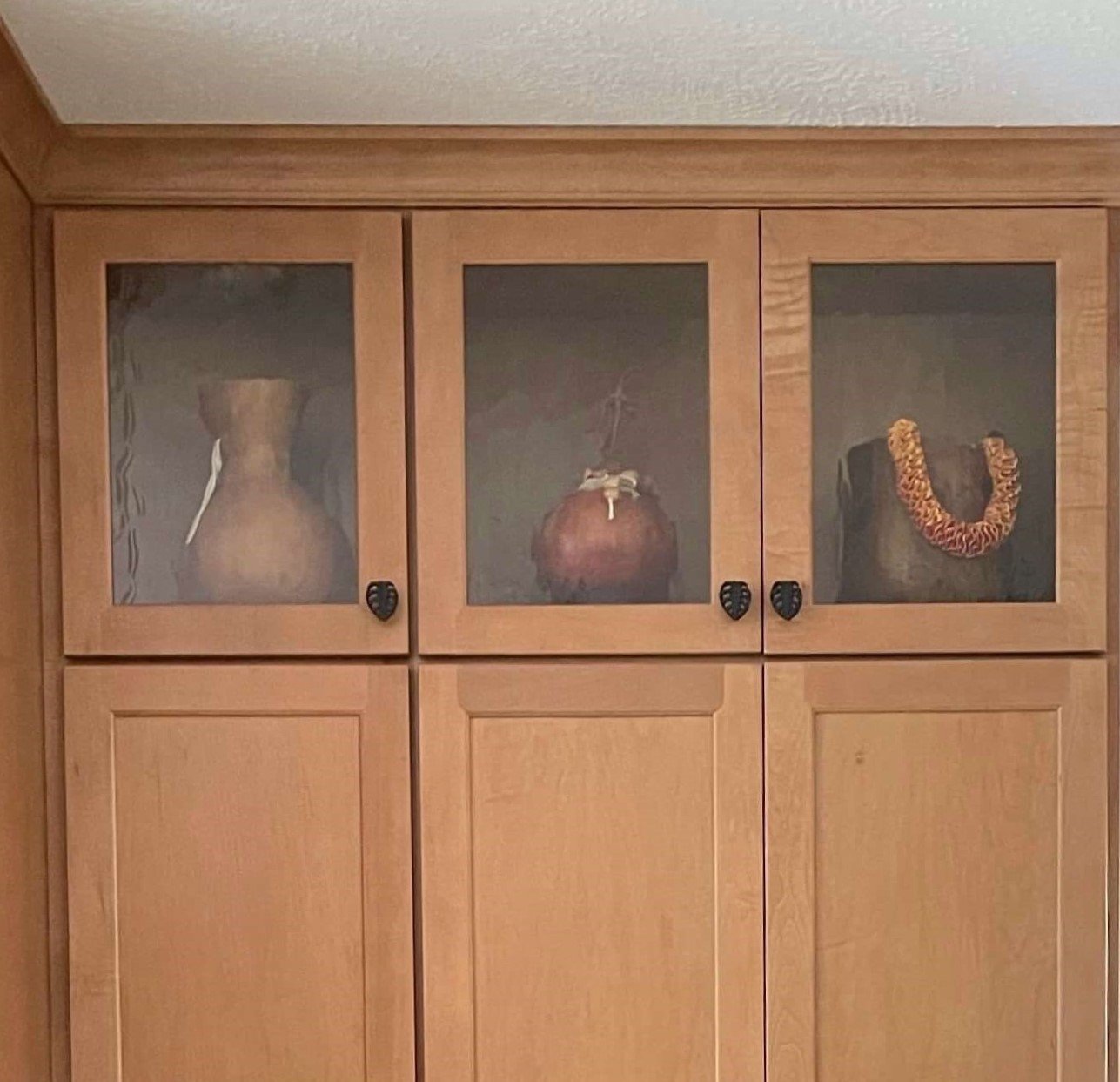
I helped them select warm toned items from their collections for the glass front cabinets at the ceiling. It’s just a nice subtle look that contributes to the overall ambience.
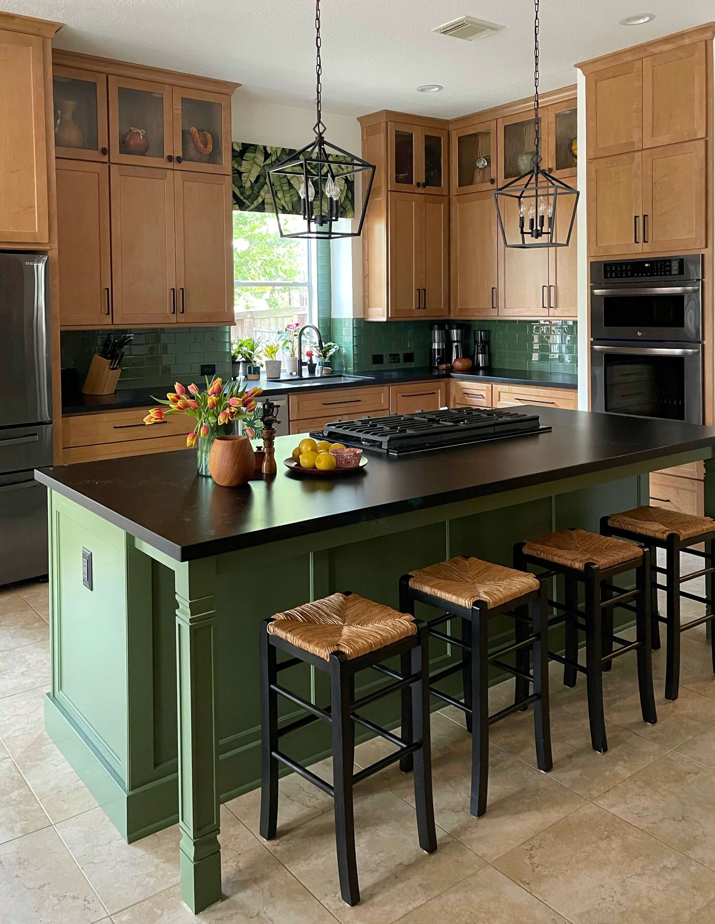
AFTER REMODEL - Warm wood cabinets with a green island make for tropical vibe for this kitchen.
Another part of their upgraded look was the island and how they went from an island with a sheetrock front and sides to an island that is all made of wood in a vibrant green color.
I mentioned that as an item to try and upgrade if you are doing a kitchen remodel in this post. >>> 6 More Outdated Kitchen Design Features Worth Addressing in Your Remodel
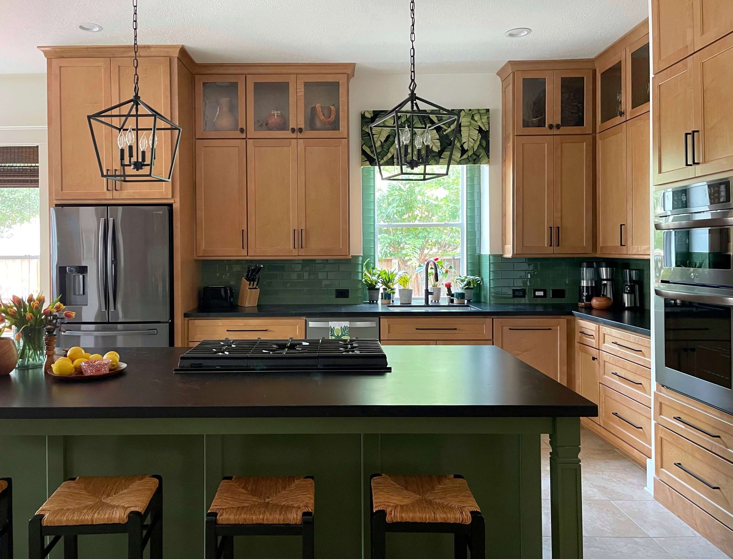
AFTER REMODEL - A vibrant green island and new warm wood cabinets to the ceiling make for a beautiful new kitchen with a Hawaiian vibe.
AFTER REMODEL - The black iron lanterns echo the other black finishes in the kitchen.
I love how the glass tile backsplash and the island are tied together with the green. Having only the wood cabinet finish and then black countertop on the wall would not have been as cohesive or vibrant.
AFTER REMODEL - Green island and backsplash bring some color to this wood kitchen.
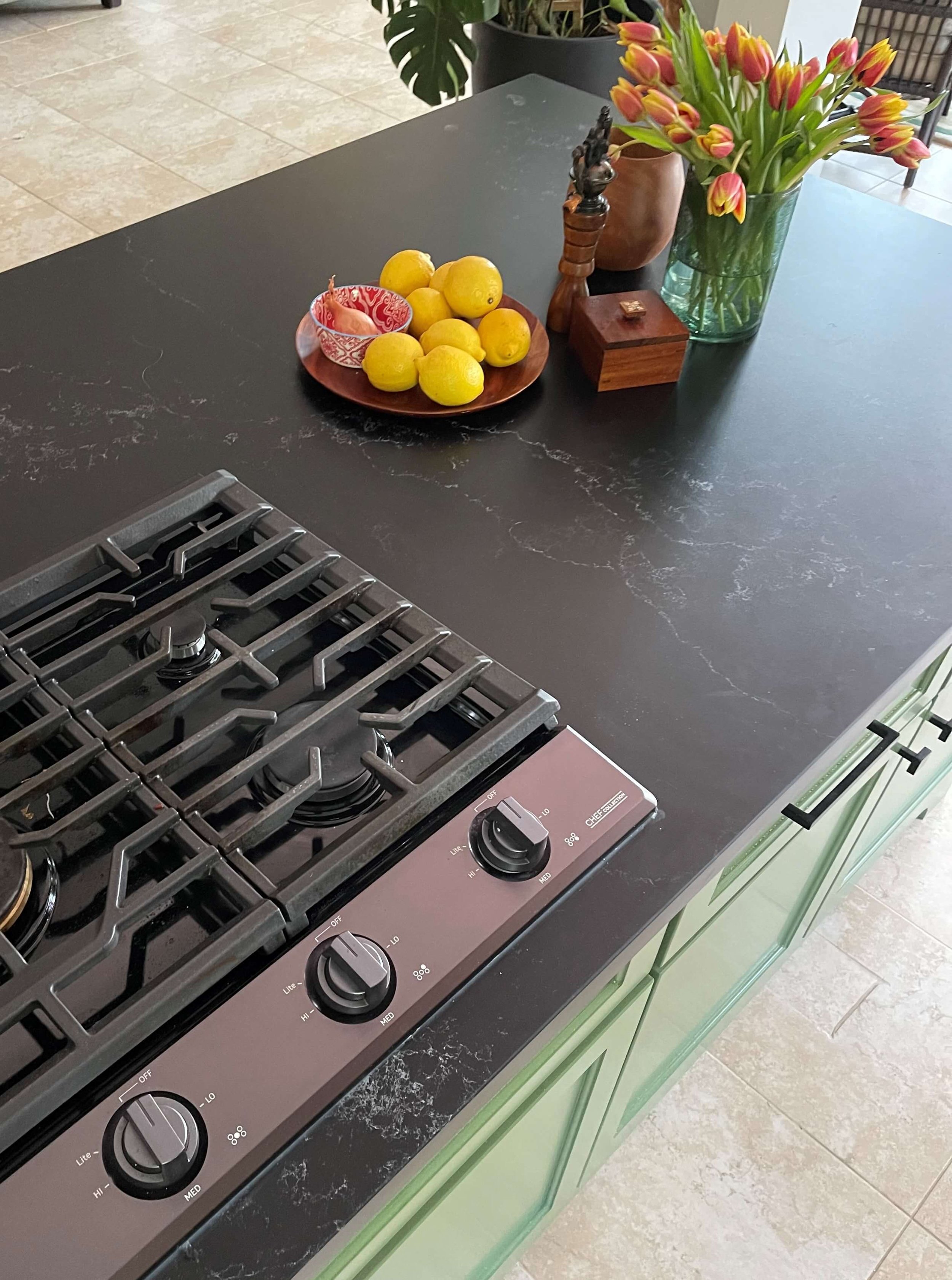
AFTER REMODEL - New green kitchen island with black matte quartz countertop paired well with their existing tile floor.
Their new appliances were the Chef Collection from Samsung, black stainless finish. They kept their stainless dishwasher for now as it is in good condition.
I like the black stainless look here. The “fingerprint resistant” black stainless cooktop really blends into the black countertop. This color is more subdued and not as bright looking as regular stainless. I think both the refrigerator and the wall ovens work well in this kitchen.
(They do have a pop-up vent just behind the cooktop, you can see in the pic above.)
AFTER REMODEL - The Caesarstone Empire Black matte finish resembles a black soapstone.
See the personal touch here on the upper cabinets where they put a leaf pull on the top doors? Very fun!
You can see that these are not the warm wood cabinets of yesterday. While maybe a similar color tone, these look current and perfectly on trend. Features like the touches of black, the cabinets to the ceiling, the simple cabinet door style and the bold green accent color give it that more up-to-date vibe.
They did a great job and are happy with their new kitchen. I love the warmth and color here and am so impressed with their DIY skills coordinating everything and doing some work themselves.
I’m proud I could give them direction and help them out with another check-in consult along the way. Hats off to these design-savvy homeowners!
Want to see more Before & Afters from my consultation clients? Here’s a few below!
Pin this image below to Pinterest to save for later and help me share my blog!
This blogpost was thoughtfully written by me, Carla Aston, and not by AI, ghostwriters, or guest posters.







You won’t believe the before and afters of this kitchen remodel today. I’m so happy to say I had a small hand in the design, but these homeowners were the real champs here. After our Designed in a Click session, they went for it in a big way and made some major changes that rendered them remarkable results.
Take a look…..