Okay, so I ranted a bit recently about some model home design and details.
What I posted deserved saying, for sure, and I have even more of those details saved for another post.
However, I do think I saw some nice design and details while there that I’d like to give them credit for. These design features are elevating the look of model homes these days, making new home buying still so enticing.
These are the features that we are often trying to create or provide when we do remodels as they weren’t common in older homes.
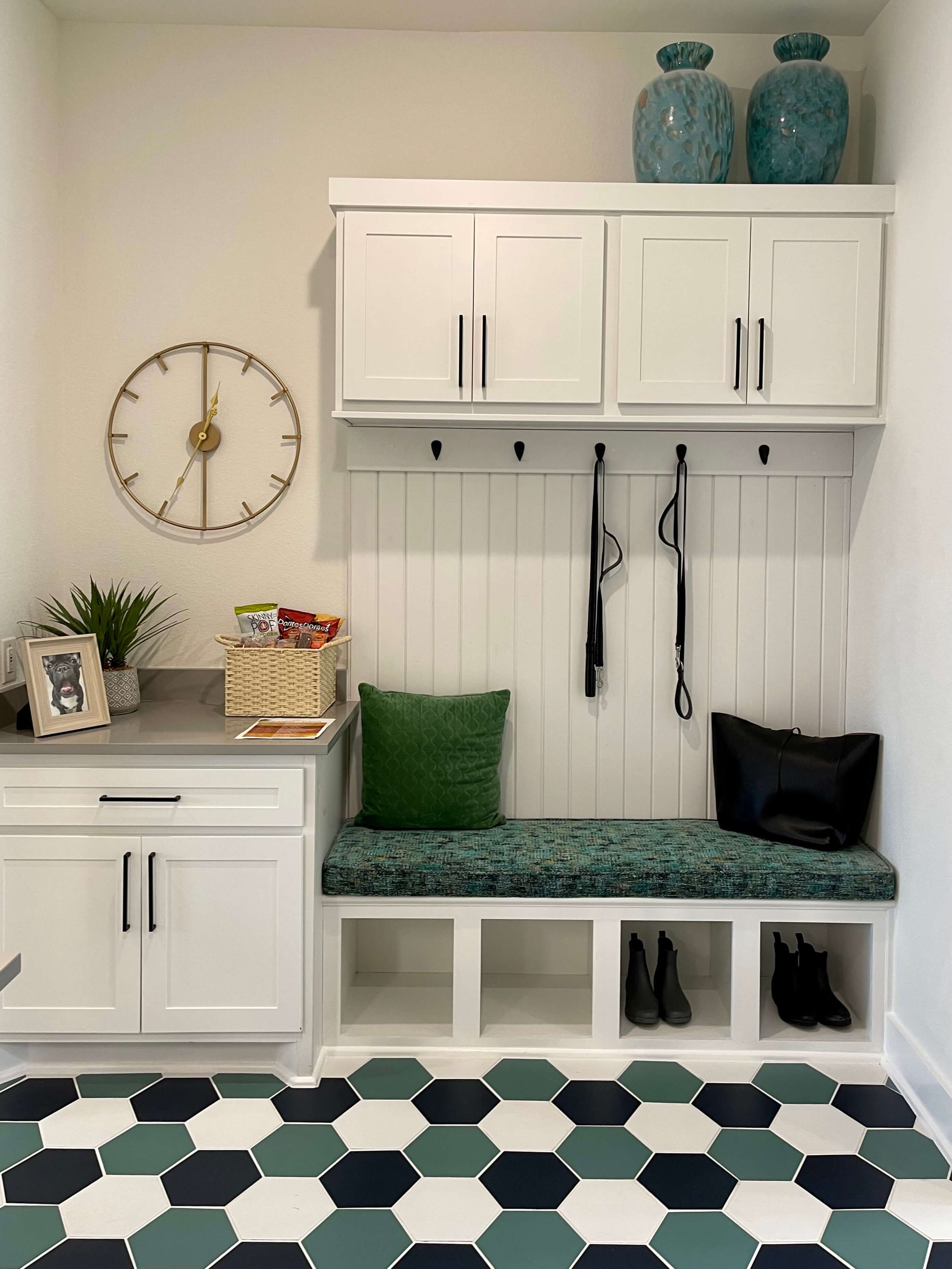
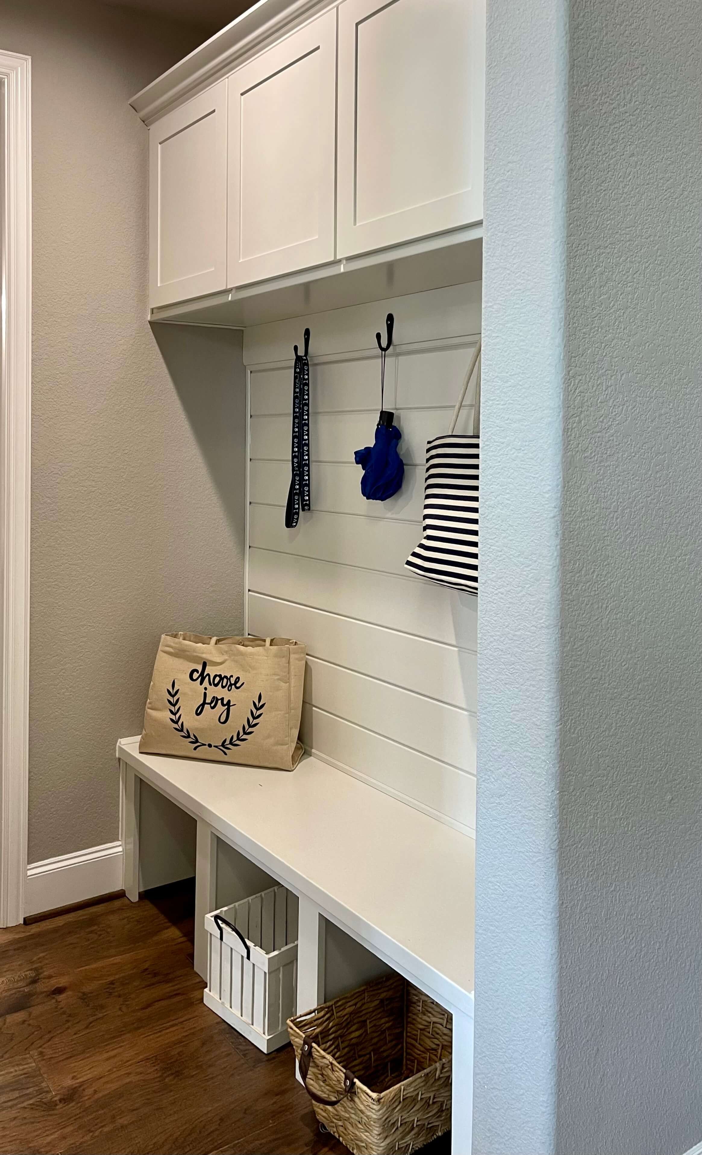
1) Mudroom Entry Bench
These were not a common feature in homes around here 20 years ago. How I would have loved having one of these in my home to help corral all the stuff that a family brings in to the house.
I saw that even some the lower priced models had a bench, so I do praise them for this feature that honestly, should be in every home.
Mudroom Entry Bench - So helpful in any home.
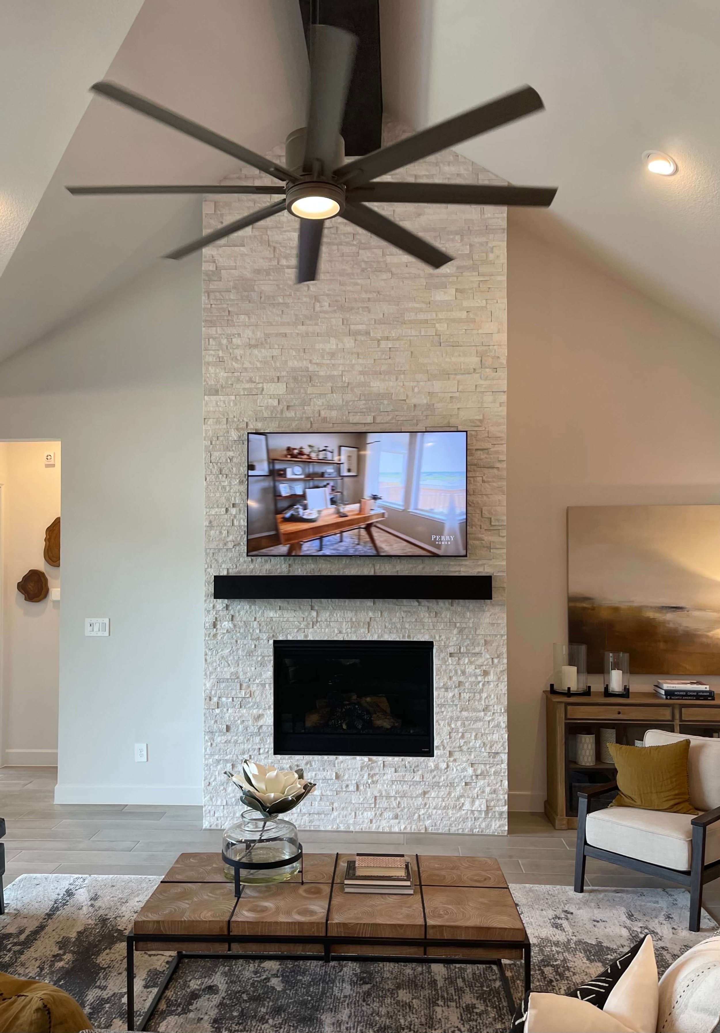
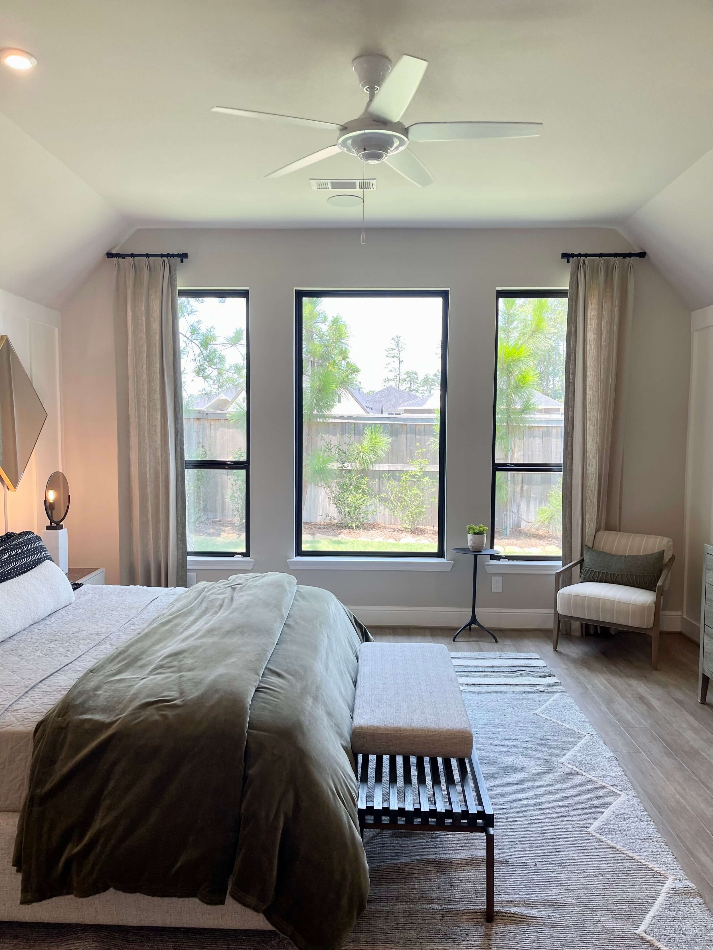
2) Better Looking Ceiling Fans
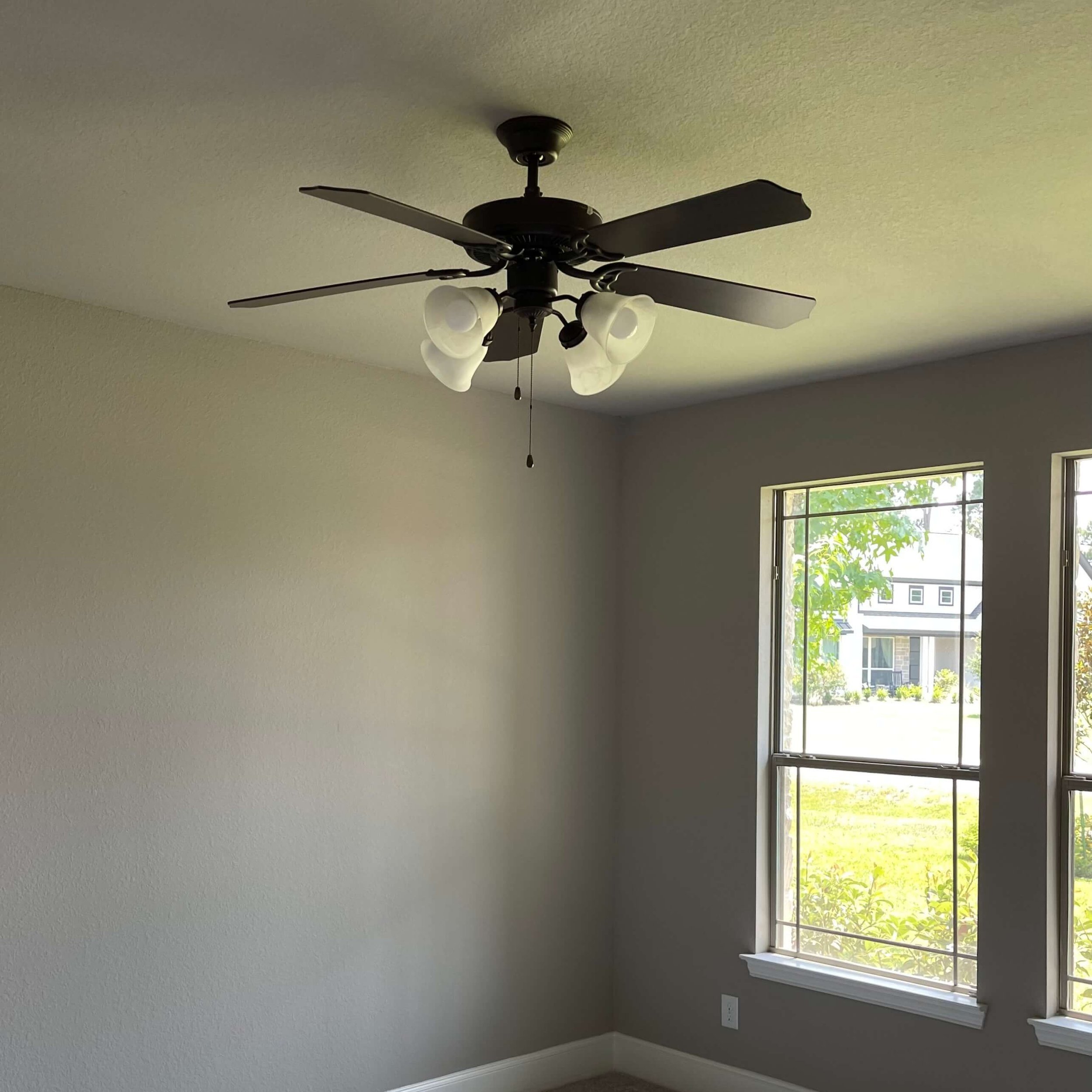
I noticed some better looking ceiling fans in these models, no boob lights or the 4-prong spider light. I’m guessing they are LED, so that’s good. (Here in Texas we need our ceiling fans!)
They all seem a little cleaner lined, like the ones I share in my ceiling fan post. I’m sure some of these were an upgrade, but at least they have the option for a better fan.
The last thing you want to do is have ugly ceiling fans to live with or replace when you’ve just bought a brand new home.
Better looking ceiling fans go a long way to create a nice ambience in a home.
One of these extra large ceiling fans is nice in a home with a vaulted ceiling.
A plain white ceiling fan that blends into the ceiling is a simple option that does not offend.
This dated looking ceiling fan is a big dust catcher and something you want to steer away from these days.
If they have a ceiling fan like this as standard, it is good to upgrade to something with a simpler look. This was in one model that was older and had just sold.
3) Patterned Laundry Room Tile Floors
I guess builders took their cue from Pinterest for this model home feature. Every laundry room I saw had a patterned floor tile of some kind.
I do love it myself, as it is the open space you can actually see in a laundry room. Walls are often filled with cabinets and appliances so wallpaper, fun paint or tile on the walls might not make an impact.
A patterned floor tile like these will definitely be noticed and bring a little fun! These might all be upgrades but they would be a great choice nonetheless.
Patterned tile floors in the laundry are great for hiding any soil or lint and make this hard-working room a lot more fun.
Patterned laundry room tile floor
Patterned laundry room tile floor
Drees Homes had a fun floor with a cute cubby built under the stairs for Fido. I appreciate that vent fan in the ceiling there too.
4) Taller Upper Cabinets
I saw more kitchens with tall upper cabinets and cabinets to the ceiling, basically cabinets with that extra level on top of the primary upper cabinets.
Honestly, I haven’t been in model homes in years, they’ve probably been doing this for awhile.
All I know is that this is one of the biggest problems I see when remodeling homes 20 years old or more. We are always either replacing the uppers, tearing out soffits or adding to existing uppers somehow.
So glad they are doing this!
However, I’m not so sure about so much glass. These were all just a little too busy and distracting from the overall look. (Maybe some kind of frosted glass or patterned glass would be a good idea!)
Cabinets to the ceiling work well here and eliminate the dust-catcher ledge.
The tall cabinets are certainly warranted in this kitchen with the vaulted ceiling.
I would love to sketch a design idea for this wall. It would include a tall, feature hood that contrasted from the white cabinets, then a gap of wall space between the hood and the uppers on both sides. But that’s another blogpost.
5) A first Floor “Den”
One thing I loved in this model home was the DEN!
It was off the front entry and had French doors, so you could close it off.
Although I liked the room concept and location, I’m not fond of that color. It’s a little Redend Point, SW Color of the Year to me.
Bring back the den! Model Home Shopping
I could actually see this as the perfect place for my husband. He still does work part time as a consultant in his semi-retirement. He does lots of zoom meetings and reviewing things on his laptop and his favorite perch is the leather chair in our open family room.
I’d love to have him in a more enclosed space so his voice and the tv don’t envelope our home.
The leather chair is like his comfy home office, with little piles of paper, files, bills, etc. stacked around. I’d love to not have that right out in the main living room.
We all need our own space sometimes, right? :-)
There were no windows but there was natural light from the French doors. No windows is good for tv watching anyway.
You could do a wallcovering and some soft furnishings to absorb sound too.
I toured another model with a similar situation, an interior room decorated as a media room. I prefer the den idea, but it was basically in the same location of the home as in the other house I saw, first floor off the entry.
First floor media room in an interior space - Model Home
Have you seen any nice features in model homes recently that you thought were clever and helpful for a homeowner? Let me know in the comments. Post a pic if you have one!
Did you miss the “Bad Details - Model Home Edition” post? You can find it below.
This blogpost was thoughtfully written by me, Carla Aston, and not by AI, ghostwriters, or guest posters.





I’m back with more bad details, this time from some model homes I toured recently. :-)