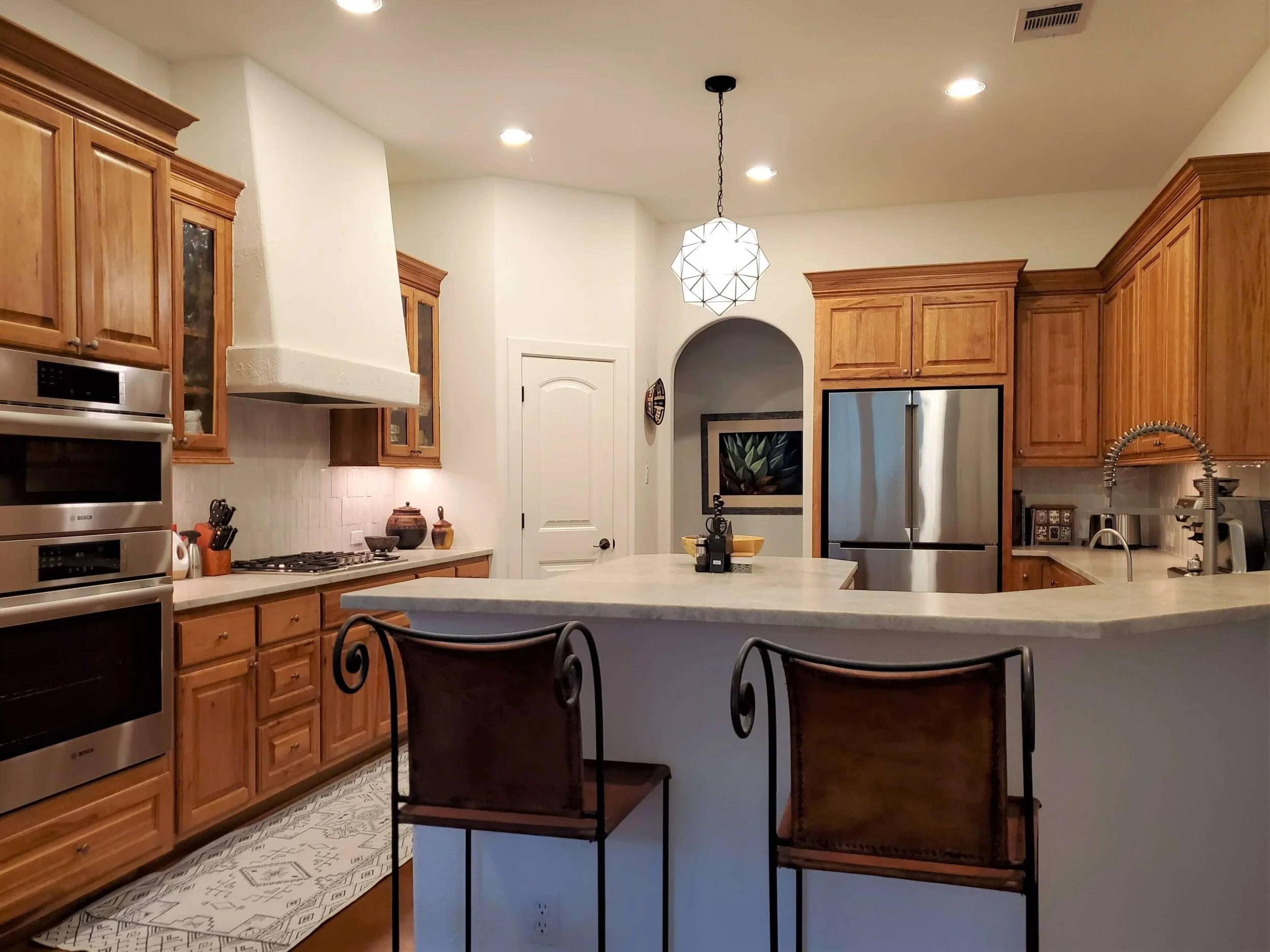
I just received some “after” photos from someone who used my Designed in a Click consultation for her partial kitchen makeover awhile back. I really like the way it turned out! She decided not to go all in with a major redo and keep the remodeling work more minimal. I think it works so well for her home.
A Partial Kitchen Makeover Can Be All That You Need
There are times when you cannot possibly afford the time or money for a major overhaul, even if you need one.
There are times when it’s not really about the time or money, it’s about if it would be worth the investment to go big, or if you would be happy with the overall look that a partial remodel would give you.
It’s about evaluating just how badly you need a major remodel to make your kitchen a place you will love to cook and work in and if just doing a partial remodel will get you to a place of satisfaction with the dollars you would spend.
After all, you don’t want to put good money on top of something bad, put lipstick on a pig, or leave the elephant in the room. (All of which I’ve written about before! :-)
Sometimes you need an outside opinion to address what you can do that would get you a desired end result. Such was the case here, in this remodel.
This homeowner had come to me previously with a revamp of her living room. I featured it on my blog and she did a great job in that space.
Now it was time for the kitchen, but her questions and overall direction were not clear to me.
She asked about new countertops and backsplash, light fixtures for over the island and she mentioned she was getting new stainless appliances. She wanted a lighter, brighter space, something more up to date.
However, she also asked, in the last question, about moving appliances around, opening up the wall to the living room more, etc. That last question would make for a much bigger remodel than what we have here today and would likely mean replacing cabinetry.
I felt like this was really two different scaled projects with two different approaches, so I addressed the simpler one and with the bigger redo, I alerted her to some of the issues that would be involved with that.
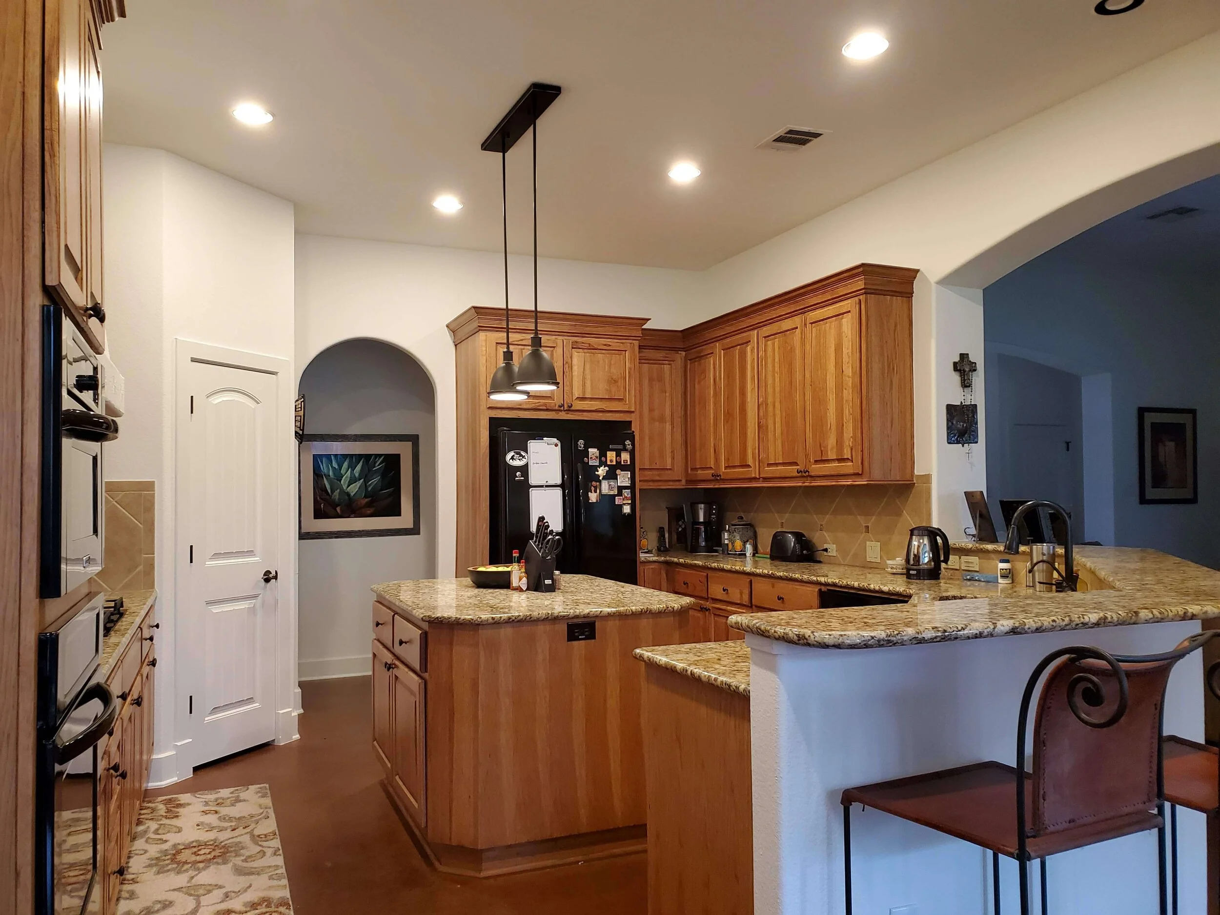
Here was her previous kitchen.
Design Consultation For Partial Kitchen Makeover - Before
Design Consultation For Partial Kitchen Makeover - Before
Design Consultation For Partial Kitchen Makeover - Before
Design Consultation For Partial Kitchen Makeover - Before
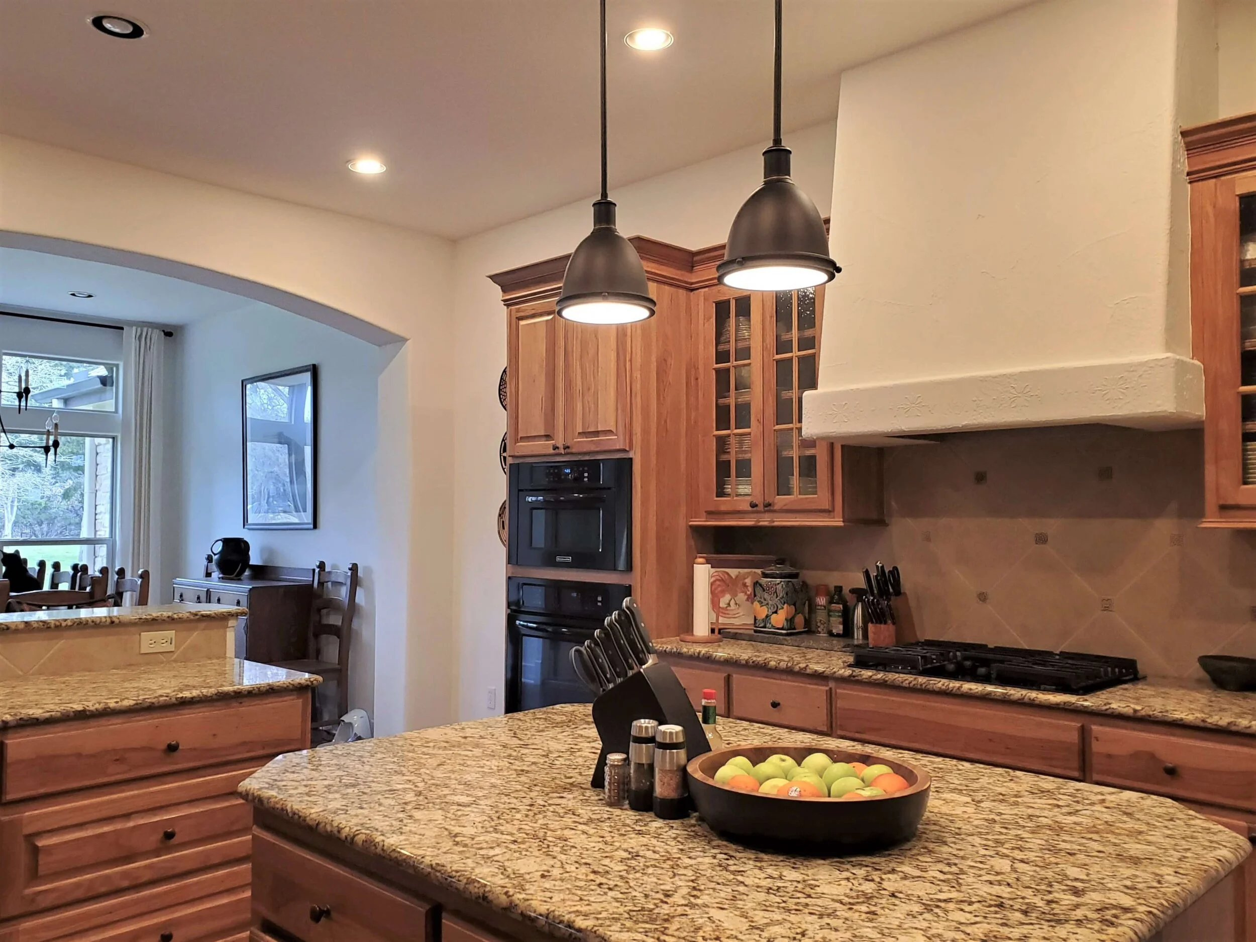
This kitchen had the typical look from homes built during this time, in the 2000-2010 range. Spotty granite counters, warm toned travertine backsplash, two tiny pendants hanging over the island and warm wood cabinets filled out the space. It was a rather dated look.
She had already painted walls and trim a warm white that brightened everything up nicely, so she was already on her way to a lighter, brighter kitchen.
It’s impossible to patch a stained concrete floor.
With her stained concrete floors, I could see that moving things around and reconfiguring the kitchen would likely be a problem with the floors. You would have to make sure and cover up any footprint of cabinets that were existing now, or you’d have to address the floor. With stained concrete running through this room and neighboring rooms, that could likely get out of control with cost fast.
You see, I’ve stained concrete before.
Once you stain it, it is done. If you have places that you need to touch up or patch, it is almost impossible to match and have it look like a complete, fresh stain job. The last thing you want to do in a home you are living in is sand and refinish concrete floors. It’s worse than wood floors, believe me.
Since her wood cabinets were a nice quality, I elected to go with what she had here and improve the rest. She liked the wood cabinets but wondered if lightening them up somehow would be a good idea.
Here’s that pic of the kitchen again.
Design Consultation For Partial Kitchen Makeover - Before
Since the cabinets are really the color of the concrete floor, I didn’t think lightening them up was necessary. I did recommend removing the grid from the cabinet doors and getting a full panel of glass, either an etched or patterned glass would be nice. That’s a less traditional look and one we are doing more often in kitchens now when we want glass panel fronts.
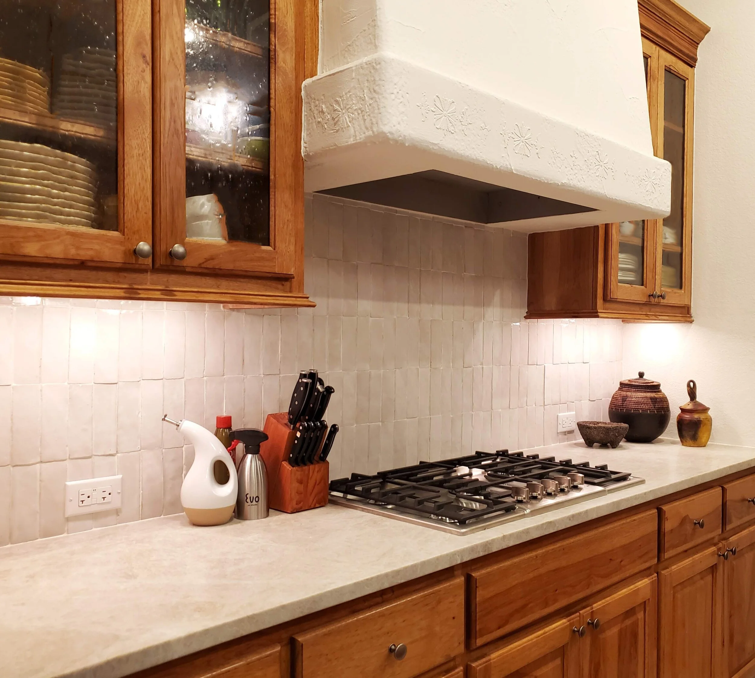
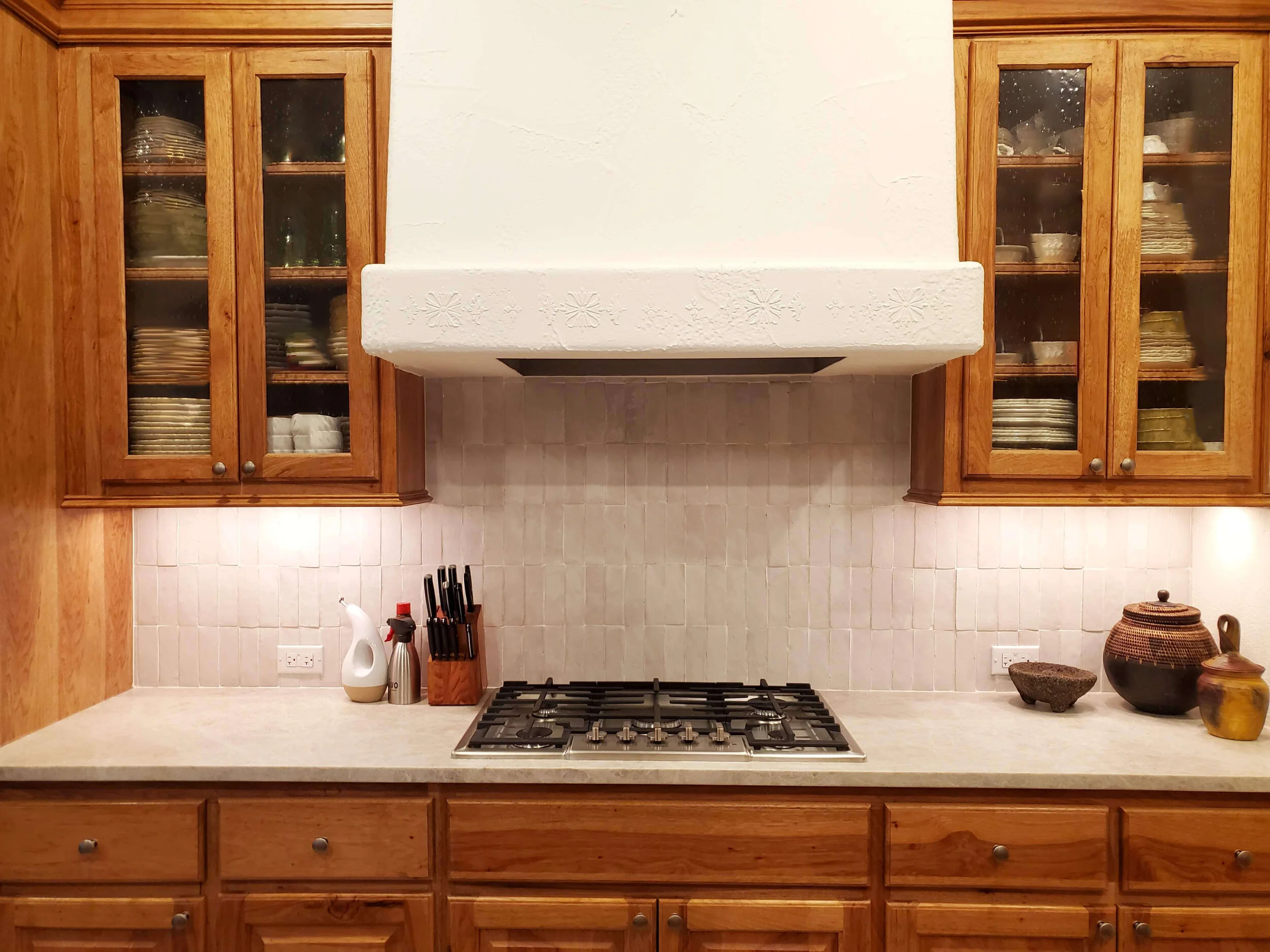
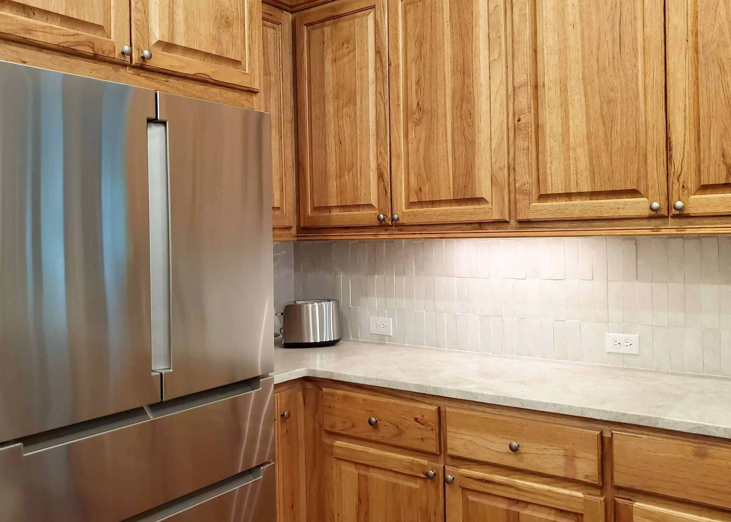
I recommended a countertop stone that works well with warm whites and warm wood tones that I often use, Taj Mahal quartzite. She did just that on the counters and it works beautifully!
Then I suggested an warm white ceramic tile for the splash. Basically, I wanted to make the wood be the stand out finish in the room and brighten things up with a warm white on everything else.
She chose a beautiful zellige tile, which really works so nicely with a more southwestern and earthy look. The plaster hood, wood cabinets and terracotta stained floor all lean into that style and I love the handmade look these tiles have for the backsplash.
(I was also soooo pleased to see she did NOT do a side backsplash! :-)
Design Consultation For Partial Kitchen Makeover - After | New Taj Mahal quartzite countertops and a warm white Zellige tile backsplash help brighten up the wood cabinets in this kitchen makeover.
I advised her to go with an antique nickel or pewter type cabinet pull, I was looking for a darker cool tone finish to offset the warm wood, and she did that too. The stainless appliances also help lighten things up in the kitchen.
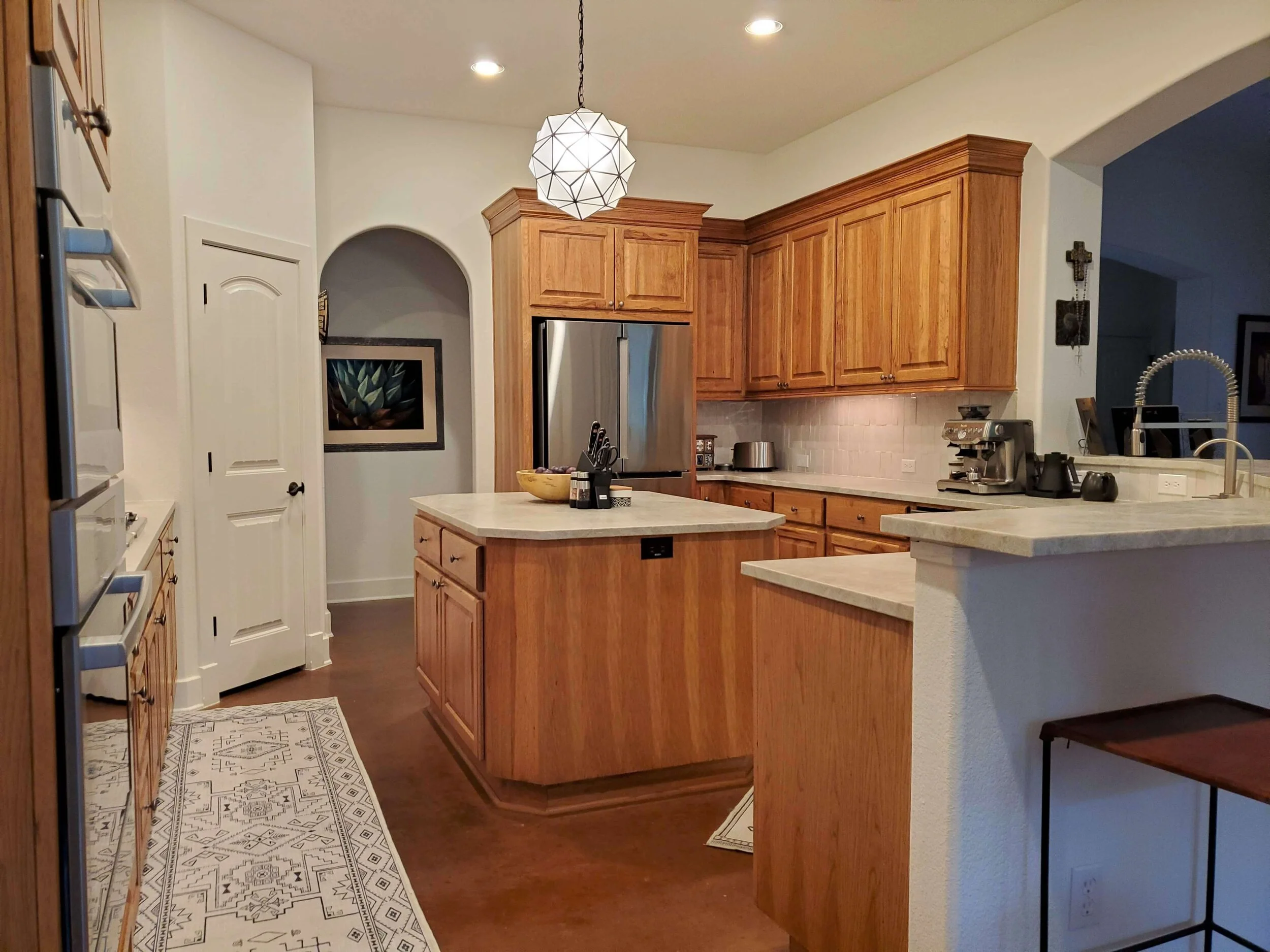
I recommended a single, central light fixture, to be hung higher in the room, over the island. The kitchen island just wasn’t big enough for two pendants, and a fixture that had white glass in it could reinforce the lighter look in the room.
Doesn’t all the warm white make the wood look good? I think her kitchen is definitely lighter and brighter and much more current. I would still like for her to paint the island the white, as I think it blends into the floor a little too much, but she might still do that. :-)
Design Consultation For Partial Kitchen Makeover - After | New Taj Mahal quartzite countertops, a warm white Zellige tile backsplash and a new light fixture help brighten up the wood cabinets in this kitchen makeover.
Design Consultation For Partial Kitchen Makeover - After | New Taj Mahal quartzite countertops, a warm white Zellige tile backsplash and a new light fixture help brighten up the wood cabinets in this kitchen makeover.
Design Consultation For Partial Kitchen Makeover - After | New Taj Mahal quartzite countertops and warm white Zellige tile backsplash help brighten up the wood cabinets in this kitchen makeover.
Design Consultation For Partial Kitchen Makeover - After | New Taj Mahal quartzite countertops and warm white Zellige tile backsplash help brighten up the wood cabinets in this kitchen makeover.
I really loved her choice on the light fixture, it goes with the handmade look of the tile, a leaded glass fixture. The light rug is nice too, to brighten up the floor.
I think she did a great job and she is really happy with her end results!
Design Consultation For Partial Kitchen Makeover - After | New Taj Mahal quartzite countertops, a warm white zellige tile backsplash and new light fixture help brighten up the wood cabinets in this kitchen makeover.
See this homeowner’s art!
I actually met this homeowner in person, at a local art fair in my area. She had a booth and was displaying her rich and colorful pastels there. I loved her work and we exchanged cards. I would love for you to visit her beautiful site and see more for yourself! Check it out here >> Anna Lisa Leal
I can’t wait to open these consultations back up and see what all of you have that you’re working on. Right now, I’m looking at next week to start taking a few of these consultations.
Want to see more home design success stories like this? I’ll be featuring more soon, so don’t miss out. Subscribe below!
Pin this image below to Pinterest, to save for later!


