My design service, Designed-in-a-Click, can be just the thing to get you out of a design dilemma.
Sometimes all it takes is another set of eyes — eyes that have seen lots of design predicaments over the years.
Here’s an example of one that I did recently with my mother-in-law, who happens to own a house in the tropics.
Btw: Now, mind you, I don’t make immediate family pay for services (especially my mother-in-law), but this is so much like the type of service I provide that I can’t help but share.
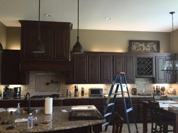
She’s always wanted to fix this house up a bit; but, currently, it’s a rental, so investing much money into it isn’t desirable. She had preferred to sell it and, thus, wondered about making it more desirable for resale; but, since it didn’t sell in the window of time that was most hot for the area, she decided to rent it out. They were looking for long or short-term renters. The kitchen bugged her some, as it felt dated; but she liked the tile in this particular environment, and I agreed with her. Can you imagine granite countertops in this tropical home’s kitchen?
Of course, minimum expenditure was a priority. How to get the most bang for your buck was of utmost importance.
Here was her basic question:
“How do I make this space seem more up-to-date and like a great tropical getaway to rent?”
Here’s what I told her to do:
Since you are doing this primarily so it will look good for resale or rental, and because you or no one you know will be living there long-term, I think minimizing the wood cabinetry look would be desirable. I would remove the upper cabinets and put in two long open shelves; then do a new plaster hood, perhaps with some wood trim.
It will really bring home a more tropical look; it will open up the kitchen and make it feel less dark; AND you won’t even see the dated cabinetry style or color, as it will only be BEHIND the bar and below the counters. You can stash some colorful pottery up there on some open wood shelves, which will relate to the tile counters; and the plaster will blend with the wall and feel very organic and natural for the home. The short, builder grade look of those cabinets feels cheap and generic, to me. The open shelves with a plaster hood will be perfect for a rental and/or would make a bigger visual impact on new buyers. It would just feel more indigenous.
And here are the visuals I provided: (Btw: Sometimes it’s just a recommendation; but, in this case, she needed to be shown what I was talking about.)
This Designed-in-a-Click took over 20 min of time. (Actually about double.)
Sometimes the response I give runs longer than the amount of time we have; and, in that case, I ask for another payment to be made when I’m done. Or, if I can sense at the beginning that just reading and digesting the info will take up most of the 20 min, I will let them know it will be more. It’s hard for a buyer of this service to understand how long it takes to respond with thought and care. However, as you can see, I provided some specific ideas for a particular dilemma/question she had:
“How do I make this space seem more up-to-date and like a great tropical getaway to rent?”
Want to see more from this house in tropical Costa Rica?
Her listing is HERE (for now).


