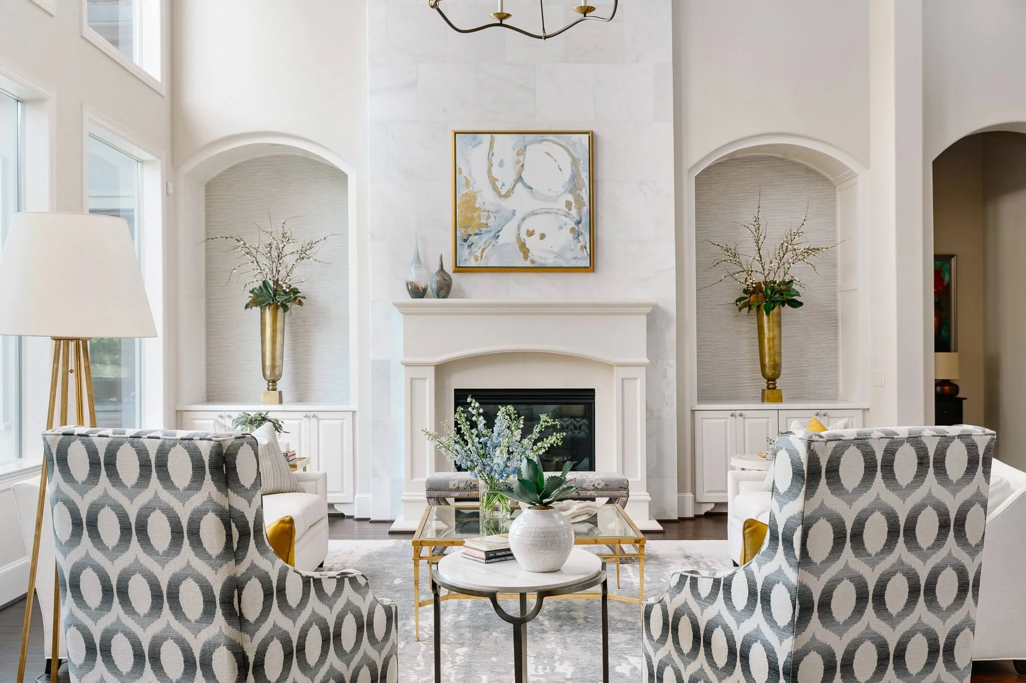
This project reveal just keeps getting better and today I’m going to share the living room, along with some of the architectural changes we made.
These features helped to upgrade some of the finishes in this home and get a lighter, fresher, more customized look.
Here’s the before pic.
BEFORE - A light filled beautiful space that lacked the quality of materials this living room deserved. #livingroomideas #marbletile #fireplacewall #niche
This is a beautiful grand space with lots of natural light.
It has great bones, but to the homeowner, it felt a little lackluster for the value of this home.
I agreed.
The LIving Room’s Architectural changes
I felt that some more luxurious finish materials could be brought in, to give it some class, and I really couldn’t see keeping all those little ordinary bookshelves there on each side of the fireplace.
Not that built-in bookshelves aren’t nice, but there were lots more in other parts of the house, we didn’t need them. Frankly, I just couldn’t see a bunch of little tchotchkes sitting on those shelves.
This space was too big, too grand.
Small decorative items there would have felt cluttered.
I wanted this space to lean in to the direction it was already going.
I wanted to create a real focal point and to embrace the idea of larger, more dramatic pieces for furnishings and accessories.
Cladding the fireplace in marble tile
One of the big upgrades here was the 18” x 18” Calacatta marble tile we used to clad the fireplace. It has some warmth and softness to it that reads sophistication and quality. It really helped subtly upgrade the look of this focal point.
IN PROGRESS - Adding marble tile to the fireplace wall brought some quality and luxury to this living room #livingroomideas #marbletile #fireplacewall
Adding quality to the niches
After removing the bookcase shelving on the top of the cabinets, we added in marble counters. We then paneled the sides and top of the arch to beef up those niches and make them more special.
Installing a nice grasscloth to the back of the niche gave depth and texture and just added in those finish layers that this home really needed.
IN PROGRESS - New marble counters were added in the niche built-in cabinets #whitemarble #cabinetry #niche #countertop
IN PROGRESS - Paneling and framing around the top and sides of the niche was added to bulk up the spaces add quality. Grasscloth was installed on the back wall. #grasscloth #cabinetry #paneling #niche
See how it all played out below. Love the marble, grasscloth and paneling upgrades.
Paneling and framing around the top and sides of the niche were added to bulk up the spaces and add quality. Grasscloth was installed on the back wall. | Designer: Carla Aston, Photographer: Colleen Scott #grasscloth #cabinetry #paneling #niche #fireplace #fireplacewall #livingroomideas
Furnishings
Two comfy light colored sofas, some gilded metal finishes, a bold fabric on the high modern look wing back chairs and then the pretty X benches helped fill out this room.
I love the rug and it’s subtle contemporary pattern.
Living room furnishings with custom stools and gilded, glass top coffee table| Designer: Carla Aston, Photographer: Colleen Scott #rug #livingroom #livingroomideas #stools #coffeetable
We played off the gilded finishes, which paired nicely with the blue/gray color, to grab some citrine yellow for pillows.
White sofa with gilded, glass top coffee table, yellow pillow, onyx bowl | Designer: Carla Aston, Photographer: Colleen Scott #living room #livingroomideas #whitesofa #yellowpillow #coffeetable #coffeetablestyling
Quality accessories like the onyx bowl, the art glass vases on the mantel, and the custom art piece painted specially just for this room, help tie everything together.
Fireplace mantel with art and art glass vases | Designer: Carla Aston, Photographer: Colleen Scott #living room #livingroomideas #fireplacemantel #fireplace #vases #homedecor
Lighting Upgrades
I was so excited that this homeowner was willing to ditch the ceiling fan and do some beautiful lighting in this space.
That gorgeous chandelier married the warmth of brass, which we were adding into this space, with a black finish that helped it to stand out and draw your eye up to the high, beamed ceiling.
The floor lamp chosen echoes the shape of the chandelier.
Is that intentional??? You bet.
Gilded lamp in living room| Designer: Carla Aston, Photographer: Colleen Scott #living room #livingroomideas #floorlamp
Just like the oval shapes are repeated in the upholstery, the art, the side table. ;-)
The combination all works in this living room
If you remember from my post on the dining room, entry and study, this homeowner wanted a leaner, more clean-lined look, nothing too trad or Mediterranean.
I think it all combines together to be bright, comfortable, and sophisticated.
Lovely living room with white marble clad fireplace | Designer: Carla Aston, Photographer: Colleen Scott #living room #livingroomideas #marblefireplace #niches
Lovely living room with white marble clad fireplace | Designer: Carla Aston, Photographer: Colleen Scott #living room #livingroomideas #marblefireplace #niches
Brass details on a cream lacquer side table with custom pillow | Designer: Carla Aston, Photographer: Colleen Scott #sidetable #brass #pillow
Lovely living room with white marble clad fireplace | Designer: Carla Aston, Photographer: Colleen Scott #livingroom #livingroomideas #marblefireplace #niches
Lovely living room with X base stools | Designer: Carla Aston, Photographer: Colleen Scott #livingroom #livingroomideas #marblefireplace #niches
See the breakfast room over there? I’ll be sharing more spaces in this lovely home, coming soon. Sign up below so you don’t miss seeing more of the transformation. You can check out the dining room at this link.
Credits
Photographer: Colleen Scott Photography
Contractor: Shaun Bain, Curb Appeals
Custom art over fireplace: Stacy Hosrich
Check out the rest of the room reveals on this project, linked below. :-)


Take a peek at this beautiful, luxurious master bedroom reveal I’m sharing today. You’ll be wanting me to design a bedroom for you too!