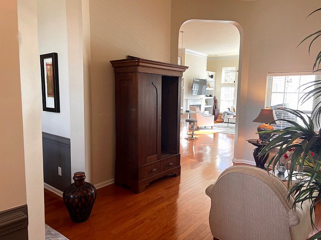
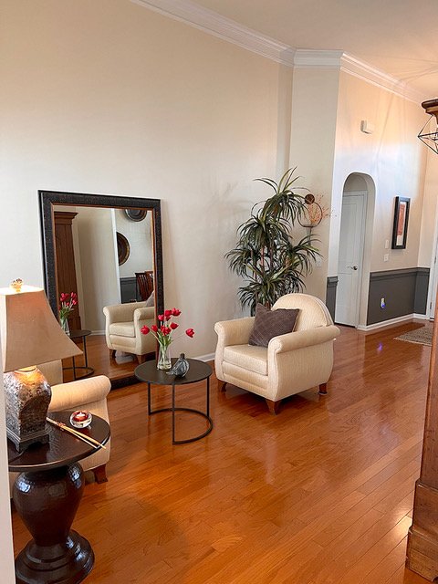
This small, pass-through room is actually more of an alcove. It is not a space that the homeowner really used at all but it did need to look designed (not filled with leftover furniture) as it is right at the front entry.
These questions were from my recent Instagram Q&A with my subscriber group. I just couldn’t help going all in on this, since I had answered previous questions from this subscriber last month and had seen some pics of her house.
My blog contains affiliate links. Any purchases, at no additional charge to you, render me a small percentage, are most appreciated and make this blog possible. :-)
Question - What to do with this small pass-through room?
My goal was to come up with some ideas that would give this space a pleasing look that might possibly attract some use. I also wanted to view it as sort of an extension of the entry hall and dining room, as these spaces are all open to each other, so that the “problem room” won’t look so small.
Here are some of the items essential for this room to fill it out and make it functional and inviting:
Window treatment to address short window
Seating that would be arranged more up against the wall
Support furnishings - rug, ottoman, accent lighting
Wall decor (used from another room)
Pillows for color
Small alcove or “pass-through” room near entry hall and dining room.
A tall armoire fits on this wall nicely. I like that piece there since the ceiling is so high, it works.
You can see how this space is just right off the entry hall and is not big enough to work as a living room and it is too open to work as a home office or some other function.
Here is the alcove, as viewed from the dining room. Front door is just there to the right of this photo.
Here’s the dining room that I had consulted with her on last month. She wanted to know then if they should leave the chair rail.
I told her to remove it. The ceiling is so high here that it looks really short. Additionally, it is a really chunky, large moulding, bigger than the baseboard, so it feels somewhat out of scale. I also didn’t like the way it just ended on the wall at the openings and windows.
Dining room - Chair rail to be removed.
Dining room - Chair rail to be removed.
How to Design this Small Pass-Through Room
1) Window Treatment
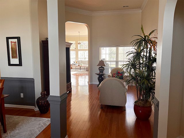
You can see the ceilings are high here and the arched opening to the back part of the house is tall. The window in this alcove though looks really short by comparison.
View to the alcove from the entry hall. You can see how all these spaces are connected. There is a big difference in height between the arched opening and the window in the alcove area.
I would look at raising the look of the window height there with drapery and a shade. Here’s an example of how to fake that window height, below.
While many people will hang the drapery a lot higher, leaving that big open space above the window still feels a little unfinished. It doesn’t really fake a taller window with tall expanse of sheetrock exposed.
Covering that area with a shade and dropping the shade to just above the top of the window, does do a great job of faking that window height.
2) Seating group arranged against the wall
I’d start with two lounge chairs, I like this tub shape that is popular these days. I’d keep it in a solid color. Since they had used a dark gray in the dining room, I thought they might like it in here too.
3) Support furnishings to fill out the space.
Add a rug, small ottoman and two torchiere type floor lamps to shine light up at the tall walls.
This rug combines the dark gray with some warm colors, that echo the wood floor.
Here’s the quick sketch of this small pass-through room’s design.
Quick sketch of small pass-through room. carlaaston.com
4) Wall Decor
I really like the idea of moving the copper platters from the dining room to this alcove. I also prefer the mirror then to hang in the dining room, after the chair rail is removed.
I even like the idea of doing accent walls (don’t slam me for this) with the dark gray on the plate wall in the alcove and dark gray on the mirror wall in the dining room.
She could also echo the window treatment with tall draperies and then shades at the lower windows to get a similar look and tying the two spaces together.
5) Pillows
Pillows in the chairs add a spot of color and always make a room feel cozy and ready to use. I love the yellow of the pillows in the storyboard below.
Here’s a storyboard showing it all put together!
Small pass through room with dark gray and warm tones. carlaaston.com
Check out a few more of these Q&A’s below.


I had another decorating Q&A this past weekend and had a few questions about wall decor. Check them out by clicking through and see the sale on my Wall Decor Guide, linked at the end…….