This Tuscan style dining room needed a fresh look. The homeowners were actually in process of remodeling the kitchen and other areas of the home. This was the dining room before they started anything.
And here was the dining room in progress in the remodel. This was when the homeowner reached out to me to ask about furnishing this space. Their rectangular table never really worked in this mostly square room.
I do love that everything is lighter and brighter now with the white paint and that it flows from the kitchen and other rooms of the house.
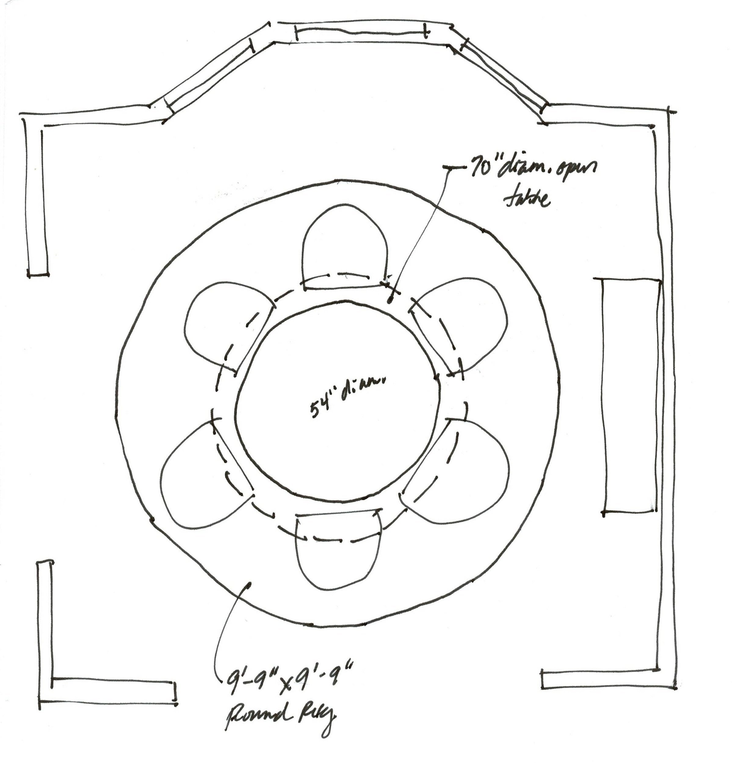
Let’s start with the floor plan.
It is almost a square room, at 12’-2” x 13’-6”. In this case, a round table would really work best, as you can see below.
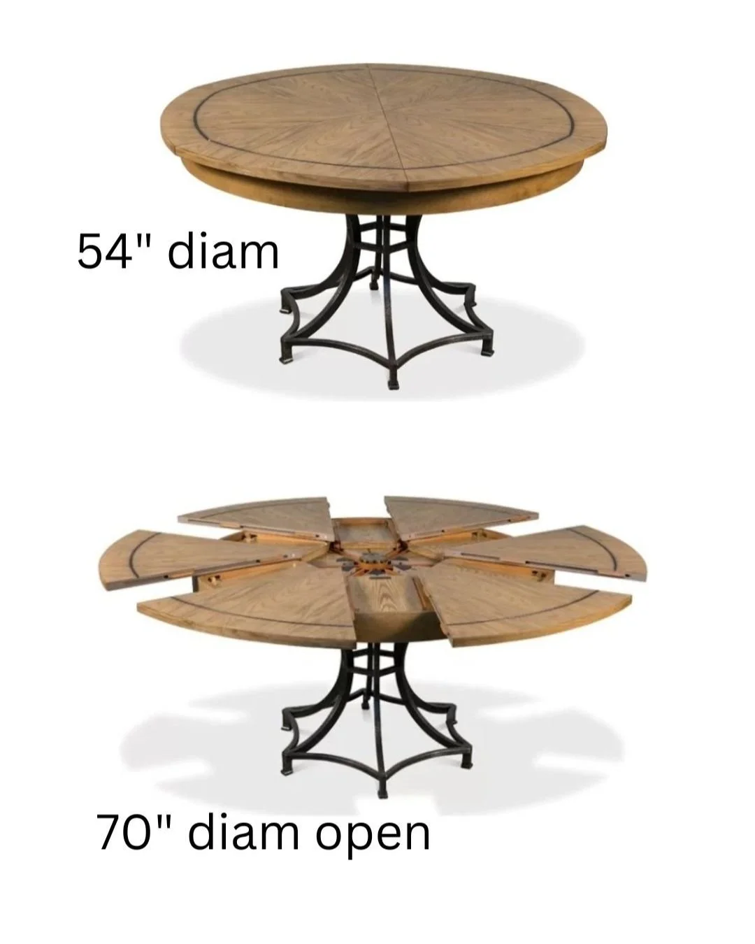
I found a round table that expands, from Sarreid, so you can have that option with a table like this. This one went from 54” diam to 70” diam. You can see how it expands in the pictures below.
Sketched to scale, dining room furniture layout.
There are other round tables that expand like this on the market now, so it is not terribly uncommon to find something that would work.
For seating, I really like this rounded upholstered arm chair for the table. I think it would accent the table nicely and soften the room with the upholstery.
While I like the table with a wood top, to add some warmth with the tile floor, I feel like the sideboard or console in there should be painted to kind of blend in to the wall.
The sideboard before made the room feel a little crowded and looked heavy. This one has a more Old World, traditional style but feels fresh, light and doesn’t visually encroach in the space.
I like a round mirror above the console and the warmth in the finish on this mirror relates to the table and will stand out on the white walls.
I also like those skinny, unique buffet lamps on each side to add some detail in here.
Lastly, I think something needs to be done with the ceiling.
I’m not a fan of the wedding cake, stair-stepped tray ceilings of the past, they mainly just look dated and don’t really do much for the room.
In this case, I’d recommend filling in that upper square part of the tray and then rounding off the lower part to be in the shape of a circle, with a crown at the top.
I think that will simplify the look while still using that extra height available there. I’m just not a fan of those corners, they look a bit contrived to me.
How to address this dated tray ceiling. carlaaston.com
She can then paint that flatter upper part in a color or add wallcovering there to add interest.
I really like this chandelier, below, it touches on the Tuscan style a bit with some curves, but has a more clean lined look. The black and brass metals are nice together here too.
Here’s how it would look all together. I feel like it works with the house and is definitely more up to date.
Oh, and I found a round rug that would work nicely, it is 9’-9” x 9’-9”, so really a perfect size. Love the beige and gray color palette here too.
A fresh look for a dated Tuscan style dining room. carlaaston.com
A way to make this more colorful is to add the color on the ceiling and in the rug. That will keep the space flowing between dining room and neighboring rooms.
Here’s a terracotta scheme and then a light blue scheme. I’d start with the rug that would fit that square space before selecting a color for the ceiling.
Color options for new dining room look.
Color options for new dining room look.
Here’s another room in this home, linked below, that I consulted on as well. Get your design consultation booked so you can begin your projects in the new year with a bang!


This homeowner is doing a remodel and the cabinetry in their home office is getting redone. They needed a furniture layout and they really wanted to know what to do with these existing niches in the wall. Should they just sheetrock over them and close them up?