I’m not a big fan of niches (I have some in my own home), but in this home office update, they came in handy.
This homeowner is doing a remodel and the cabinetry in their home office is getting redone. They needed a furniture layout and they really wanted to know what to do with these existing niches in the wall. Should they just sheetrock over them and close them up?
Home Office w/ existing niches
Niches in this home office that needed a purpose. carlaaston.com
Home office to get a redo, with niches that needed a purpose. carlaston.com
Home office to get new cabinetry and layout. carlaaston.com
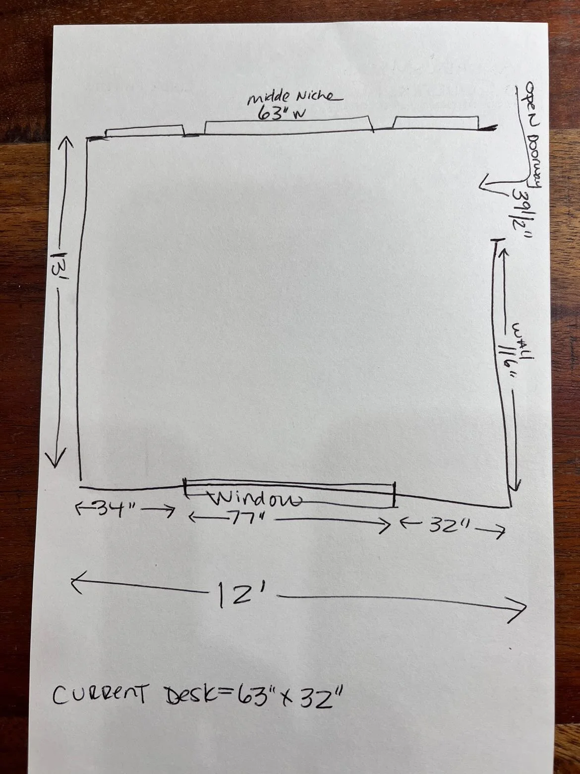
Here are the dimensions of the room, almost a square. The existing desk will stay.
The homeowner sent a sketch and dimensions of her space. So helpful!
new Home Office Layout
In so many cases I do not like niches, however in this one, I do! I think they could be perfect for bookshelves and the center one that goes all the way to the floor, would be a good place to tuck in a piece of furniture.
Here’s the new layout I proposed that gives some purpose to the niches and will tick all the boxes of wants for this space.
They needed:
plenty of storage and a credenza type work surface
to reuse the existing desk
some lounge seating would be nice
to figure out what to do with the niches
I love this cabinet for that niche. The size works perfectly, I like how it is up off the floor and lightweight looking but still has lots of storage. This color won’t protrude into the space either.
Here’s how it looks in the elevation. Fits into that niche just right!
I’d like to see the shelves slightly deeper than the side niches are, so that the shelves dog-ear over the edge like a window sill. That will give a little more depth and make them a little more useful.
See the shelf detail I’m talking about, below, used in this etagere seen at Highpoint Market last spring. This even has a slightly curved shelf which also might work for this home office to give more depth to the shelves.
Etagere bookshelf seen at spring Highpoint Market, 2022 in the Hooker showroom. carlaaston.com
Here is the elevation sketch I did for the built-in. I want it to resemble a piece of furniture, so I pulled it away from the side walls by a foot and then varied the heights. The side sections are only 15” deep and the center lower section can be a 24” or whatever the homeowner needs for a worksurface.
If you go back and look at the room, the niche comes right down into the corner on the right side of this wall, so the built-in can’t really touch that wall if we leave the niche. The ceiling design is centered in the room too, so having it go to the ceiling here wouldn’t really work.
I always prefer stained wood countertops, they just wear better than painted wood and look more like a desk. It provides some nice contrast too.
They could paint this whatever color they prefer. Something dark or just a few shades darker than the wall maybe. Depends on the wall color they use and what they like.
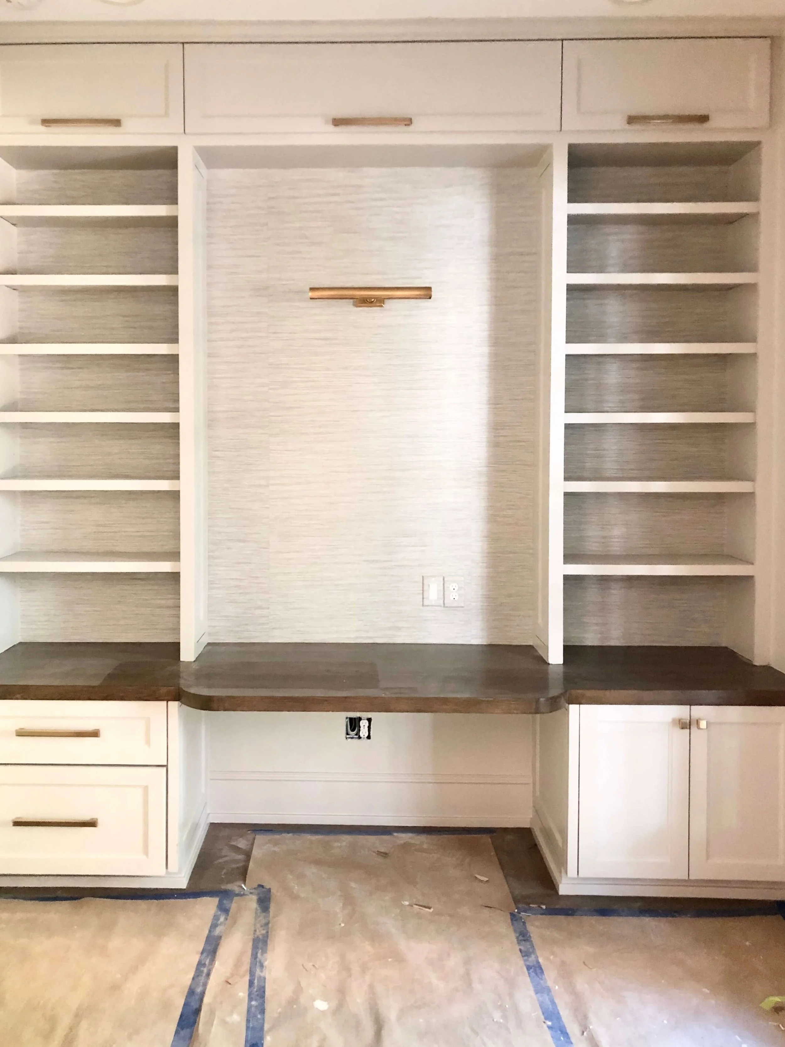
Here is a pic from a job site of mine where I did a similar built-in, although it was wall to wall and to the ceiling. You can see the storage can be changed up, but this is the general idea.
Need to see more home office makeovers for inspiration? Check them out below.


Many people have had to rethink spaces in their homes this past year. Even more are finding that, while working from the kitchen table or the bedroom was okay for awhile, their #wfh life needs a more permanent upgrade.
That’s exactly what this homeowner was looking for in a recent Designed in a Click consultation. She was looking to add some furnishings to her pretty bare home office.