This homeowner knew the look she was going for and had made a few selections for her dining room and foyer, but wasn’t quite finished yet. She had some questions and needed some guidance to complete her plan.
Here’s where I stepped in. :-)
She made a good start and I could see her vision, but tying it together and finishing it off with more selections were in order. My Designed in a Click email service was just right for this project.
My blog contains affiliate links. Any purchases, at no additional charge to you, render me a small percentage, are most appreciated and make this blog possible. :-)
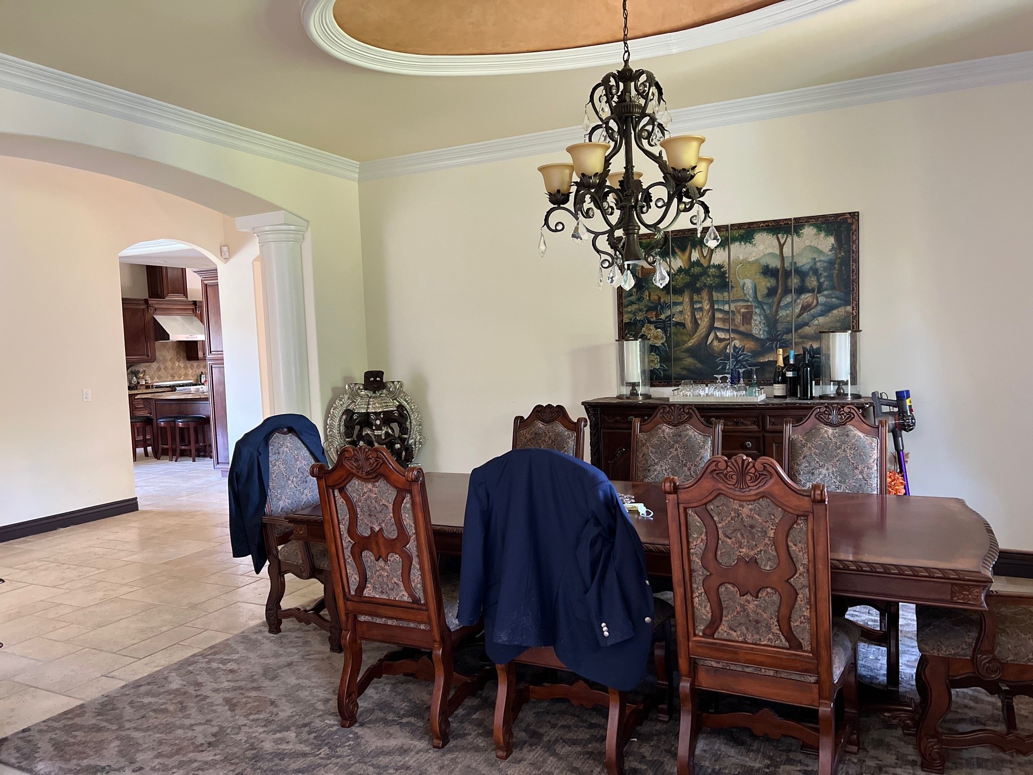
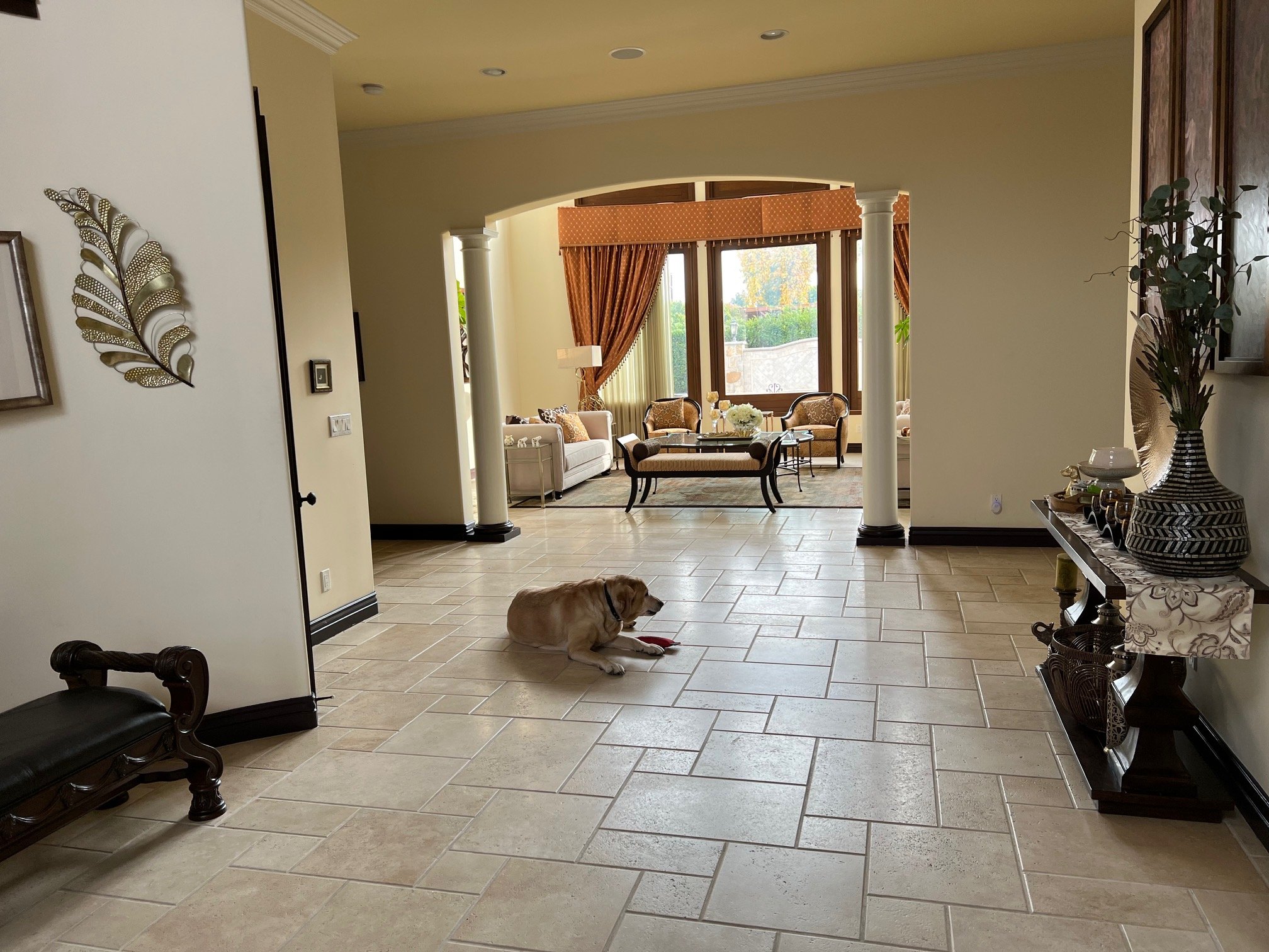
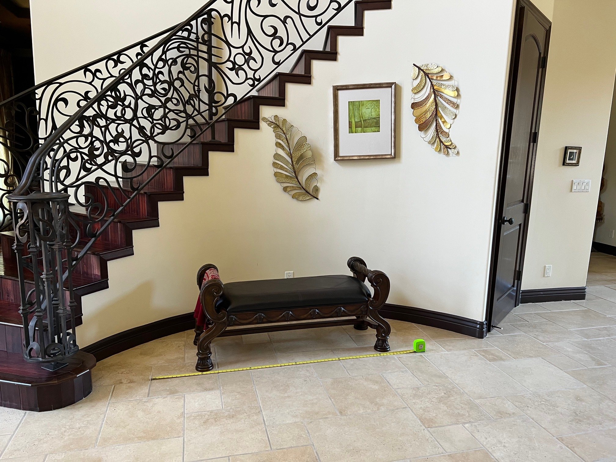
Photos of Dining Room and foyer
This dated dining room and entry need a reboot, and the homeowner wanted to go all in with something crisp, light and modern.
There would be no remodeling here, we would deal with furnishings, lighting and maybe some paint. :-)
Dining Room Design Plan
Here are the furniture pieces she had picked out. Some were options, but she wanted to know which would be best.
You can see how dramatically different it is from what she had. I like this direction, for sure.
I loved the table. It is from Baker. It is excellent quality and I love the tambour look drum base and that is an all light wood table.
The console is really great, but I probably wouldn’t do a tambour look console and table together. We don’t want it to be too matchy.
She had this credenza as an option, and although I love the design and look of the other console better, I like the more simple one with this table.
She had a tryptych mirror above it which was a perfect scale for above the console. I liked the lacy pattern here too.
She had two options for chandeliers and I really loved the bubble chandelier. I was afraid this was all getting a little on the glam side and I wanted to lean away from that a bit. I feel like too much bling doesn’t feel like real luxury.
Next were the chairs. I didn’t like the idea that every piece in this room was light toned, I felt like it needed some contrast. The chairs could be a nice statement and a great place for contrast.
Here’s what I proposed. These chairs would provide some graphic punch to this room and look great next to the light wood table.
I like the idea of an upholstered head chair with arms and this one would make a good option and pair well with the side chairs.
With all the light furniture, I would recommend painting the dining room a dark color, for a dramatic look.
She could match the dark baseboards that are there and do the walls, the crown and the ceiling perimeter in the dark color. Then, in the oval center, do a wallcovering that has a bit of a metallic sheen with some texture.
Remember the oval on the ceiling?
This wallcovering is from Schumacher.
I think that would make the furniture stand out and make this room feel special and more intimate. I like the idea of a light colored rug here and this animal print look is a subtle pattern.
Here are all the products put together. I think it will make a huge change in this dining room, adding elegance and luxury.
Foyer Design Plan
Remember the foyer?
There are two wall spaces like this on both sides of the dining room entrance. I like the idea of doing matching consoles here.
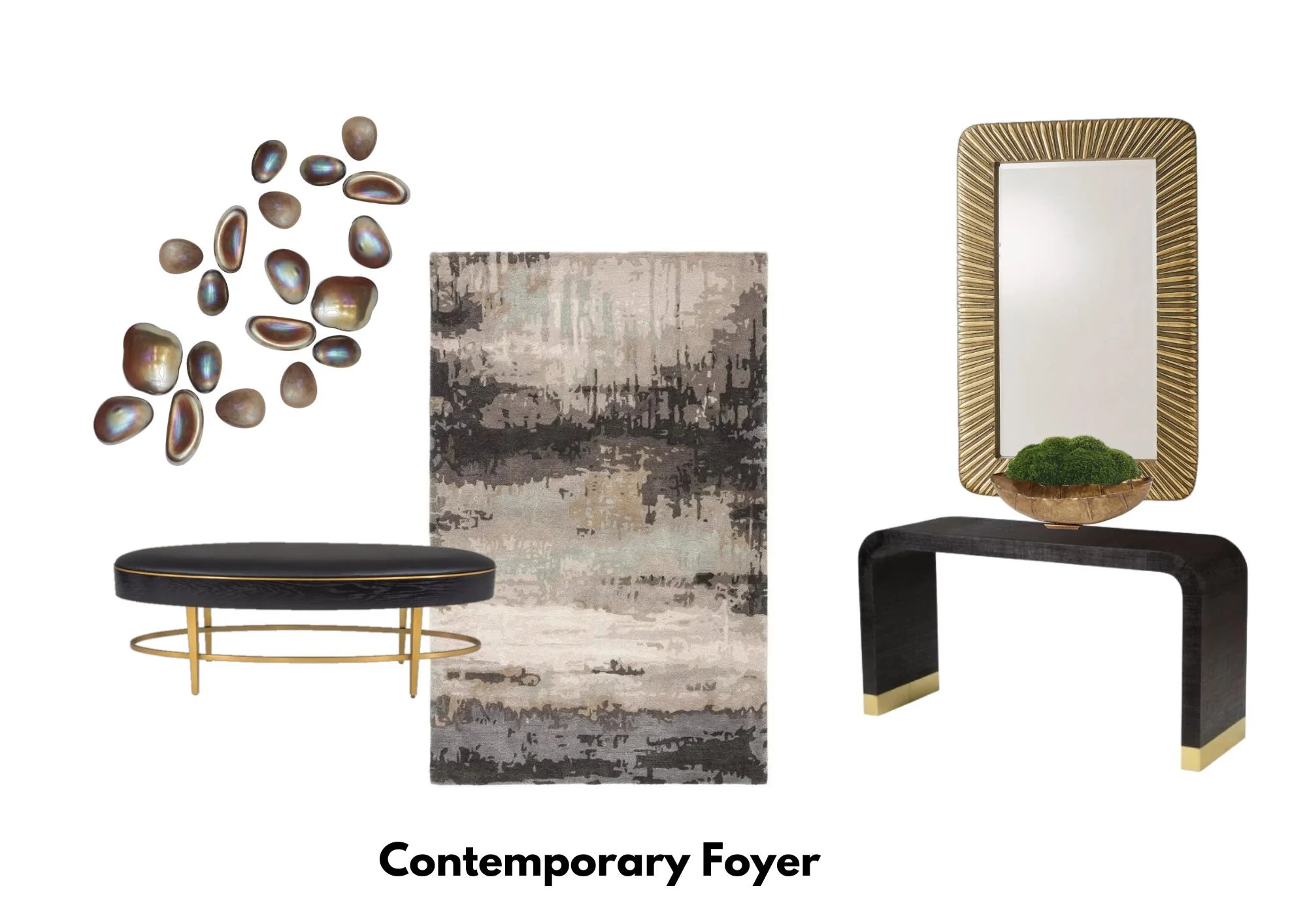
I love the texture on this curved console and the brassy base. It’s simple but very impactful.
These are the mirrors I’d do above each console. They mimic the curved shape and have a hint of glam that’s not too glitzy. The scale of these works well with this foyer space.
I would keep this look really simple with a wide brass bowl filled with green moss.
Now for the opposite wall, under the stair.
She had asked about doing a round table here or something like that, but we already have consoles. I prefer a bench and this ellipse shaped bench could not be any more perfect.
These glass pebbles are great for curved walls and I’d do a collection of them under the stair.
Lastly, I’d do a contemporary rug that would make a bold statement.
And here’s how they look all put together.
Using light furnishings in the dark dining room and then dark pieces in the open, light toned foyer will help relate those two spaces.
She is making some big changes here and I look forward to seeing how it turns out!
My Designed in a Click Service will be revamped soon. Take advantage of my great pricing for this helpful service now, before the change. :-)
This blogpost was thoughtfully written by me, Carla Aston, and not by AI, ghostwriters, or guest posters.
See more examples of my Designed in a Click room makeovers, below.
Pin these images below to Pinterest to save for later and help me share my work. :-)


Come and see the design plan for this plain hall bath. It won’t be plain any longer!