Remember this kitchen makeover?
I mentioned in that post that in between the two phases of that kitchen remodel we also did their master bathroom. Well, today I’m excited to share the end results of that project!
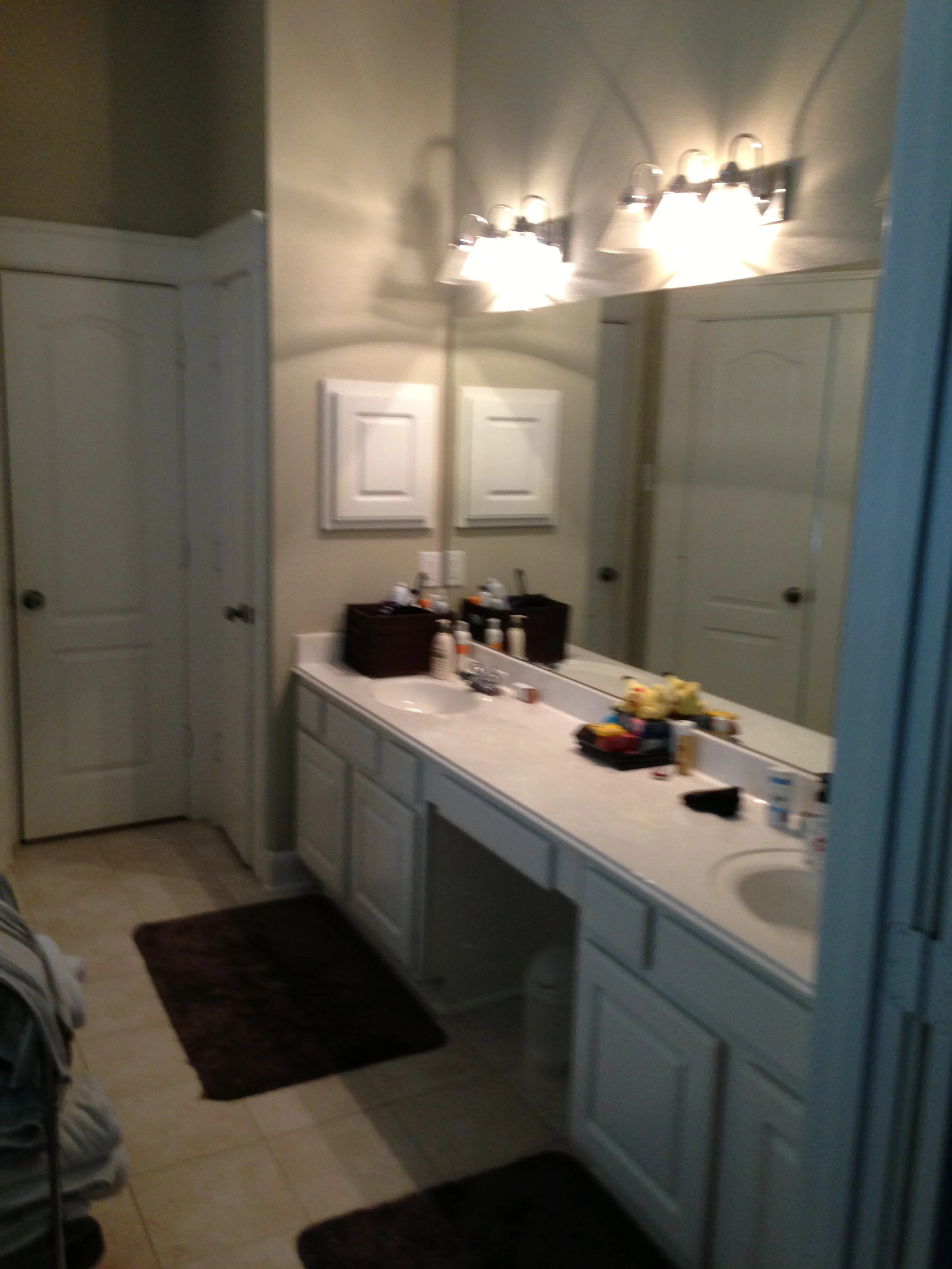
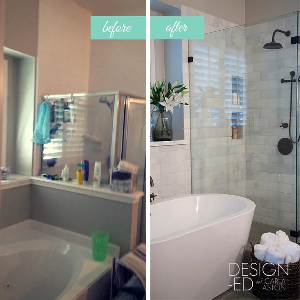
Overall, this bathroom was dated, had a few leaks, and felt tight and confined. But there was one area where there was an abundance of space — look up….
Those high ceilings were going unnoticed!
Look at all of that unused space up there. It's about time those high ceilings were given some attention!
My challenge was to stay true to their style of a greige-toned space with an up to date but rustic look and make the bathroom seem larger and more luxurious.
Here are all of the "before" shots:
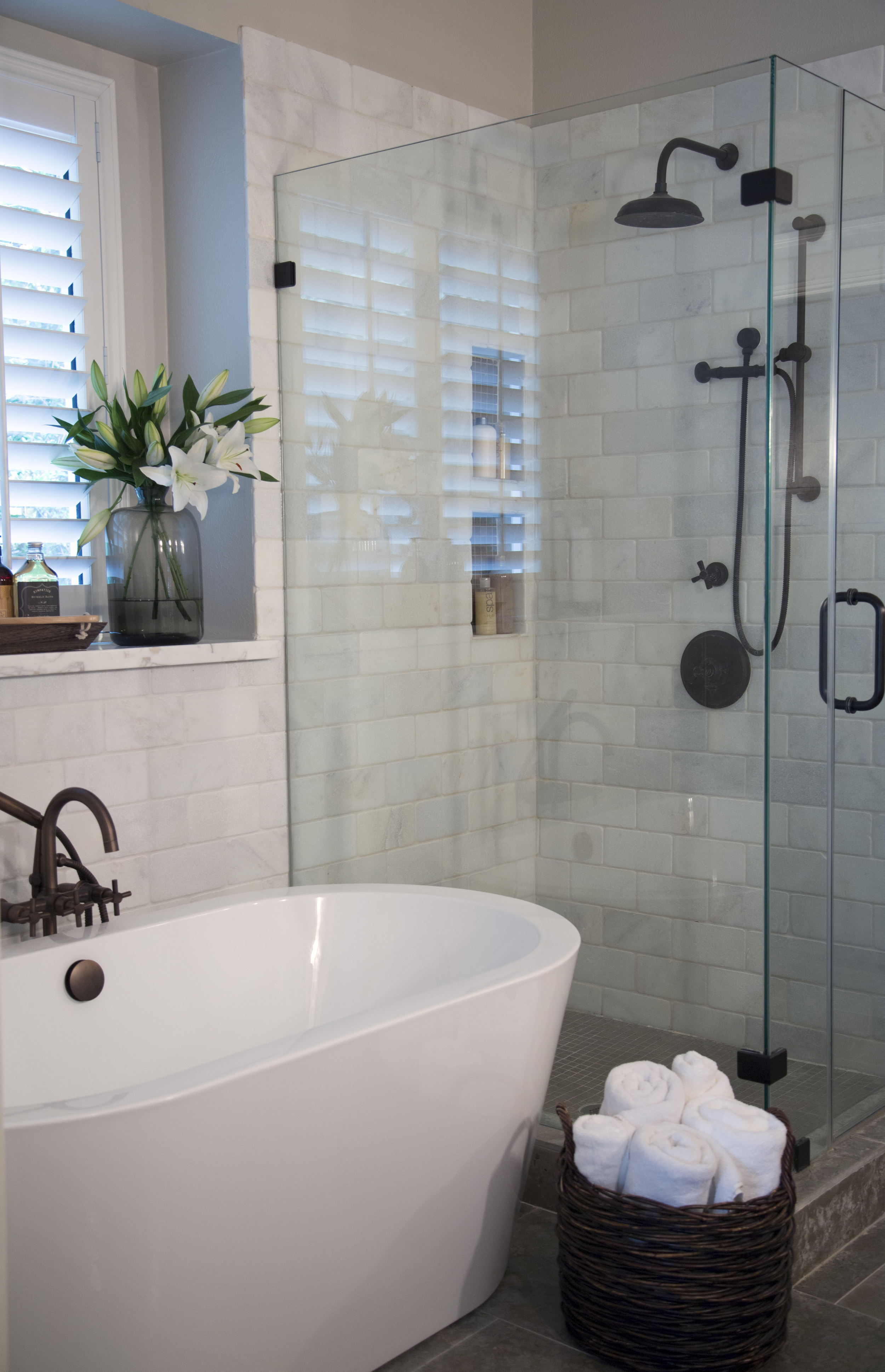
If this isn’t a best case scenario for installing a free-standing tub to help your bathroom feel larger, I don’t know what is. We laid a 5’ tub on top of a gorgeous brushed limestone floor — it’s tight (we only have inches to spare), but it’s sooooo effective.
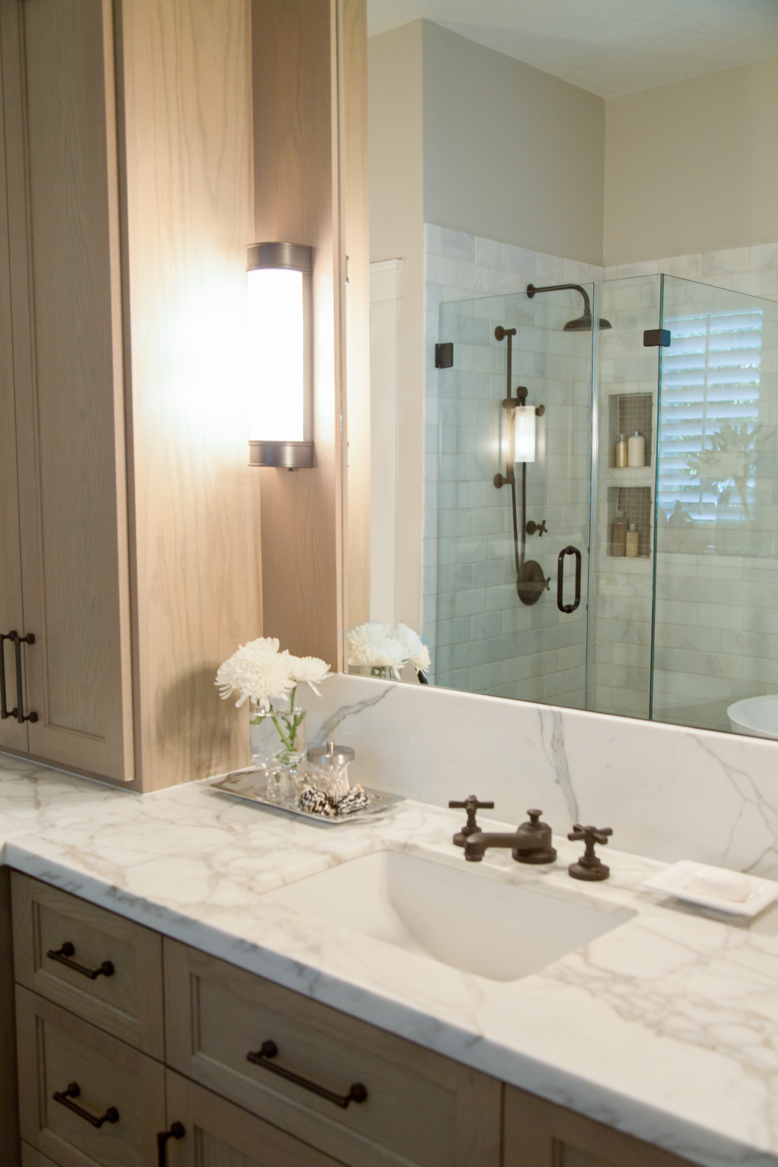
Whitewashed oak cabinetry that went up — almost to the ceiling — to draw your eye upwards and make the room feel grander. They got more built- in storage in the cabinets, along with side medicine cabinets. And the center tall tower accentuates the height of the space, as do the tall mirrors. All those vertical elements do their thing, you know — they draw your attention to all of the underappreciated space that's above eye-level.
White Calacatta marble softened the room with tumbled marble tile on the walls and brushed limestone on the floors, providing the rustic feel they love. Dark bronze fixtures and hardware added some definition and punch, which worked beautifully with our style.
Oh, and did I mention we also put in a barn door? Because we did. ;-)
Take a look down below...
AFTERS
A Confined Bathroom Is Uplifted with Bountiful Space!
PROJECT DESIGNER: Carla Aston
PHOTOGRAPHER: Tori Aston | ToriAston.com
PHOTOGRAPHER: Tori Aston


