Today I’m going to share some cool before and afters of one of my projects. For me, these pics were a long time coming.
I worked with these clients some years ago. I did some design work for their kitchen remodel to help get them to their goal of a more grayed down, more stylish, rustic / industrial yet still sophisticated look in their bungalow style home. We’ve also redone their master bath, but I’ll share that later. For now, let’s talk about the kitchen.
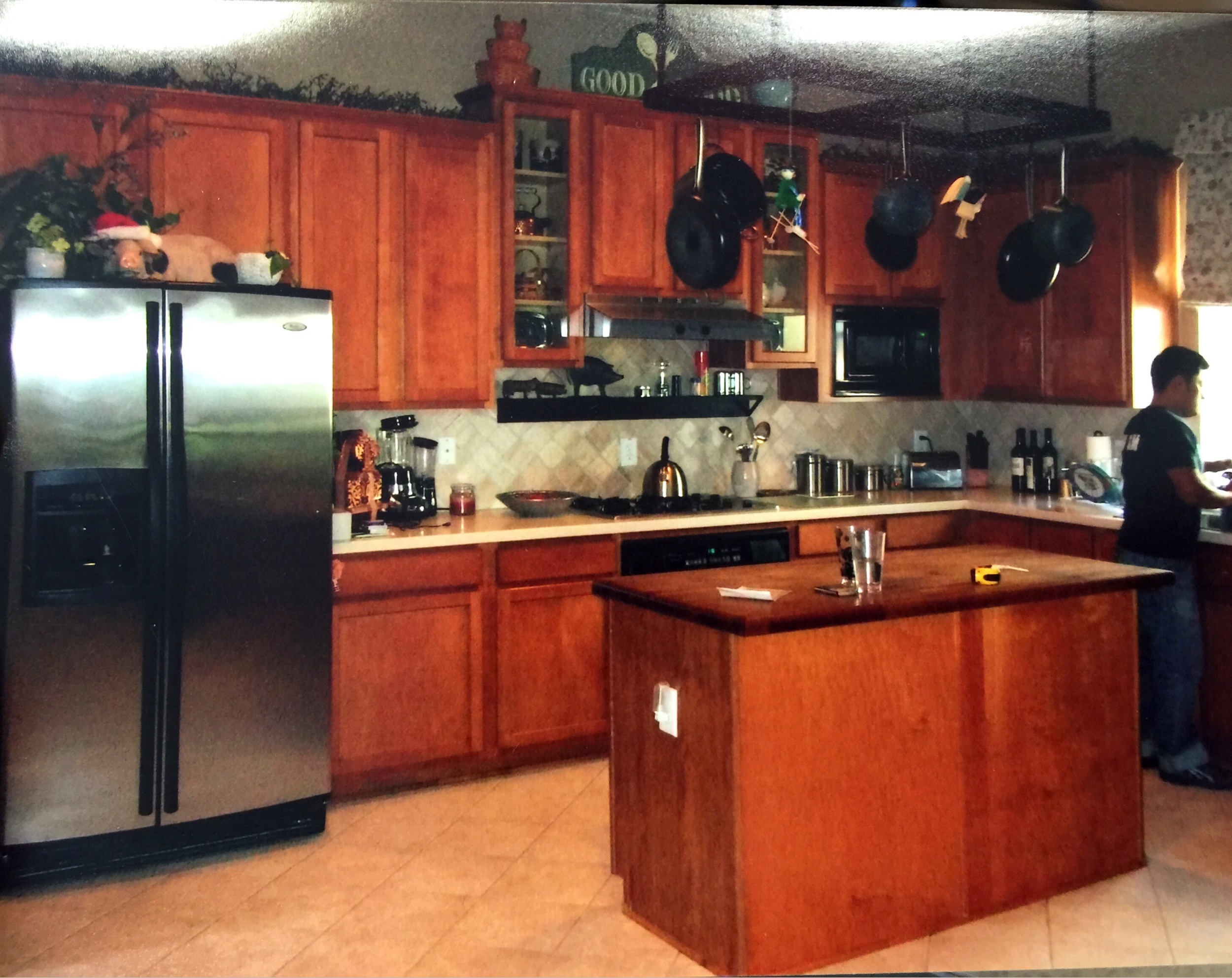
This was a builder production home we were dealing with.
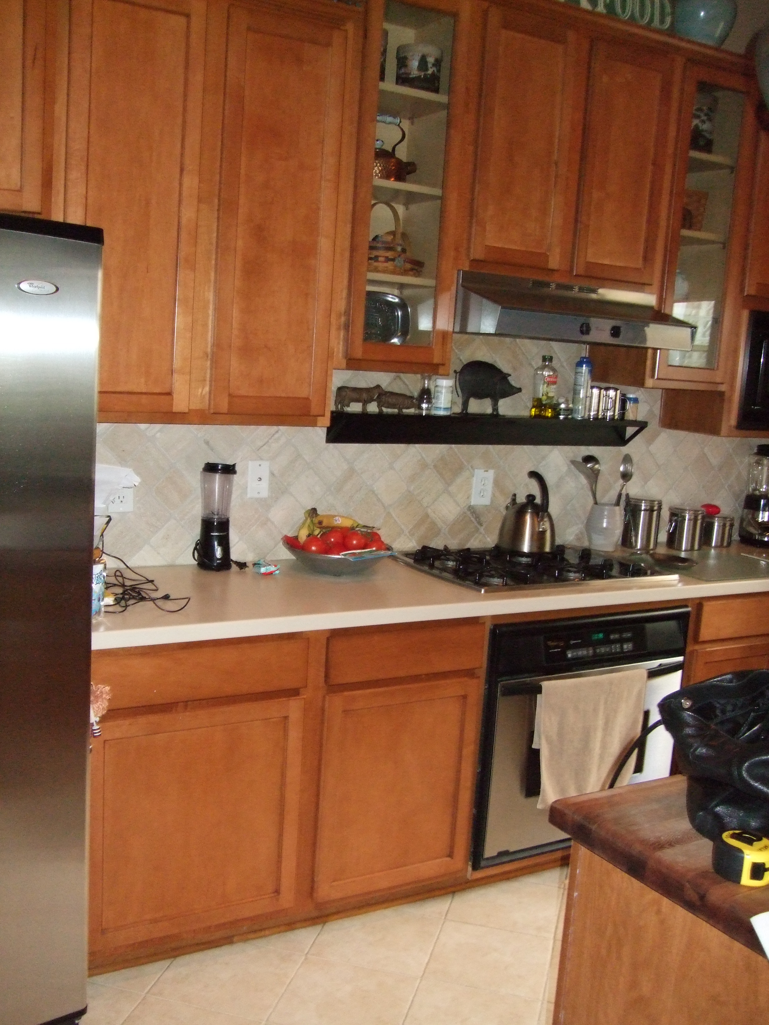
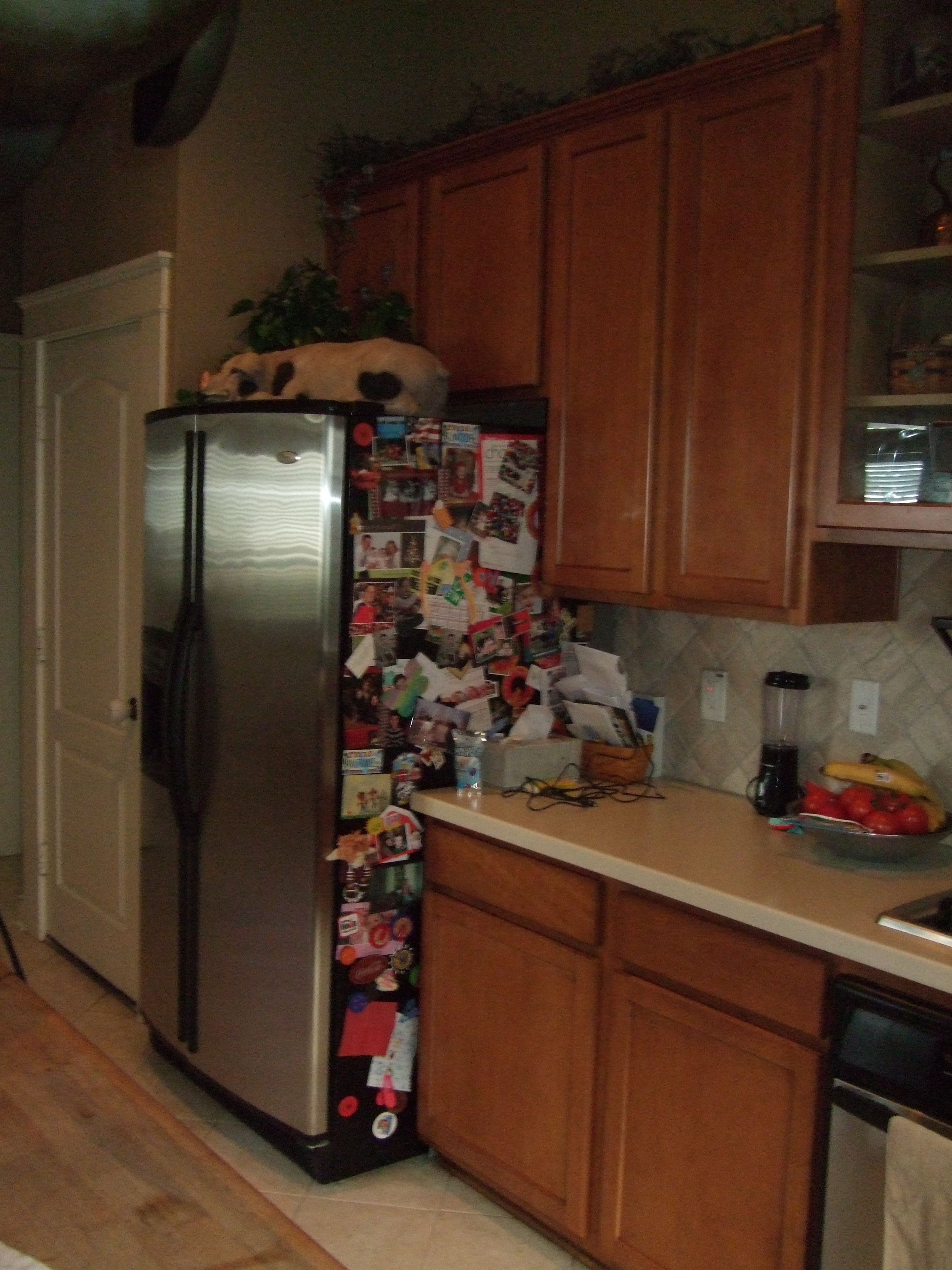
It had a simple, white-ish tiled floor; orange wood cabinetry with a basic island to match; solid surface counters; and what was most bothersome to them: the stepped upper cabinets above the range. They needed some new appliances and were ready to tackle part of the job.
In phase one, we knocked out some big items that made a significant dent in the kitchen's overall look.
They weren’t ready to do the floor because, really, they wanted new flooring throughout the downstairs and weren’t yet ready to bite that particular bullet. The floor in the rest of the downstairs was an orange-toned wood that matched the cabinets in the kitchen, so they weren’t yet ready to paint those or refinish them either.
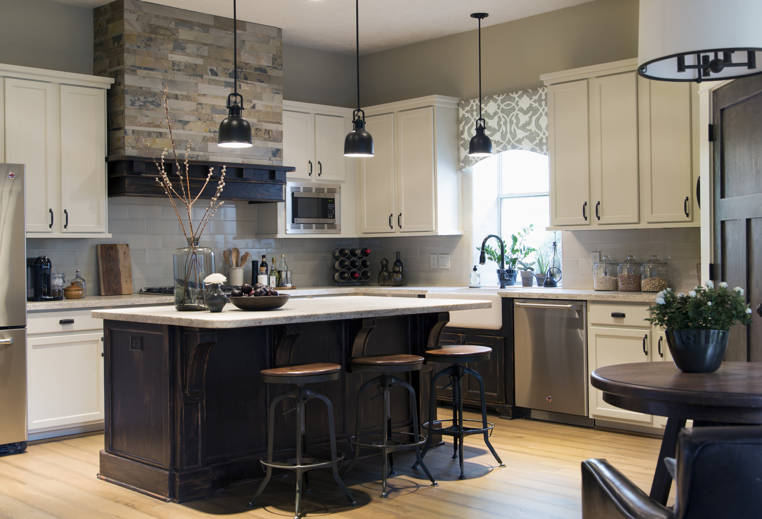
Instead, we focused on their priorities: a new hood; new island; new appliances; new countertop and backsplash; new farmhouse sink with a new cabinet there only; paint; and lighting.
Click image to enlarge
Removing those upper cabinets above the range opened up the opportunity for a big statement with the hood, drawing your eye up and making the room seem larger. The slate mix played a role in introducing that rustic /craftsman vibe we wanted. To this day I still love that matte finish Walker Zanger large subway tile used on the backsplash. It has a bit of a slight color variation, enough to give a sense of “special”, yet it doesn't dominate the scene.
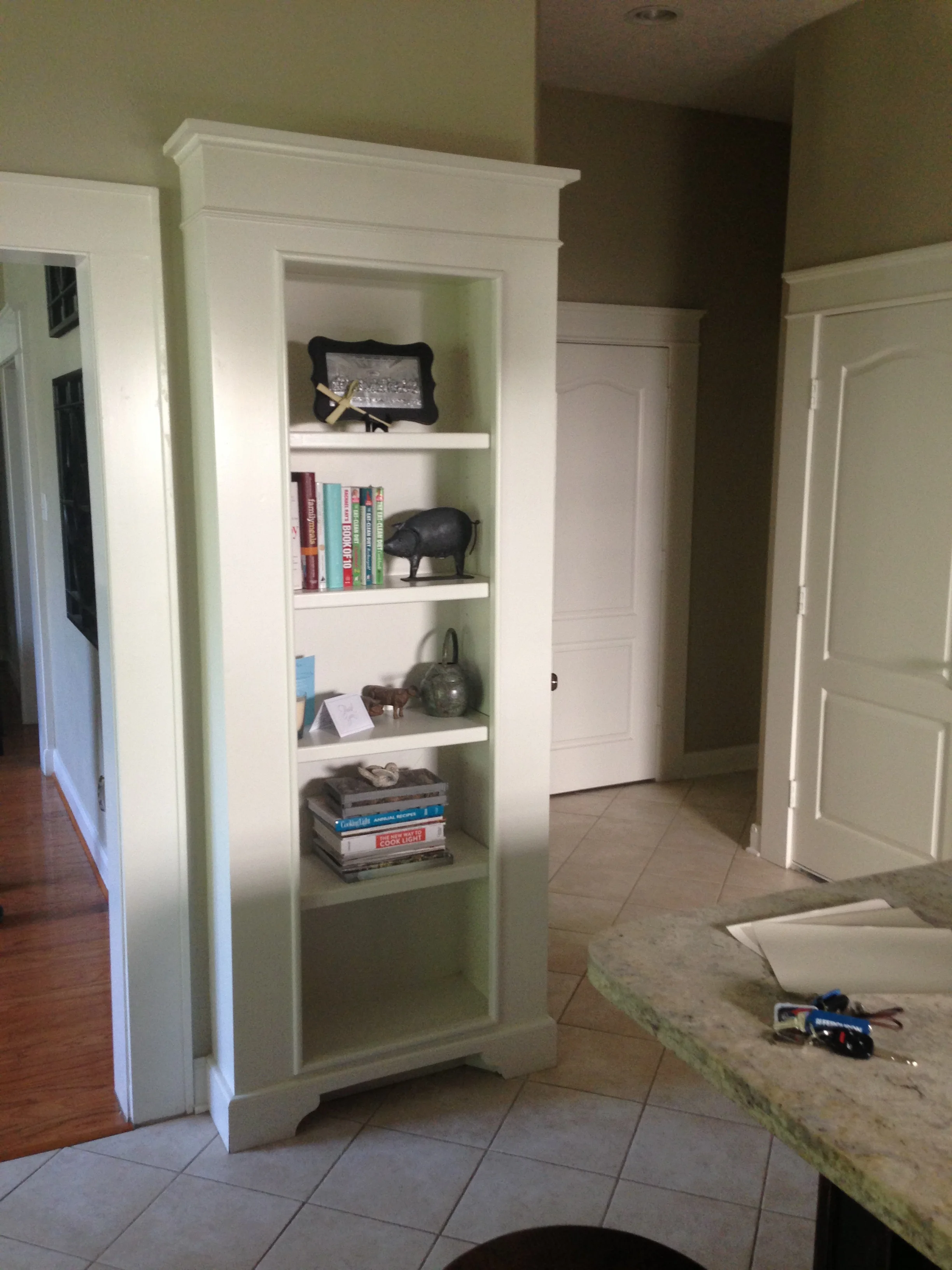
Bookshelf, before
Fast-forward several years to this past spring...
After years of enjoying the work we put into their kitchen during stage one of the renovation, they finally invited me back to help them finish the design, with new flooring and paint for those orange cabinets. We changed out the trim on the upper cabinetry for a cleaner look; remade the bookshelf into a wine rack; and installed new ebony stained wood doors to highlight their bungalow / craftsman style home.
During the first go-around, we brought in some black finishes and slate to add the rustic feel and contrast with the wood they had. This time around, we obliterated the last of the older finishes, (orange wood tone, Bye-Bye. :-) and did a gray wash, distressed wood floor with a light neutral paint on the existing cabinets to make them recede from attention.
These homeowners wanted more of a lounge area in their kitchen instead of the typical table and chairs. So, to give them the cool coffee house look they were going for, we custom-made a smaller, yet still substantial table, paired with some leather lounge chairs.
While it took some time for this kitchen to get where everyone wanted it to be, its end result was definitely worth the wait!
Oh, and before I go, here's one quick note to my current and future clients:
I’m now officially too old to be able to wait a few years to come back to your project. Let's do it all now! :-)
AFTERS
A tired kitchen is awakened!
PROJECT DESIGNER: Carla Aston
PHOTOGRAPHER: Tori Aston | ToriAston.com
More from this house!
Bathroom Before & Afters

