I’m sharing a recent consultation I did where the homeowner had questions about what to do with her walls. One was bare and the other wasn’t looking right, she just couldn’t quite put her finger on what that was.
First of all, I’m allllll about wall decor these days, after putting together my new ebook guide that I am officially launching today in my shop!
So, after you look at at the recommendations I’ve shared here, hop on over to the shop and see if it might be something you’d like to add to your library, for when you need to attack your bare walls or maybe just mix things up for a refresh. :-)
Walls Needing Some Attention
Here are her pics. She has a great start on her room and I can’t wait to see where she goes from here.
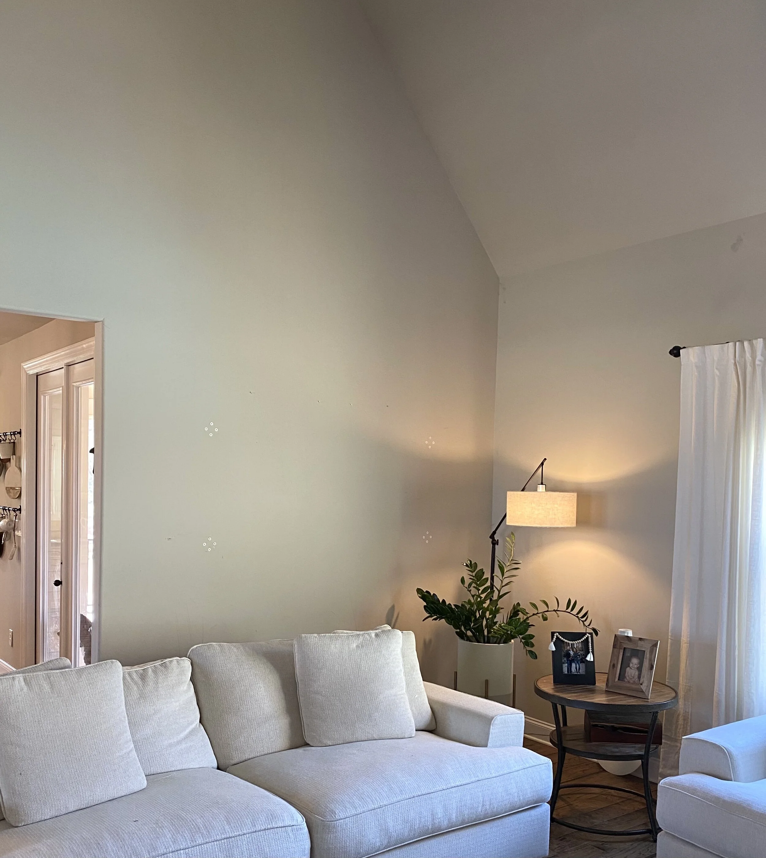
The primary wall that was bugging her was this one, behind the sofa. It was tall and blank.
This corner felt a little empty and blank.
This tall wall behind the sofa needed some art or decor.
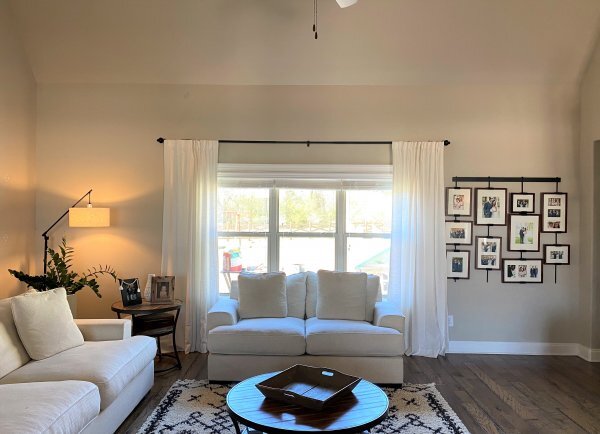
Here’s a wide view of the living room with the blank corner and the collage on the other side of the window.
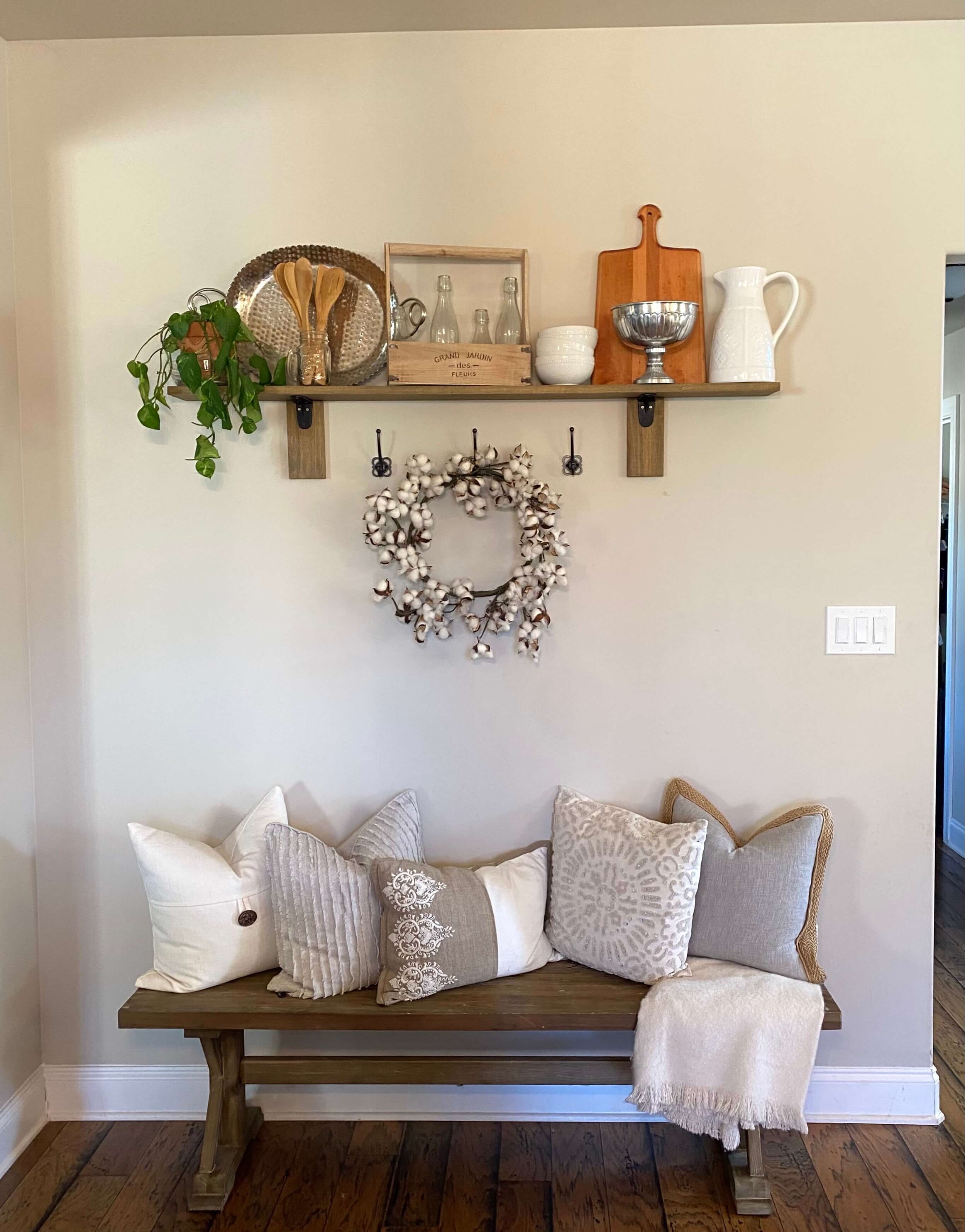
The bench, below, was placed on a wall in the kitchen. The homeowner didn’t know what else to put there, but felt this was sort of like a placeholder and wanted some suggestions.
This bench ended up here in the kitchen area, but the homeowner wasn’t really sure of this decor or furniture placement here.
Here was my response.
First of all, pretty room! You've done a good job! You just need to fill things out a little and this will feel like a finished, complete space.
The photo gallery on the right side of the window felt a little off to the homeowner.
That lamp in the corner in the living room is great because it fills the void so well. I would make that wall, behind the sofa, the place for some art and color.
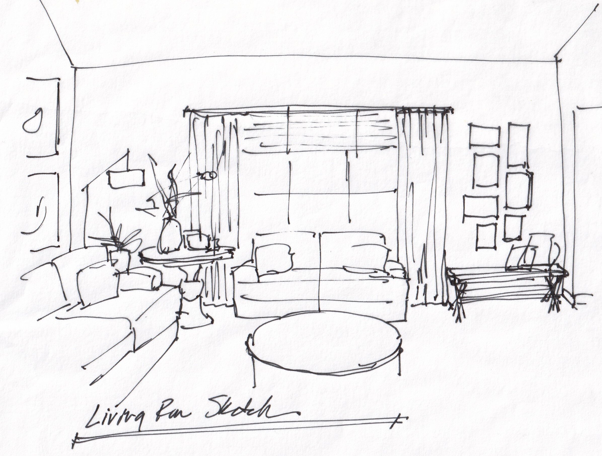
I would do 4 pieces that are vertical, and space them apart as in my sketch, below. You could alternatively do two or three horizontal pieces, stacked, or one really big vertical piece. Just make sure there is breathing room on each side and that the art runs vertically, overall, and has plenty of height. I would try to line up the top of the art about with the top of the adjacent wall and then the lower art at the top of the sofa. That would be ideal.
Regarding the wall collage on the other side of the window, I think it is just a little too wide or too horizontal on that wall. It needs some space on both sides and should maybe fill the wall more vertically.
Can you just take the framed pieces off the rod and make a gallery there without it? Then, use the bench that is in the kitchen, below the gallery, to fill that space.
Back to the opposite side of the window, I think you need a more substantial table there in the corner. Something beefier and definitely larger in diameter, maybe taller too. I'd go for something like a 36" diameter "entry hall table", then you can style it with picture frames, a plant, books, etc. Maybe something like wood round table.
Here's a round table with a more modern look, but also has a larger scale.
In the kitchen, I'd do a console there. It could then serve for extra counter space. You could make it into a coffee bar or dessert bar when entertaining. There are even some consoles that have space for stools underneath, if you want some seating there.
This bench was just a sort of place holder on this wall in the homeowner’s kitchen. She wasn’t sure what else to put here.
A console or buffet piece just feels more "kitchen" like to me and might be more useful on down the road in this space. Not sure what style you have in your kitchen, but here is a console that has a rustic look.
This might be nice. I like the marble top and metal base and baker’s rack look of this console.
Here's another marble top console with a little bit of a rustic look.
I think these changes would help to fill out your space. I'd love to see some pics as you move along on your decorating journey!
So, do YOU have some blank walls staring at you right now?
Do you have questions on placement and what type of wall decor or art to fill them with?
I have some solutions for you. :-) And over 36 examples/case studies that show you exactly what I’m talking about.


