Espresso, or a dark brown/black finish, was really popular on cabinets about 10+ years ago. I see soooo many homes with this look these days, after getting lots of my Designed in a Click Q&A’s and many images submitted for my wall decor posts.
Walls are typically painted a warm beige, countertops are usually a medium spotty granite, with either some kind of travertine tile or linear glass mosaic tile backsplash used with them.
Does this look familiar?
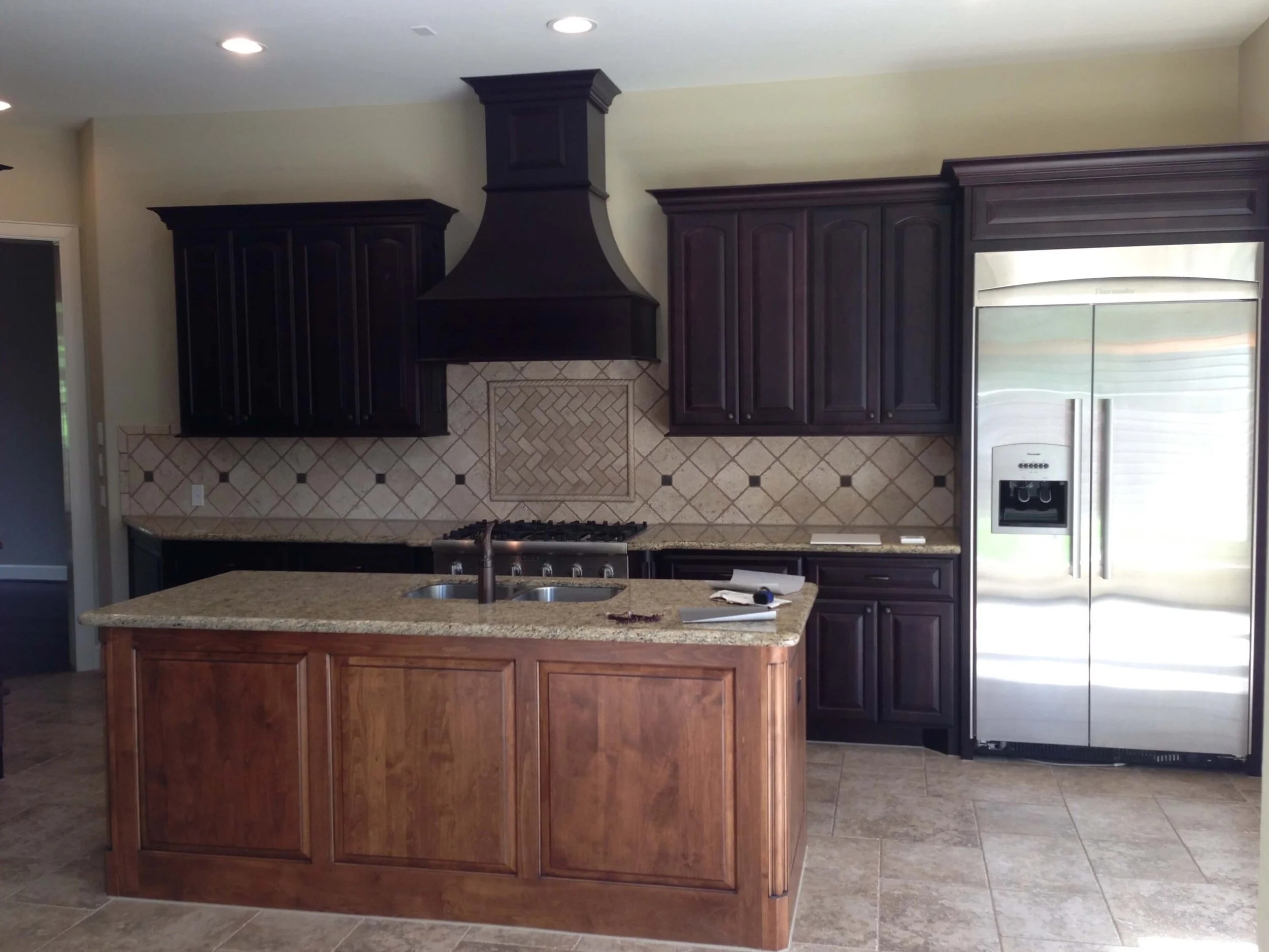
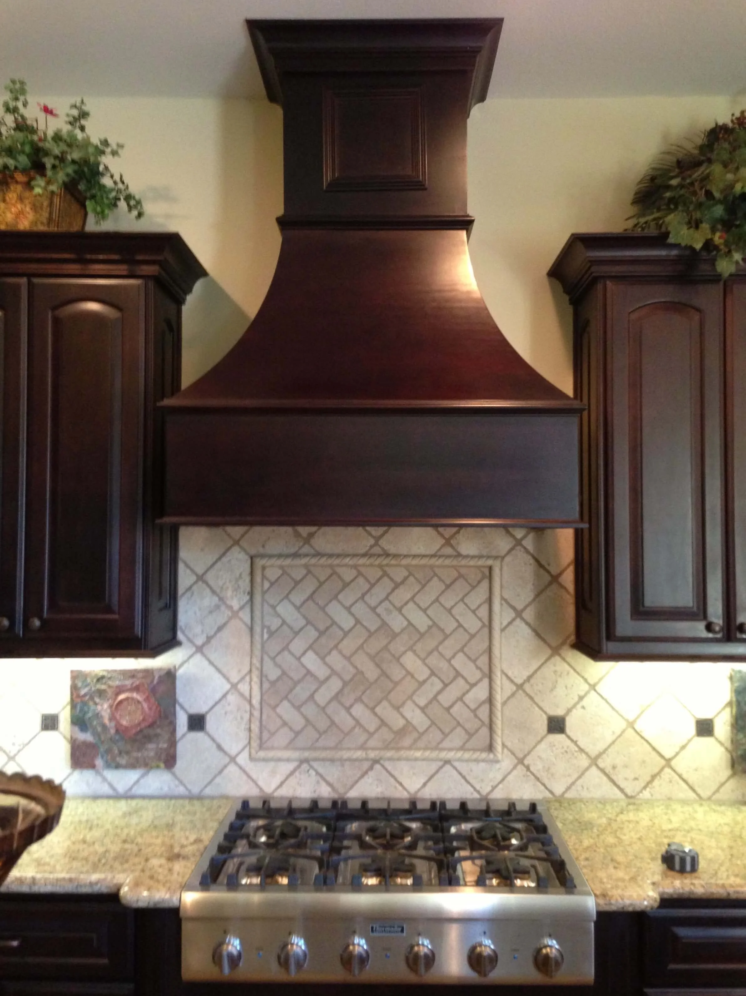
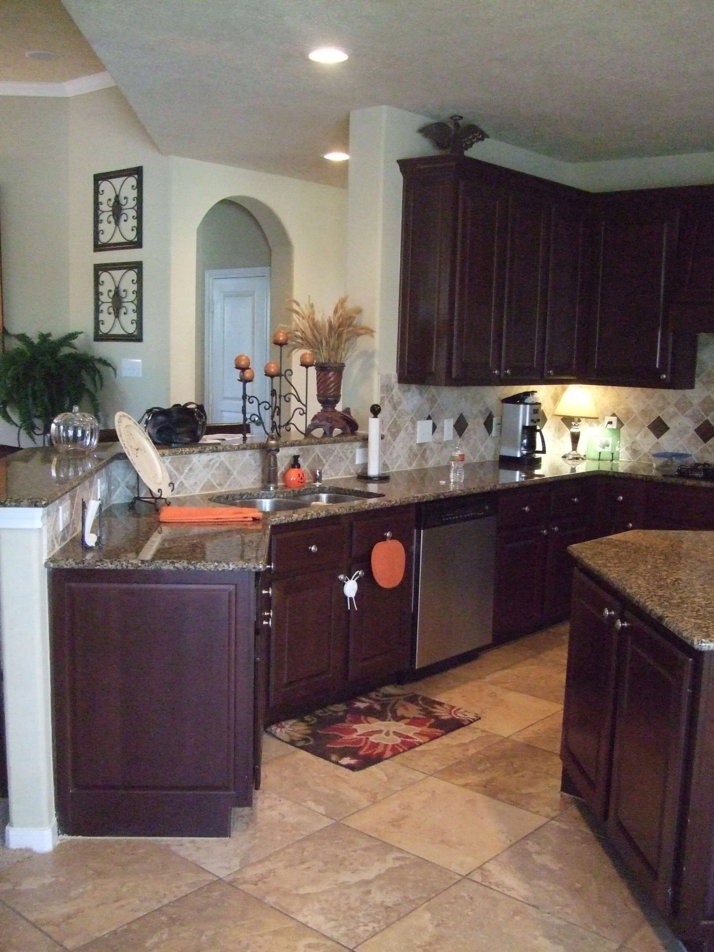
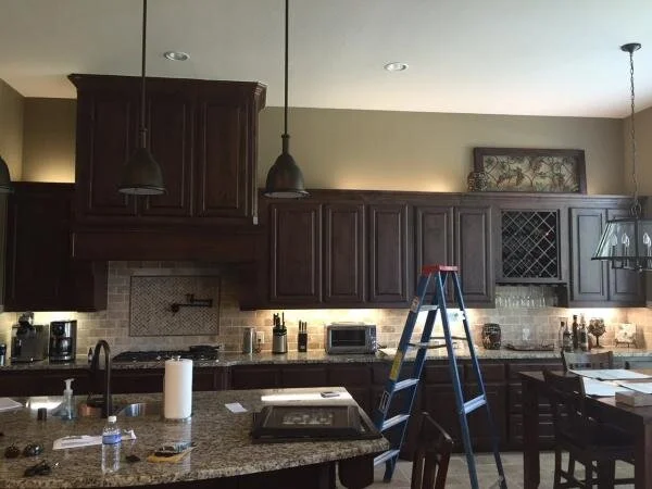
Espresso kitchen cabinets with spotty granite counter, travertine backsplash and dark bronze cabinet pulls. Can these cabinets be salvaged to produce a new, updated look?
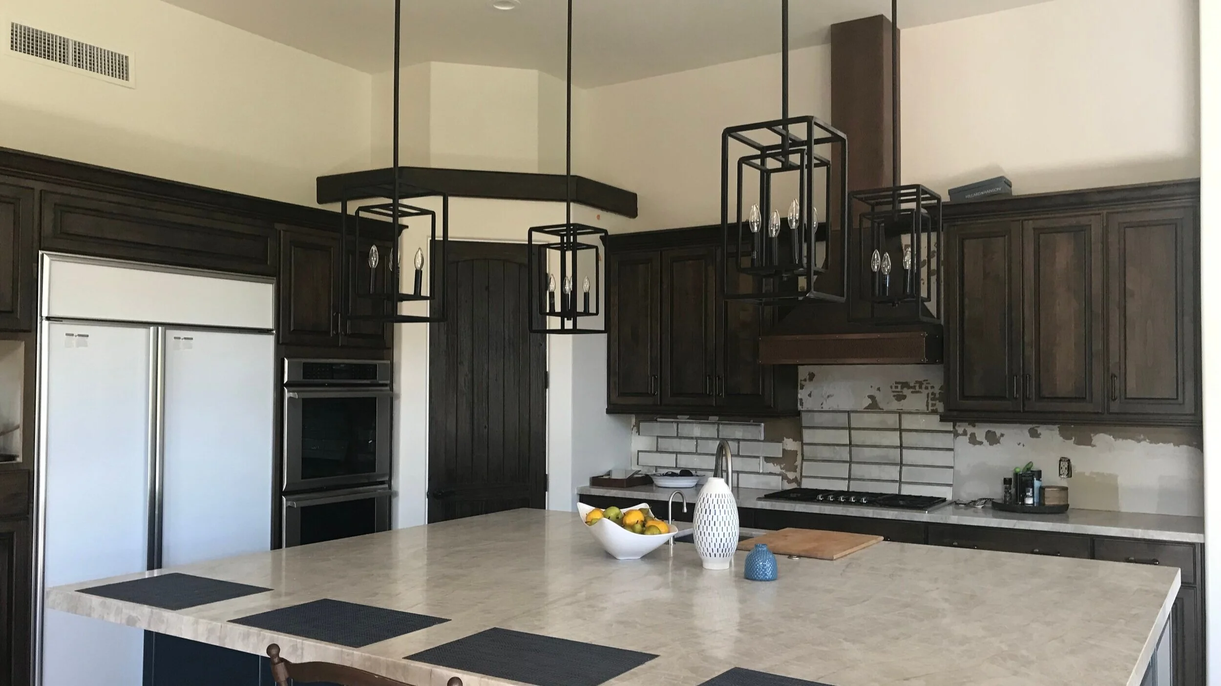
Espresso kitchen cabinets. I like the countertops here, but there is a lot of dark wood.
Dark espresso kitchen cabinets, spotty granite counters and travertine backsplash. How can we bring this look up to date?
I had a couple of jobs like this some years ago. The big problem for my clients was that it was all just too much brown.
Everything looked dark, heavy, masculine, and rather boring.
Don’t get me wrong, I love some dark cabinets and dark finishes.
However, when paired with a boring beige, it is just anything but remarkable and tends to look muddy. It tends to look a little Hyatt Place or Marriott or Hampton Suites, if you know what I mean.
Many times, brown leather sofas, dark wood floors, oil rubbed bronze metal finishes, etc. are also found in these homes. The dark brown leather sectional sofa people must have made a killing in the 00’s!
I totally get it. It’s better to have something kind of generic and build style and color preferences on top of these big design features in a room. I understand the logic.
It’s kind of like buying a black dress and then using the accessories to change the look.
So, let’s see how we can do that, while using those espresso cabinets.
Dark espresso kitchen cabinets with spotty granite and travertine backsplash can look rather dark, masculine and boring.
What somewhat minor changes can we make that might lighten things up so that the look goes from feeling like the generic 00’s to more, let’s say……..2021 and beyond (because 2020 is sticking in my throat)!
1) Pair Espresso cabinets With White
One of the ways to make that espresso color a striking and sleek look, is to bring out the contrast between it and the other finishes around it.
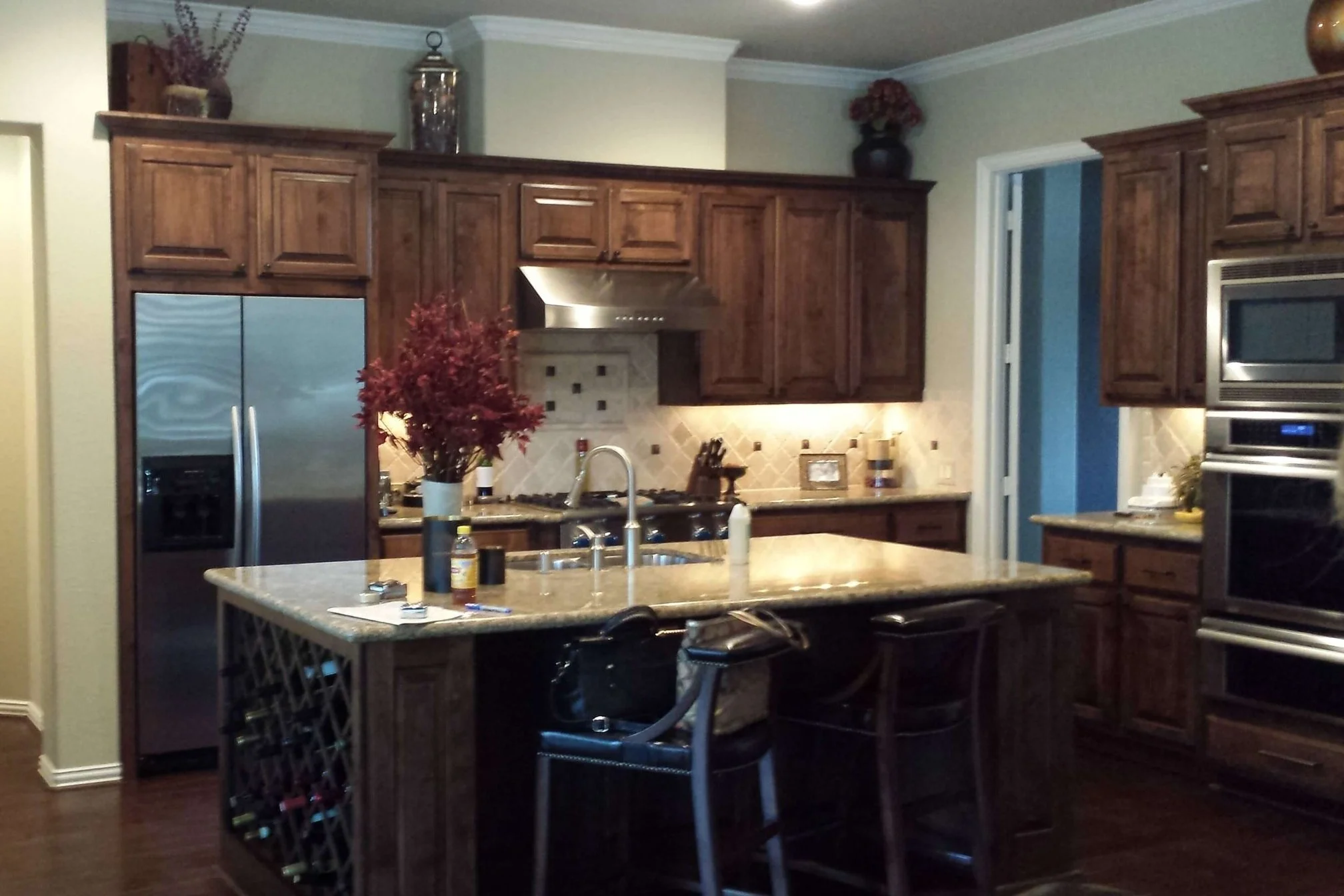
Here’s a picture of a kitchen remodel I did some years ago. The homeowner didn’t want a full gut remodel and wanted to keep the appliances. The house was fairly new, so the cabinets did not need replacing because of wear or anything.
This client wanted something more sleek and modern looking.
The existing look was more traditional and rather muddy, as I described above.
BEFORE Kitchen Remodel - Espresso cabinets on back wall with travertine backsplash and spotty beige granite countertops.
Even though the style of the cabinet door was a traditional, raised panel, we kept the cabinets and modified everything else to get it more of the look she was after.
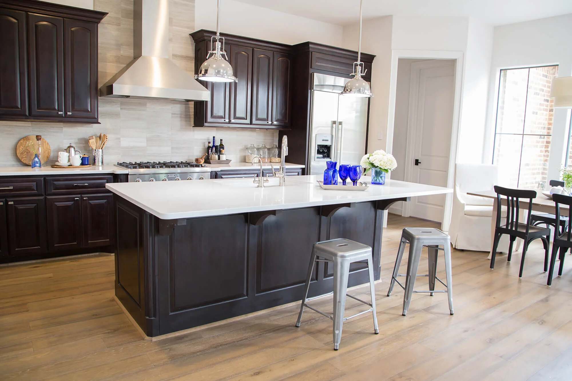
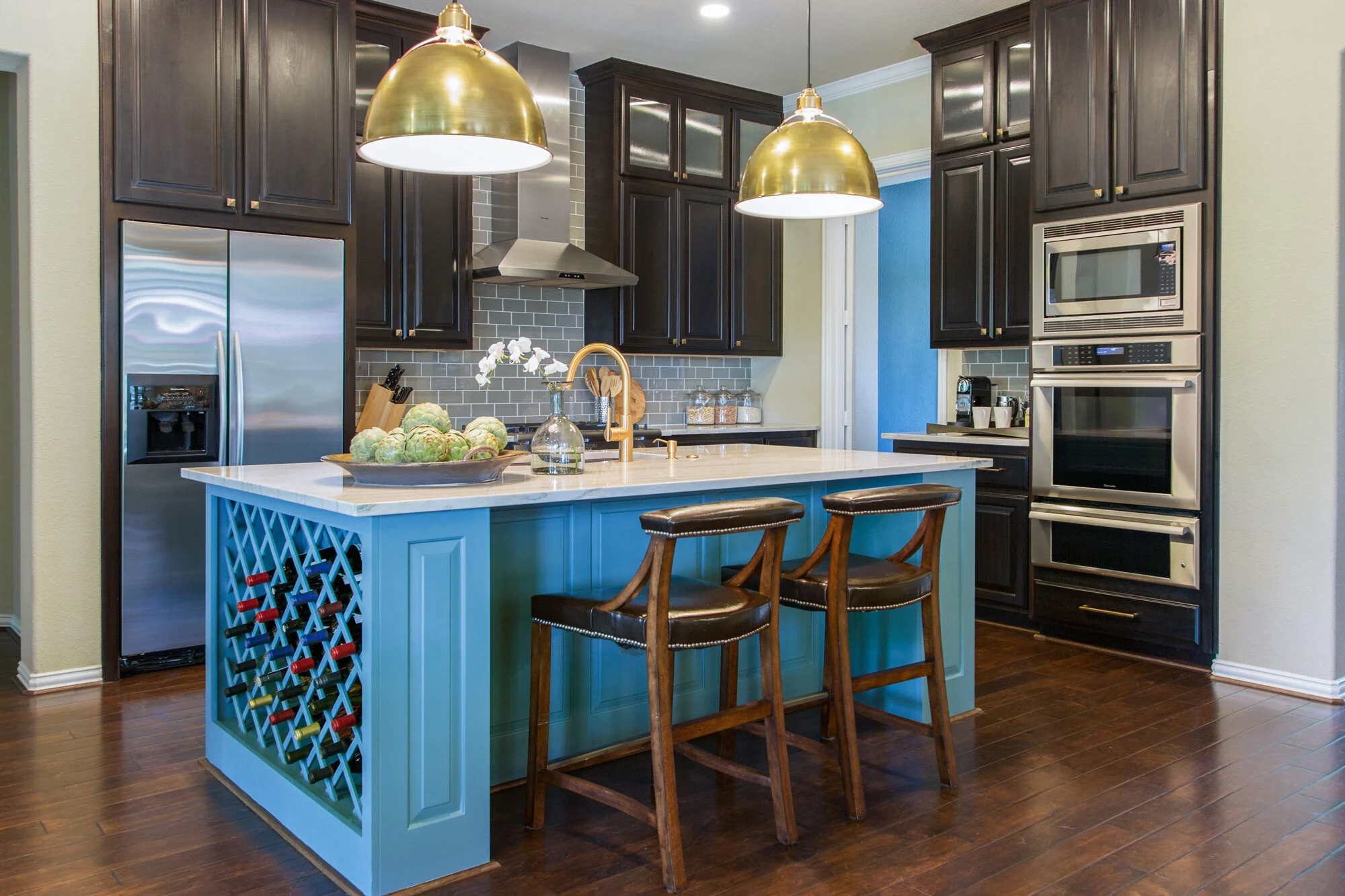
We went in with white countertops, white walls, a sleek new stainless hood and a linear natural stone backsplash in a more modern, stacked layout.
The warm toned island was painted to match the other cabinetry for a very high contrast look overall. Sleek polished nickel cabinet pulls now stand out on the dark cabinets and nickel pendants also bring some shine. (You can see in the “before” pic, that there was dark bronze cabinet pulls on the dark espresso cabinetry.)
Here’s the “After”, much more up to date. :-)
AFTER Kitchen Remodel - Pairing white with the espresso cabinets updated them and made the space feel fresh and new. Carla Aston, Designer | Tori Aston, Photographer
Espresso Cabinets In The Living Room
In the adjacent living room, we painted the existing cabinets espresso to match the kitchen and went in with a larger scale version of the backsplash stone tile on the fireplace to the ceiling. Floating espresso shelves contrast with the white envelope and make for a timeless and much more updated look.
Espresso cabinets ground the space that has a fresh, light envelope. Carla Aston, Designer | Tori Aston, Photographer
You can see that even my client had a dark espresso sofa that we used in the space. Adding some soft white pillows, a textural rug, and two large white linen chairs with ottomans, helped bring more high contrast to this space as well.
The dark finishes don’t overwhelm the room when there are plenty of light, contrasting elements in the same space.
Espresso cabinets, a dark wood table and dark brown leather sofa are not too heavy in this space surrounded by white and some warm texture on the floor. Carla Aston, Designer | Tori Aston, Photographer
Espresso Cabinets Around The House
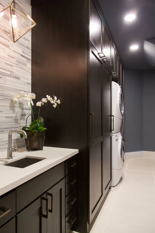
In this laundry room in another project, below, white countertops and a light floor and backsplash give a modern look to this space. The cool blue toned paint color off sets all the dark brown nicely.
Laundry room with espresso cabinetry, blue-gray walls and a light countertop and floor. The light finishes balance the dark wood color. Carla Aston, Designer | Tori Aston, Photographer
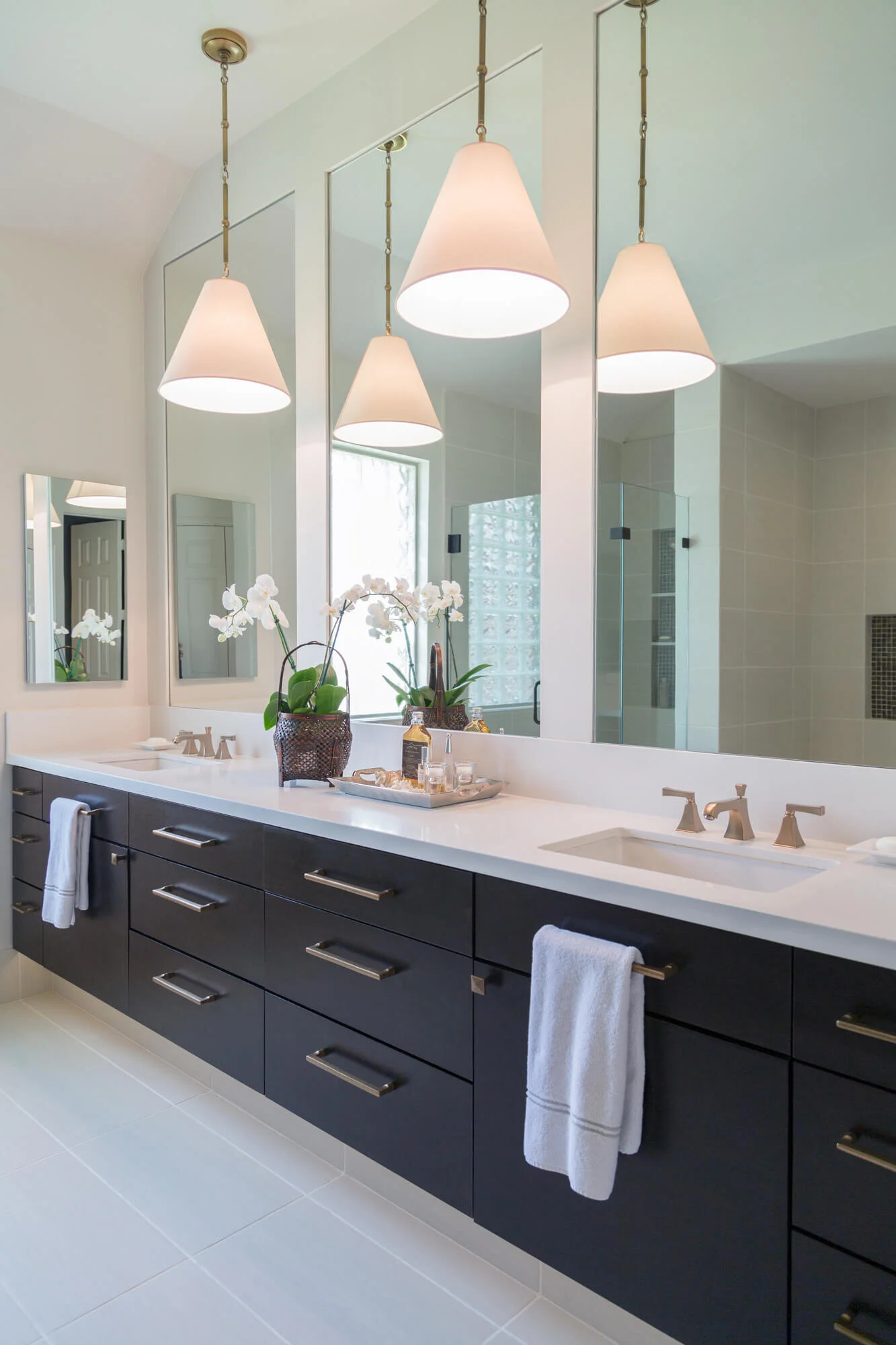
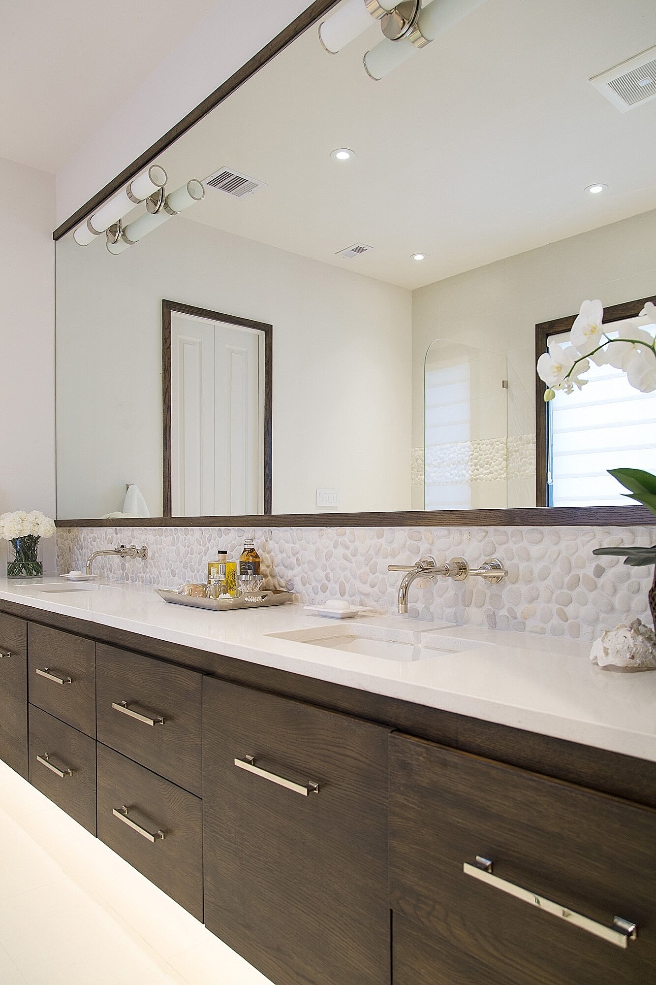
In these two bathrooms, pictured below, espresso stained lower cabinets look smart within their all light, white environments. One is featured with brass metal accents and the other with polished nickel. Both finishes stand out nicely on the dark wood cabinets.
Carla Aston, Designer | Tori Aston, Photographer
Carla Aston, Designer | Tori Aston, Photographer
2) Add A Vibrant Color Palette To Dark Espresso cabinets
This project had brown stained cabinets that were slightly off color from the floor. The floor was slightly redder than the brown cabinetry.
If you’re going to have two dominant wood tones like this, it is good to make them significantly different, or match, in my opinion.
We opted for significantly different and stained them an espresso finish.
In order to make the espresso feel current and fresh, I opted for a bold, colorful island, some bright, brassy pendants, and light countertops and splash.
Before Remodel - In this kitchen remodel, we opted to go dark espresso for the perimeter cabinets.
Adding some bold color in this kitchen helped make the espresso cabinetry look fresh and new. The brass pendants really stand out against the dark finish. Carla Aston, Designer | Tori Aston, Photographer
We used a yellow fabric on these upholstered chairs, to relate to the brass and compliment the turquoise color on the island.
Dark, espresso cabinetry anchors the far corner of this space. The bright color palette livens things up in this kitchen and living room. Carla Aston, Designer | Tori Aston, Photographer
I really loved this color palette and it enabled the homeowner not to have to paint all the walls from her warm toned gold color.
Opposite the kitchen, the turquoise and yellow are repeated in the living room. Carla Aston, Designer | Tori Aston, Photographer
If you have espresso toned cabinetry and are tired of their dark, heavy, masculine look, there are ways to make them feel lighter, fresher and more up to date.
Get rid of the muddy finishes surrounding them and go with either white or bolder color.
Did you like this post? You might try these that also show some ways to work with materials that were popular in the past.
Pin this to Pinterest for me, to help me spread the word! Many thanks! :-)
How To Update Kitchens With Espresso Cabinets and Furnishings






![More Help For Your Travertine Floor Problem! [Warm Toned Color Palette]](https://images.squarespace-cdn.com/content/v1/4fcf5c8684aef9ce6e0a44b0/1613516289251-5HS2QWA5PYHK0N0IN93B/Travertine_tile_flat_lay_moodboard___Copy__1613516252_62832.jpg)


I have been playing around with some warm gold color schemes for a project and I have to say, I think this is a fresh, updated look for 2022 and beyond. Take a look at some of the rich combinations I’ve come up with…..