I'm so excited to share some sneak peeks of this remodel I've worked on for about a year now. It is in the home stretch and there is so much activity on the jobsite, with all the final layers being put in place.
First, I have to hand it to the General Contractor, Kevin Hall, of Hall Construction, who has done a great job with this big project. We've affected every room in this house doing some major work, and it was a big undertaking.
The homeowners have been wonderful to work with and I'm very lucky to have been part of their project. The reason everything is turning out so well is because of the people involved here. :-)
Now, I'm just sharing some sneak peeks.
I always love a big before and after reveal. :-) I hope to share some professional photography at some point, after the dust settles.
Here is a before pic of the kitchen.
BEFORE - Kitchen with oak cabinets, faux finish walls, and plain tile floor
This house had lots of faux finishing with heavy texture, oak cabinets and rather dark, golden finishes. We wanted to lighten things up for a cheery and bright ambience.
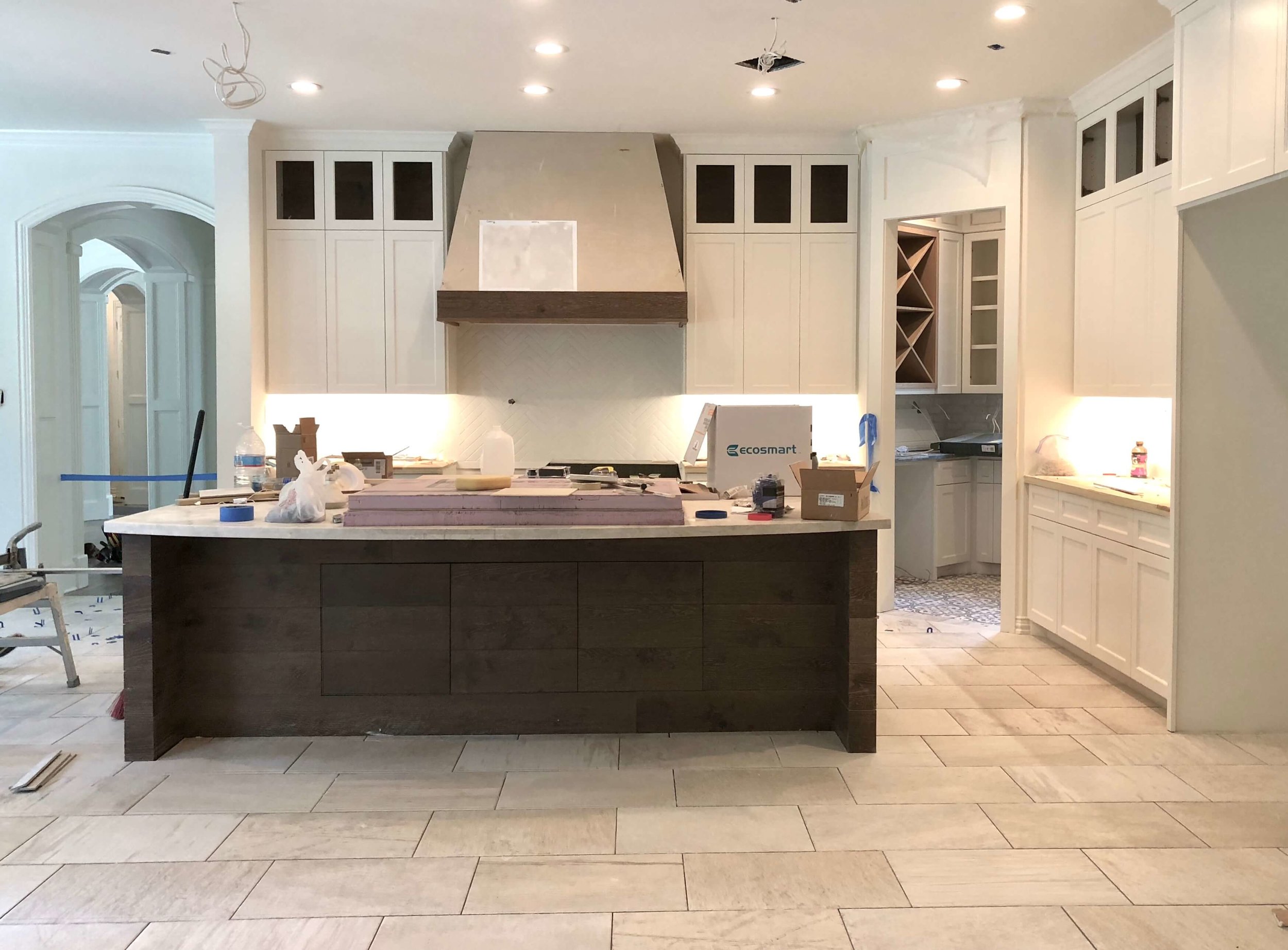
The cooking center of the kitchen was moved from the island to the wall in this remodel, for a more dynamic elevation and to allow for the 60" Thermador range. :-)
I relate more about this project and how the appliances were relocated here.
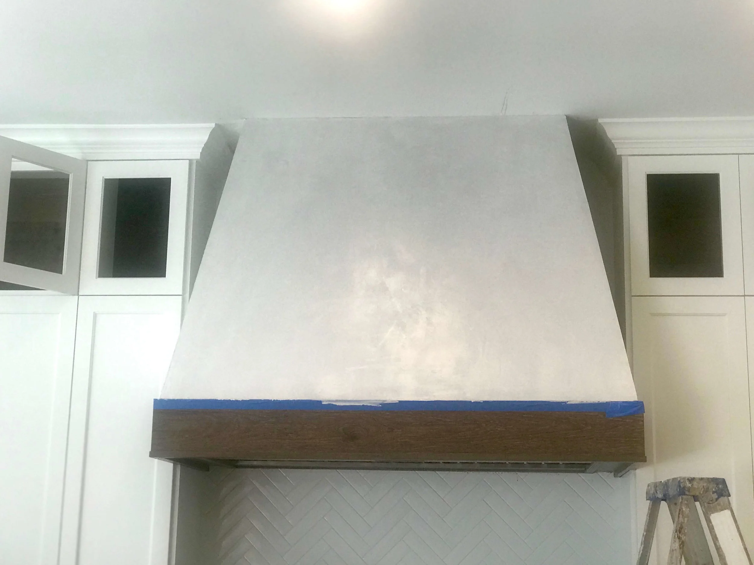
Kitchen remodel in progress - Herringbone backsplash is in, hood is being prepared for special finish.
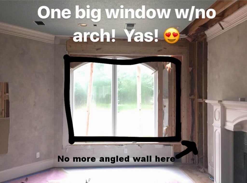
You can see in the "before" kitchen image above, the floor plan had lots of 45 degree angles which really created a challenge trying to utilize the space we had in a more up-to-date, logical layout.
You literally would open up a wall and there would be a triangular shaped void. Not exactly useful square footage.
These were not only all over the center "joint" section of the house (in terms of the floor plan), but also in other rooms, done to sort of round out the spaces. :-/
Well, we took care of that. We also pared down on the arches too. I never counted how many there were, but I'm glad there are less now.
Family Room
Although rooms stayed where they were, we did some reorganizing and tweaking of the existing spaces. I feel like the home really has fallen into it's proper place in terms of layout and function overall now.
In the family room, open to the adjacent kitchen, the dark stone fireplace filled one wall. However, the giant niche and tv wall were really the main focus, directly opposite the kitchen and breakfast room.
BEFORE - Family room with tall, dark fireplace and giant niche
BEFORE - Family room with giant niche above tv cabinet for older model large screen tv.
It made furniture arrangement difficult, since the view/windows were on the wall opposite the fireplace.
The homeowners decided to relocate the fireplace to the tv wall and incorporate the tv there, clearing the way for a seating group that could face the view and the tv.
It made for a really pleasing elevation that becomes a real feature of the house.
Here was the proposed design and then, the result.... in progress.
In Progress - New fireplace wall with built-ins in family room with tall ceiling
Here’s the fireplace wall a little further on down the road, pictured below. The custom designed glass inserts and door hardware are missing from the cabinetry, but it is almost there.
Loved the way the subtle plaster effect turned out here. And I specifically designed the darker shiplap paneling to sort of camofluage the big screen tv mounted above the fp.
Coming along nicely, no? :-)
Tile floors laid in 1/3 offset
So excited about how this porcelain tile floor is coming out. The variation is perfect here in this big space. It will hold up for years to come with children, pets, and pool traffic going in and out of this space.
We got the last batch of this tile, from Thorntree in Houston, so don't bother asking for the spec! It is now officially discontinued.
(So glad we got it!)
Pantry / Butler’s Pantry
Here's a quick peek, below, at the fabulous Butler's pantry with the gorgeous soapstone countertop and hammered nickel sink.
Love the white brick walls in here too. (Just wait till you see the floor!)
Soapstone countertop with hammered nickel sink in Butler's pantry | Carla Aston, Designer #soapstone #butlerspantry
New built-in wine rack and cabinetry in Butler's pantry with brick walls and soapstone countertops
Love how the custom pantry door turned out along with the white brick walls | Carla Aston, Designer #whitebrick #pantrydoor #pantry
More of that nice white brick was installed behind the open wine rack.
In progress pic - Butler’s pantry wine rack w/ white brick walls, soapstone counters | Carla Aston, Designer #whitebrick #pantrydoor #pantry
Home Office / Study
The home office was dark and the wood very orange. :-( That iridescent tile was not doing us any favors here.
BEFORE - Home office with orange tone wood built-in
BEFORE - Home office fireplace and paneling with orange tone wood
I felt like the cabinetry could be drastically improved upon, incorporating painted cabinets to the ceiling with a stained wood counter and integrated task and decorative lighting.
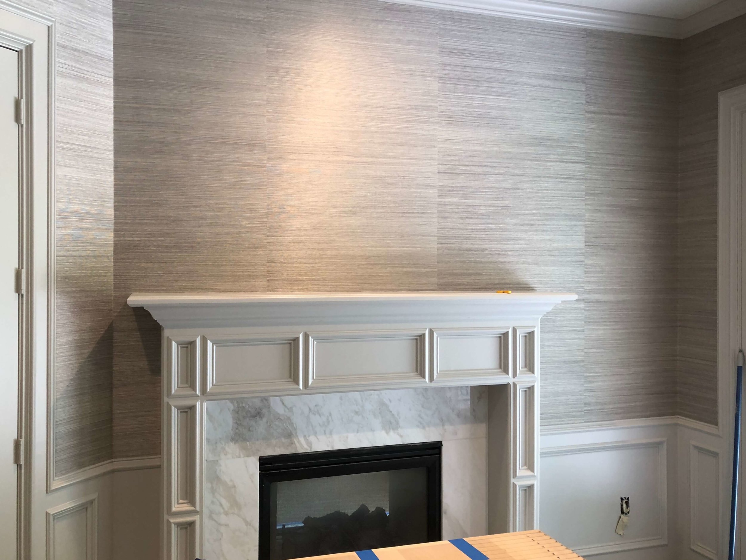
Painting the paneling and mantel, adding a frosted white slab marble surround and a beautiful grasscloth wallcovering brought this space up to date.
Home Office / Study built-ins In Progress | Carla Aston, Designer
Home Office / Study with new marble fireplace surround, paint, and grasscloth wallcovering | Designer: Carla Aston
IN PROGRESS - Here’s the home office’s built-in details. I designed a slight curve for a deeper desk area and grasscloth in the back of the cabinetry over the desk. Love the plaid carpet we chose too. Carla Aston, Designer #homeoffice #desk #cabinetry
Too Much Cabinetry
There were lots of bulky built-ins all over the house, like this one pictured below.
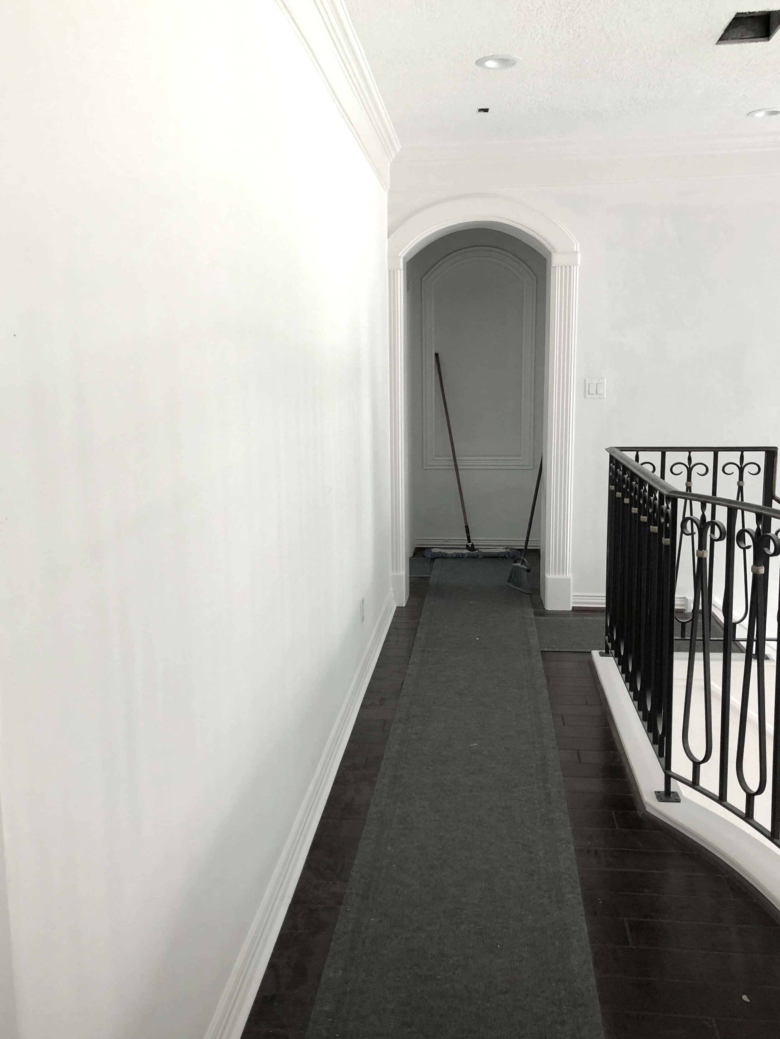
When I looked up at this one from the main entry hall, below, all I could envision were a bunch of little objects and picture frames cluttering up that big wall. There were already more useful built-ins elsewhere in the house and this one just wasn't needed.
Now, that flat, smooth wall is ready for a gallery of art that will make a significant statement on the upper floor of this entry hall. :-)
BEFORE - Upper floor hallway with built-in display shelves
Remodel in progress - smooth, flat wall for gallery art
Upstairs Gameroom
The upstairs gameroom built-in was designed for a bulky, deep tv.
New cabinetry will fit a flat screen tv and still has nice storage.
BEFORE - Gameroom cabinetry for old style tv
Remodel in progress - Gameroom cabinetry for flat screen tv
Bathrooms
Of course, we tended to the bathrooms too. Shampoo niches are my weakness.
Shampoo niche and shower seat in the master bathroom | Carla Aston, Designer
Shampoo niche with flower pattern tile in upstairs bathroom | Carla Aston, Designer
The master bathroom has a new free-standing tub with a beautiful leaded glass window that I custom designed.
They have privacy with the milky, wavy glass and a graceful pattern too, that relates to some of the curved panels in the cabinetry in other rooms in the house.
Stair Carpet
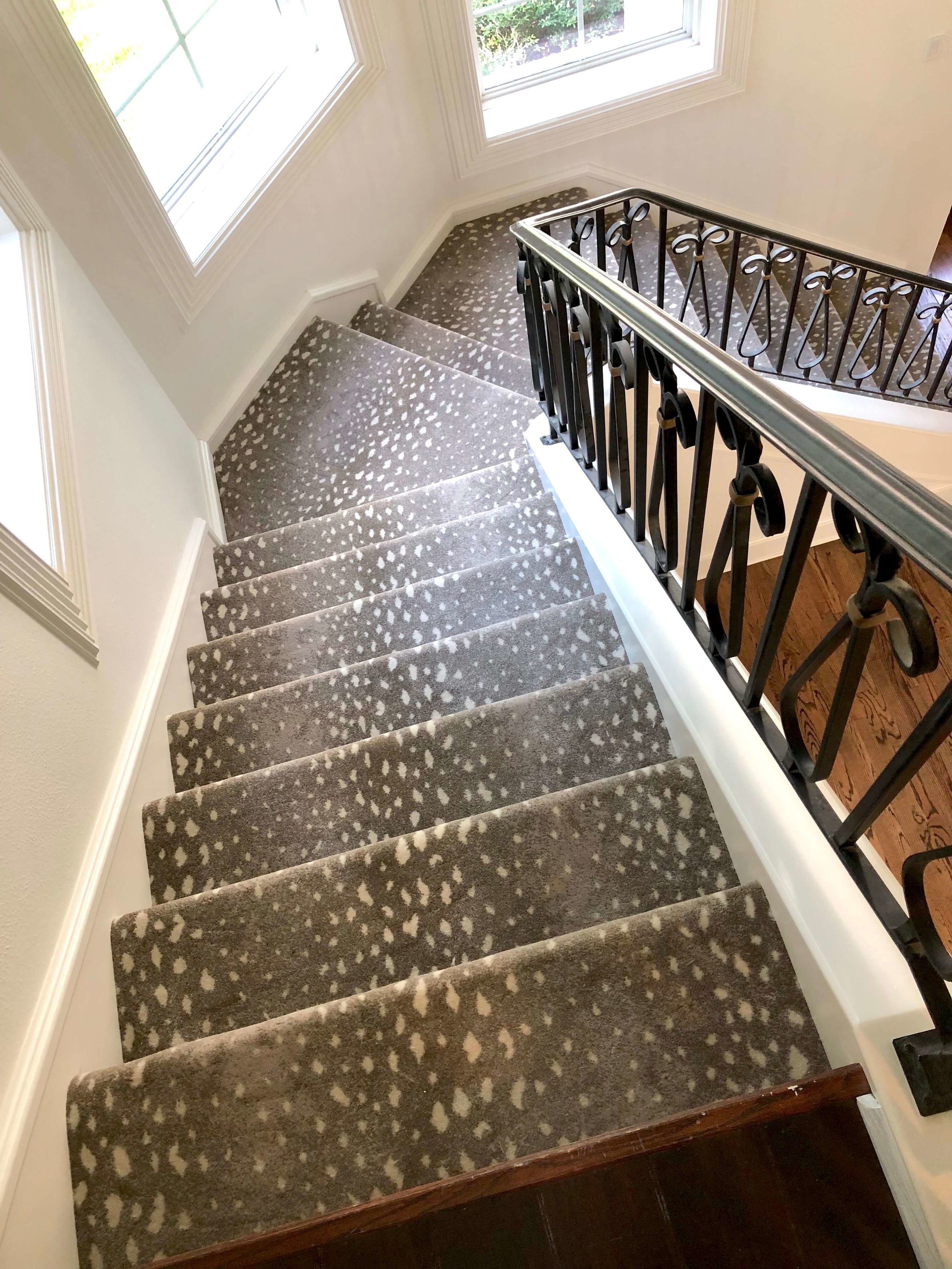
Check out the Stark Antelocarpa carpet on the stair. Beautiful, no? And that powder room is coming along nicely!
Antelope pattern carpet from Stark on the stairs | Designer: Carla Aston
Powder Room
Isn’t this powder room shaping up nicely? Love the vessel sink, the custom designed vanity, the marble and how we shaped the backsplash corners. The wallpaper is so pretty too!
Powder room in progress w/ custom vanity, white marble countertop and backsplash, vessel sink, and tone on tone wallpaper | Carla Aston, Designer #powderroom
More kitchen pics
Here's the beautiful plaster finish going on the hood. It's a subtle tone-on-tone effect, designed to reflect the same look as the quartzite countertops and the flooring. :-) Looking good! Carla Aston, Designer #kitchenhood
The 60” Thermador range is in with the gorgeous herringbone laid tile backsplash and plaster hood with wood trim | Carla Aston, Designer #kitchenhood #herringbonebacksplash #range
There's so much more going on all over this house. I can't wait to see it all complete!
Check out some of the renderings I had done for this space here.

