A small powder room is great.
A small guest bath is okay.
But a small primary bath...
It's just inconvenient.
Let's just say a small primary bathroom isn't something your realtor will be including on your house’s tear sheet when it comes time to sell.
But there’s hope! There are ways to deal with this. Your small bathroom can be designed to look and function just as well as the rest of your great house.
You just need to know a few tricks - a few little pointers that can help a tight, tiny space GROW, visually.
These tricks I'm about to show you can be applied to any type of room.
However, in a bathroom, they are particularly important.
Every bathroom has to satisfy certain needs and, therefore, must include the basics: the sink and faucet, shower or bathing area, and the toilet. No matter how small the space, these things have to be shoved in there.
(Oh, and, of course, a big bath tub, some linen storage, an extra sink for the Mr., some great lighting and mirrors, and maybe a seated vanity . . . Well, all those would be nice in a beautiful bathroom, too ;-)
If this was a living room, you could just remove a piece of furniture.
But bathrooms a little more troublesome.
Here’s a quick summary of all 11 creative ways to make a small bathroom look bigger. Keep reading below to get details and photo examples for each creative tip:
Keep everything the same tone / color / value as much as you can.
Paint the ceiling the color of the walls.
Blend the tile color and wall color.
Take the tile in the shower up to the ceiling.
Watch your material transitions.
Use clear glass in your shower.
Go BIG on the mirrors.
Go for plenty of natural light.
Use mirrors strategically.
Recess some cabinetry and shampoo shelving into the walls or wall cavities.
Replace the linen closets built out of sheet rock walls with cabinetry.
So how can you make that tight bathroom space seem bigger?
How do you get more visual square inches in that room?
Here's how...
TIP #1 | Keep everything the same tone / color / value as much as you can.
For example: Don’t have dark walls and light tile (or vice versa), because this will chop up the space, visually, and make it seem smaller.
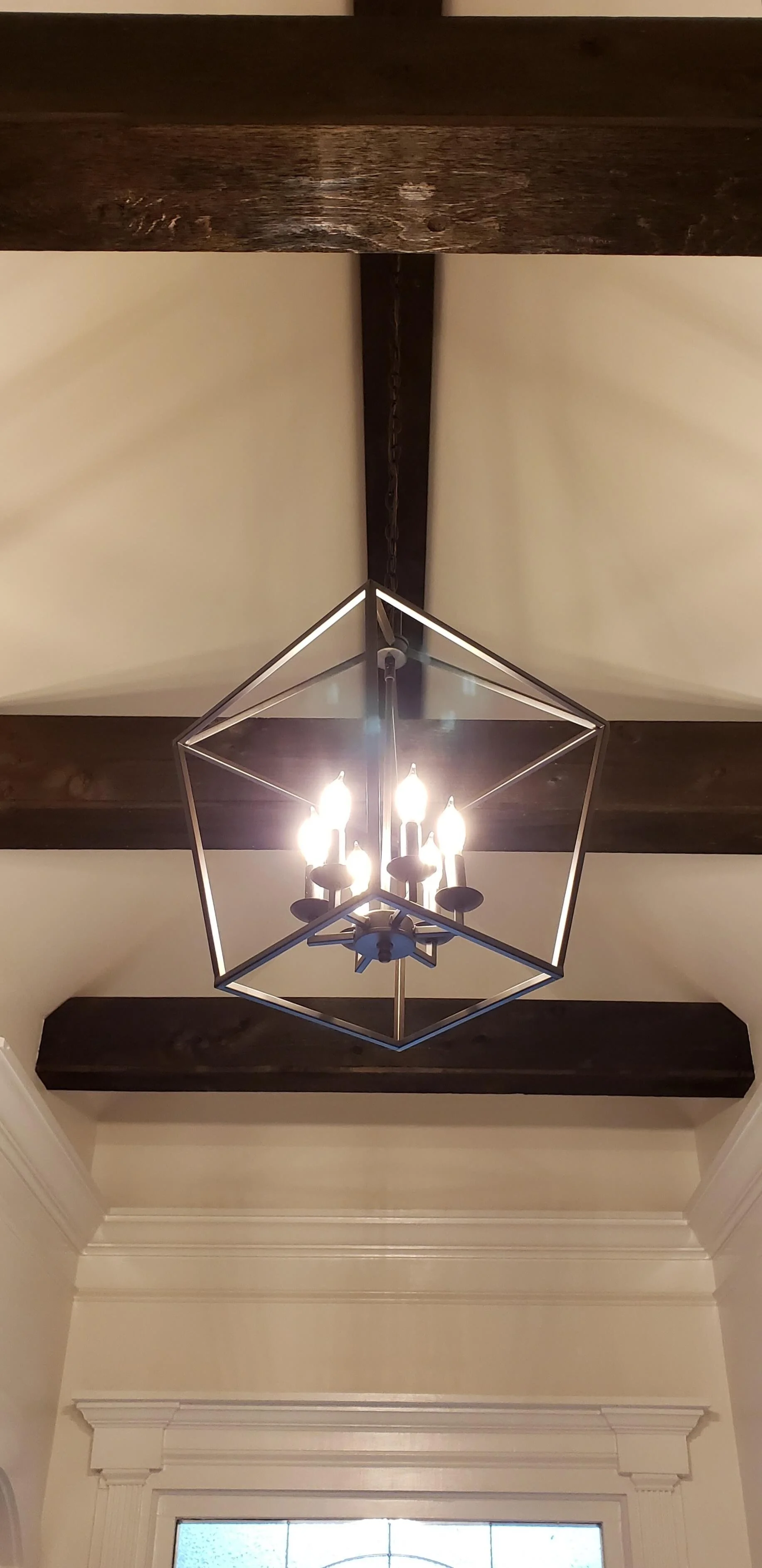
However, if you do want some contrast, limit it to something that is more of an object in the space, like a low cabinet, some unique doors, or a light fixture.
Then that object will stand out as a feature, while everything else will recede and blend together as a backdrop. In this case: recession = expansion (of space).
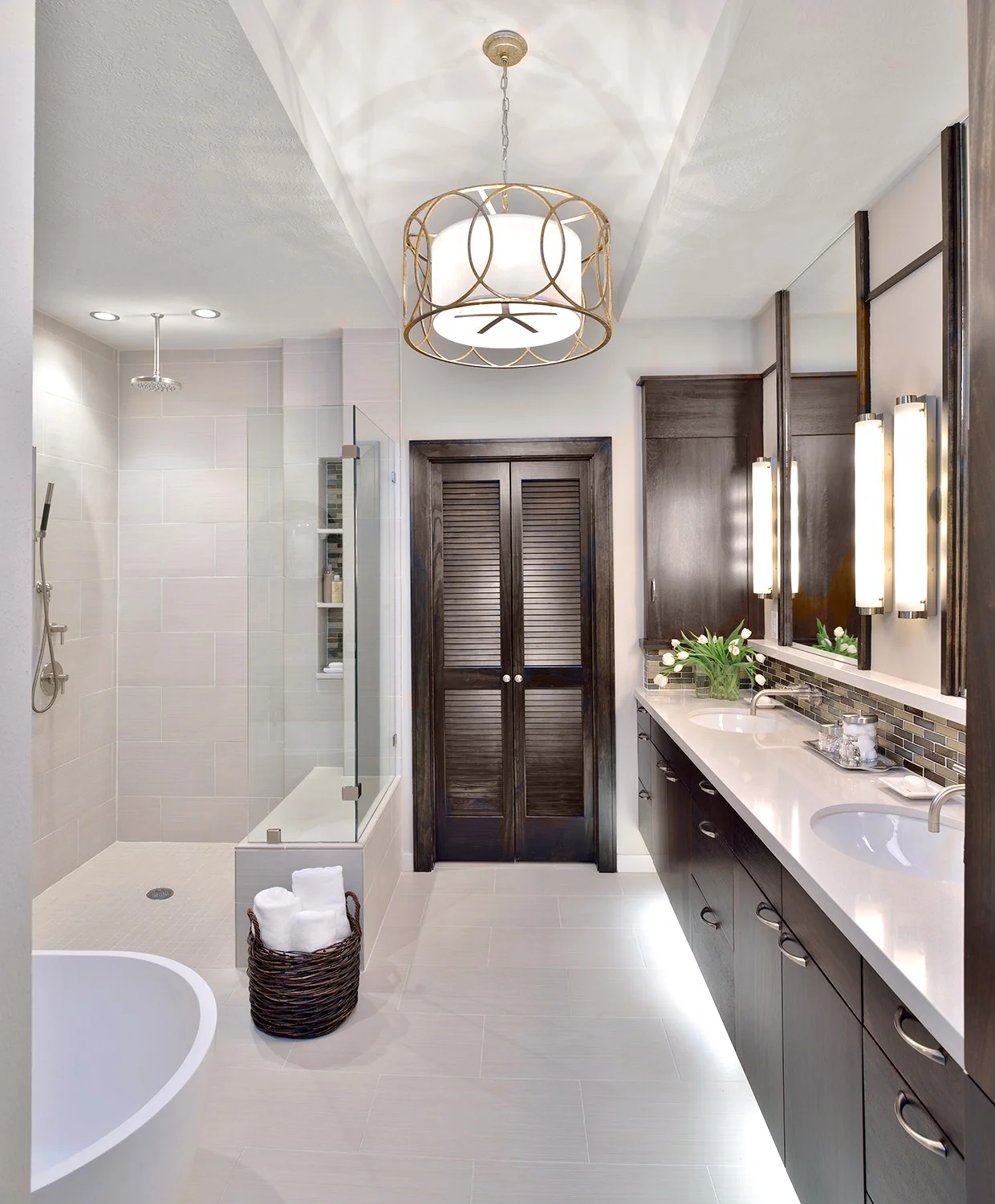
Here's the AFTER of that bathroom, where contrast was created in the cabinetry and new louvered doors. They appear more special and the bathroom feels lighter and fresher overall with the envelope of light gray.
Here’s a remarkable before and after a reader of my blog uploaded in the comments of a post. See how just changing that dark paint color made that bathroom feel bigger?
The heavy moulding no longer stands out and the whole space feels more open and luxurious. The new light fixture helps too.
TIP #2 | Paint the ceiling the color of the walls
...Especially if your ceiling is angled or has some oddly shaped low areas.
Painting everything a unifying color will make those unusual shapes disappear, and the space will visually expand. It cuts down on the number of transitions and planes intersecting, therefore creating a cleaner, more expansive upper space in the room.
Sometimes, I'll go one shade lighter on a flat ceiling, because ceilings always read a bit darker than the walls anyway. This will give the same effect.
This bathroom ceiling at 8’-0” didn’t feel as low since it was the same color as the top of the wall.
Tiffany blue and white, feminine bathroom | Carla Aston, Designer | Miro Dvorscak, Photographer
TIP #3 - Blend the tile color and wall color.
Blending the tile to the wall doubles your space in a small bathroom.
Imagine tile with contrasting color in this shower. Visually, it would cut the size of the bathroom in half, making the shower appear to be a separate space. By blending the color / value of the tile with the wall, it will all read as one larger room.
TIP #4 | Take the tile in the shower up to the ceiling.
It amazes me how builders will stop tile 1’ below the ceiling, then trim out the edge of the tile with bullnosed edges. That probably costs more money than just taking the tile all the way up to the ceiling.
Again... Fewer transitions + less contrast = more expansive feel.
Tile to ceiling at shower stall | Carla Aston, Designer | Colleen Scott, Photographer
TIP #5 - Watch your transitions.
The more you can bleed a material from one area to the next without stopping and starting it, the cleaner and less busy the space will appear.
The tile pictured below runs all the way around the bathroom. Even the same flooring runs into the shower.
Tile on floor and walls runs on into shower to create a larger, more expansive look. Designer: Carla Aston, Photographer: Tori Aston
The tile in this bathroom runs up over the curb and then is installed in 2 x 2 version on the shower floor for a more expansive feel. Carla Aston, Designer | Charles Behren, Photographer
TIP #6 | Use clear glass in your shower.
Textured glass can make a space feel like it has an extra wall. You may be able to get light in and have some privacy, but it will be a visual barrier within the room.
This bathroom feels more open with clear shower glass. Designer: Carla Aston, Photographer: Colleen Scott
TIP #7 | Go BIG on the mirrors.
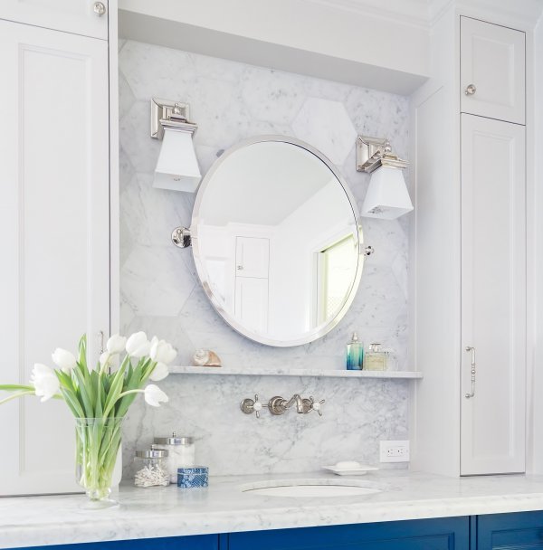
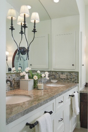
Nothing makes a bathroom feel grander than a mirror that reaches to the ceiling. Trimmed out in wood or tile, a tall, expansive mirror with lighting installed on top of it, or hanging in front of it, will double the light's impact and make the space grow.
TIP #8 | Go for plenty of natural light.
Natural light in a master bathroom is always desirable. After all, nothing beats the feeling of walking into a bathroom in the morning and glorious sunshine being there to welcome you! (It helps with your make-up too.)
I’ve seen many bathrooms with windows that have been covered with shutters, or some sort of blacked-out window covering, to create privacy, and either approach is just like walling up a window!
Instead, cover a window with a translucent window shade, or a tone-on-tone stained glass window - that way you can have natural light and privacy!
Milky white glass was used in this stained glass window design to add privacy to this master bath. Designer: Carla Aston
If you don’t have a window, consider a solatube, or some kind of skylight to bring some natural light into the space.
In this pic below, you will see how beautiful Hunter Douglas translucent shades were used to provide privacy and let in the light.
TIP #9 | Use mirrors strategically.
We all know that mirrors are only as good as what they reflect. One great idea is to place mirrors across from a window within the room. Doing so will make it visually seem like you have two windows in the same space!
In the picture below, do you see how the mirror on the bathroom's cabinet doors reflect the light from the window in the adjacent bedroom?
Use mirrors strategically to make your small bathroom look BIGGER | Designer: Carla Aston, Photographer: Miro Dvorscak #bathroommirror #bathroomdesign
I’ve also used mirrors in a small bathroom, from side wall to side wall, over a vanity with wallpaper used in the room. The wallpaper dies into the edge of the mirror, and that pattern then visually continues on to infinity through the mirror! You’ve just enlarged your room tenfold without moving a wall!
In these photos, placing the mirror across the whole bathroom, opened up the space up immensely.
TIP #10 | Recess your cabinetry and shampoo shelving into the walls.
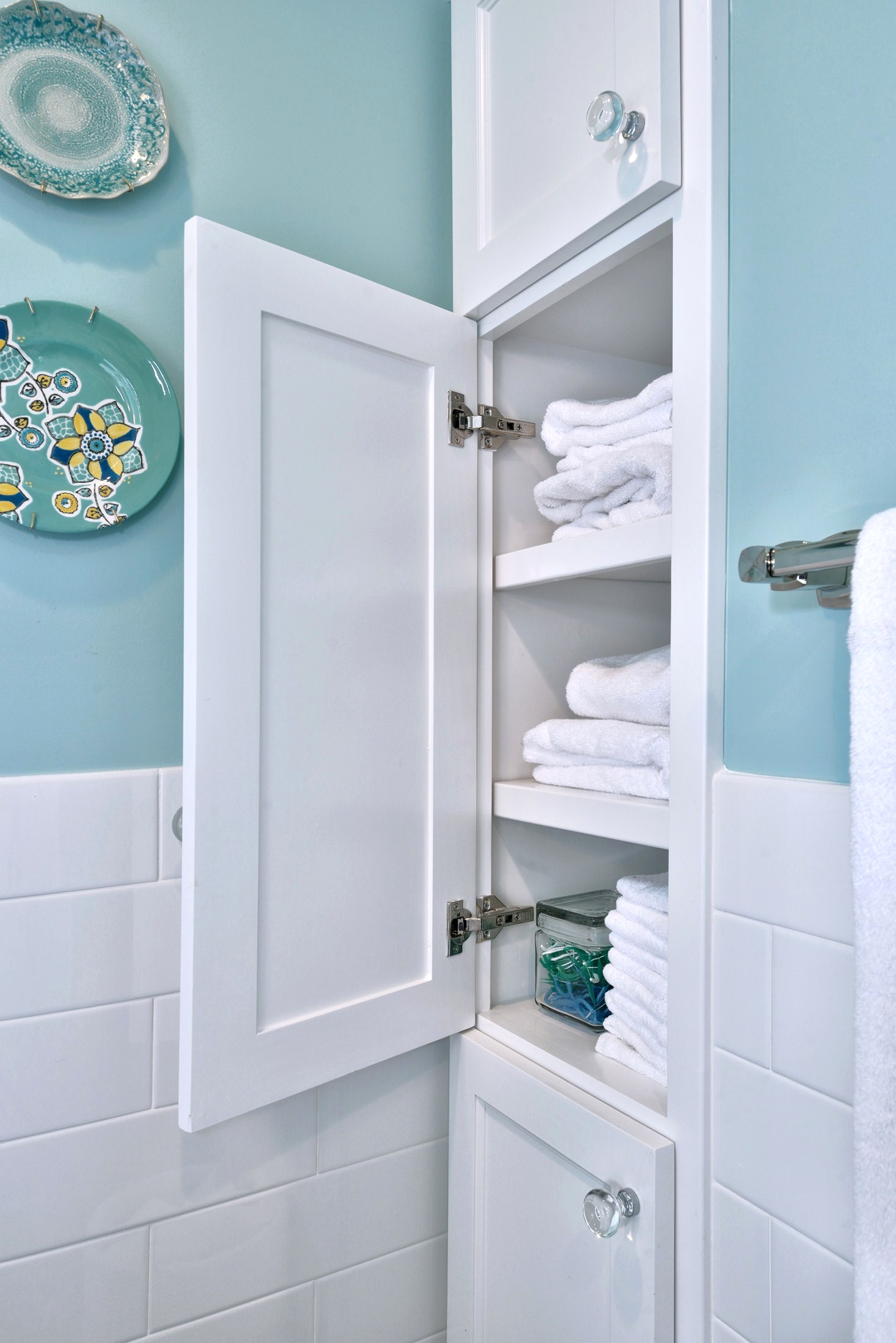
Just like a typical medicine cabinet is recessed into a wall, if you have a linen cabinet that protrudes out into the space, and you need just a few more inches of storage, bury it into the wall. Of course, doing so will require the walls to be reframed in that area, but that's okay! Because it's amazing what 4 extra inches will get you!
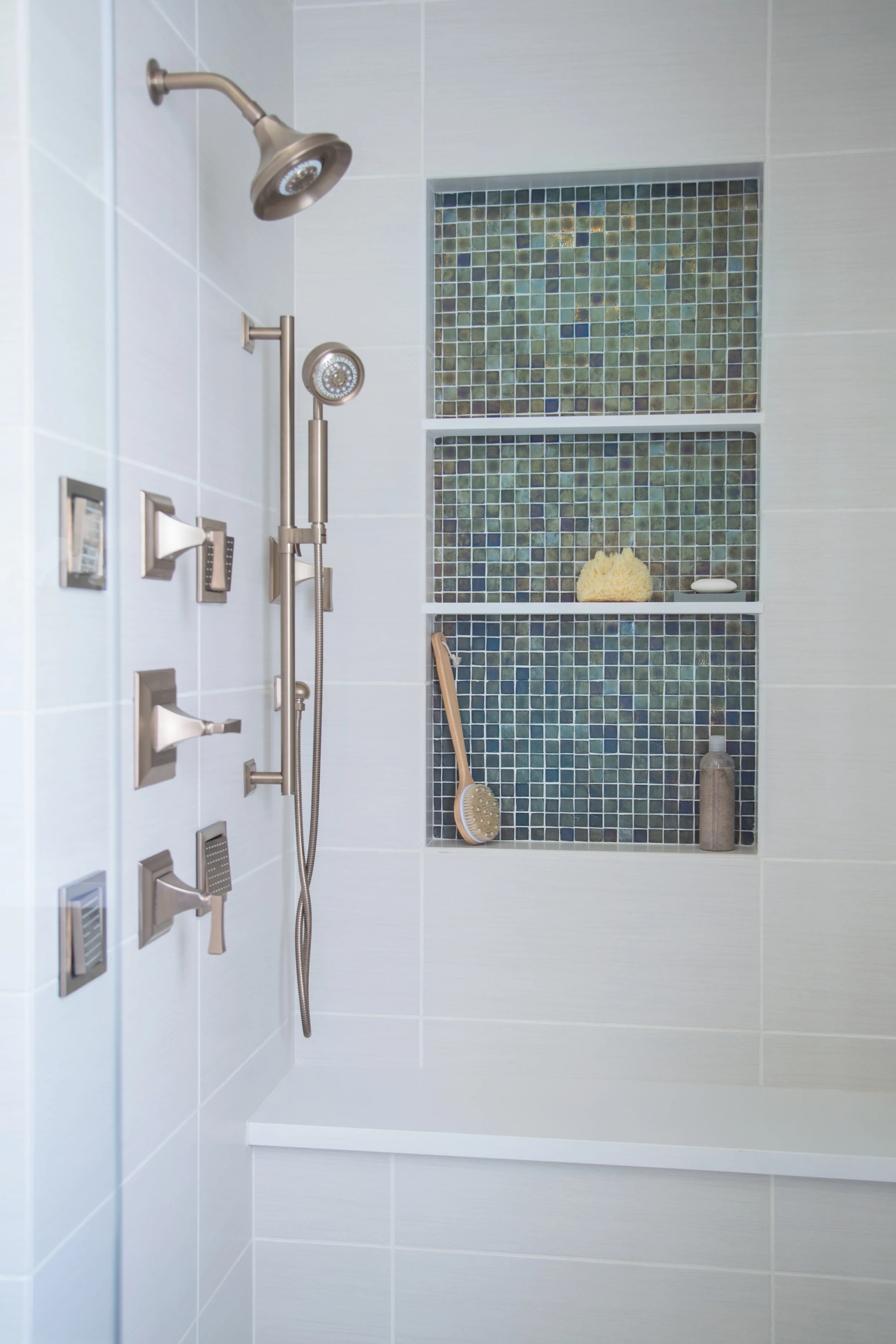
Oh, and BTW, I’m love with beautiful shampoo niches :-)
BONUS TIP #11
Okay, one more... (They keep coming to mind! ;-)
Get rid of the linen closets built out of sheetrock walls with a full height door. That’s such a cheap way to build a linen cabinet, and it makes the walls encroach in your space! If you build that cabinet out of wood, in a typical cabinet fashion, you gain 8-10” of overall width (the thickness of the two sheetrock walls on each side).
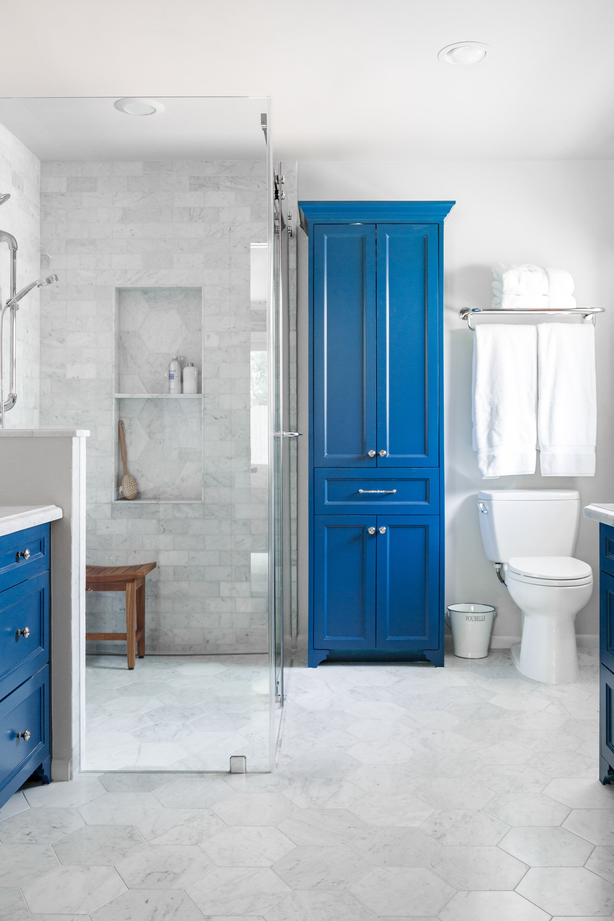
A cabinet can then be built to look like a piece of furniture in the room, much like this blue one, which will add character and get rid of those extra walls!
The bathroom above uses many of the tips I've mentioned in this post. Check out the incredible before and after pics at this link all about the bathroom remodel.
The tile matches the wall to create a visually seamless appearance. And it goes all the way up to the ceiling in the shower and doesn’t stop short.
The contrast in the room is in the cabinet, which causes them to stand out and the walls to recede.
We did a beautiful shampoo niche in the shower to store bathing products and we ditched a linen closet built of sheetrock walls for the lovely cabinet you see in the image.
These bathrooms in the images here are luxury bathrooms although some started out as quite small and cramped.
While some may not seem small to you, they nevertheless employ the same principles used to make bathrooms appear larger and more spacious. These same tips can be used to work in smaller, tinier bathrooms.
I’ve got my handy Bathroom Design Guide to share here today. If you need some help planning your bathroom remodel, my project checklist can serve as your go-to source so you don’t leave anything out and can thoughtfully design the bathroom of your dreams!
Click Here >>>> Bathroom Design Guide

