Back with another project sneak peek this week where we are remodeling the kitchen and a few other areas to get this house on the market.
Get your house shopping shoes on, cause you’re going to want to see this one!
This house was a little dated, but has some great square footage and a nice private setting with a lovely pool and neighborhood.
We are taking care of the dated part though, with some significant upgrades so that this house will sell like lightning when it goes on the market.
My blog contains affiliate links. Any purchases, at no additional charge to you, earn me a small percentage, are most appreciated, and make this blog possible. :-)
Kitchens sell houses, so that’s where we will be focusing our remodeling.
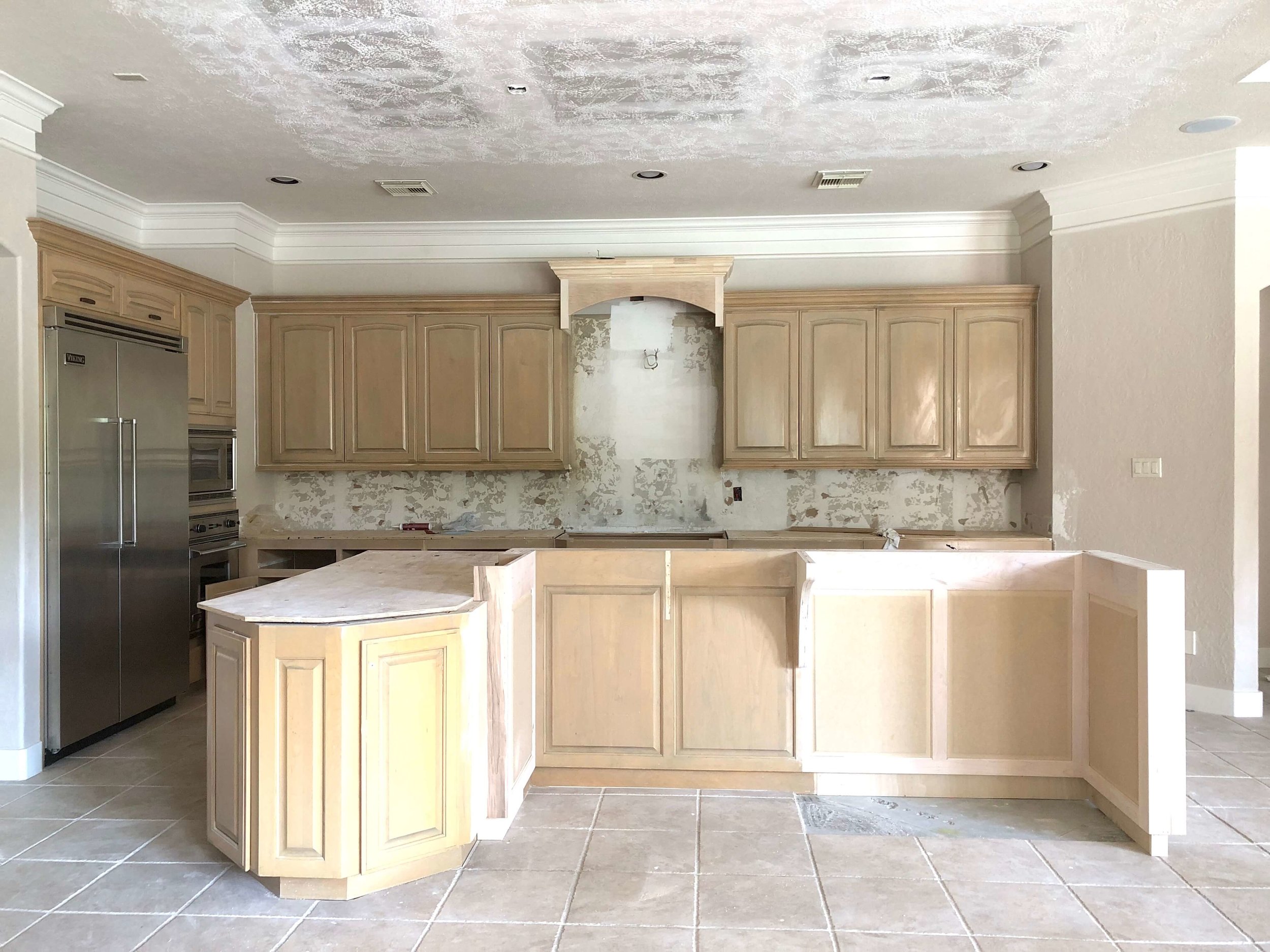
The layout and appliances were great, but we did need to get some new countertops, backsplash, sink/faucet, lighting, and do something about the unusually shaped island with the dropped ceiling furr down, imitating the shape, above.
BEFORE - Kitchen island and soffit above definitely needed to be on the list to remodel
BEFORE - Kitchen island convoluted shape with curvy brackets
We’ve been modifying the island cabinetry to have a more uniform and straight lined look, getting rid of the little brackets and that convoluted shape, which I am soooo happy about.
We couldn’t just tear it out and go all new because we had a very limited number of tiles left to replace the existing and there was no tile under the existing island. The footprint of the island, more or less, had to be maintained.
We’ve straightened out the island and raised the “hood” area above the cooktop. I love that ceiling soffit being gone!
You can see we only need to add about 5 -6 tiles in that one spot where we reworked the shape of the island.
Remodel in progress - kitchen island is modified to get a simpler shape
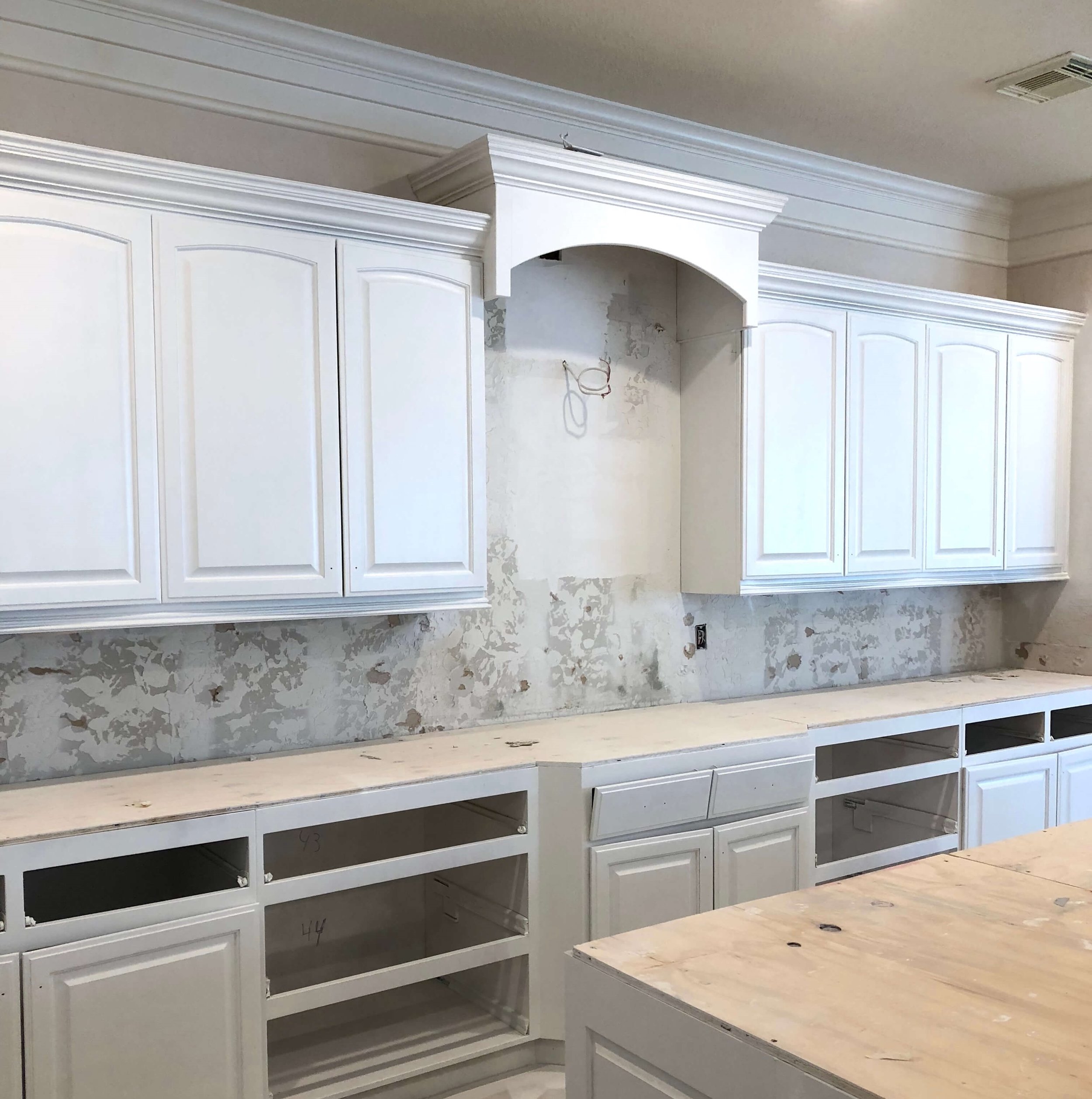
Of course, fresh paint is going to do wonders here too.
Here’s what that back wall will look like when done.
Simple, cleaner lines are more popular these days with home buyers.
Everyone is all about cleaned up details in the style of their homes these days. This simpler shape will appeal to many more buyers.
Since we are keeping the tile floors, I needed to get a countertop that would work with the travertine look color.
I chose to have some contrast here since we are painting the cabinets a creamy white and I didn’t want everything to just wash out. Plus, I want to draw attention away from the floors and up to the kitchen, where we are investing in the property.
I went with a nice cool gray quartzite for the countertops.
Here are the slabs with the tile floor sample that is existing. We’ll be doing a slim gray subway tile in a herringbone pattern to provide some interest, but keep it subtle.
Platinum quartzite slabs for kitchen remodel, from Arizona Tile
We’re painting the island and that new “hood” above the range in a gray to match the tile.
There is a pop-up downdraft vent behind the cooktop, so the “hood” is just an simple accent feature.
I had the contractor build a new deeper one (I included my sketch of the detail), higher than the line of the upper cabinets, so that long, continuous, boring line of crown was broken up somewhat and the tile backsplash was given more prominence.
Quick sketch of new “hood” detail at cooktop
New boxed out “hood” detail
Remodel in Progress - Cabinets are primed, ready for painting all to match the walls except for the “hood” which will be gray to match the tile backsplash. I like the new height there at the hood area. The existing pop-up downdraft venting allows for a more spacious feel at the cooktop.
New lighting will dramatically help update this kitchen.
In addition to tearing out that unusual soffit above the island, we will be adding two of these pendant light fixtures.
I wanted something big, clean-lined and modern looking that would illuminate the new quartzite and make a statement without being too design-specific.
This wall sconce will be added on top of the herringbone tile backsplash for some detail and illumination at the cooktop. I like how it’s shape imitates the shape of the pendants.
The breakfast room pendant is great because it is airy and light and mimics the ceiling and window detail in the entry and living room.
The ceiling mount in the bedroom has a modern drum shade. The bronze stem adds some detail and the finish works with the ceiling fan that is over the bed.
The tv / entertainment center built-in is another place where we are remodeling.
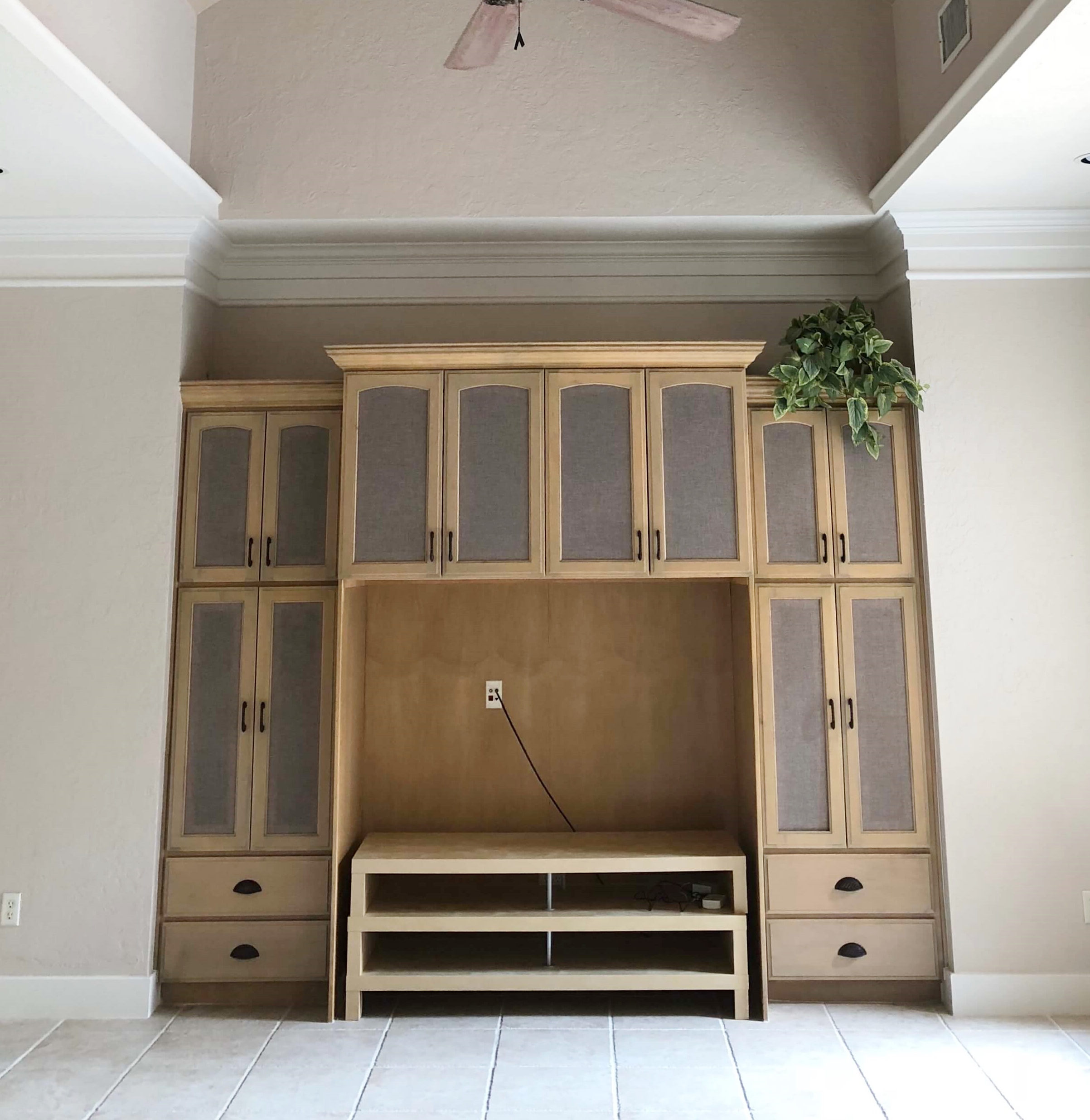
Here was the existing family room built-in.
BEFORE - Entertainment center built in cabinetry for old style big screen tv in family room
We elected to just modify it, replacing the fabric panels with wood and building in a center cabinet to fill in the big, deep box.
I had the carpenters build a false back in the center section, which I often do when modifying deep built-in tv cabinetry. It brings the tv more to the front of the piece and makes the unit not look like it was built for an old style tv.
Remodel In Progress - Primed cabinetry at family room entertainment center
The tile went up to the edge of the built-in, so we had to cover the footprint and this cabinetry change will give this unit a brand new look. It will be all ready for a new flat screen once it is finished and painted.
The master bedroom is another place we are doing a bit of remodeling to get a cleaner, simpler look.
I shared these pics before of the master bedroom built-ins. And while it is always nice to have built-ins, if you could see the size of the closet and all the built-ins in there, in this house, you would realize they don’t really need much in the bedroom!
BEFORE - Master bedroom built in cabinetry wall with armoire for older model box style tv
Also, this cabinetry was designed for a box style tv and, in this case, I felt like modifying and painting it would just be investing in something that a future home buyer wouldn’t even want anyway.
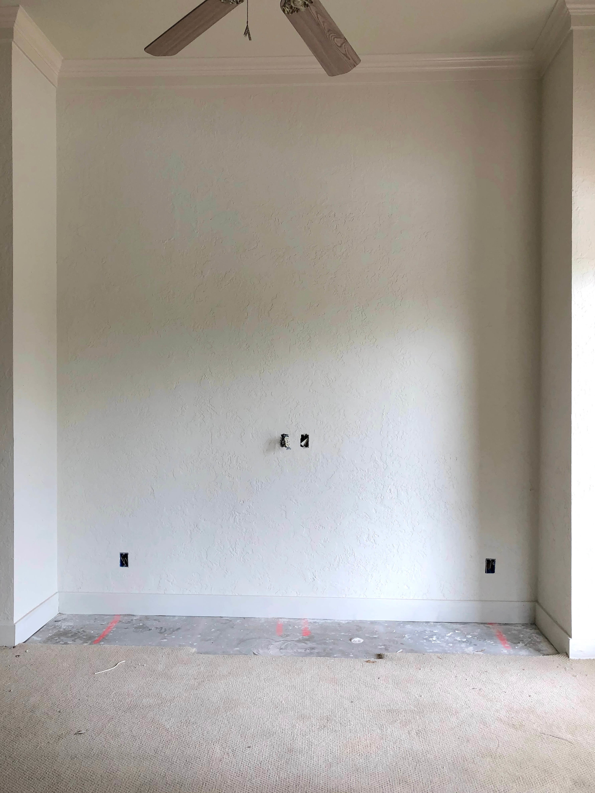
Therefore, we removed it, cleaned up the wall and made it ready for a beautiful piece of furniture and a flat screen tv or whatever a new home owner would like to put there. :-)
Cabinetry is removed and wall is patched and painted ready for new carpet to go down.
We’ll be removing that dated looking ceiling fan too and install a nice light fixture. There was already a dark bronze ceiling fan in this room, over the bed.
Things are shaping up and this house will soon be on the market!
I just love quick remodels like this where some strategic, savvy design input can make a huge impact.
SEE THE FINAL RESULTS OF THIS REMODEL HERE!
Are you considering putting your house on the market for sale?
If you have a house you need to sell, you might want to check out my local consultation service for some advice on helping get your property ready for buyers.
If you are planning on selling next spring, when the market is typically really hot, and need to so some updating to get your house ready, you should start now to get it done in time.
Contractor: Tony Knepper, Knepper Enterprises


