I can’t wait to share the dining room and music room with you in this project reveal today. They turned out so striking with some sophistication and boldness that only high contrast can give.
Let’s start in the music room.
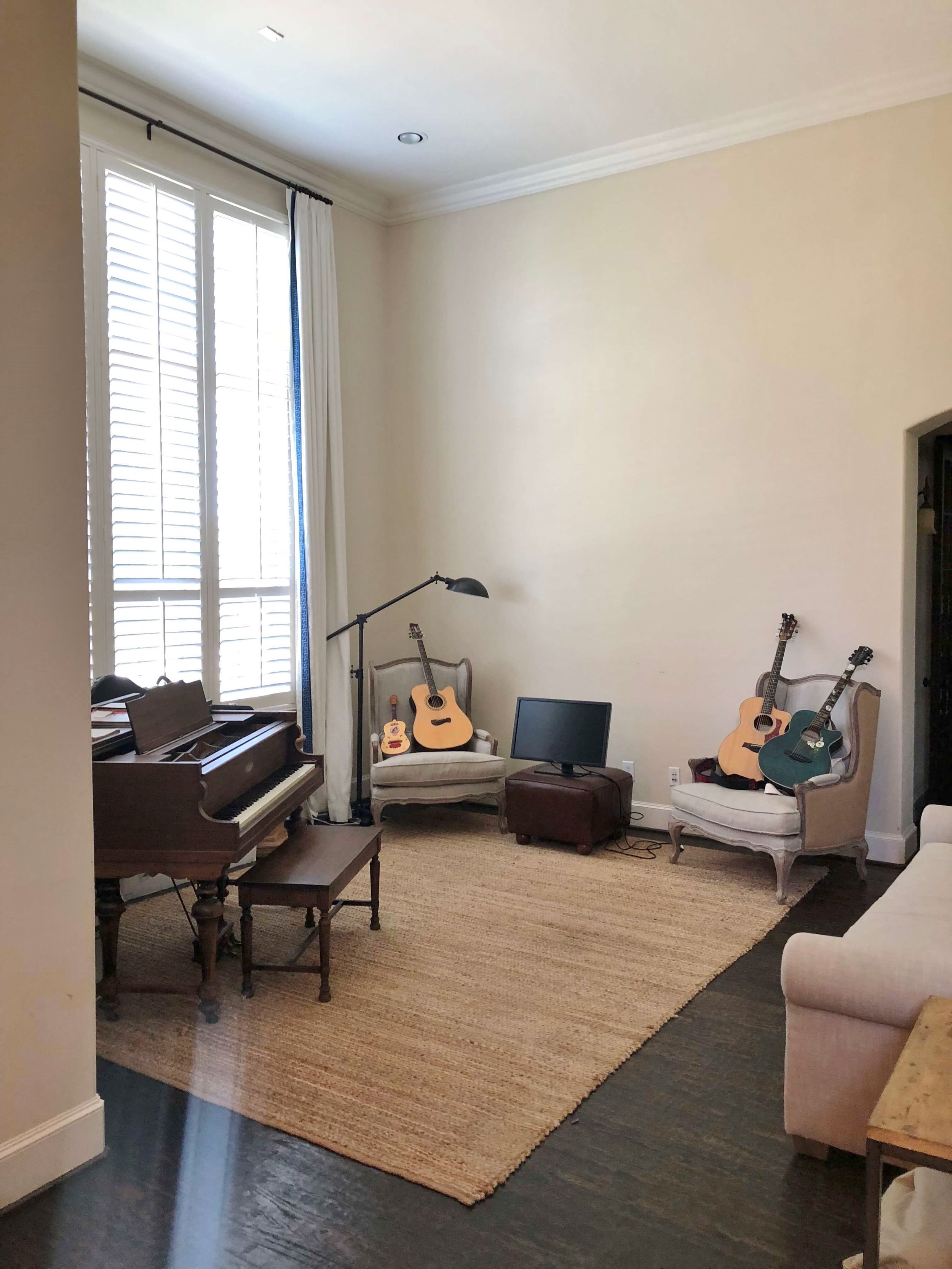
The piano was a beautiful wood and I wanted to feature that more prominently in the space. We also wanted to keep the curtain panels, as they had been custom made and in a white linen with some trim, they could work nicely in the updated room.
We reused the homeowner’s existing sofa too, but relocated it in the space. It is an exceptionally deep sofa and I felt it was best on the far wall.
Here was the before pic.
BEFORE PIC |PROJECT REVEAL - A Striking Dining Room And Music Room Made Over With High Contrast | Designer: Carla Aston, Photographer: Colleen Scott
In this remodel/makeover, we painted the whole house a light neutral white, SW Alabaster, to brighten things up and add some crispness to the envelope. Everything was a little too bland before and the walls and trim were slightly yellowish in tint.
All walls, ceilings, and mouldings were painted the same white. We originally wanted to go whiter, but with the existing shutters in an more yellowed white, SW Alabaster was just the right choice.
Except in the music room. (And some bedrooms.:-)
Here, I felt the need to go bolder, to contrast with the light neutral sofa and draperies that we would keep. I also wanted to make this room feel like a special space, dedicated to music and perhaps a place to escape for some solitude.
So, we wrapped it in a rich, dark navy. :-)
PROJECT REVEAL - A Striking Dining Room And Music Room Made Over With High Contrast | Designer: Carla Aston, Photographer: Colleen Scott | #musicroom #navywalls #piano
That beautiful Antilocarpa carpet from Stark, one of my faves, always makes for a dramatic floor.
We spruced up that sofa with some new pillows, a pair of pretty brass lamps, a few glamorous tables and then hung some graphic art.
Now the beautiful wood piano adds warmth and brings in some detail. It feels like a featured and beloved piece in the room.
We also did new drapery hardware in a distressed silver finish to stand out against the dark walls and repeat the finish on the art framing. :-)
PROJECT REVEAL - A Striking Dining Room And Music Room Made Over With High Contrast | Designer: Carla Aston, Photographer: Colleen Scott #navywalls #antilocarpa
I thought the opposite wall, where the sofa was previously, was perfect for a simple white console and a mirror to reflect the light from the windows across the room.
It allowed more space for the path to the home office beyond and became a striking visual all by itself.
I love the brassy touches here, as it adds warmth and a very current style to the room.
PROJECT REVEAL - A Striking Dining Room And Music Room Made Over With High Contrast | Designer: Carla Aston, Photographer: Colleen Scott #foyer #entryhall #navywalls
Next up is the dining room, just across from this striking space.
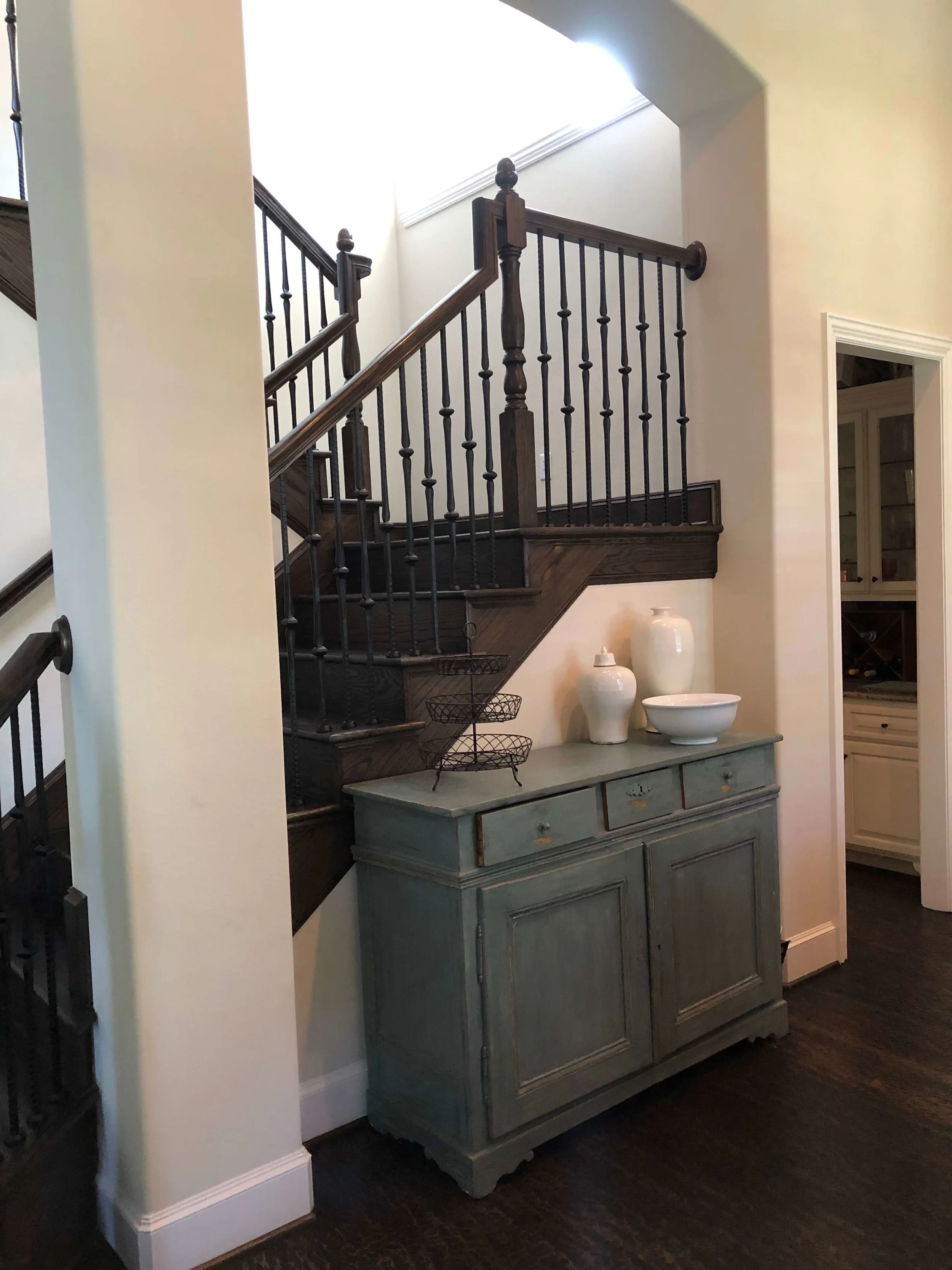
Here are the before pics.
BEFORE PIC |PROJECT REVEAL - A Striking Dining Room And Music Room Made Over With High Contrast | Designer: Carla Aston, Photographer: Colleen Scott
BEFORE PIC |PROJECT REVEAL - A Striking Dining Room And Music Room Made Over With High Contrast | Designer: Carla Aston, Photographer: Colleen Scott
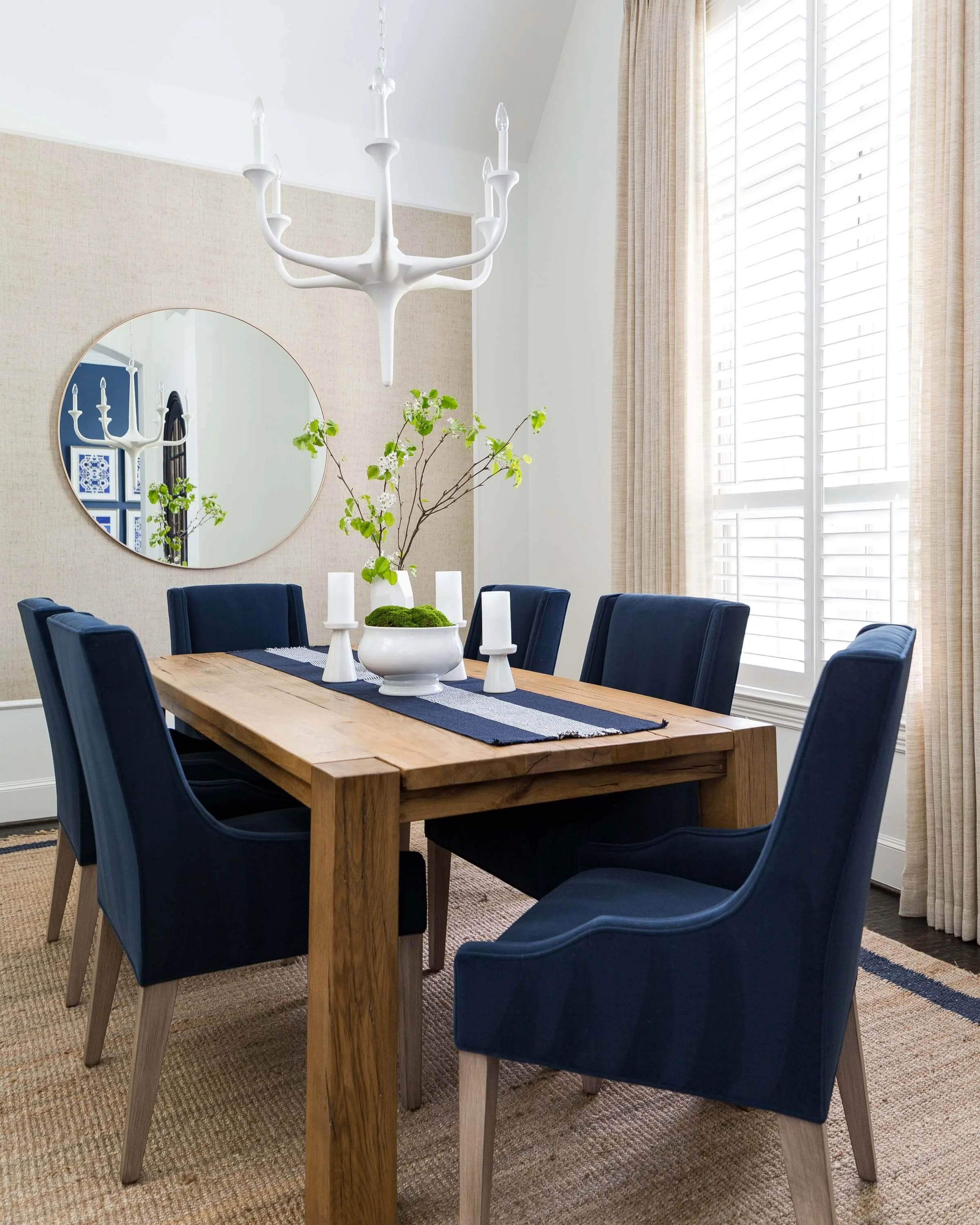
You can’t see the dining table in those photos, but we reused it in the refreshed space. It was a nice, rustic Parson’s style table that was working great for them.
The chairs and console, however, were not.
They looked tired and again, a little bland. Plus, I wanted to relate it to the beautiful music room.
I started with the idea of the large mirror, reflecting that gorgeous wall color into this space.
PROJECT REVEAL - A Striking Dining Room And Music Room Made Over With High Contrast | Designer: Carla Aston, Photographer: Colleen Scott | #diningroom #navyandwhite
I love how it reflects the white plaster chandelier too, contrasting against the blue walls beyond. It becomes the art in the room, doesn’t it? Mirrors are, after all, all about what they reflect. :-)
Adding in some plush navy dining chairs, a textural rug that repeats the navy color in the border, and then some more neutral texture on the drapery and then the back wall, brought the whole space together.
It worked so well with the existing table and added some elegance without losing the relaxed, casual vibe.
Remember, we are going for a modern crispness here, an update, a pulled together look that works for a busy family, reusing a few of their own pieces.
(Cause we did a bigger remodel in the kitchen that I will share later. ;-)
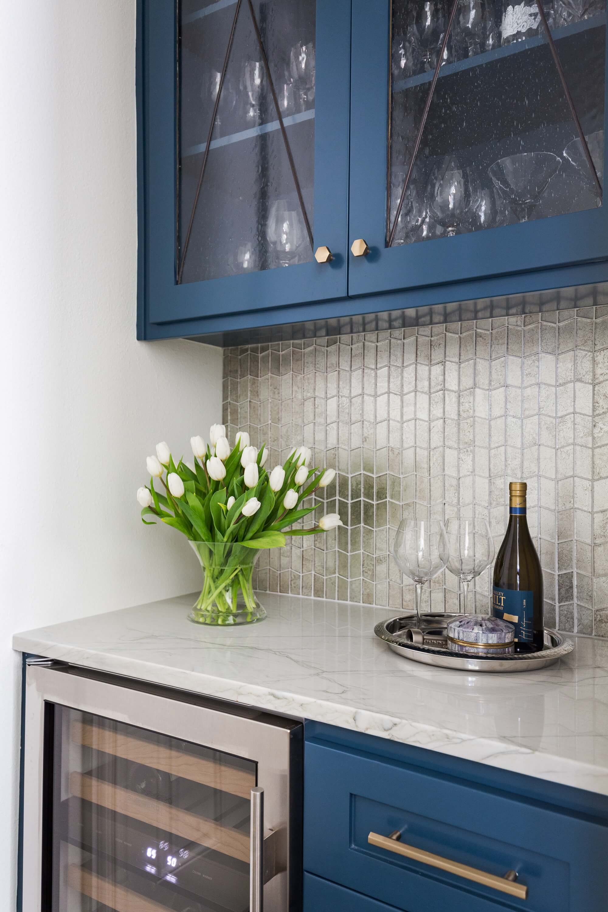
See that little glimpse into the butler’s pantry over on the left of the photo above?
Here it is, below, with it’s glamorous antique mirror tile, brassy knobs, beautiful color, and textured glass cabinet doors.
PROJECT REVEAL - A Striking Dining Room And Music Room Made Over With High Contrast | Designer: Carla Aston, Photographer: Colleen Scott | #butlerspantry #bar #mirroredtile
We changed the blue paint in this little space. I didn’t want to use the same color as the music room as, well, that would be so one-dimensional of me, right? :-)
I knew that going that dark with the navy in this tiny space, that the color would basically look black with no natural light. So, we went brighter and bluer, yet it looks almost the same in the context of the space.
I love all the geometry here. The hex knobs, the tile shape, the X pattern in the leaded glass, all done intentionally to look fresh, modern and up to date.
Here’s a look at the console area of the dining room. I’m especially fond of the relief on the face of the painted carved wood console, it provides more of that geometry and doesn’t look overbearing. Some acrylic knobs add a little sparkle here too.
BTW, I checked that console’s finish sample with our SW Alabaster paint color to make sure our whites were on point.
Because, that’s what designers do. ;-)
PROJECT REVEAL - A Striking Dining Room And Music Room Made Over With High Contrast | Designer: Carla Aston, Photographer: Colleen Scott | #diningroom #navyandwhite
Just to call attention to one extra design feature, that back wall of the dining room.
I really wanted some wallcovering or color in here, even though I loved the white. This room was so full of odd openings and angles, including the angled ceiling that sloped to that back wall. If I had thrown color to contrast on that wall or any walls for that matter, where would I have ended it?
So, I framed out the back wall with a little trim and added a textural wallcovering that repeated the coloring in the rug and table to add a little somethin’-somethin’ there.
Oh, and we used that wallcovering elsewhere in the house too and I’ll be sharing that later. :-)
PROJECT REVEAL - A Striking Dining Room And Music Room Made Over With High Contrast | Designer: Carla Aston, Photographer: Colleen Scott | #diningroom #navyandwhite
There I go, putting lots of smileys and winkies all through a project reveal again.
That’s what happens when I share with all you design lovers out there who, I know, get that all these little details add up to thoughtful design. See what a little design intention will do for a home?
I would love a pin to Pinterest here, to help share my work and some of the ideas used in this redo. ;-)
Accolades to these pros:
General Contractor: Shaun Bain, Curb Appeals
“After” Photos Photographer: Colleen Scott


