Design Lovers, I’m excited to share this primary bathroom remodel project I’m revealing today! It was part of a bigger, overall remodel / addition and I think this bathroom turned out beautifully.
First, take a look at the view into this bathroom from the primary bedroom.
My blog contains affiliate links. Any purchases, at no additional charge to you, render me a small percentage, are most appreciated and make this blog possible. :-)
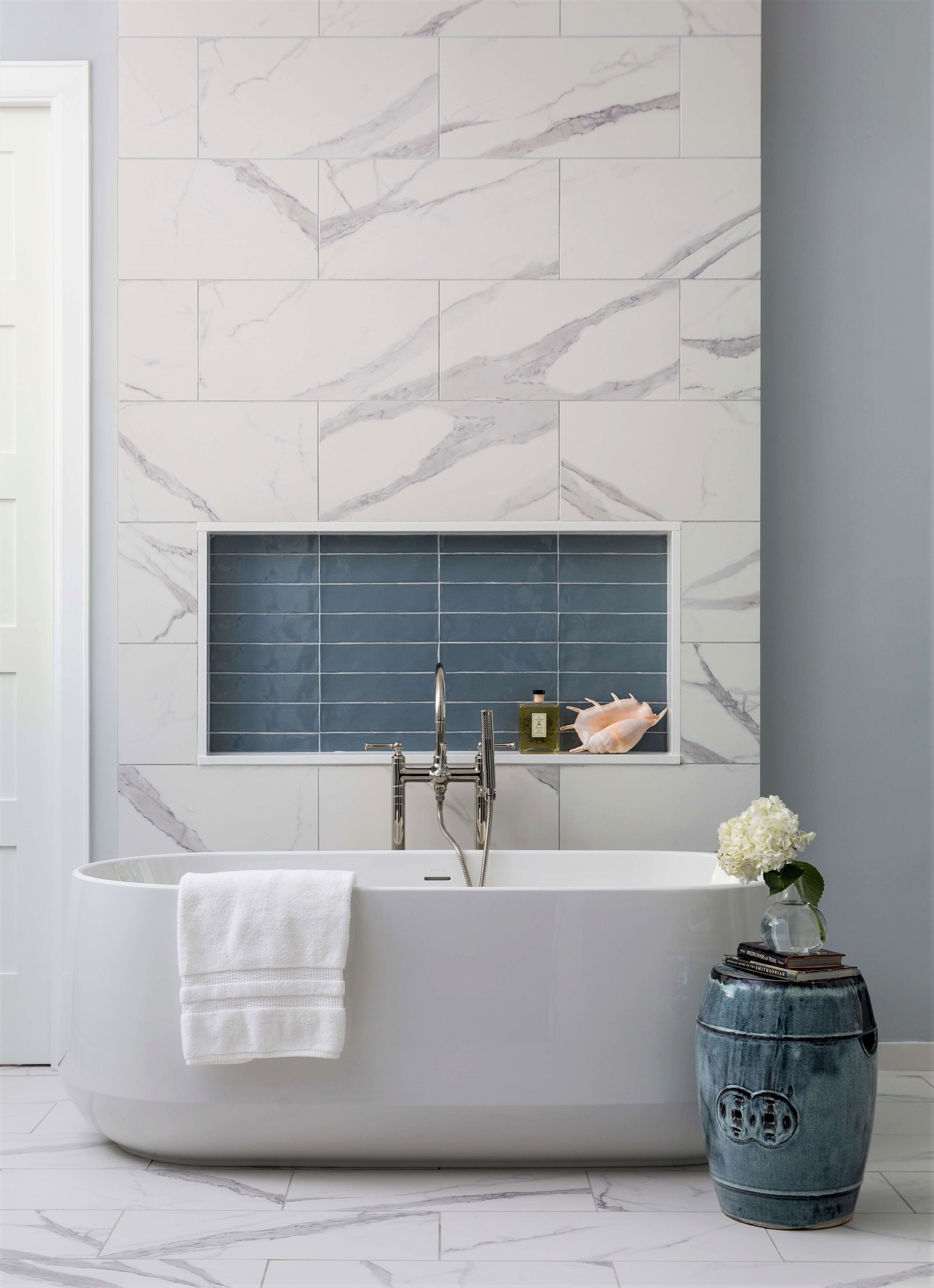
Free standing tubs are here to stay for their gorgeous sculptural look, if nothing else. A handy shampoo niche is close by for stashing toiletries and adding some color contrast to the bathroom. Bathroom Remodel - Carla Aston, Designer | Photographer, Colleen Scott
Gorgeous, right? :-)
I mentioned that this bathroom was part of a bigger remodel. I shared the kitchen, mudroom and mudroom bathroom here, so go take a look at that when you’ve checked out all these photos.
When I started designing this bathroom, I had the drawings from the architect, but we made some changes along the way.
One thing I did in this bathroom is center the free-standing tub on the doors, so that all-important-vista into the bathroom is the best it can possibly be. I want all the bathrooms I design to have a luxurious and spa-like ambience, so my clients can enjoy the time spent in here and have a little place to escape in their own home.
When they peek into their bathroom, I want them to feel like they are in a boutique hotel instead of just their bathroom at home.
This tub was the original one that the homeowner and architect selected and it looks great here, against the tiled wall.
I love a good shampoo niche and this one is handy for bottles and soaps, but also adds some color on this white tiled wall.
Another change in the plan was to connect the closet, which is just beyond that door to the left that leads to the closet, go on through to the laundry room. It’s so conveniently located and the dirty clothes or towels never have to be walked out into the main part of the house.
The laundry room is a dream, I can’t wait to share that later. :-)
Bathroom Vanities
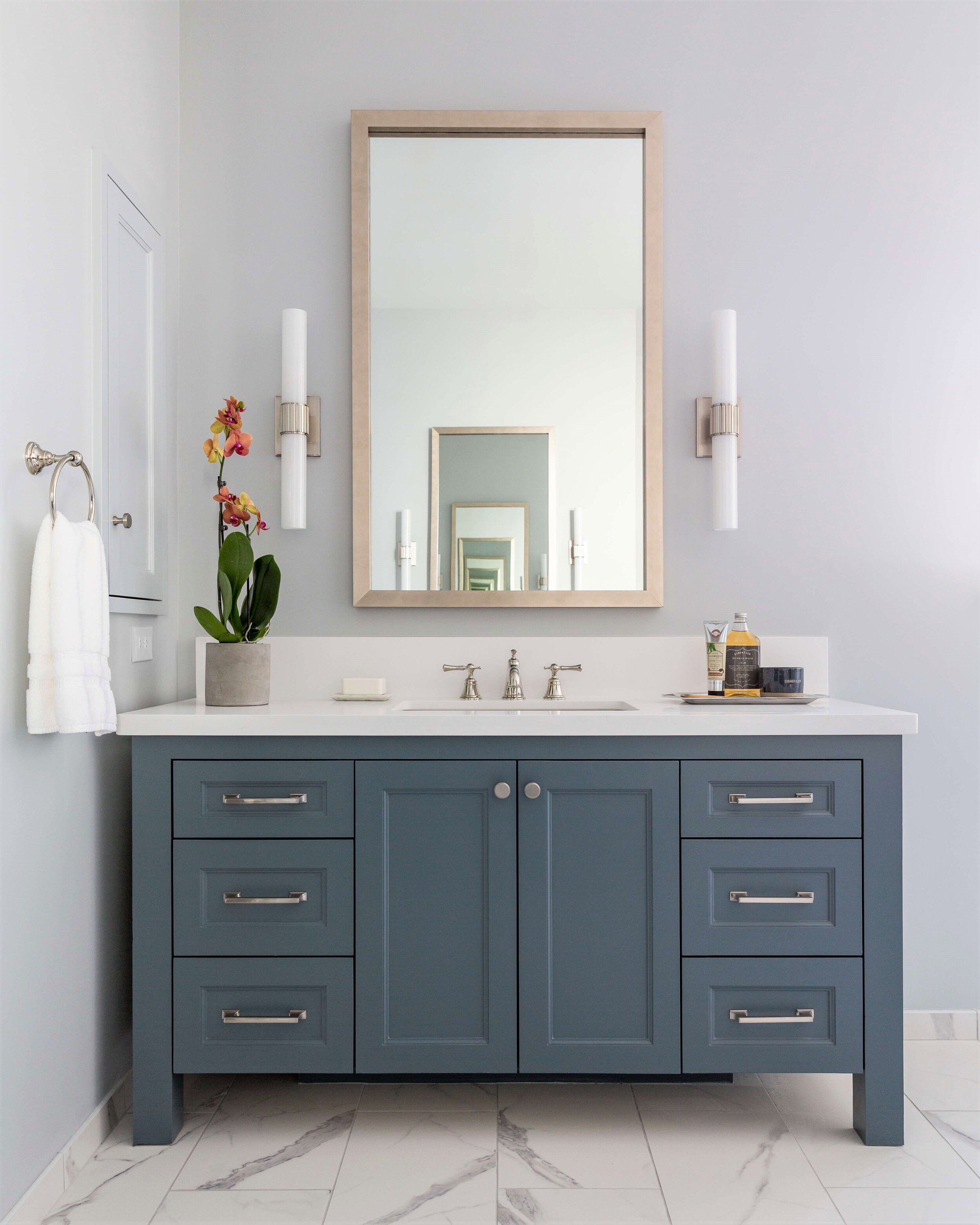
The bathroom vanities here were custom designed to look like a free-standing cabinet, painted the color of the shower tile, so that the color is repeated around the room. The medicine cabinets were painted to blend with the wall so they didn’t stand out.
The vanity cabinet was given a more custom look with legs. The built-in medicine cabinet is painted to match the wall to blend in. Bathroom Remodel - Carla Aston, Designer | Photographer, Colleen Scott
That white marble look tile on the floor, from Arizona Tile, is a great porcelain. It’s durable and easy to maintain. Since we had pattern in the room with the marble look tile, I went with a solid white quartz countertop and splash.
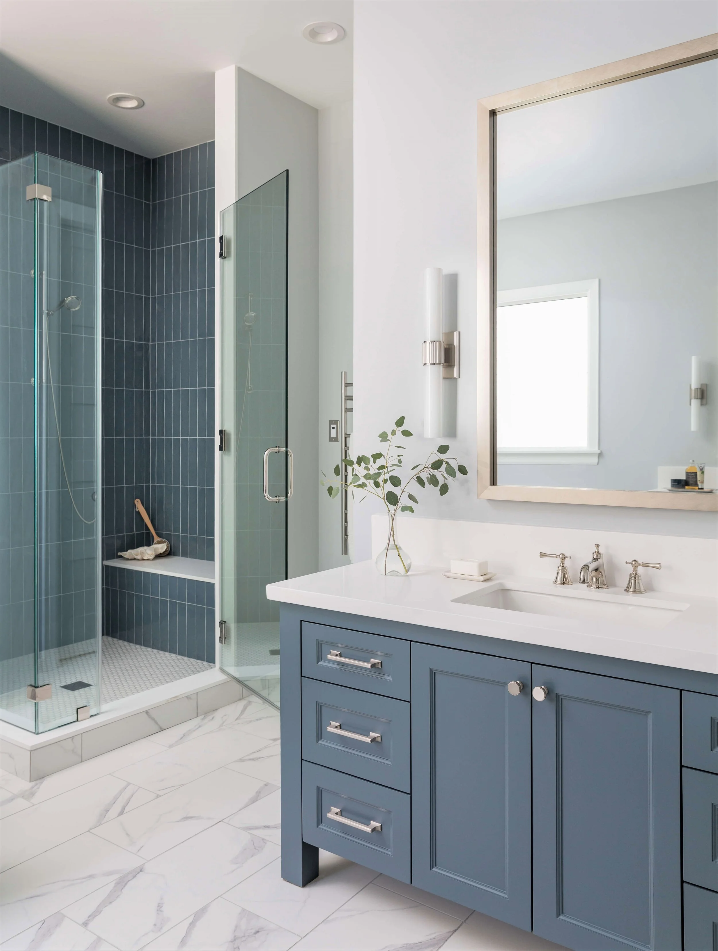
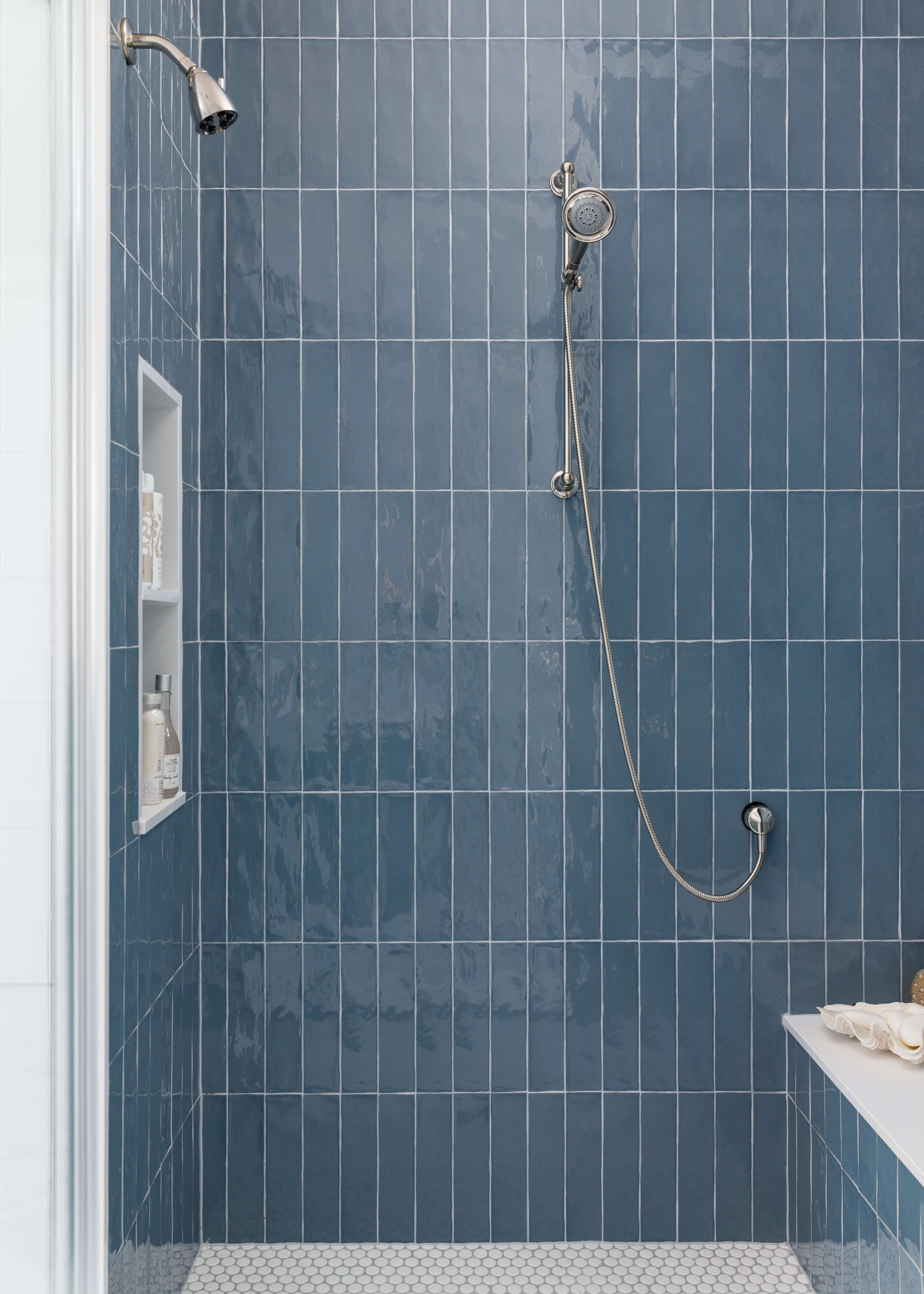
The shower is so gorgeous, covered in Arcilla Azul tile from Ann Sacks. Laying it vertically just makes so much sense here with the shower tucked back into the corner with the high ceiling.
The vanity cabinet color was selected to match the tile in the shower stall. Satin nickel finishes keep a cool tone in this bathroom. Bathroom Remodel - Carla Aston, Designer | Photographer, Colleen Scott
We had lots of horizontally laid rectangular tiles in the house already, and the original tile selection was a picket shape in this space. We had to reselect since it was unavailable and this was really the perfect solution.
I used the quartz slab material at the shower seat, curb and jamb of the shower opening. It was also used around the shampoo niches too. It’s a pricier installation, but such a clean look and is easy to maintain too.
White jumbo penny tiles from Walker Zanger were used on the shower floor. Good for traction and a clean, simple look.
I just love the glossy look of these shower tiles from Ann Sacks, laid in the vertical pattern. The jumbo penny tile floor is a nice contrast in shape, size and color for this shower stall. Bathroom Remodel - Carla Aston, Designer | Photographer, Colleen Scott
This shampoo niche is tucked behind the corner hidden from view in the bathroom. Trimming it out in solid quartz slab material keeps it easy to maintain and makes for a crisp look. Bathroom Remodel - Carla Aston, Designer | Photographer, Colleen Scott
A Mr. Steam heated towel bar adds a luxurious touch in this bathroom. Shower controls are tucked inside the stall to the right of the glass door.
The vertical layout of tile in the shower echoes the tall slender space it occupies in the bathroom. White quartz slab material trims out the bench, niche, curb and jamb of the shower stall for ease of maintenance. Bathroom Remodel - Carla Aston, Designer | Photographer, Colleen Scott
The blue color is repeated around the room with the tile niche, small drum table and bathroom vanity cabinet color. A heated towel bar, from Mr. Steam, is a nice luxury addition to any bathroom. Bathroom Remodel - Carla Aston, Designer | Photographer, Colleen Scott
I’m so happy with the way this bathroom turned out! I’ve got more to share from this family friendly home, three more fun bathrooms that I’ve shared here.
This tiled shampoo niche is perfect for stashing bottles and potions for the tub. It creates a lovely vignette as you look into the bathroom from the bedroom. Bathroom Remodel - Carla Aston, Designer | Photographer, Colleen Scott
Kudos to the other pros on this job:
Contractor - Lucas Craftsmanship
Architect - Morningside Architects
Photographer - Colleen Scott
Are you thinking of remodeling your bathroom in the new year?
The time is now to start planning. Plumbing fixtures, lighting and tile are all having issues with lead times these days. It’s a good idea to start thinking of all your options now.
Check out my Bathroom Design Guide to get my detailed list of options and considerations that I run through, when planning a bathroom remodel.
I’ve had lots of questions about the tile and fixtures used in this bathroom. Subscribe to my blog below and you can get the product source list.
Pin this to Pinterest to save for later reference!
Primary Bathroom Remodel Reveal with blue tiled shower, a gorgeous free standing tub and fabulous shampoo niches. Carla Aston, Designer | Photographer, Colleen Scott

