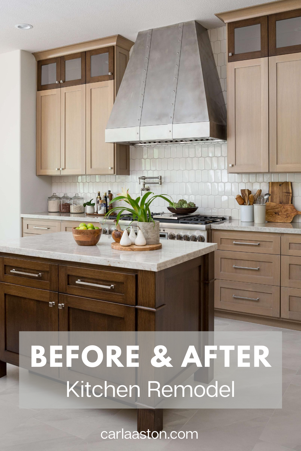
I’m sharing a kitchen remodel today with oak wood cabinets and some before and after pics you will love!
The kitchen “before” had golden oak cabinets, but they were dated and poorly laid out. We went back in with better quality cabinetry, new finishes and a new layout for more up to date and beautifully sophisticated kitchen!
“Before Kitchen” Remodel
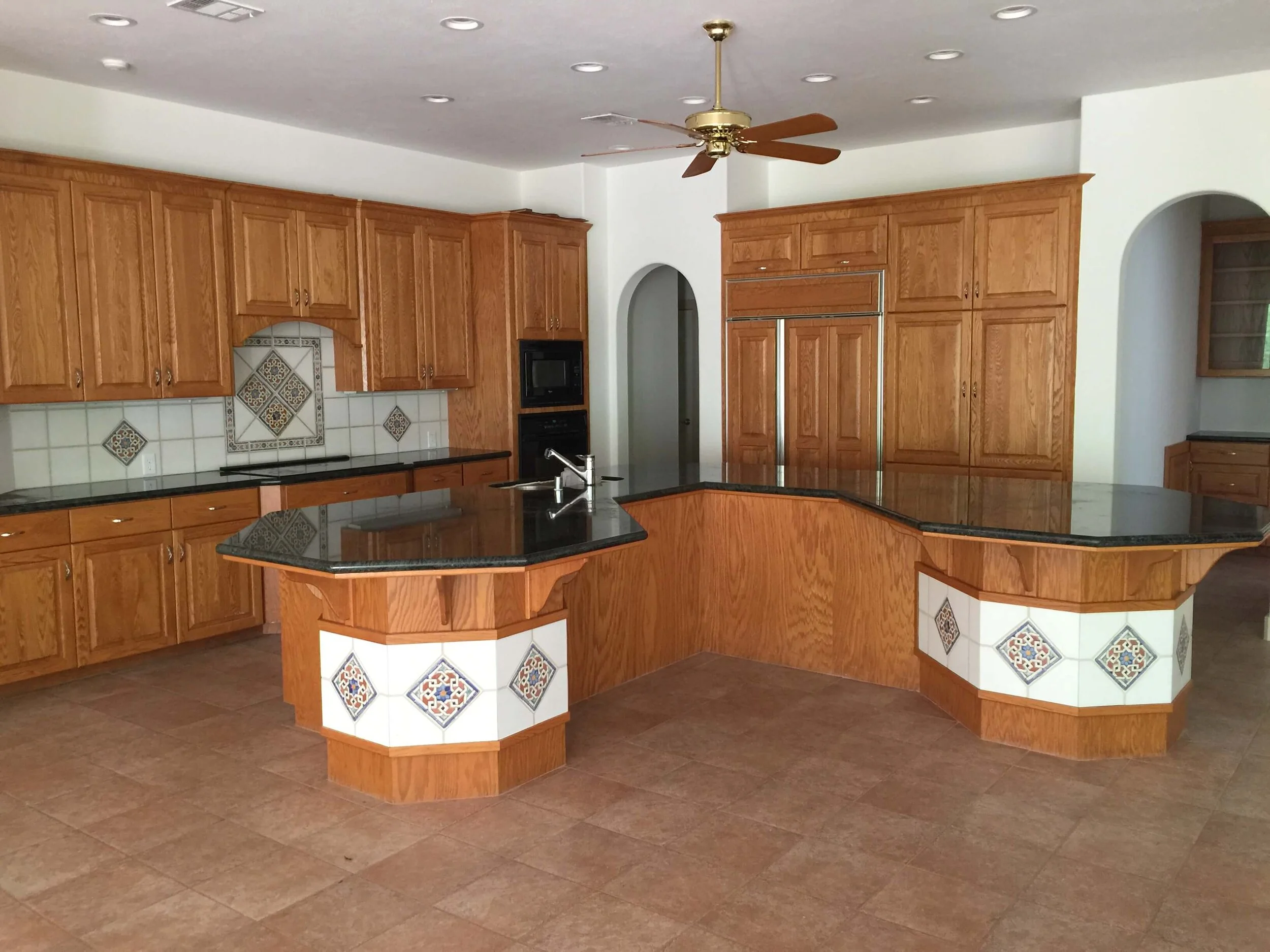
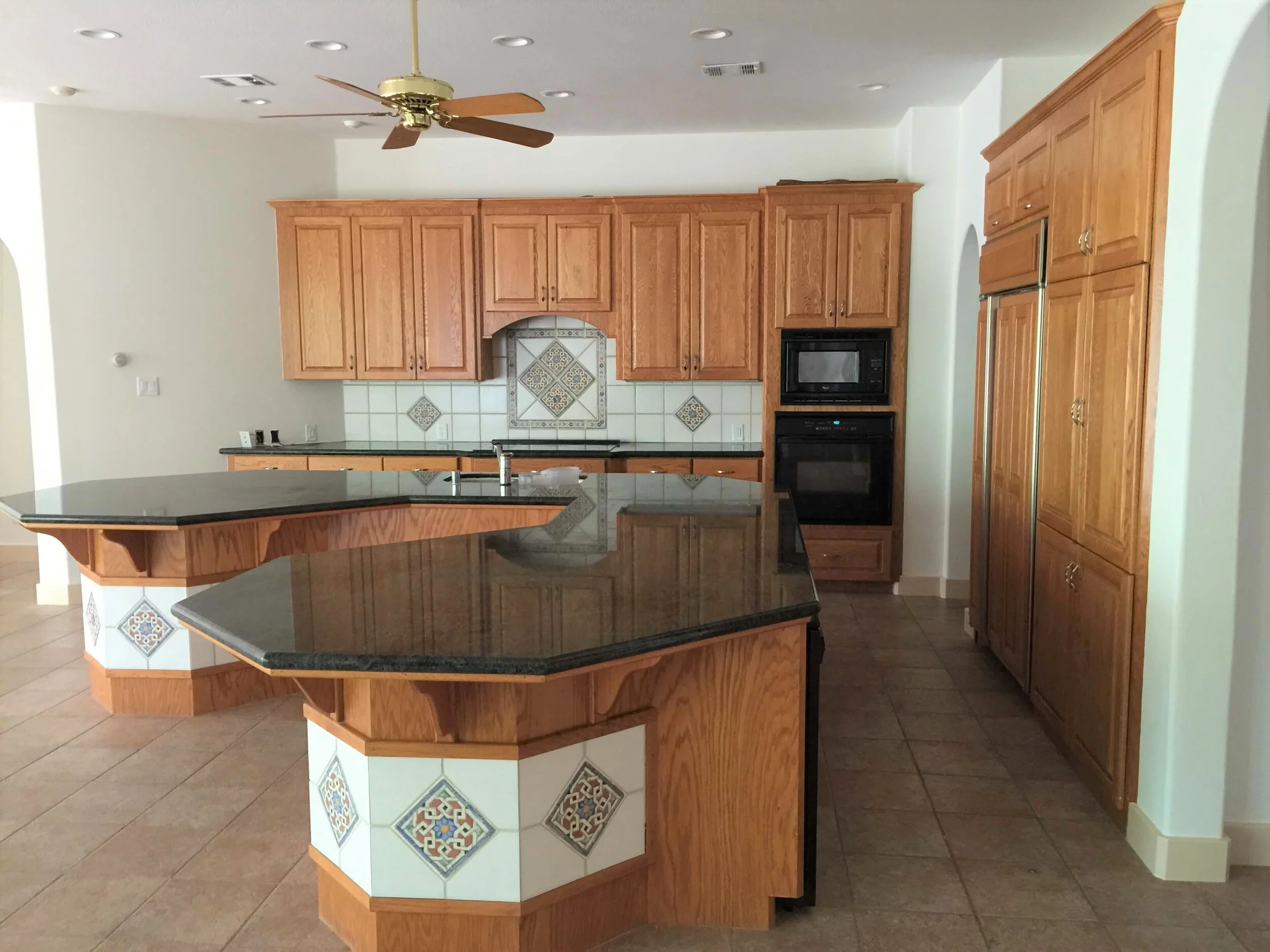
If you’ve been reading my blog, you’ve probably seen the “before” pics of this kitchen. I have shared the poor design of this previous space and it’s oddly shaped kitchen island, the tight layout for such a big area, the exorbitant amount of countertop, and dated tile.
BEFORE Kitchen Remodel - Golden oak cabinets with an oddly shaped kitchen island and dated finishes had to go in this kitchen reno.
BEFORE Kitchen Remodel - Golden oak cabinets with an oddly shaped kitchen island and dated finishes had to go in this kitchen reno.
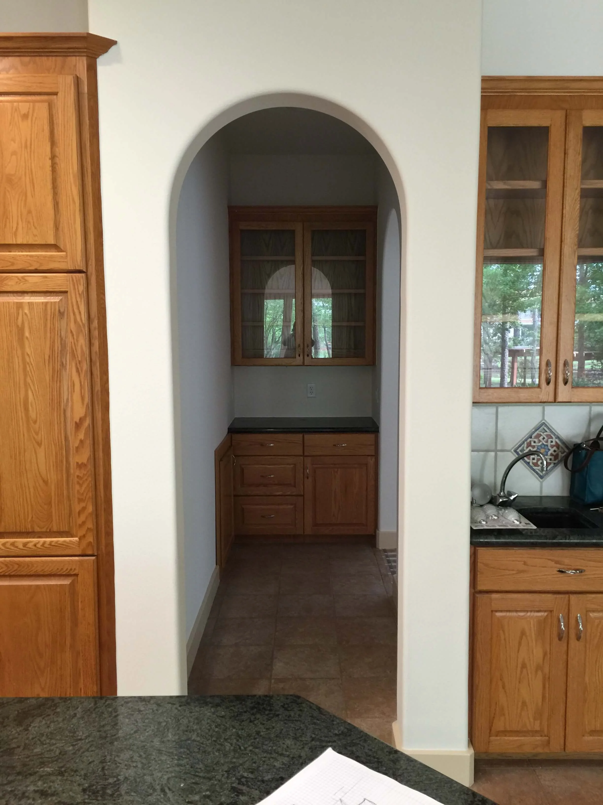
We enclosed this butler’s pantry to build a new pantry closet since we opened up the adjacent wall more to the dining room. There was no need for this little hall to the dining room anymore.
Problems to Fix in this kitchen remodel
Layout - The homeowner liked a lot of countertop space, but the shape of this island pinched in the kitchen’s work area. With a wide open space to play with, the layout was not very effective.
Hood - There was a downdraft on the back wall, behind the cooktop. Downdrafts are really the most inefficient way of getting rid of odor and cooking grease. All that just doesn’t draft “down” naturally. Drafting up is much more natural and efficient, regardless of the quality of the venting.
You should see my downdraft vent in action. It actually pulls the flame on my gas cooktop over to the vent side and makes my cooking surface uneven when on.
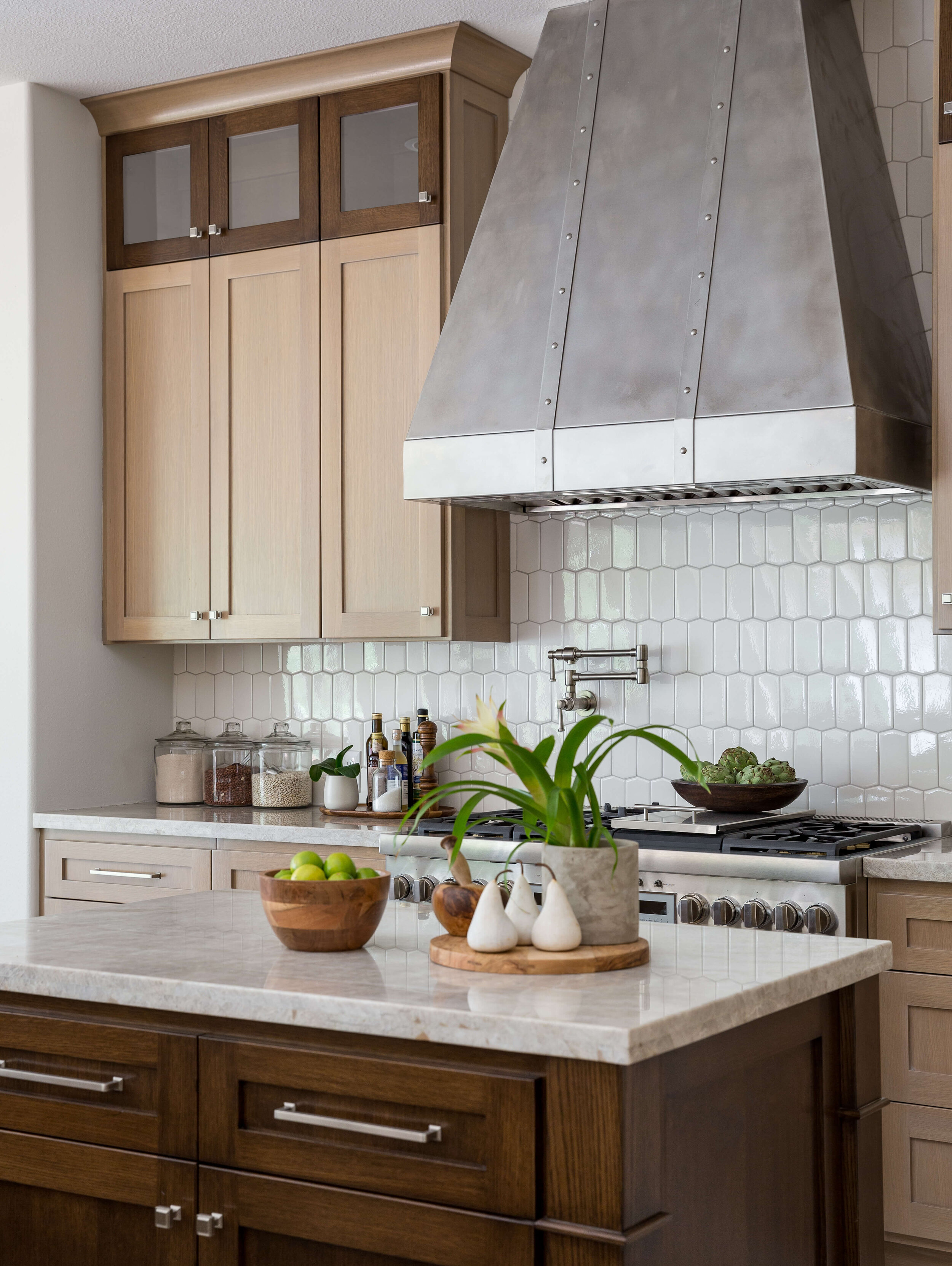
Focal Point - I wanted to make the hood a large, focal point in the kitchen, while taking the venting up and out, above the cooking surface. It was the perfect place for a custom hood design, which was exactly what we did.
I really did not like the angled wall on the left side of that wall and the way the cabinetry ended there. That kind of careless detail always presents visual problems with upper cabinets and backsplashes, so I had that squared up in the layout.
Define the perimeters of the kitchen - This kitchen was so big and open. That’s a great problem to have, right? In this case, I wanted to define the kitchen work area better and still provide a lot of counter space for the homeowner’s needs.
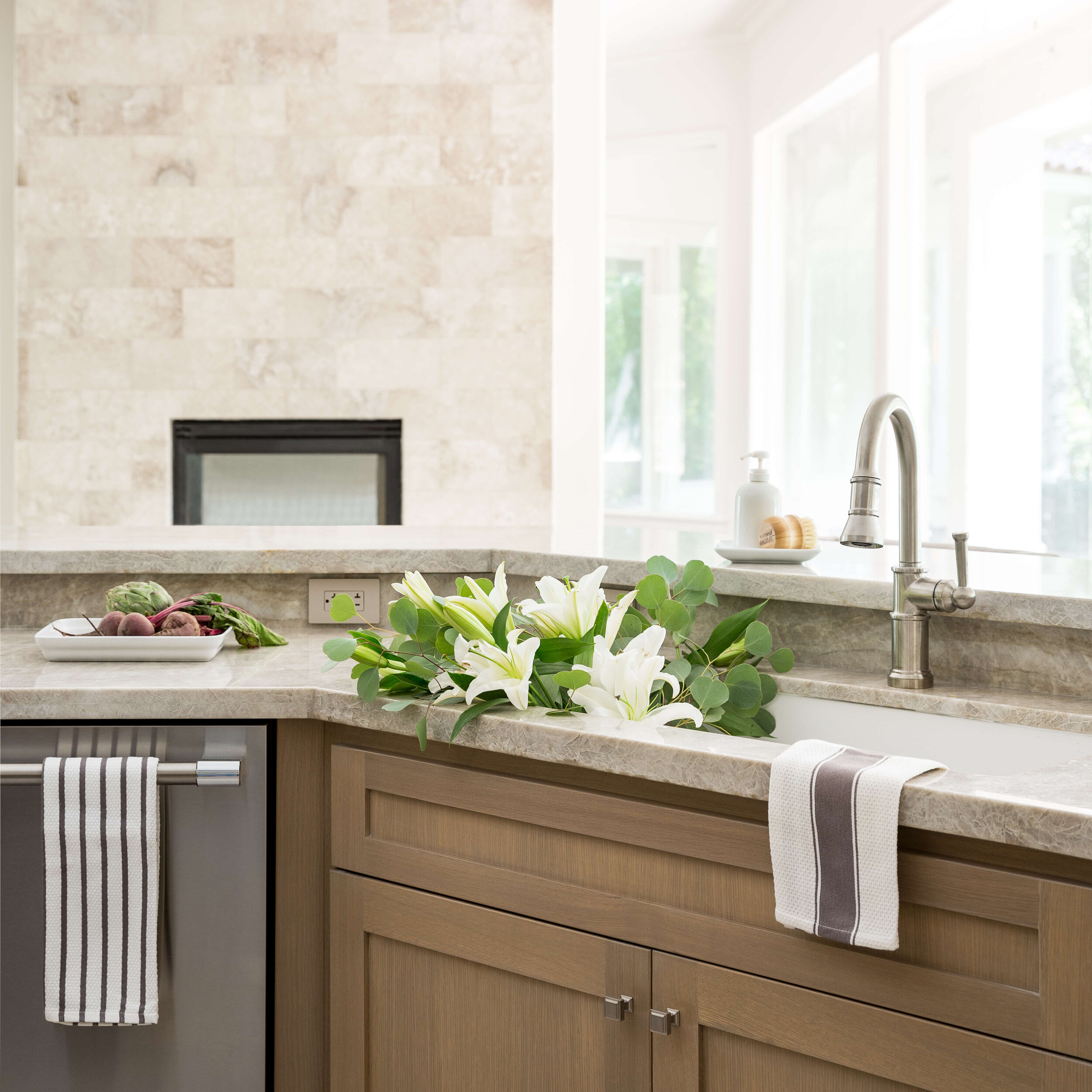
The homeowner liked a high bar at the kitchen sink and really, that worked great in this large, open space and helped set the perimeters for this large kitchen.
Material Considerations - The homeowner had requested dark wood cabinets at the beginning of the job. They had also debated flooring materials, whether to go wood or tile. They liked really light tile floors and ultimately decided they needed the durability of porcelain tile.
That decision really dictated the selection of the cabinetry and other finishes. I didn’t want such a high contrast between cabinets and floors. I felt like the lighter wood would be good for the house’s value and we found a gorgeous Du Chateau wood flooring for the other parts of the house.
We ended up matching that for the cabinetry and working in some dark stained wood elements to add some variation and a bit of that dark wood look they had first requested.
This client also likes a relatively calm and simple style without busy pattern or bold contrast. The light rift cut oak cabinetry worked well to provide just that type of feel in the kitchen.
“After” Kitchen REmodel with Oak Cabinets
I’m excited to finally share the end results here!
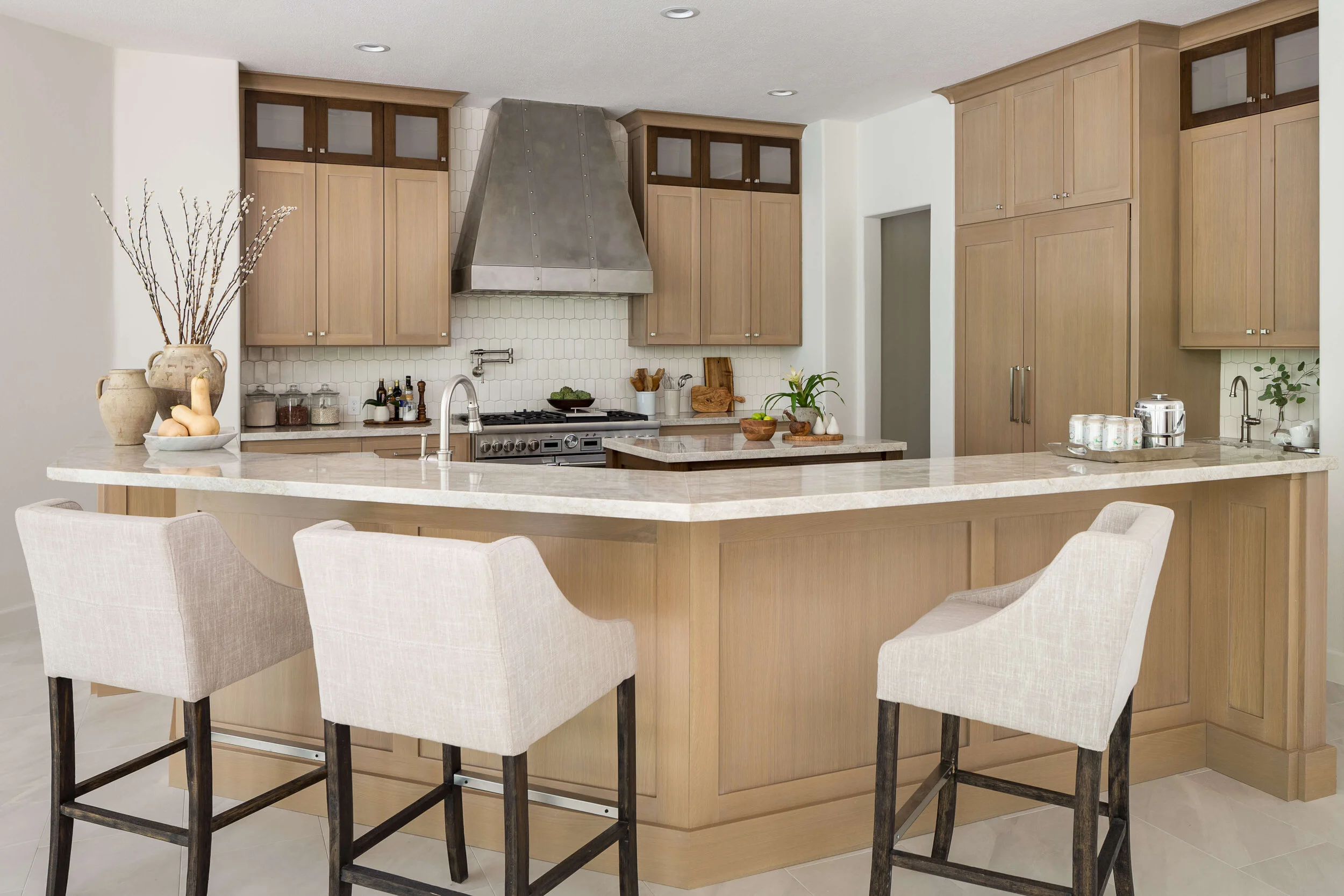
BEFORE AND AFTER KITCHEN REMODEL - Light, rift cut oak cabinetry made for a beautiful, sophisticated kitchen. The hood became the focal point of the space with some contrasting wood elements providing interest and richness. Carla Aston, Designer | Colleen Scott, Photographer
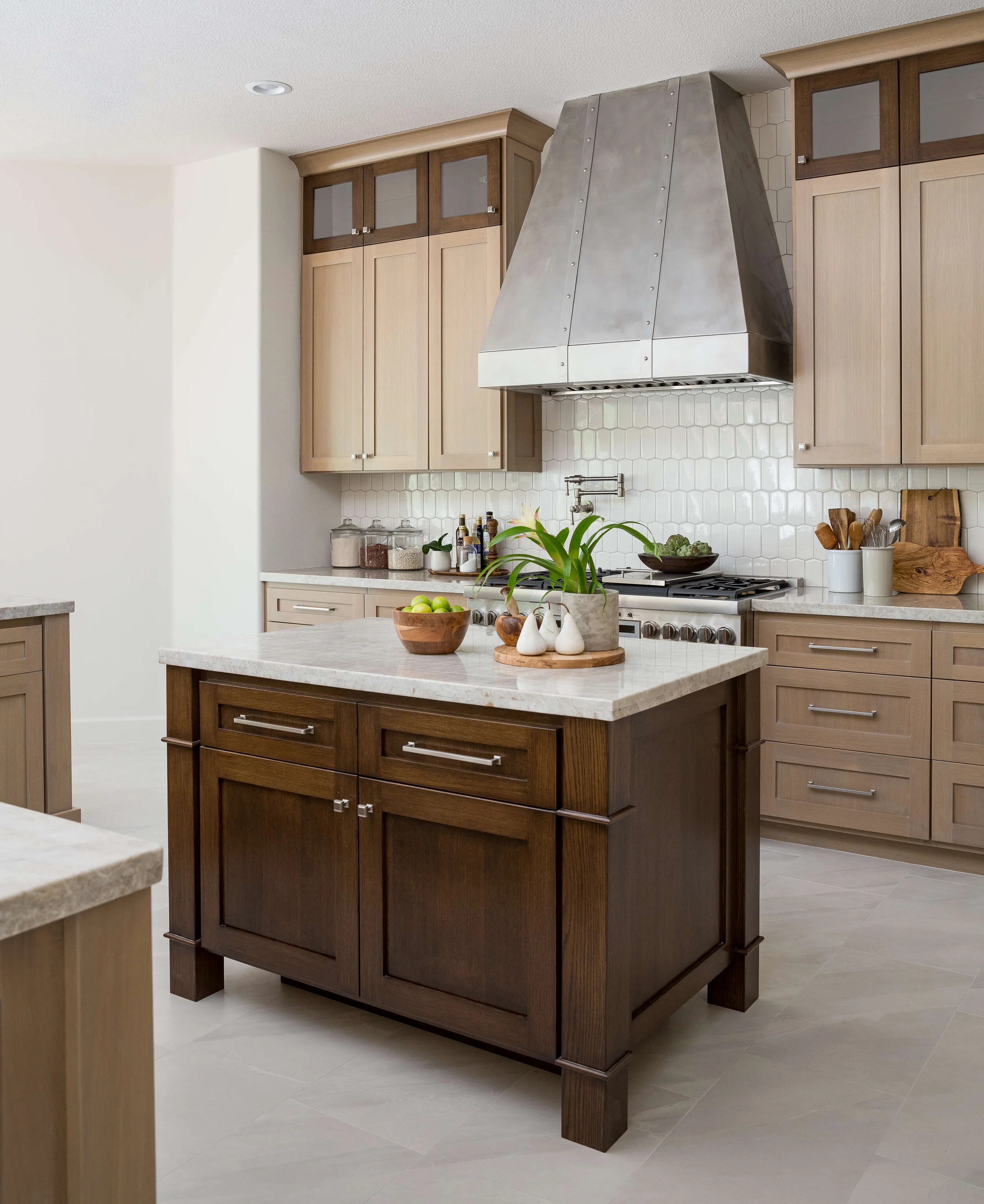
BEFORE AND AFTER KITCHEN REMODEL - The high bar set the perimeter boundaries of this kitchen nicely for such a large, open space. The custom hood and cabinetry made for a striking focal point. Carla Aston, Designer | Colleen Scott, Photographer
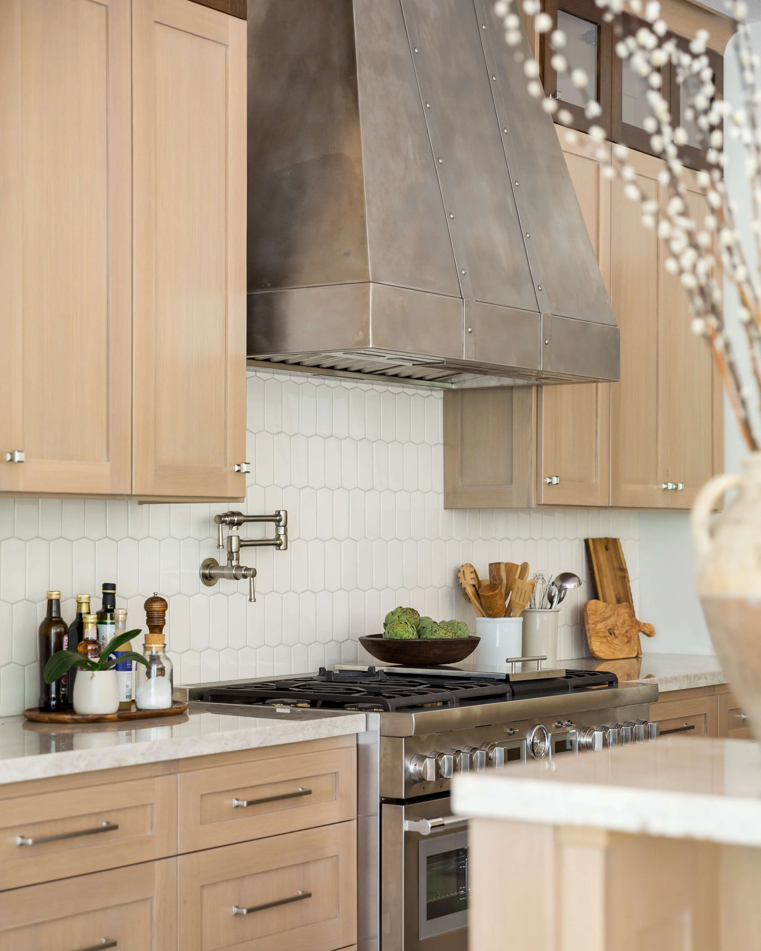
BEFORE AND AFTER KITCHEN REMODEL - A custom designed stainless hood over the Thermador 48” Pro Range. Taj Mahal countertops blend nicely with the light wood cabinetry. Carla Aston, Designer | Colleen Scott, Photographer
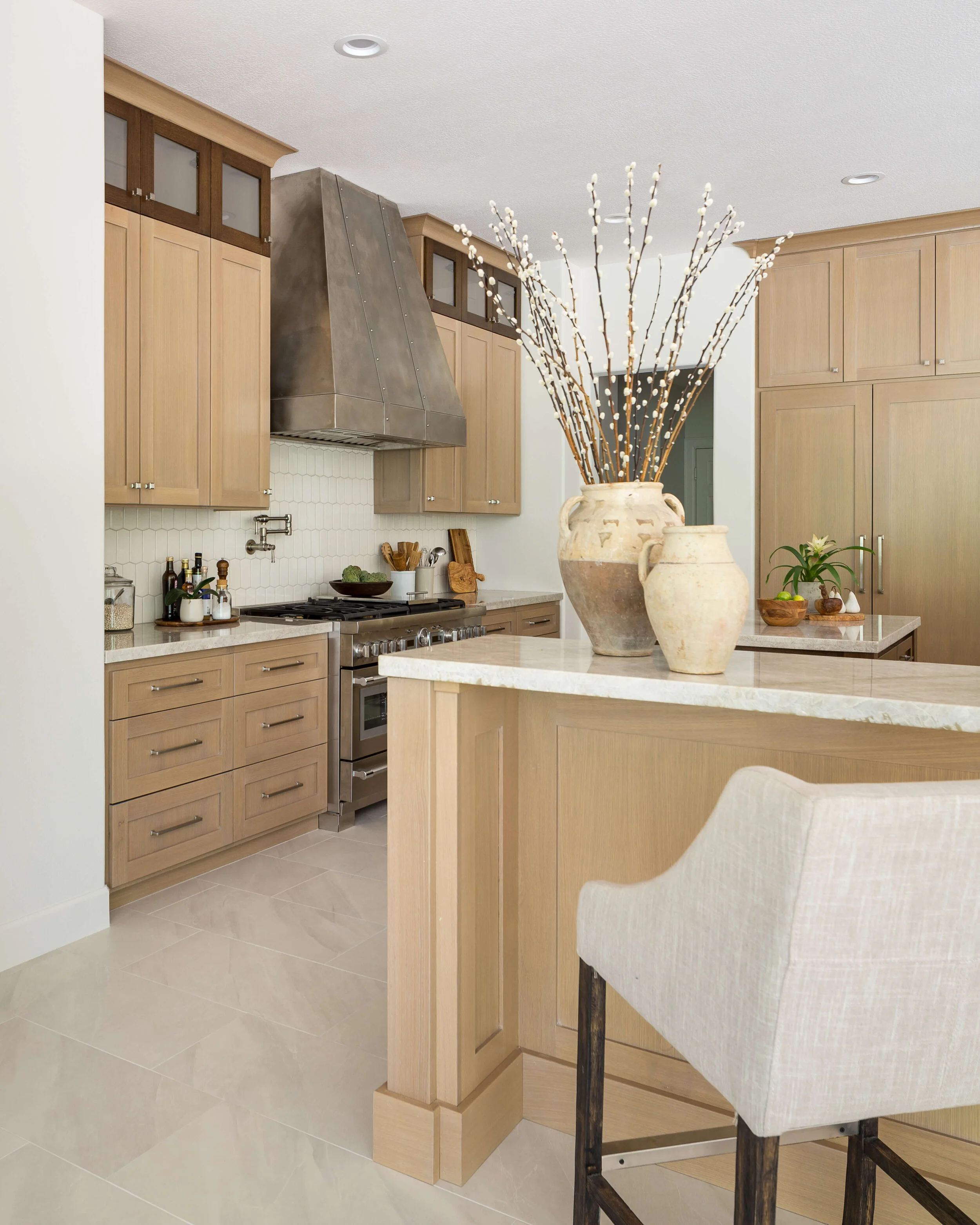
BEFORE AND AFTER KITCHEN REMODEL - The light porcelain tile floor will be really durable for this client. Keeping the majority of the wood cabinets light toned made for a crisp but earthy look. Carla Aston, Designer | Colleen Scott, Photographer
BEFORE AND AFTER KITCHEN REMODEL - Here’s a clear view of the custom hood designed and made especially for this kitchen. The vertical direction of the tile leads your eye up. Carla Aston, Designer | Colleen Scott, Photographer
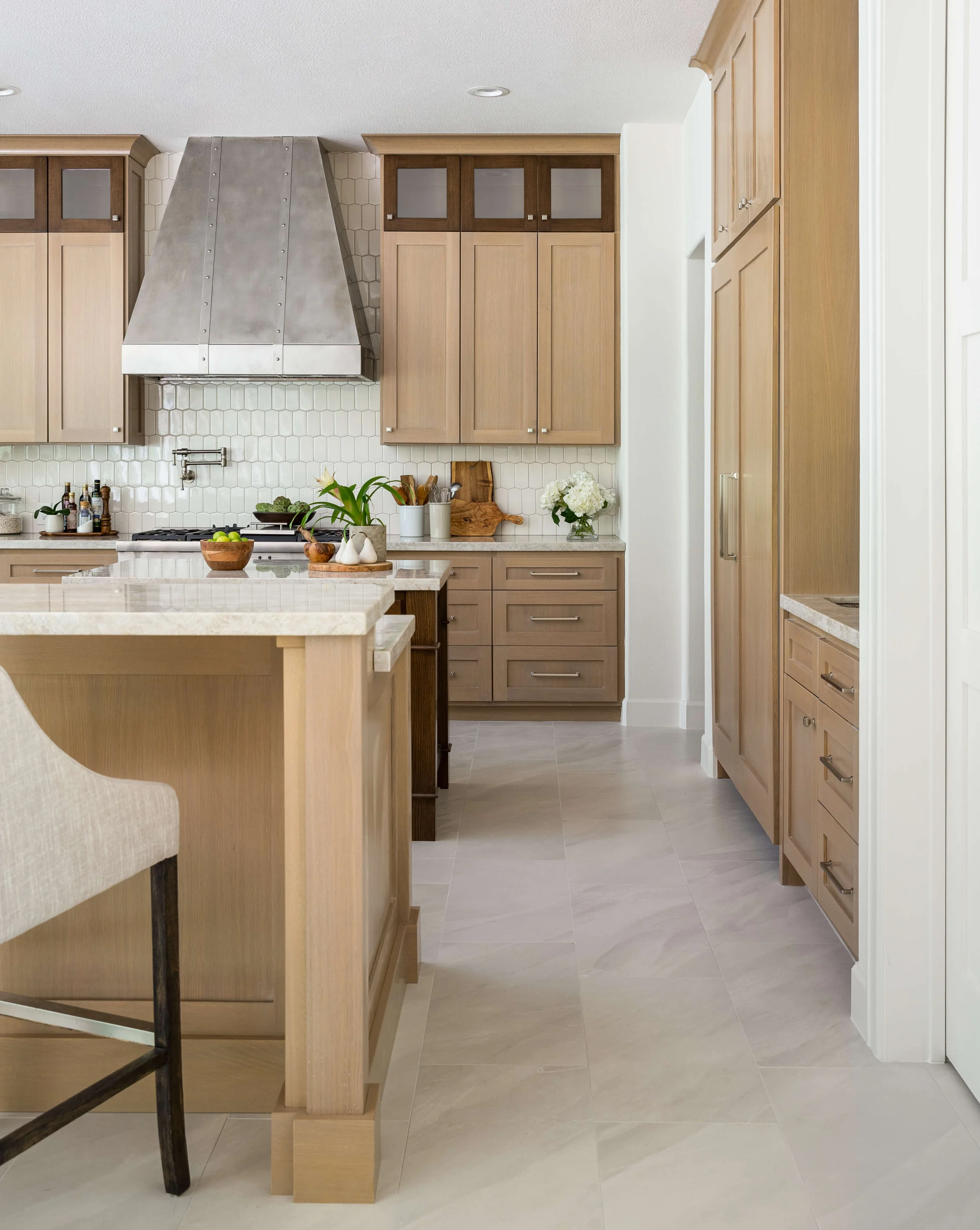
BEFORE AND AFTER KITCHEN REMODEL - The stained wood island stand out in the all the light toned finishes in this kitchen. Carla Aston, Designer | Colleen Scott, Photographer
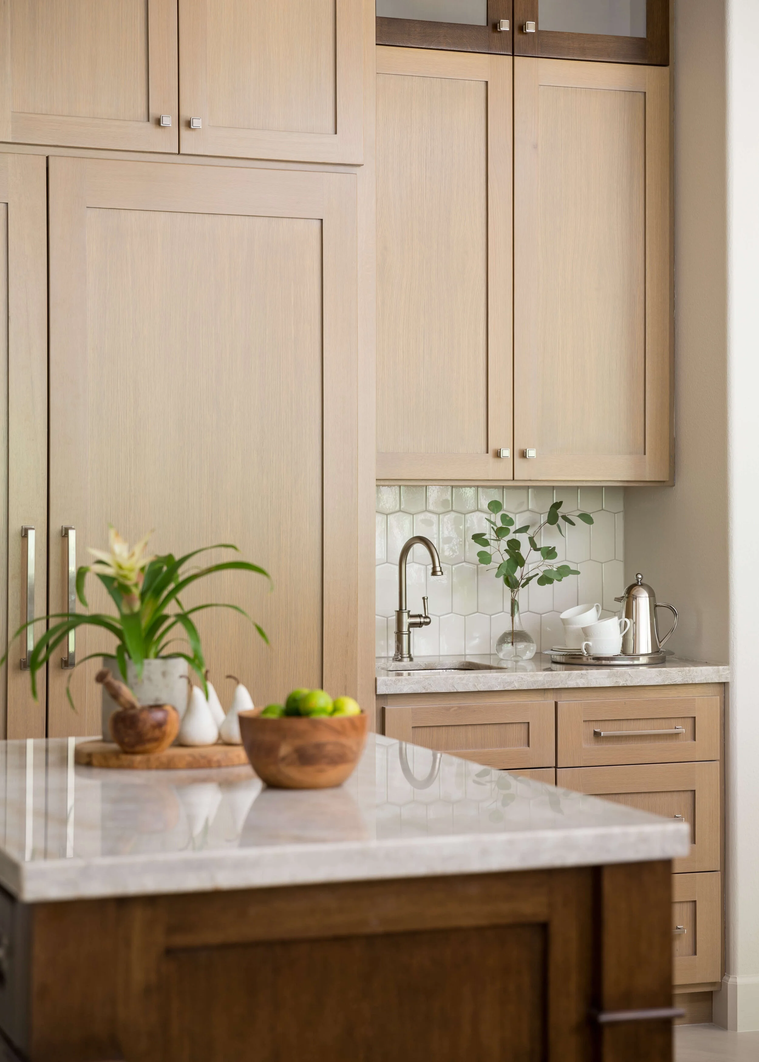
BEFORE AND AFTER KITCHEN REMODEL - The wood paneled refrigerator has a bar sink beside it. The stained wood island stand out in the all the light toned finishes in this kitchen. Carla Aston, Designer | Colleen Scott, Photographer
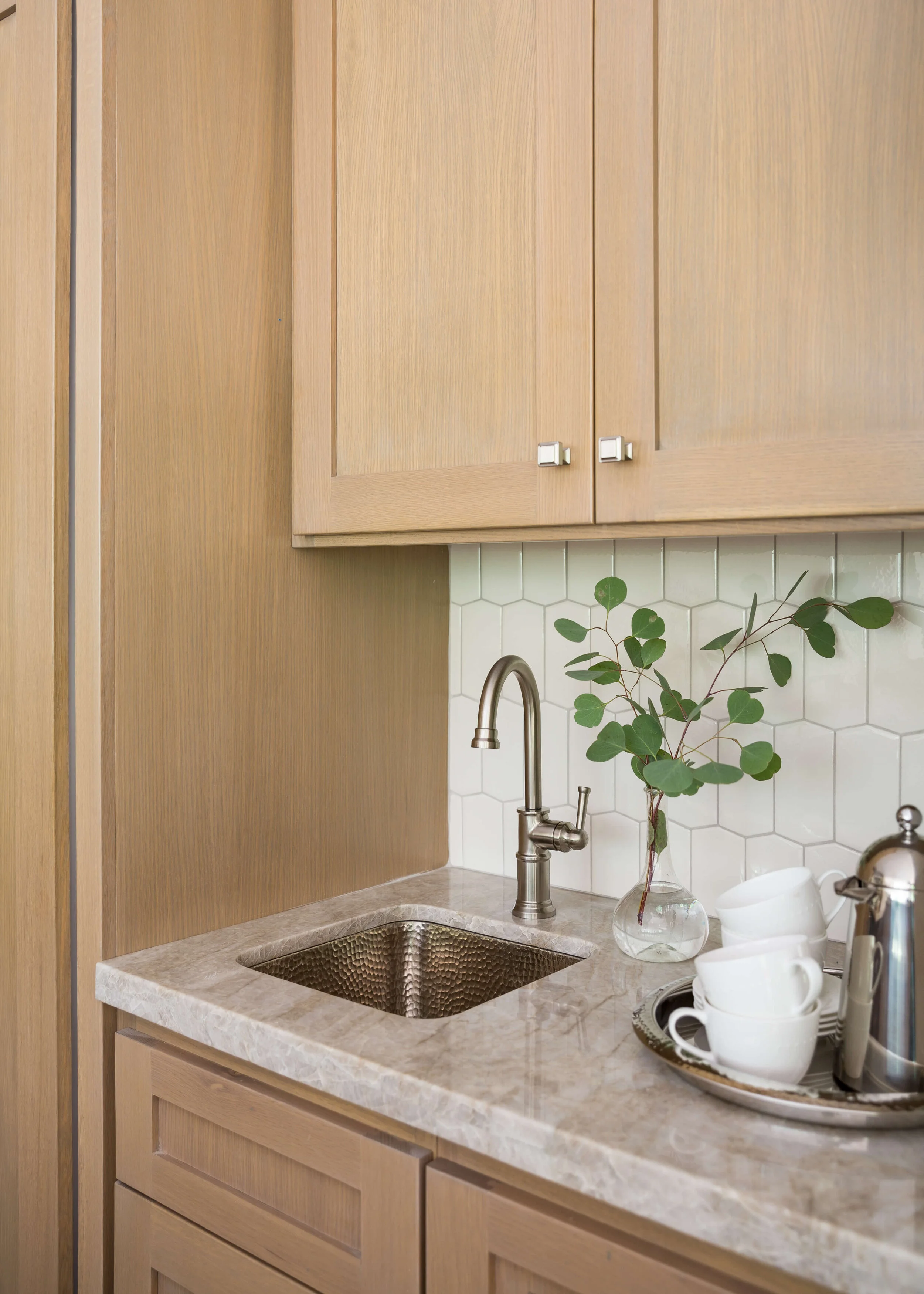
BEFORE AND AFTER KITCHEN REMODEL - The Thompson Traders hammered nickel bar sink gleams over by the paneled refrigerator. Carla Aston, Designer | Colleen Scott, Photographer
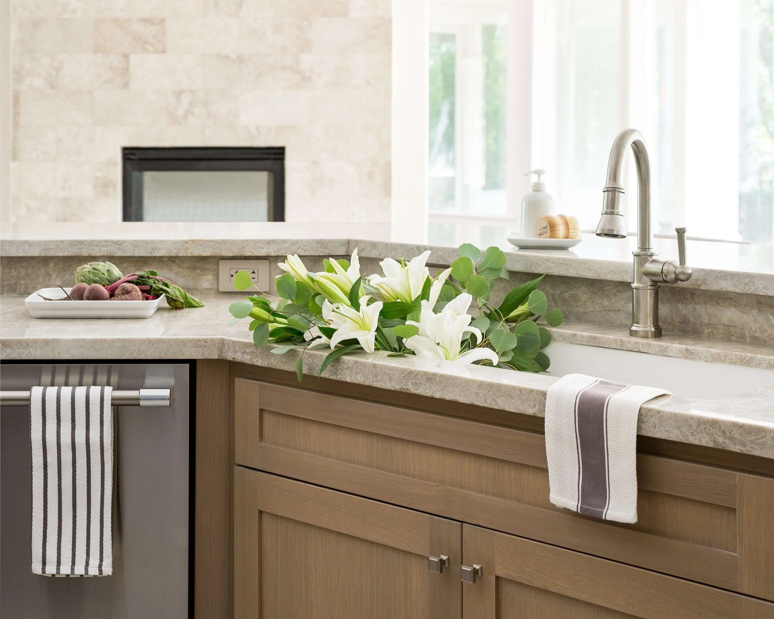
BEFORE AND AFTER KITCHEN REMODEL - Taj Mahal countetops work nicely with light rift cut oak cabinets. Satin nickel touches add a cool tone to all the griege color. Carla Aston, Designer | Colleen Scott, Photographer
I loved the Taj Mahal countertops we used here. They were light but still had that lovely greige/taupe quality that some Taj Mahal slabs can have. They didn’t go too warm, we were lucky to find just the right slabs for this job.
BEFORE AND AFTER Kitchen Remodel With Oak Cabinets - Carla Aston, Designer | Colleen Scott, Photographer
Doing satin nickel on the plumbing fixtures and cabinet pulls tied in the beautiful finish of the custom hood and kept things light and fresh looking.
That subtle tile backsplash from Ann Sacks (which is now discontinued unfortunately) added a vertical quality to the back wall elevation and the gloss finish was just enough polish to reflect the light beautifully from the windows.
I love how this kitchen turned out with all the parameters my clients set. I think it works beautifully in this home. You can see how the overall style and concept was repeated in their master bathroom, that I shared here.
Pin this image to Pinterest for me to help me share, please! Many thanks!
Kudos to these other pros on the project:
Jitka Mayorga - Jr. Designer
Shaun Bain and Gus Bruna - Curb Appeals, Contractor
Colleen Scott - Photographer
See more of this home at these links, below. :-)


I’ve got a couple of bathroom remodels to share today that are the secondary baths of a home. And even though these are neutral and simple, they have an elegant and calm look that would appeal to anyone. Come and take a look….