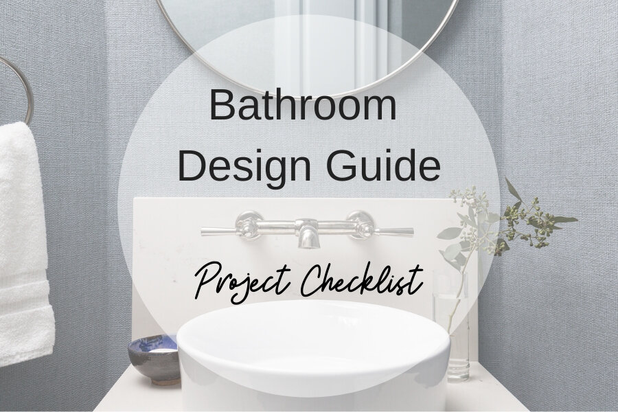
I’ve got a couple of bathroom remodels here to share today that are the secondary baths of a home. And even though these are neutral and simple, they have an elegant and calm look that add a lot of value to a home.
Showing some love to secondary bathrooms can definitely make a home feel finished and thoroughly designed. :-)
Jack And Jill Bathroom Divided In Two
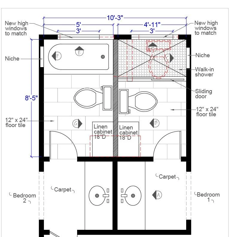
This Jack and Jill had room for a dividing wall in that shared space, but it is a big deal to relocate plumbing and add a new toilet. Especially on a first floor where there is concrete to dig through to make those plumbing changes.
Here was the plan, we added a wall down the center, put a shower on one side, a tub/shower on the other, modified window sizes and locations and included some built-in cabinetry.
Making a Jack and Jill bathroom into two separate baths. Secondary bathrooms need love too! Check out these simple but beautiful, secondary bathrooms. Carla Aston, Designer
I love the arch here at the vanity that was here before. I’m glad this one part of these bathrooms that remained. The tone on tone wallpaper and white finishes bring a calm appeal. An arched slab backsplash repeats the curves.
Secondary bathrooms need love too! Check out these simple but beautiful, secondary bathrooms. Carla Aston, Designer | Colleen Scott, Photographer
Here’s the interior space of the bathroom with the shower. This bathroom got a luxury toilet with a bidet seat. Very appropriate these days, no?
Secondary bathrooms need love too! Check out these simple but beautiful, secondary bathrooms. Carla Aston, Designer | Colleen Scott, Photographer
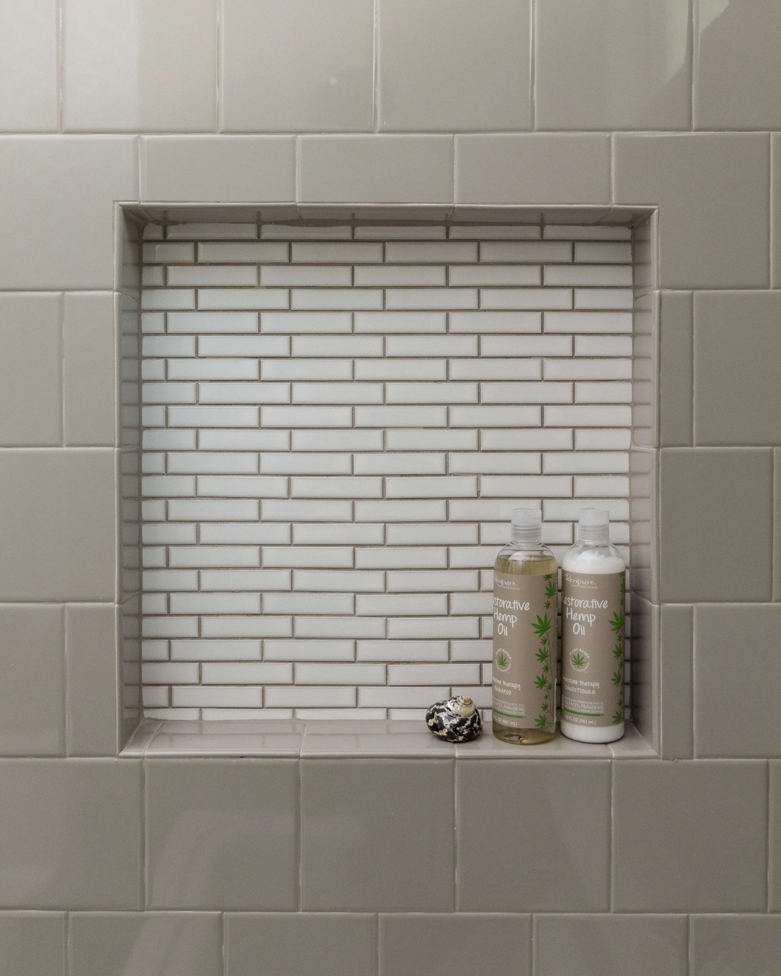
I love a pretty shampoo niche. We kept this one simple.
Secondary bathrooms need love too! Check out these simple but beautiful, secondary bathrooms. Carla Aston, Designer | Colleen Scott, Photographer
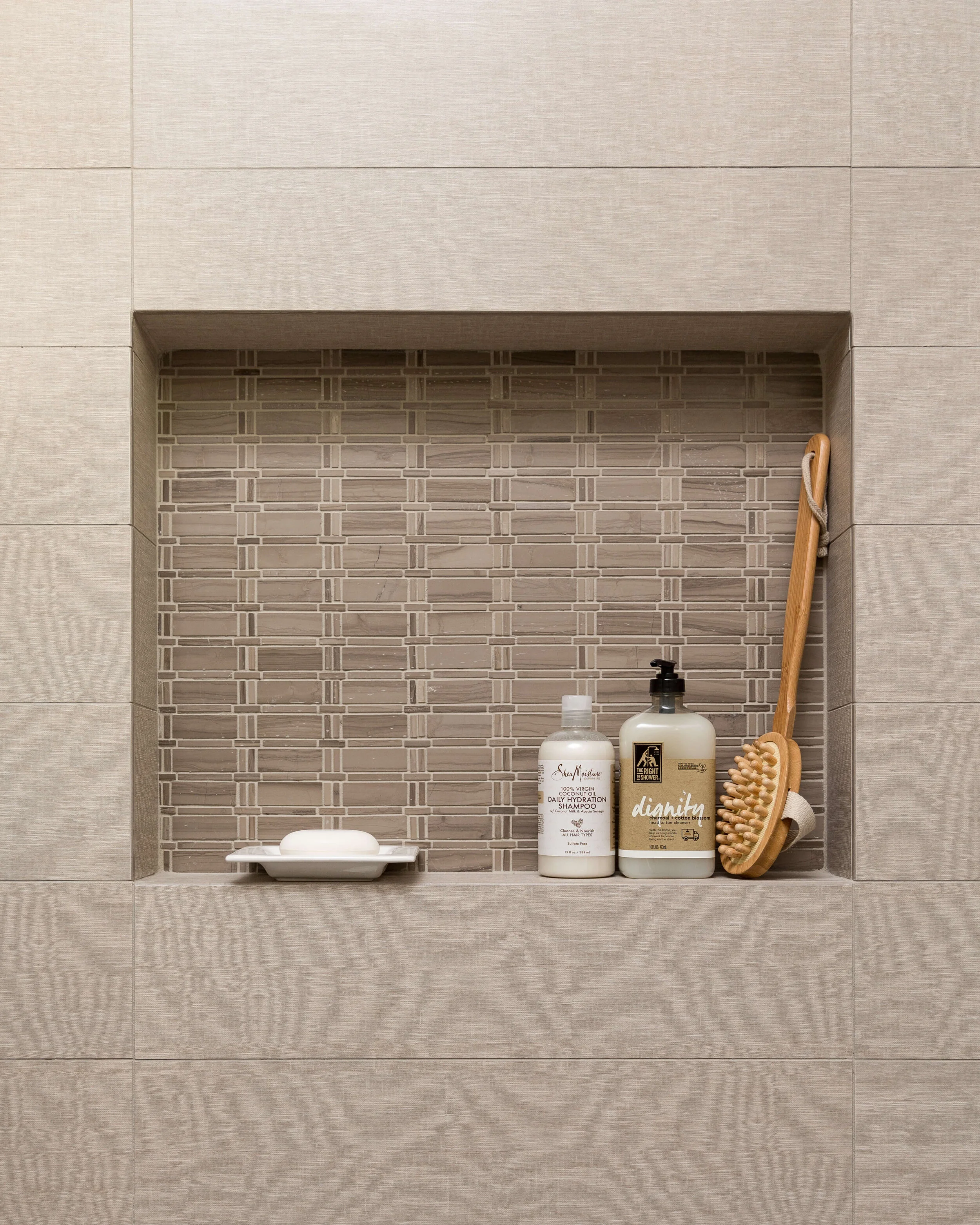
In the bathroom on the other side of the wall, we used a darker neutral tile with more small mosaic ceramic tiles in the niche.
Secondary bathrooms need love too! Check out these simple but beautiful, secondary bathrooms. Carla Aston, Designer | Colleen Scott, Photographer
Upstairs Bathrooms Need some Love too!
One of the upstairs bathrooms in this home had a shower built out with a wall. We opened it up with shower glass, and ran the same tile that was on the floor, over the curb and into the shower floor to help make this small space feel bigger. A large white subway tile was cost effective while keeping things simple and light.
Here’s the BEFORE pic of the shower.
BEFORE Image - The walled in shower was opened up to create a larger feel in this upstairs bathroom. Secondary bathrooms need love too! Check out these simple but beautiful, secondary bathrooms. Carla Aston, Designer | Colleen Scott, Photographer
And here’s the AFTER.
Secondary bathrooms need love too! Check out these simple but beautiful, secondary bathrooms. Carla Aston, Designer | Colleen Scott, Photographer
We did another simple shampoo niche with the shower floor tile repeated on the back wall.
Secondary bathrooms need love too! Check out these simple but beautiful, secondary bathrooms. Carla Aston, Designer | Colleen Scott, Photographer
Guest Bath Made More Convenient with a Curbless Shower
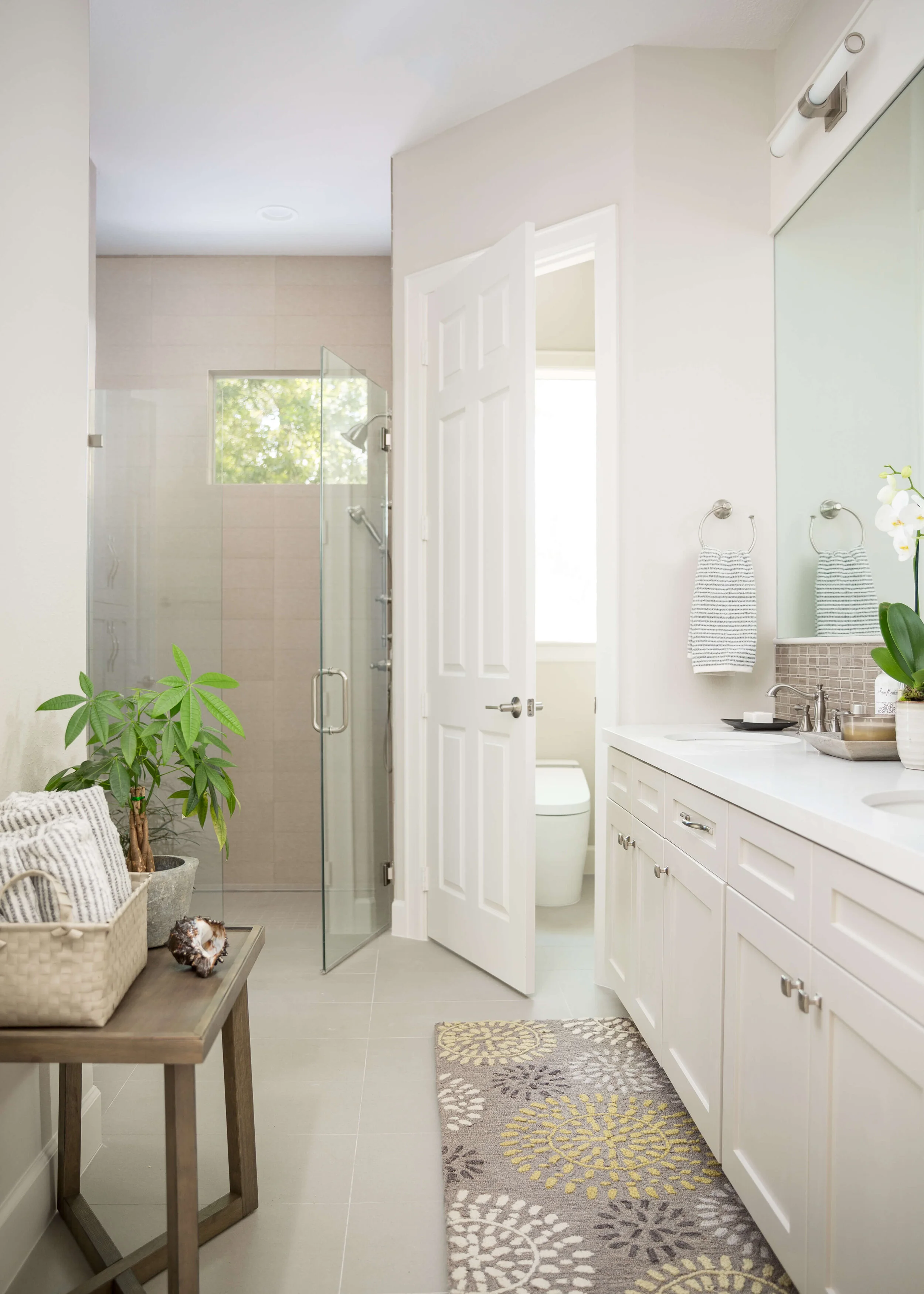
This guest bath, also opening into the hallway, was reconfigured a bit to add a closet in the room behind and expand the shower. We went curbless for the shower too, for a convenience and a more expanded look.
Secondary bathrooms need love too! Check out these simple but beautiful, secondary bathrooms. Carla Aston, Designer | Colleen Scott, Photographer
Secondary bathrooms need love too! Check out these simple but beautiful, secondary bathrooms. Carla Aston, Designer | Colleen Scott, Photographer
You can see on this photo below, there’s a subtle woven look texture on the field tile. It creates a simple and spa like feel.
Secondary bathrooms need love too! Check out these simple but beautiful, secondary bathrooms. Carla Aston, Designer | Colleen Scott, Photographer
This home was designed in whites and neutrals for this client’s taste. Check out these links to the kitchen and master bath to see how all these spaces relate to each other.
Jitka Mayorga: Jr. Designer
Photographer: Colleen Scott
General Contractor: Shaun Bain, Curb Appeals
get some design help for your bathrooms
Are you thinking about a remodel for those secondary bathrooms or even the primary bathroom in your home? You might want to check out my Bathroom Design Guide for a little help along the way.


