This question keeps coming up in conversations around the internet with design loving peeps and those getting ready to select tile for projects today.
Amanda Gates and I discussed this in our recent telecall and today I’m sharing some of my takeaways about the trend and how you can push it a bit beyond the standard look.
So…..what’s up? Is it still in style?
In a conversation on one of my Instagram posts, Lisa Mowry, a design magazine editor, says subway tile is a classic and not a trend. You can’t get more definitive than that!
I agree that it’s a classic look and therefore has a more timeless appeal. However, there are other similar options out there and ways to make it feel a little different and unique if that’s what you’re looking for. Here are some of the suggestions we discussed in the call.
6 x 6 Ceramic Tile
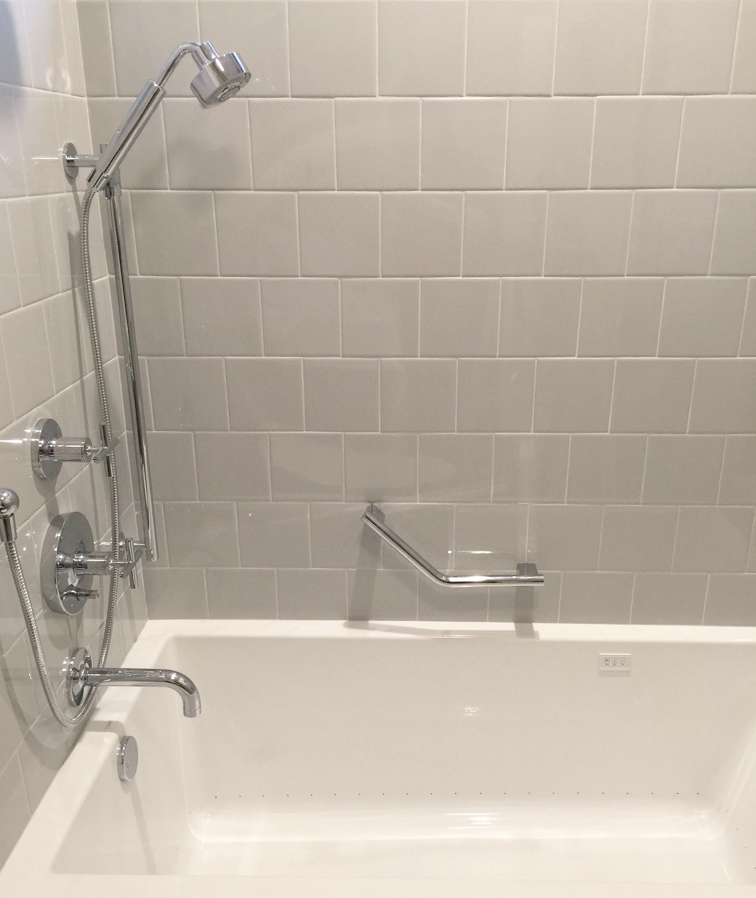
I’ve written a post about this. I’m seeing more and more beautiful projects with that old school 6 x 6 ceramic tile. I’ve used it myself in this recent bathroom remodel. We were going for a simple look as we had a bold wallpaper going on the walls. Frankly, I felt that subway tile was just a little too small and busy with the wallpaper. You can see that it looks perfectly at home with these modern features. (Final photos of that bathroom coming soon!)
When I was in San Francisco at the Zephyr blogger retreat last fall, we dropped by the Daltile showroom and the showroom manager said the next upcoming tile craze she was seeing was the 6 x 6 ceramic! (Yes, the tile of our grandmother’s bathrooms!) She said we wouldn’t believe it, but it’s getting used more and more often by top notch designers in some amazing projects. :-)
The nice thing about this tile is that it is CHEAP, like a standard subway tile is, easy to obtain, and has a look that is similar to subway tile. That makes it a good substitute. You can get all kinds of colors, some may be special order, but often times I’ve been seeing it used with a contrasting grout to make the pattern stand out.
I love how architect Lauren Wegel used a square, glazed ceramic tile in this kitchen that I featured on my blog awhile back. The walls seem so expansive with the square shape.
Porcelain tile that looks like brick
I saw this at KBIS at the Arizona Tile booth and then also in the Daltile showroom and was so excited about these tiles. We have so many choices now for porcelain tile that looks like wood, it’s about time we had porcelain tile that looks like brick!
This product doesn’t stain like brick and you don’t have to have a brick layer do the installation. It can be the tile installer who might already be on the job doing other work. It’s washable and super durable, so you can use it around a cooktop or sink area with no fear.
I love the painted white version. It does look like subway tile, but with a more rustic appearance. A perfect alternative for those farmhouse kitchen looks. No?
New, interesting shapes in a glazed ceramic tile
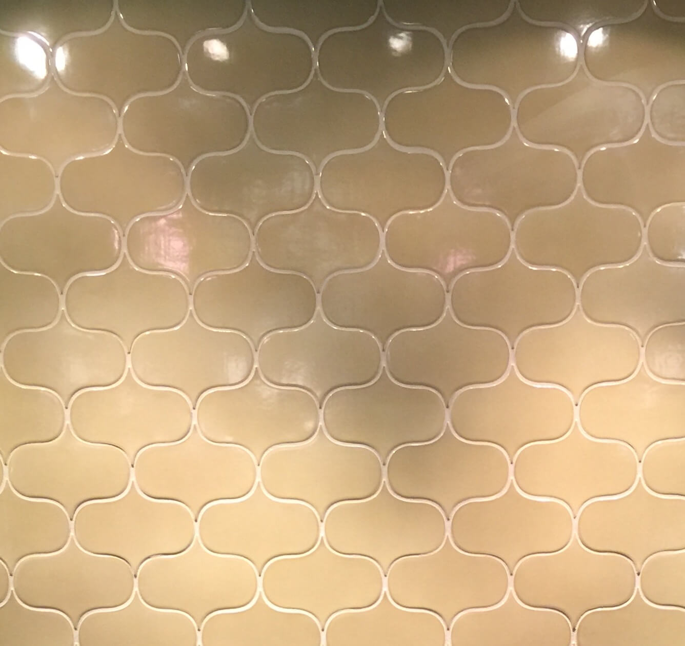
One way to still have the pretty, glossy look but do something a bit different, is to install some of the new interesting shapes coming out these days from many different vendors. Hex, chevron, Moroccan, elongated beehive, there are many unique shapes out there now to get you a more unique look for your splash. We saw these at Walker Zanger at KBIS back in January.
I'm doing this beehive shape ceramic tile from Ann Sacks in a kitchen remodel that's finally about to start. I wanted something different and for the tile to enhance the verticality of that elevation.
Natural stone subway tile
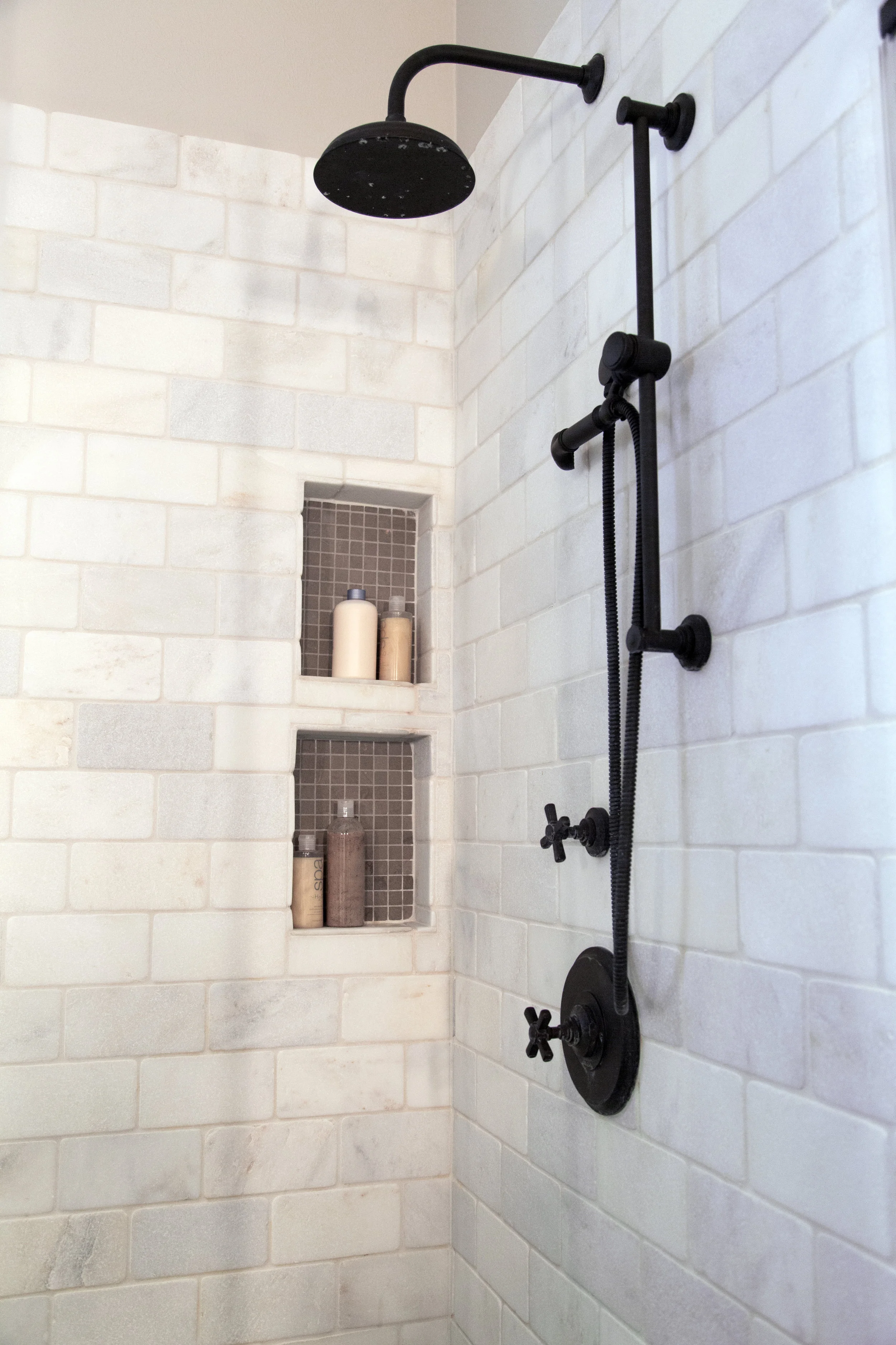
I’m using white marble subway tile in a bathroom shower now and it’s looking amazing! It’s a small-ish bathroom and we’re pouring in luxury with quality materials to get a more upgraded and special look like that of a sweet boutique hotel. We’re doing an enlarged hex marble tile on the floor to go with it. Can’t wait till it is done!
I used a tumbled white marble subway tile in this shower stall several years ago and it just has a more natural, rustic appeal than the shiny surface that a ceramic subway tile would produce. I love how this bathroom turned out.
Larger scale subway tile
Larger scaled subway tile makes for a similar look to the classic, but especially if you're covering whole walls, can make it feel less busy. I used this 4 x 12 in my daughter’s bath and love how fresh it feels.
I used an overscaled subway in a straight lay in this bachelor’s home, in his guest bath. Since we were redoing his whole house and this was his first home and remodel, we needed budget friendly and a more modern look. The large scale done in a stacked or straight lay, just gives the term “subway tile” a whole new direction.
I did these skinny, elongated subway tiles in my kitchen remodel as it felt proportional to the location I was installing it. I wanted a nice textural look there and wanted it to be noticed, hence the contrasting grout color. However, I did not want it to distract or take away from the big focus of the wall elevation, the contrasting door pattern above.
Glass subway tile
In this home's remodel below, we were looking for a more transitional / contemporary style and something with a bit of shine. We opted for a glass subway tile and laid it in a more unconventional offset pattern, to achieve that look.
Subway tile with a handmade, undulating surface and uneven edge
Pin this article if you enjoyed :-)
These are coming in lots of different sizes and shapes now, but this is great way to upgrade your subway tile look if you have the budget. It feels handcrafted, which is always a good thing in my book.
This was the perfect solution for this farmhouse / country kitchen where that bit of inconsistency fit in perfectly with the look. It didn’t call attention to itself, because there were other materials and features that were more prominent, but it was a nice, subtle upgrade.
If this is your first time to my blog..... I want to extend a warm welcome! Please find some similar posts below that you might find interesting. I hope you feel right at home. :-)


