Do you have glass panel upper kitchen cabinets? Have you struggled with what to put in them so that they look good and so that the “stuff” inside doesn’t overwhelm the beautiful look of your kitchen?
I’ve decorated several glass panel kitchen cabinets before and this is definitely on my mind when I go to fill them.
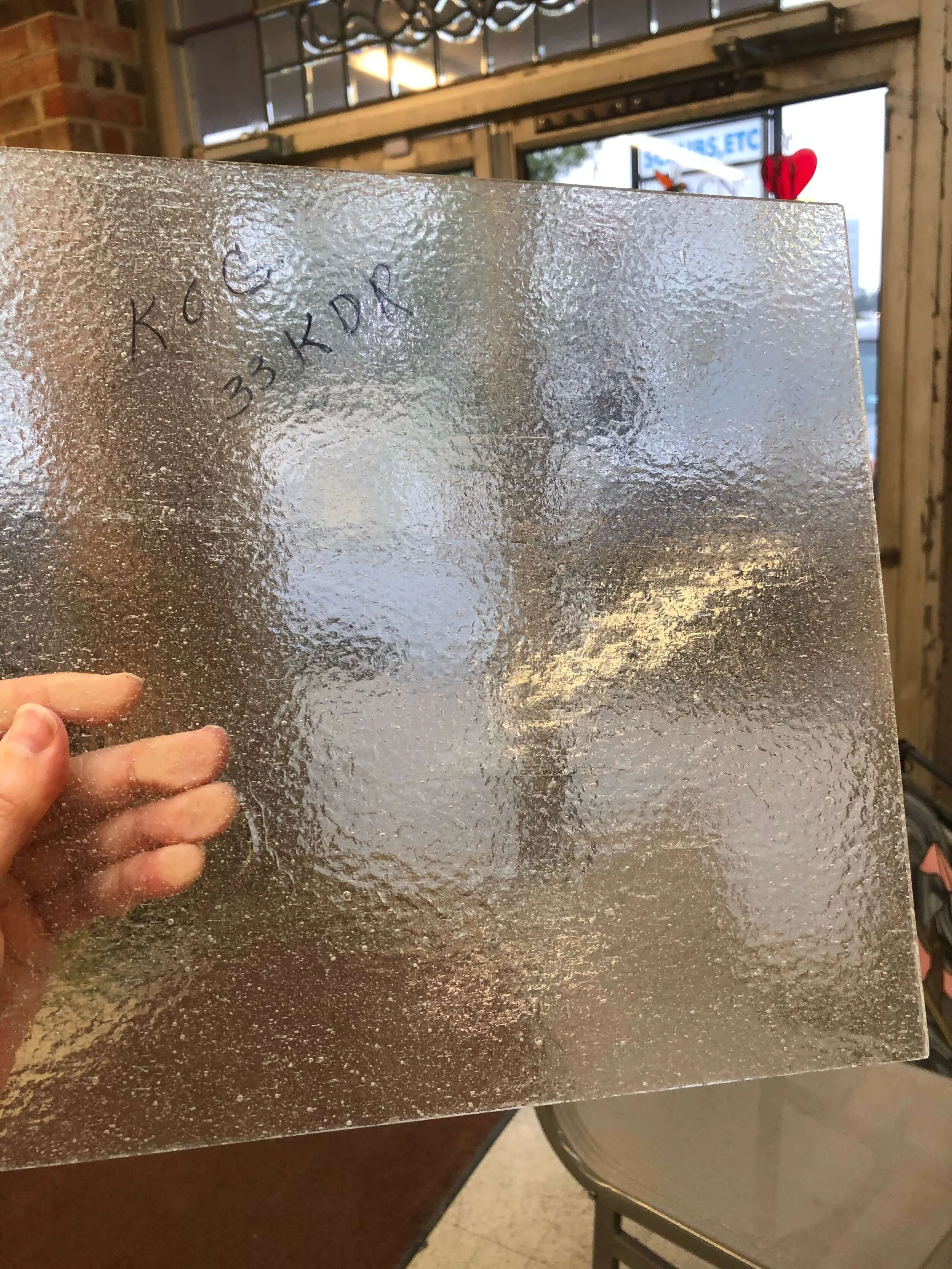
I was selecting glass for another kitchen remodel’s glass panel cabinets, going for something that wasn’t too clear, but had softer effect. It dawned on me then, that this might be a good topic for a blog post.
Textured seedy glass for upper kitchen cabinet panels.
When I filled my own glass panel kitchen cabinets years ago, after my kitchen remodel, my husband started “helping” me.
In went the bright, colorful plastic cups that had been in that spot before!
Ahem……I politely requested he leave this task to me. :-)
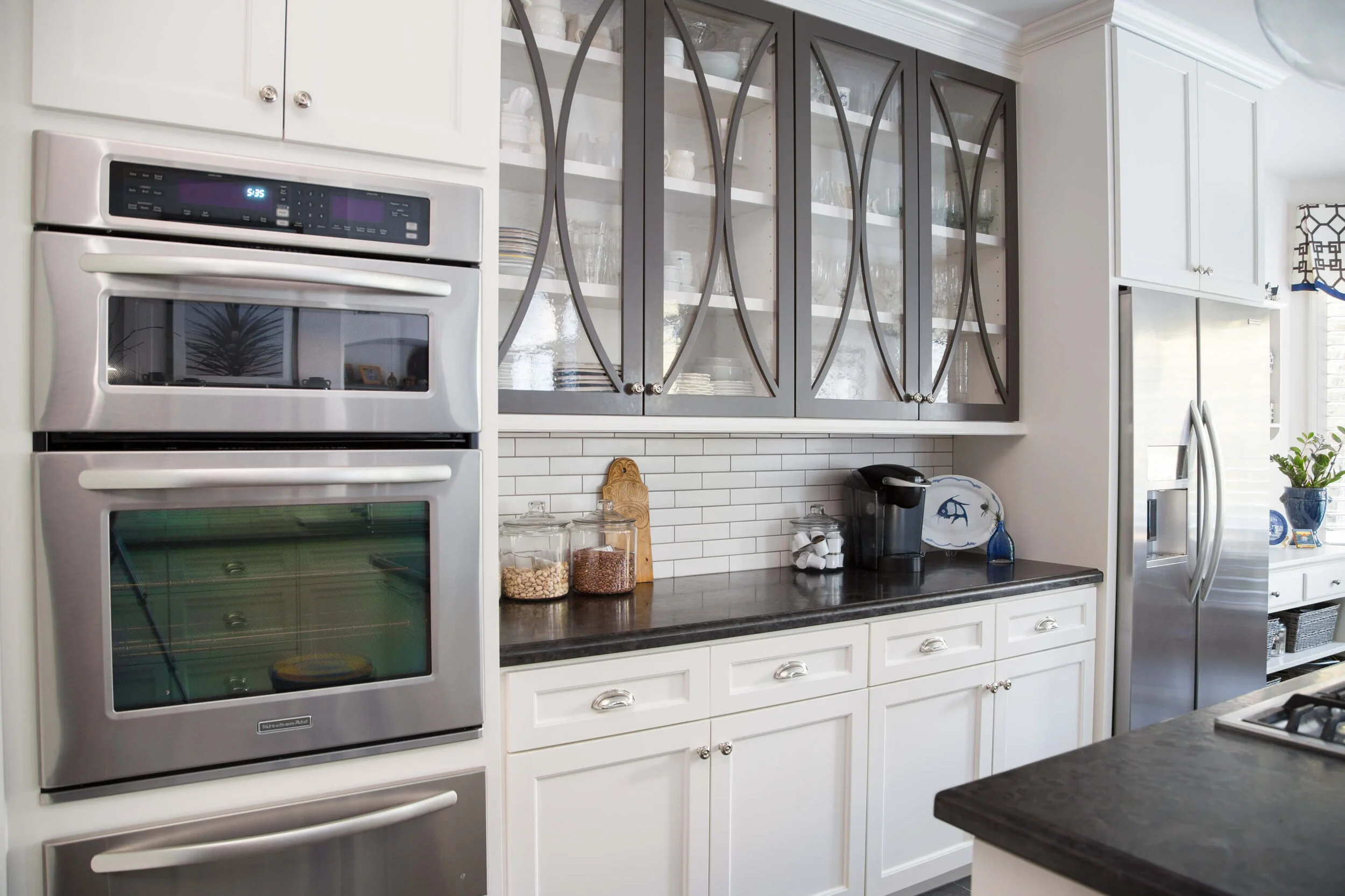
We used this German glass that had a very slight wavy texture to it, it’s pretty clear really. I have loads of white dishes and clear glassware, so I wasn’t worried about having enough to fill them when the kitchen was ready to move into.
I wanted a tone on tone look inside the cabinets that would not detract from the look of the bold cabinet door design.
I had a large collection of white dishes and clear glassware that worked well as filler for my glass front upper kitchen cabinetry. Carla Aston, Designer | Tori Aston, Photographer
I wanted the dishes to blend into the background and not make a statement on their own.
Typically, that’s how I approach filling glass panel kitchen cabinets.
Kitchen with seed glass cabinet doors
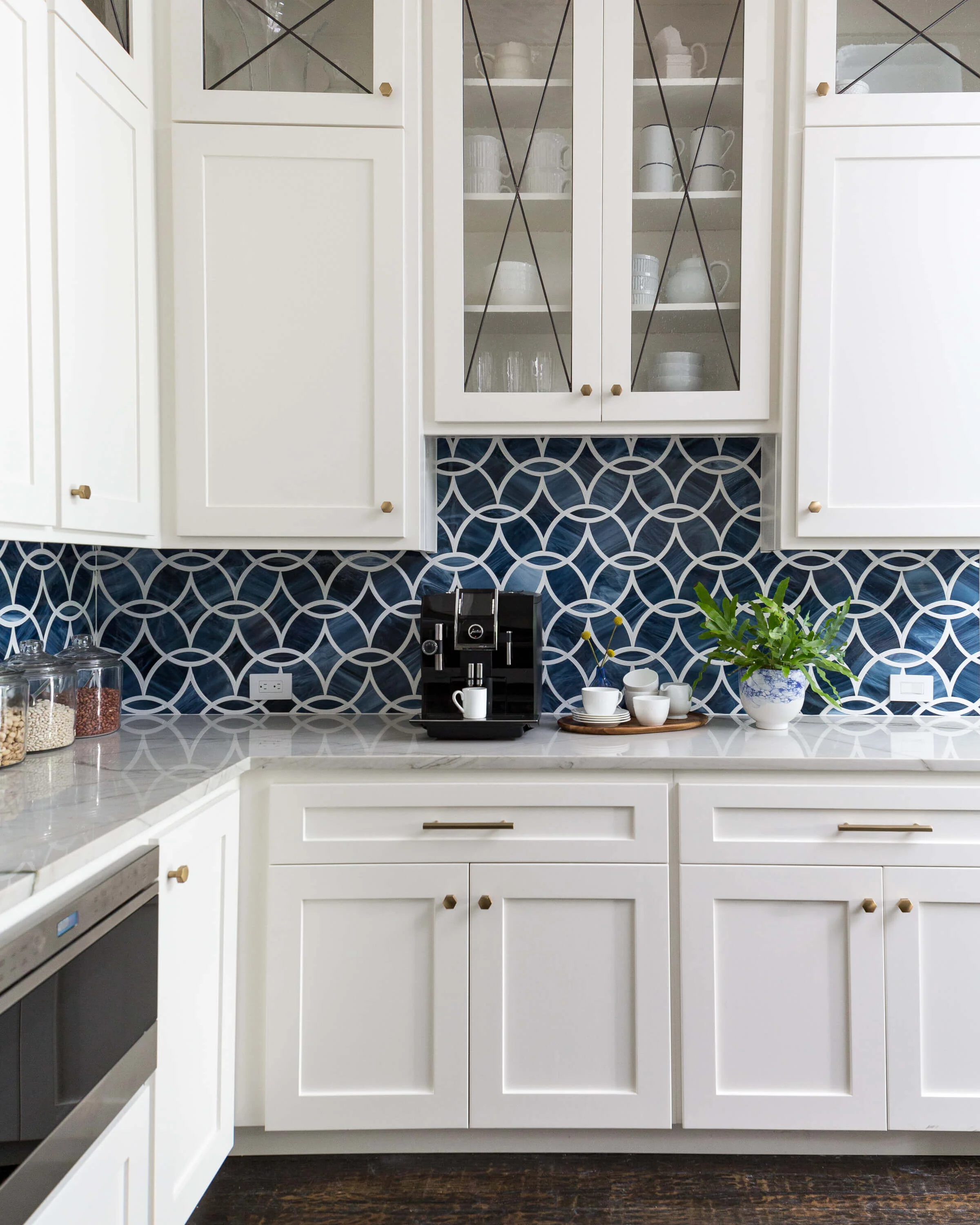
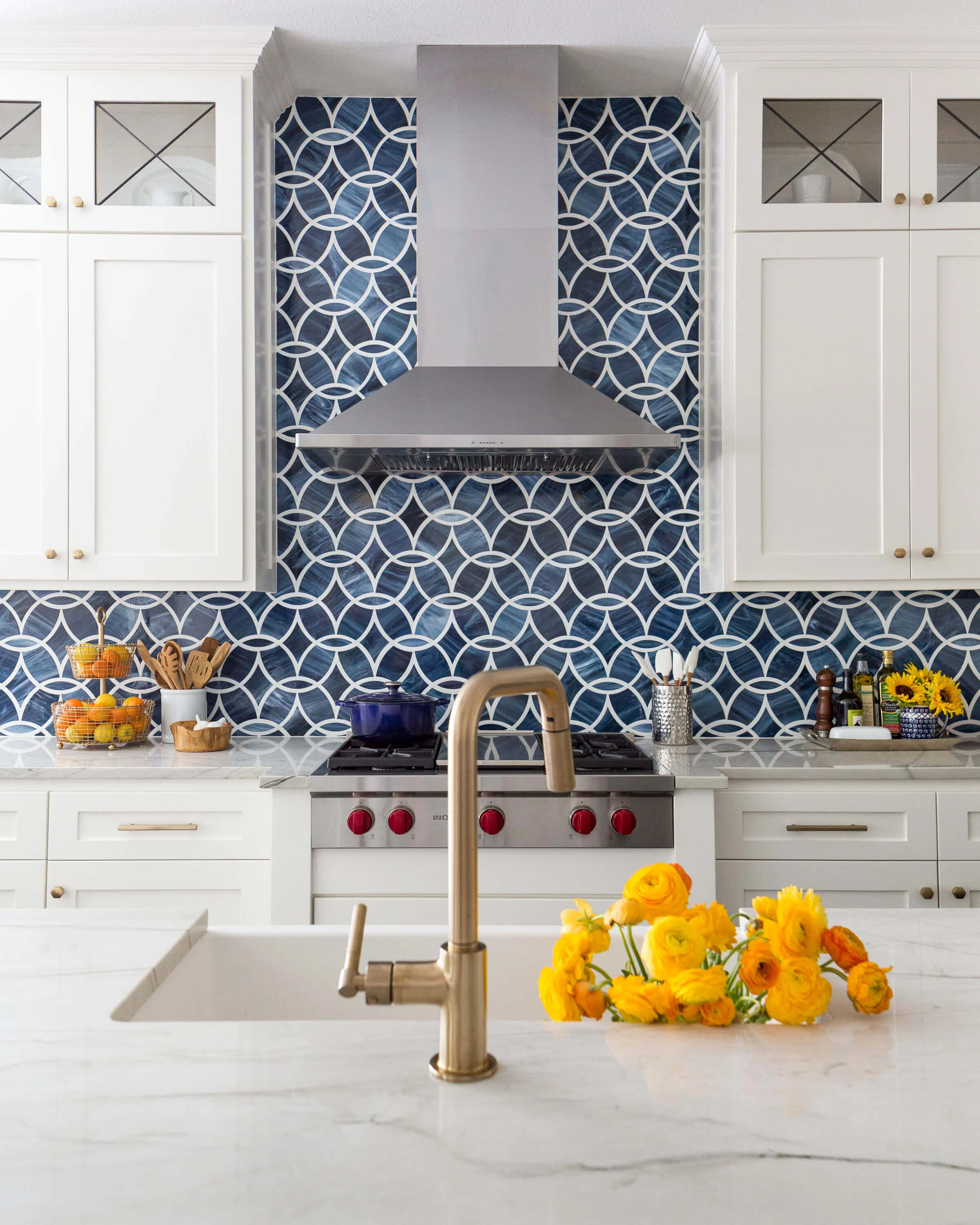
In this beautiful kitchen below, we filled the glass cabinets with white dishes, clear glassware, pitchers, vases, and bowls, so that the thin leaded “X” design would stand out and then so the bold backsplash could command most of the attention in the room.
You can see seed glass doesn’t obscure much, although up close, it has a lovely handmade type quality to it and adds some depth to a space.
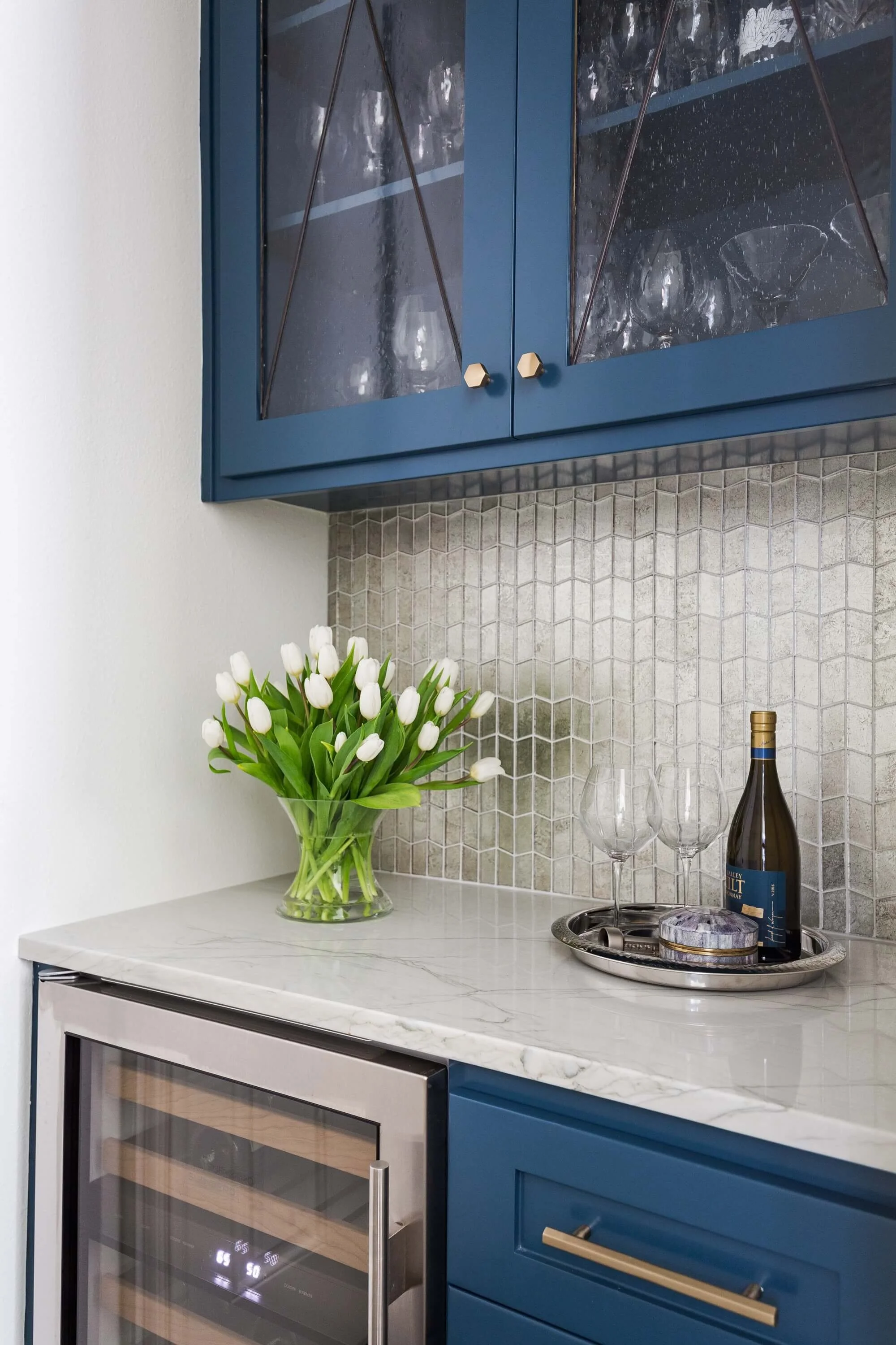
In the bar area of this project, we used dark blue on the cabinetry. The seed glass we used shows up a bit more here. Clear glassware works nicely in these dark painted glass panel cabinets.
Decorating the glass front cabinets of a warm wood kitchen
This warm wood kitchen had glass fronts in the upper cabinets at the ceiling. These were not used every day, but were perfect to display some of the ceramics and vases that the homeowner had collected from their tropical travels.
Their collection worked well with the warm wood. I helped them select some of their pieces to display up high. I would not have suggested anything white to go in these cabinets with the look they were going for.
Kitchen with ribbed glass cabinet fronts
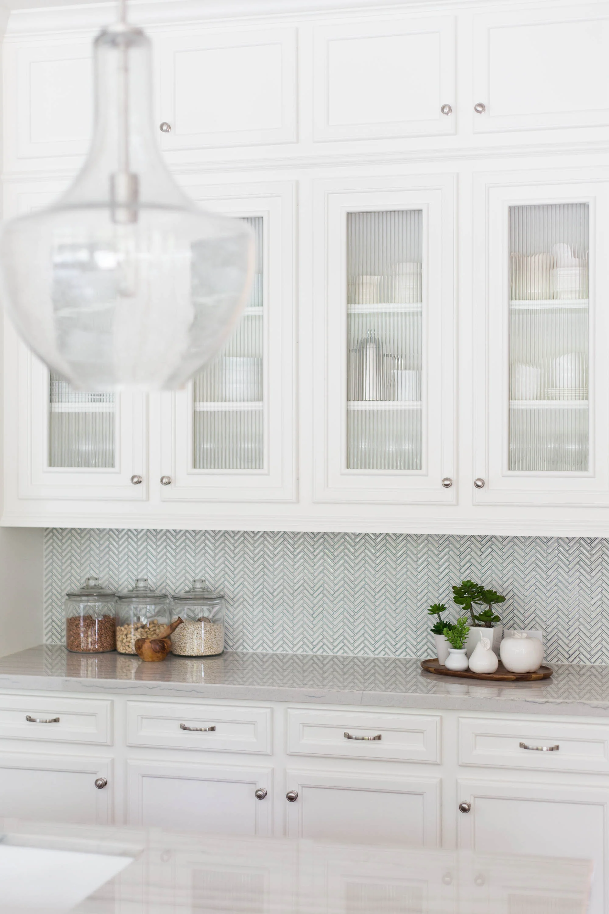
In this kitchen, pictured below, we kept the colorful stuff out of the glass front cabinets, and went with white, clear glass and maybe a silver or stainless item or two.
It’s ribbed effect is more obscure than a seed glass or the wavy glass used in my kitchen, so shapes aren’t really important, but color still is. A bold color inside there would have stood out way too much and blew the crisp, white look the homeowner was going for here.
Another white kitchen with white dishes
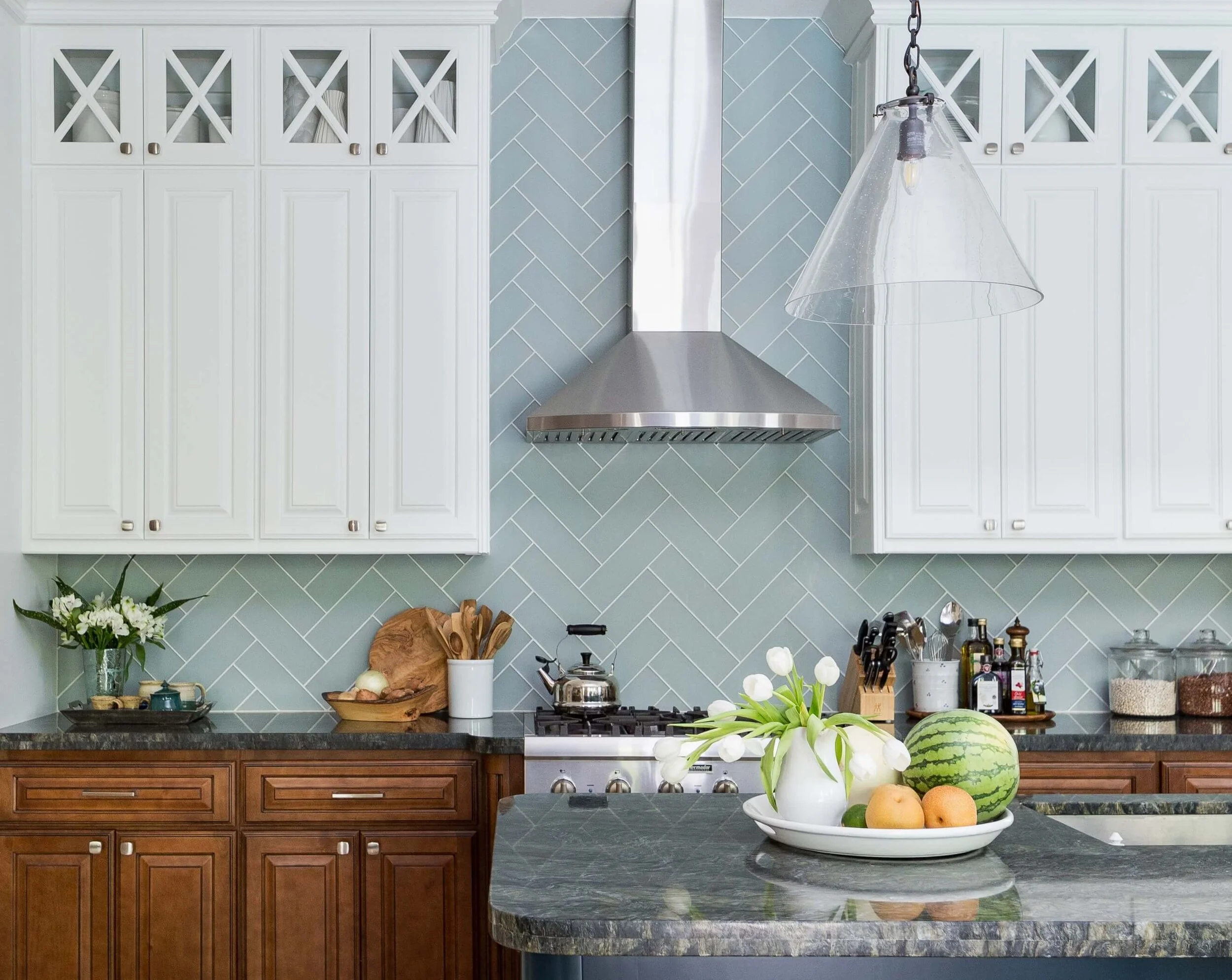
Here’s another one with white glass front uppers.
With all the contrast in this kitchen, with the lower cabinets left stained wood and the dark painted island, I didn’t want dark items up there in those cabinets to distract the eye.
Here’s more on this kitchen remodel.
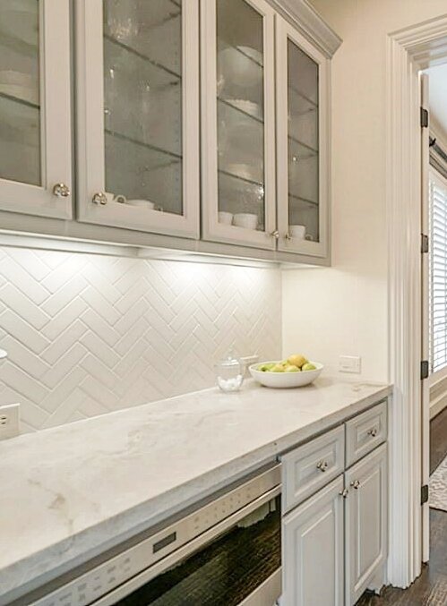
Light Gray Cabinets in Bar
The white dishes and clear glassware look great in this bar. It’s a subtle look that doesn’t overwhelm the cabinetry.
The amazing before and afters of this kitchen and bar are at this link.
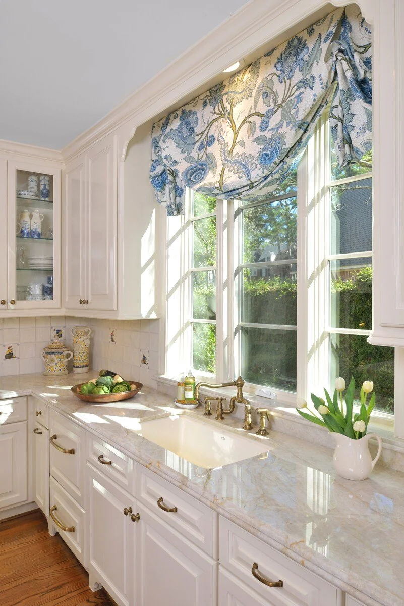
Creamy White Kitchen With Soft Blue Accents
This creamy white kitchen, below, had some soft blue accents that I chose to repeat in the glass front cabinets back in the corner. The homeowner had these items and they so perfectly repeated the pattern and color of the window treatment, I thought they worked beautifully.
We used clear glass in this kitchen as we wanted to see those pretty soft blue and white dishes.
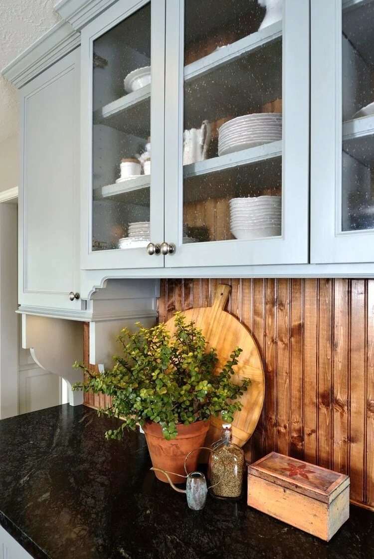
Country Kitchen with bead board wood cabinet back
This kitchen cabinetry on the back wall was designed as an unfitted look. The homeowner wanted a definite country or farmhouse type appeal, so I purposely designed this piece to look like a piece of furniture, a hutch or country cupboard.
The cabinetry was a light blue gray with a soapstone counter, it had deep brackets and some details like a taller area in the middle to give it that unfitted appearance. We used a combination of glass front and painted panel cabinet doors to mix it up and give the homeowner some closed storage and something that felt more quaint.
The white dishes and crocks in front of the oak beadboard stood out and created that vibe we were going for here.
The white dishes also created some brightness in that cabinet and related to the white on the island and on the corner cabinets in the room.
See the before and after pics of this kitchen remodel here.
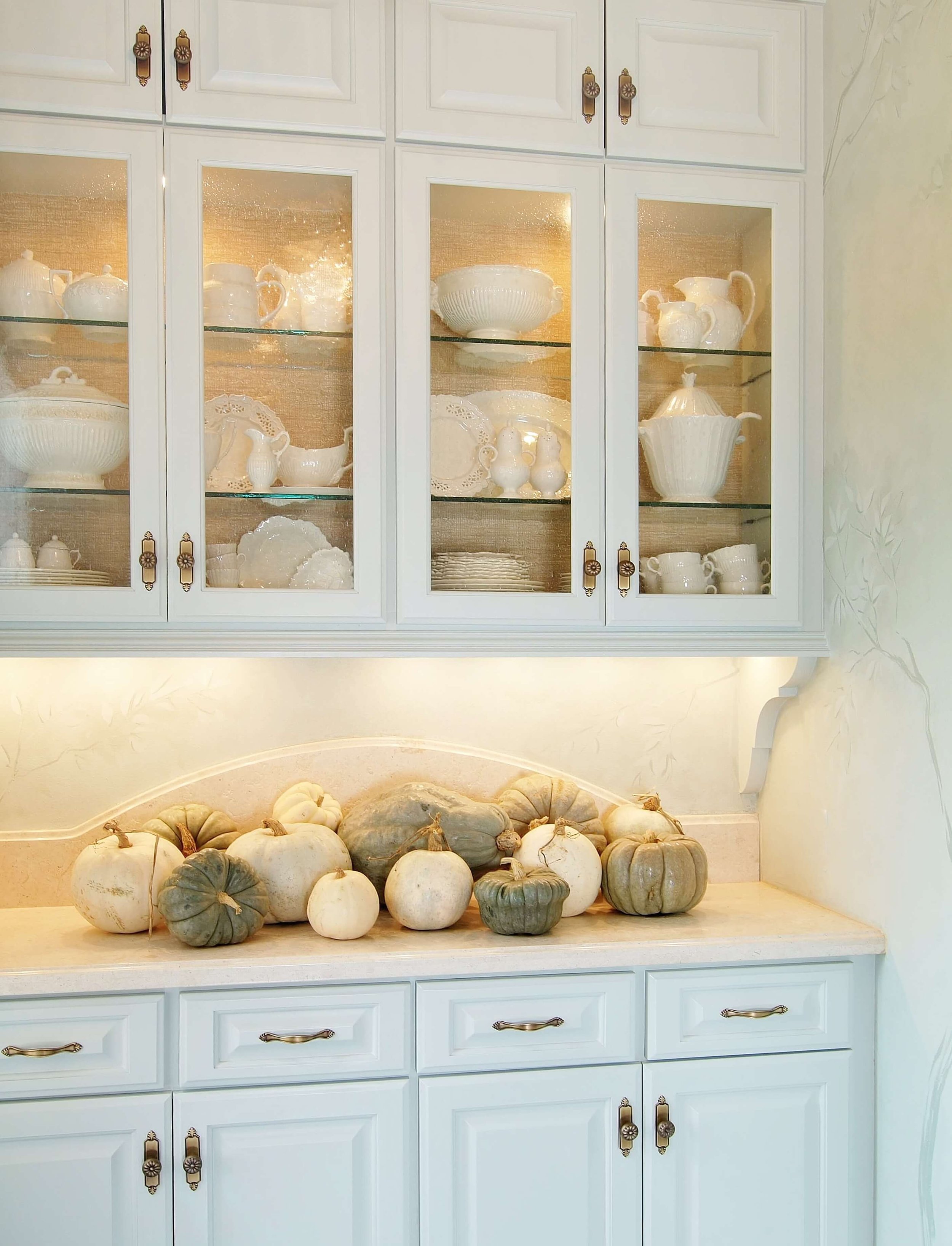
Soft Blue Green Butler’s Pantry
Here’s a cabinet that I stressed over a lot. My first showhouse space, a butler’s pantry I did many years ago. Sherwin Williams Sea Salt was the color for the cabinets and the base color for the walls.
I loved the idea of a collection of creamware for this traditional home.
I collected via ebay from all over, for several months, getting all the pieces I wanted. Pitchers, soup tureens, cups and plates helped make this soft look for the butler’s pantry successful. I used a textural woven look wallpaper in the back of the cabinet to create a subtle contrast.
Butler’s pantry with creamware collection displayed in glass panel cabinets.
Glass doors covering shelving in living room
In this digital showhouse room I did back in 2020, I designed these niches beside the fireplace to have tall, steel and glass doors on them.
This was a contemporary home and the ceiling height was 3 stories high! Here was the bare bones space I was given. See the fireplace wall on the right?
It was a tall wall for sure, so the cabinets here could not be typical. They had to have a presence. I wanted something special and a little different.
You can see in the sketch, below, that I brought the niches up to 20’ in this space, as I wanted them to align with the slabs I clad the fireplace in. Then, I used 8’ tall steel doors to be rather like cabinet doors on each side.
Everything was bigger in this room!
I framed out the niches with ebonized wood and then lined the whole niche with a blush toned wallcovering.
Blush toned wallcovering inside niches of digital showhouse
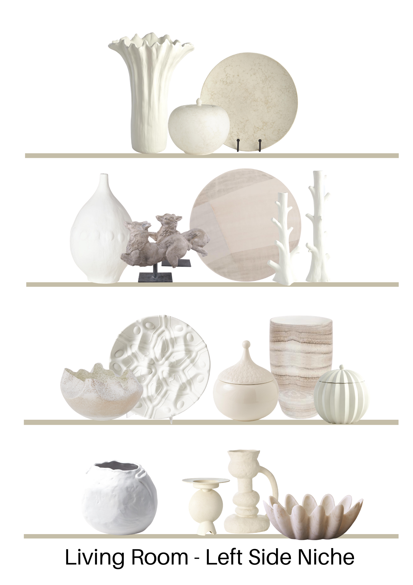
I needed to fill these niches with something, but the items needed to be large. I didn’t want a lot of high contrast so that the individual pieces stood out, and I didn’t want it to look busy and cluttered.
I went with all light colored objects and vases that created undulating shapes behing the doors and would subtly contrast with the blush wallcovering.
Here were my mock ups for the digital artist.
Here’s how the styling turned out.
To be honest, I wanted to go into those cabinets and push everything together more closely. I didn’t like it all spaced out.
However, there was not time to fine tune this more closely and this was such a minor detail in the overall deadline to get this published for the people in charge.
You get the idea though, right? If I had selected items that had high contrast, it would have distracted from the graphic look of this wall. :-)
Keep In Mind When Styling Glass Panel Kitchen Cabinets
Since most of these kitchens are white, or have white in them, the white dishes do nicely as cabinet filler.
When I design a kitchen, we typically aren’t looking for the dishes to stand out or be the star of the room. Usually, we don’t want to overwhelm the space with small, colorful details (dishes or glassware) that will draw your eye or pull your focus away from the whole.
If you are displaying a collection, however, that you want to stand out like in the country kitchen featured above, then taking into account the cabinetry, the back panel of the cabinet, and the overall look of the space is important.
If you want the dishes or items in the cabinet to make a statement or stand out, then contrast them with the back panel of the cabinet.
If you don’t want the focus on the dishes or objects within, then blend them in visually. :-)
Keep in mind when designing your kitchen
If you don’t have many dishes or objects you’d like exposed or if you don’t want to fuss with keeping things tidy (and I can certainly understand that), then don’t opt for glass or try glass that is frosted or textured.
Remember that color shows up through textured glass!
This blogpost was thoughtfully written by me, Carla Aston, and not by AI, ghostwriters, or guest posters.
If you liked this post, then you will also like my Bookshelf Styling Guide, that I’m giving away when you subscribe. See below!

