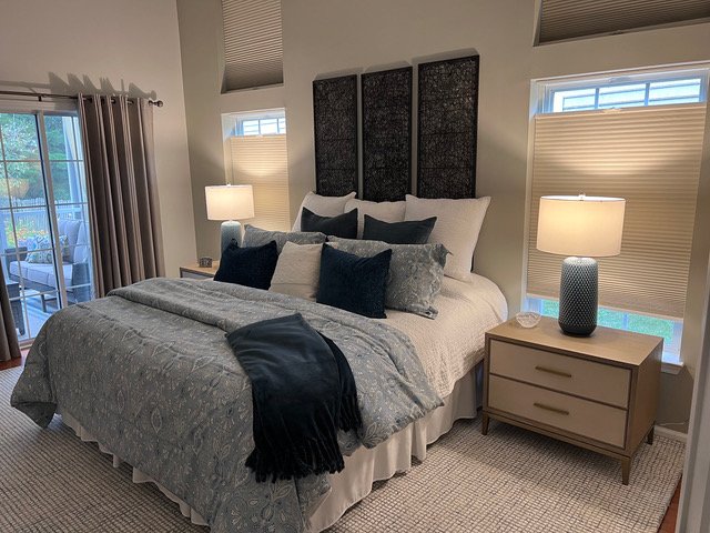
This primary bedroom had a good start but needed a little more decorating to make it feel designed or completely finished and put together.
The new items that had been recently purchased were bedding, nightstands, lamps and rug. It is a rather small bedroom for a primary suite, but it has high ceilings which I wanted to accentuate.
The homeowner did not need a dresser in this room, there was plenty of clothing storage in the closet.
My blog contains affiliate links. Any purchases, at no additional charge to you, render me a small percentage, are most appreciated and make this blog possible. :-)
Primary Bedroom Photos
The bed wall had 4 windows, all covered with black out shades.
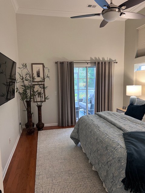
This end wall had a sliding patio door that aligned with the shorter windows.
I feel like there are quite a few things that can be done to tie everything together here, although I really like what they have done already.
As you can see from the photos, the room is not huge. I feel like the bed wall is rather chopped up with those 4 windows, so I’d like to unify that look.
The patio sliding door feels short in the room by comparison to that window wall and could be made to appear taller.
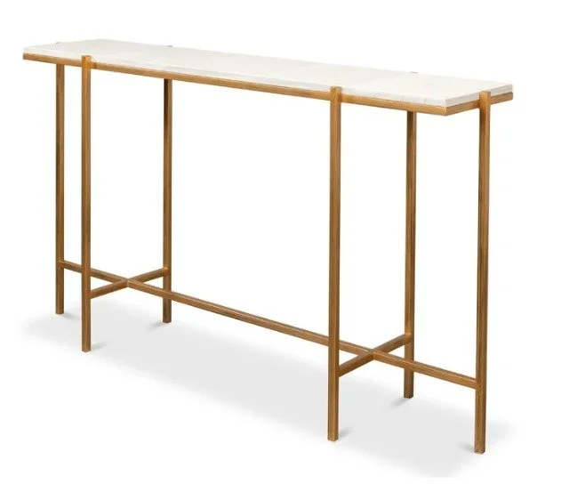
I also don’t love a tv floating on the wall with nothing underneath it. I always prefer them grounded with a piece of furniture of some kind, even though we don’t really have much depth here to work with.
Recommendations For A More Designed Bedroom Look
This room needs a headboard for sure and I thought I’d start there.
I do love this comfy looking headboard with the scalloped corners for this bedroom. The scallops will pull the taller height of the headboard away from the windows, so it won’t appear quite as big on that wall. It makes a nice backdrop for the homeowner’s new bedding.
The decorative wood panels will be used on another wall in this room.
I’d then pull those decorative panels over the the bed off, to use on the other wall. I’d strongly consider applying window casing here too, around all the windows, matching the casing around the patio sliding door.
I don’t want to add drapery here, as in this smaller space, I feel like it will just feel a little claustrophobic or too enclosed.
Here, I’d like to focus on the bed wall being an accent wall with the trim around the windows and then a picture frame type moulding applied to the center section. Then the wall can be even be painted a blue color to unify it.
Bed wall with trim moulding applied. New headboard and sunburst mirror added. carlaaston.com
That will also serve to highlight the tall ceiling height in here and feel more finished. The creamy white headboard will pop off the blue wall and an additional small sunburst mirror, like I recommended in this previous foyer post, would be nice in the center.
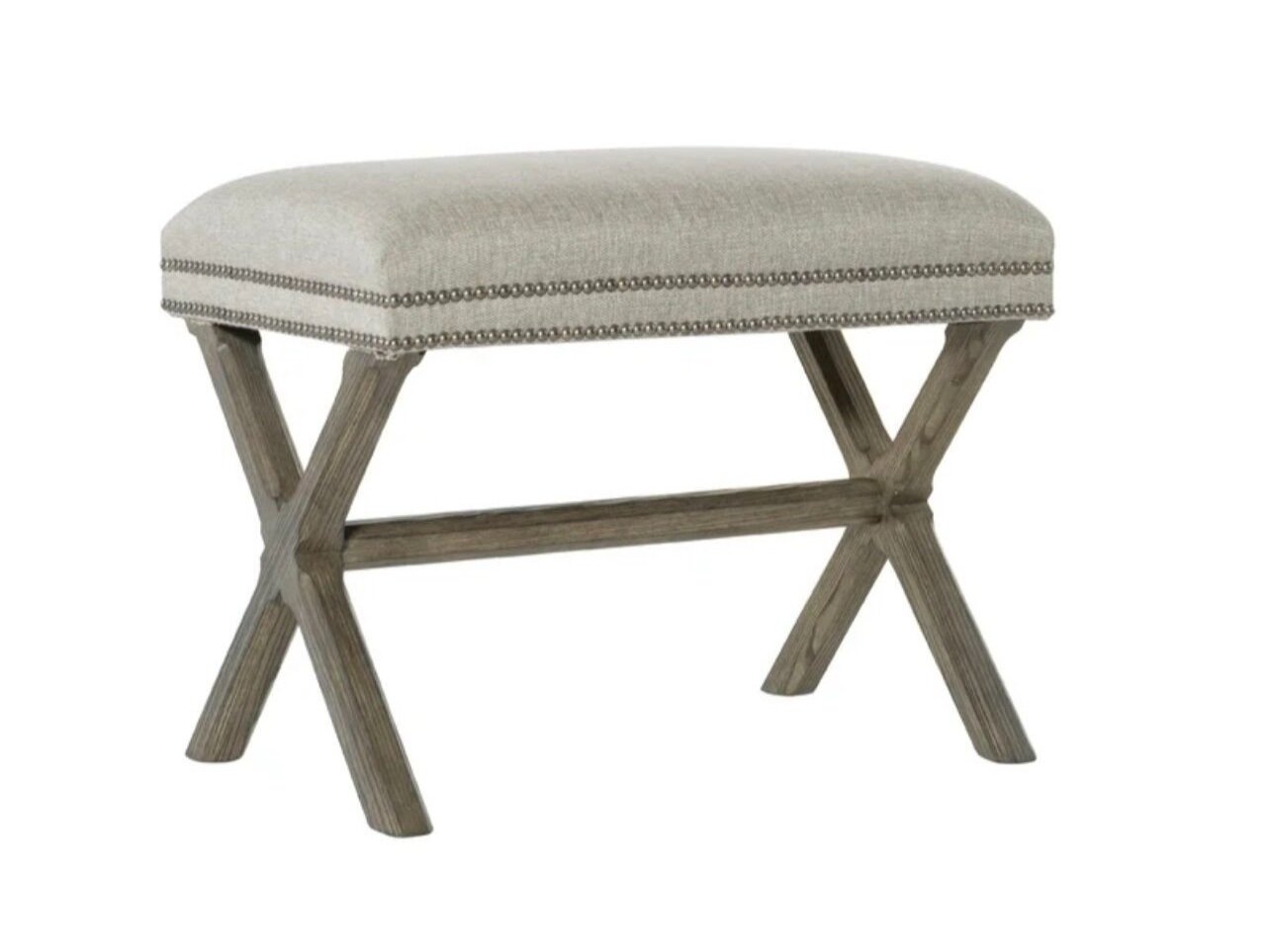
I love a bench in the bedroom, and I feel like the tall plants are not the best choice for that corner.
A bench under the art would be nice and this one would work as it looks to be a good size for this spot.
I’d do a console under the tv, you can get really slim ones now, both of these are only 12” deep, from Sarreid.
Like I mentioned above, the way the patio sliding door is treated makes it look short and doesn’t really take advantage of the high ceilings here.
I’d hang draperies at the level of the top windows on the other wall, maybe in a blue color to work with the accent wall. Then, I’d mount two of the decorative panels horizontally to fill in that void on the wall.
It will lift your eye up and capitalize on the attributes of the room.
Sketch of Primary Bedroom Decorating Ideas | carlaaston.com
If you want to take care of your own decorating but need a designer’s eye for some guidance or a fresh idea or two, try my Subscriber group on Instagram. My next Instagram Q&A will be Nov 4th.
My Designed in a Click sessions will be open again in November too.
This blogpost was thoughtfully written by me, Carla Aston, and not by AI, ghostwriters, or guest posters.
MORE Bedroom Q&A’s!


I recently had an email consultation for a primary bedroom that needed some finishing touches. This homeowner had a great start, but it felt unfinished and didn’t wow her when she walked into the room. Click through to read the solutions I shared……