I have an interesting furniture layout challenge for you today, Design Lovers! This space has a really open plan and the homeowner was having trouble arranging the furniture. They needed to have multiple functions and have it all make better sense for their family.
Check out some of the solutions I suggested as well as a few furnishings items that might be appropriate for this home.
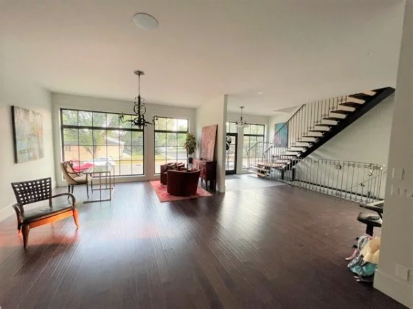
Here are the pics of the space. The homeowners haven’t lived there long, but are enjoying the open plan and back garden.
View from the front door to entry hall.
Large open plan space at front entry
The home office area in this open plan house.
The bricked fireplace area is located about half way down this long wall, putting that in the center of the house, more or less.
There is a long empty wall and really open space beside the kitchen too. Currently the sectional was pushed up against the wall here.
The view looking to the back of the home, from about the middle of the open space. Kitchen is on the left, back garden is out the French doors.
Back area of the house that opens to the garden. The dining space is back here.
The homeowner’s questions focused more on furniture layout.
How can I layout the furniture for office space (desk and a chair) and sitting space in the area all the way to the fireplace (brick wall)?
How to layout and furnish the space we want to use as our living space and kids' music corner opposite the kitchen, between the fireplace and the backyard doors.
Any advice on the entrance furniture ideas?
Any advice for window treatments at the front of the house?
This could be one of the most open spaces I’ve ever worked on, with the exception of the living room in the Seasonal Living Showcase Home!
So, fortunately, I have some experience here with how to make this layout more workable and make more sense for this family.
My suggestions for dealing with this large, open plan space.
I feel like you need to work hard to create some major seating groups, that are anchored with rugs and wall decor.
1) Anchor your main seating group at the fireplace.
The fireplace should be where you anchor your main seating group, and since it is in the middle of the home, it would work well there. I would move the sectional to float in the room in front of the fireplace area. That will create more of a focal point and you'll be able to divide up the spaces and zones better after creating this central grouping.
Add in two lounge chairs (or use that matching settee) and a coffee table, a large rug and maybe a sofa table behind the sectional and this will feel much more like a purposeful grouping.
I would flank each side of the fireplace with some consoles and art above, to make that wall feel like even more of anchor.
I have a floor plan sketch, below.
2) Home office area - Needs to be somewhat separate.
I feel like that home office area is the one area that needs some separation from the rest of the long space. It just feels too open to me.
I really don't like the way the one wall that separates the entry from that space sort of ends abruptly and hangs there by itself. It feels like an afterthought.
I would love to see that become a room, with an angled entry and then a wall separating it from the next seating group. You could do a glass wall or maybe some kind of open bookshelf / divider concept, if you really love the idea of the whole house feeling completely open, but I think it just feels a little too open there.
I have sketched this area and put some windows in a wall that relate to your exterior window sizes and detail. You could do glass French doors like you have at the entry and back doors to your garden. That would be consistent architecturally and look really interesting in my opinion.
It would also give a little privacy and prevent some sound transmission, if someone is trying to work in that area.
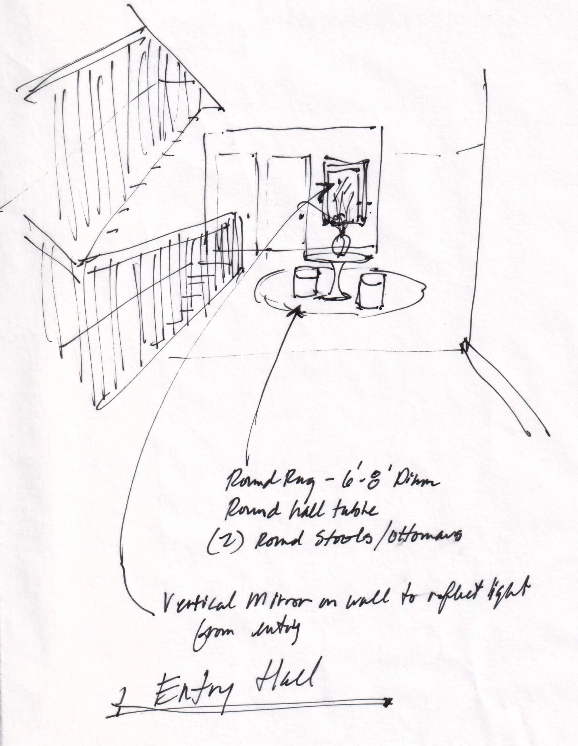
3) Entry Hall - Add furniture to make this space a destination and fill the void.
I do like adding a central round hall table here with a round rug and some upholstered stools. I think this area needs something to fill it, it's just too open.
This will give it a purpose and make it feel like a destination too. A mirror on that wall opposite the entry doors, would be nice to reflect the light and then the table and stools, too.
I would like to see you move that chandelier in the home office area here, as this will create an even more dedicated space and give importance to the table and this anchor point. (Just a thought)
4) Last seating group - Music area
I like this space being a bit different from the main sectional / fireplace area. I always like 4 swivel chairs with a round table as it makes for a nice conversation group, can float in a room beautifully, and can adapt to a lot of functions.
This is sort of an odd, in-between space, so it needs to be able to function as an extension of the main seating area and as kind of a transition to the bar and the garden.
This could be a music area of sorts, but the keyboard itself is kind of a non-statement type piece to put up against a white wall. It just looks utilitarian and I feel like you need more of an focal point here. I'd use the tall screens you have and mount them on the wall here, then put the keyboard in front of them. The keyboard will be somewhat camouflaged by the wood screens, and it provides a backdrop, almost a "stage" for playing music there.
You can locate a violin and music stand off the side there for more instruments as your children use them. I think you definitely need some large, tub chairs that swivel there, to fill the space and make it look purposeful.
A tall plant grouping between the two large seating areas will help with a visual separation there.
5) Window Treatments
As far as window treatments go, yes, I'd add some, especially to those front windows. I'd go with something modern because of the super clean envelope you've created here and the style of windows you have.
I like a ripple-fold style, it's a modern look, and I like the fabric used here with a horizontal strie pattern.
The Shade Store, Ripple Fold Drapery, Material: Upton
Ripple fold style pleats for drapery for a modern look.
The bottom line for your space, is that some strong furniture groupings, more upholstered furniture, more softness in general with drapery and rugs added in, will help make your home feel less cavernous and more comfortable.
I have a few links below, of the type of furniture I would suggest.
Mix the traditional with your modern look.
I like that you are mixing traditional looks with modern, so keep that up. I am sure you can reuse some of your furniture here, but I've got a few links to some items I'd think about as new. I prefer to see the large upholstered pieces as more contemporary, and then fill in with traditional pieces as accents.
The leather sofa and those tufted chairs are ones I'd consider replacing at some point.
Furniture Links
Central entry hall table - I like a modern look table here.
Mirror at entry hall - This could go trad, like a big carved wood mirror, or something modern. I rather like the traditional look, with the modern table and rug in front of it and the black chandelier from the home office area, above the table. That’s a nice balance of styles, I think.
Round rug at entry hall, 8' or 6' - Depends on what color scheme you want to go with, you have some red, but not sure what direction you want to go. I would do a modern look rug though here. This one is more neutral.
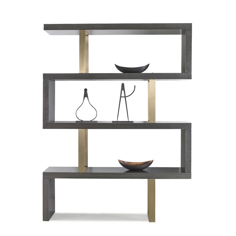
Bookcase at home office wall - I really like the walled off solution but either way, I like the idea of doing an architectural look open etagere of some kind. This one has strong lines and a mix of finishes which is nice. (If something like this is free-standing as a divider, make sure it is secure so it doesn't tip.) You could do two of these to fill the long wall.
Sofa table behind big sofa sectional - I like the bit of curvy detail here for the sofa table. Make sure it wouldn't be taller than the back of your sofa.
Consoles flanking fireplace - I like this console as I think this sort of repeats the look of your stair railings.
Swivel chairs - These Bernhardt chairs are a good size at 36” wide x 38” deep.
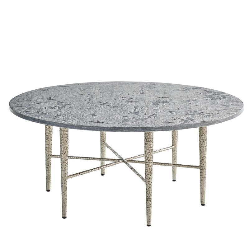
Round table at swivel chairs - Either of these tables would work, one feels lighter than the other, you might go for the heavier look coffee table due to the open concept here.
Entry hall - This hall tree might be useful against wall by front door, looks like you need some hooks and a bench.
These are just suggestions for you to explore at your own leisure. By all means, check dimensions, finishes, pricing, and other options to see what works best for you.
See more posts on furniture layouts, below.
If you need some design or decorating advice to get you over a bump in your project or just need a designer’s take on what you are doing, check out my Designed in a Click email consultation.
Pin this image to Pinterest to save for later.


Okay, maybe I’m giving myself way too much credit here, BUT….. I do know these work. If you don’t believe me, take a peek at the empty shell I received from the rendering team BEFORE I started designing this large living room in the Seasonal Living Virtual Designer Showhouse.