Do you have a room where the bookcases or cabinetry feels a little overbearing or heavy? Is there perhaps too much cabinetry in the room and you feel the need to break it up so it is more interesting or lighter in feel?
Try open shelving instead.
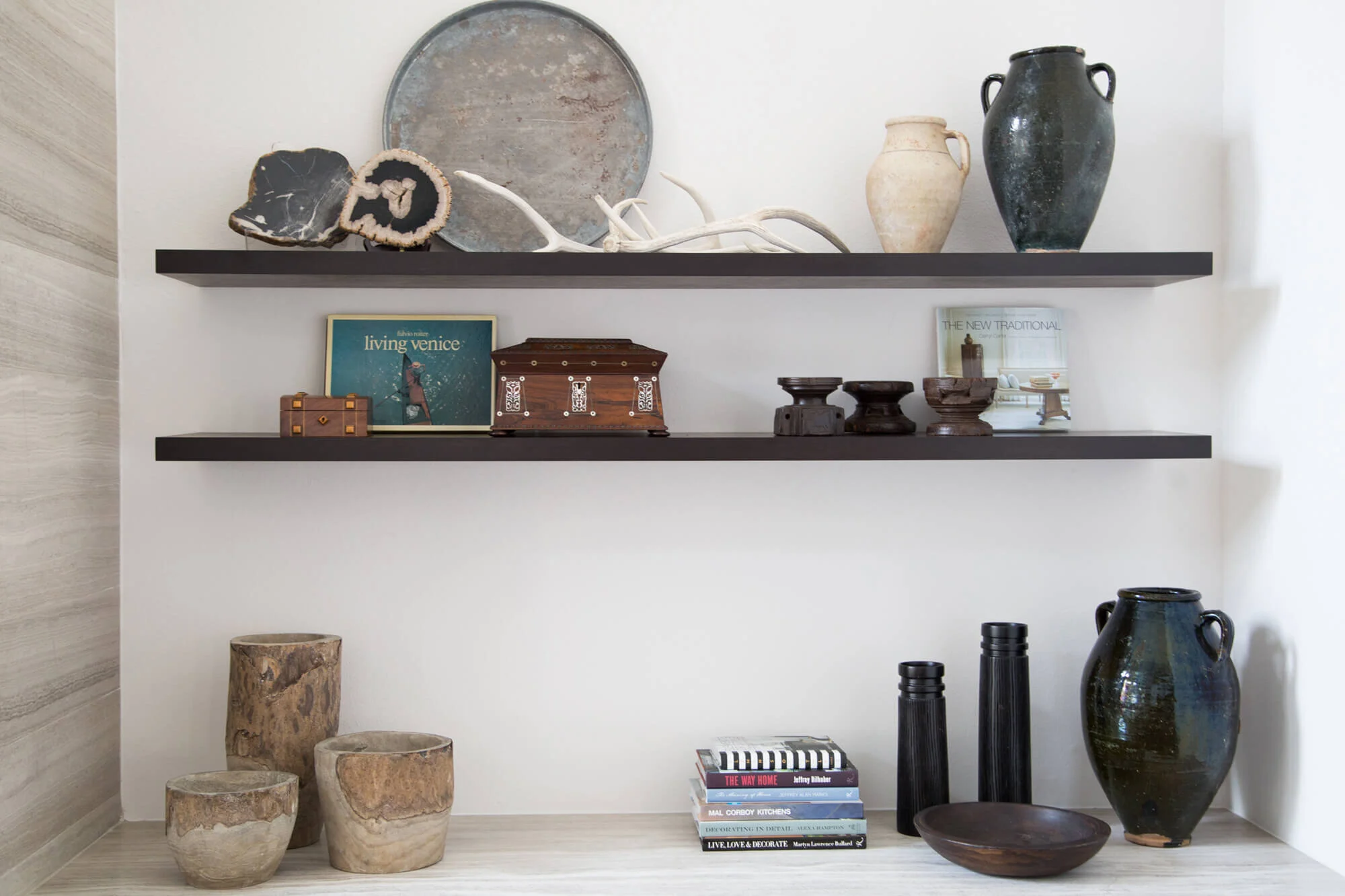
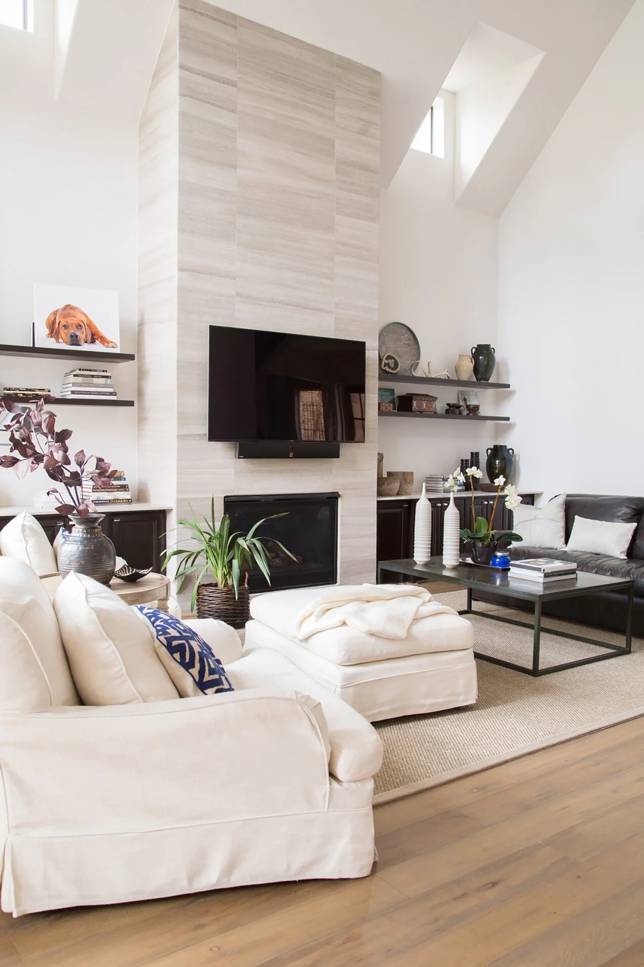
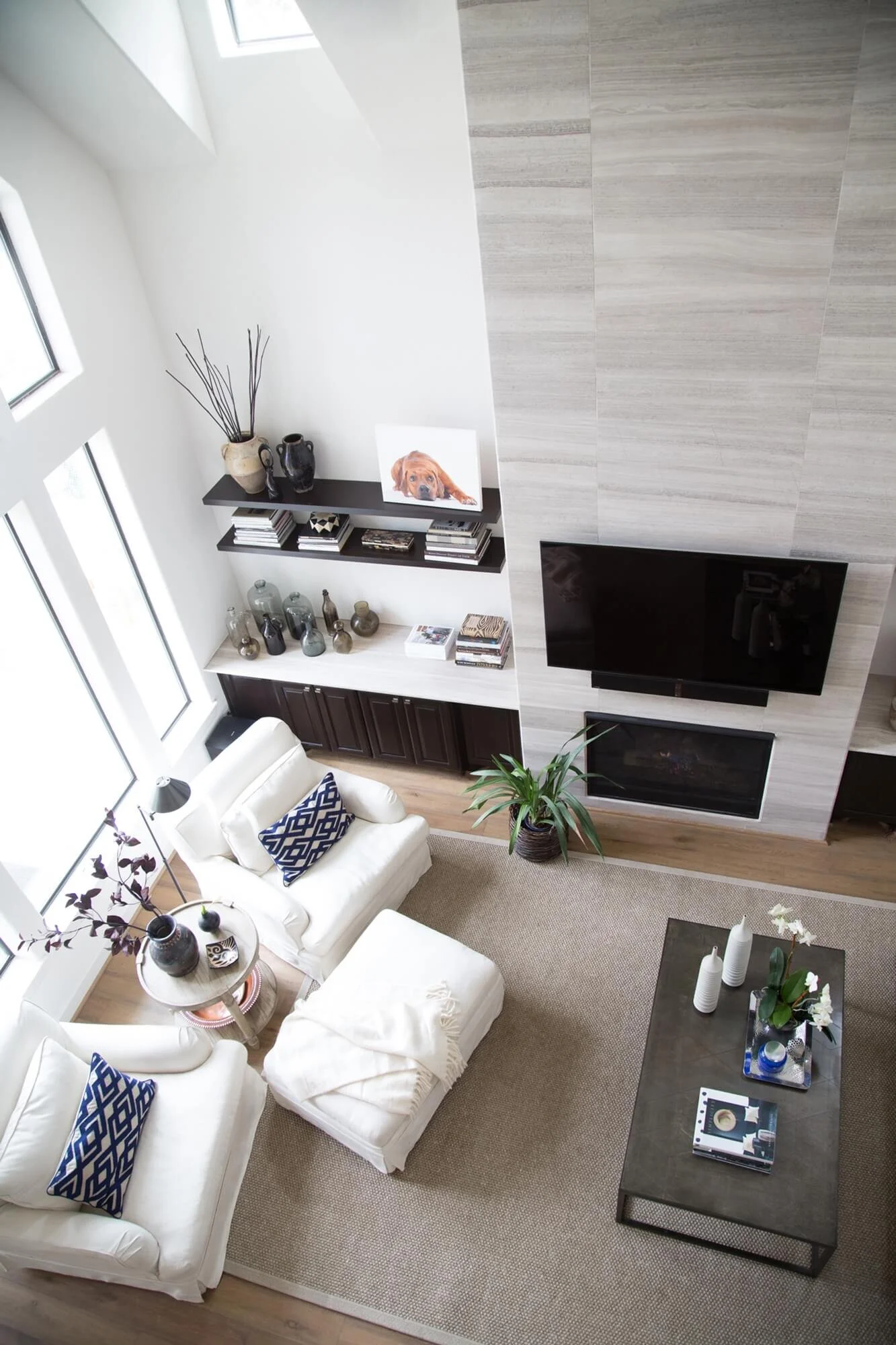
Here’s a remodel project I worked on several years ago where floating shelves updated and modernized the look of this living room.
We took a more traditional, Mediterranean-style house and made it more clean-lined, up-to-date, and fresh looking.
BEFORE - Floating shelves will make this wall feel more open and less overbearing, so your eyes can more easily be drawn upwards towards the best attribute of the room: the high ceilings.
This is a small living room — 12’ deep to be exact, from the fireplace wall over to the opposite wall - and those tall wood cabinets are a little typical and heavy. To make the room feel more open, I wanted that wall to recede, yet also still provide them with some shelving so they can have a place to display items.
Floating shelves CAD (Click image to enlarge full-screen)
We removed the upper cabinets and countertops; painted the existing base cabinets a dramatic espresso color; installed limestone slab counters to match the vein-cut limestone tile on the fireplace’s face; and added two floating shelves above the counters on each side.
This made their wall feel more open and light, so eyes can more easily be drawn upwards towards the best attribute of the room: the high ceilings. That’s where the attention should go here to maximize the volume in this space.
And it definitely looks more modern and up to date!
AFTER - Living room with floating shelves in lieu of tall cabinetry to lighten and modernize the look of this room. Carla Aston, Designer | Tori Aston, Photographer
AFTER - Living room with floating shelves in lieu of tall cabinetry to lighten and modernize the look of this room. Carla Aston, Designer | Tori Aston, Photographer
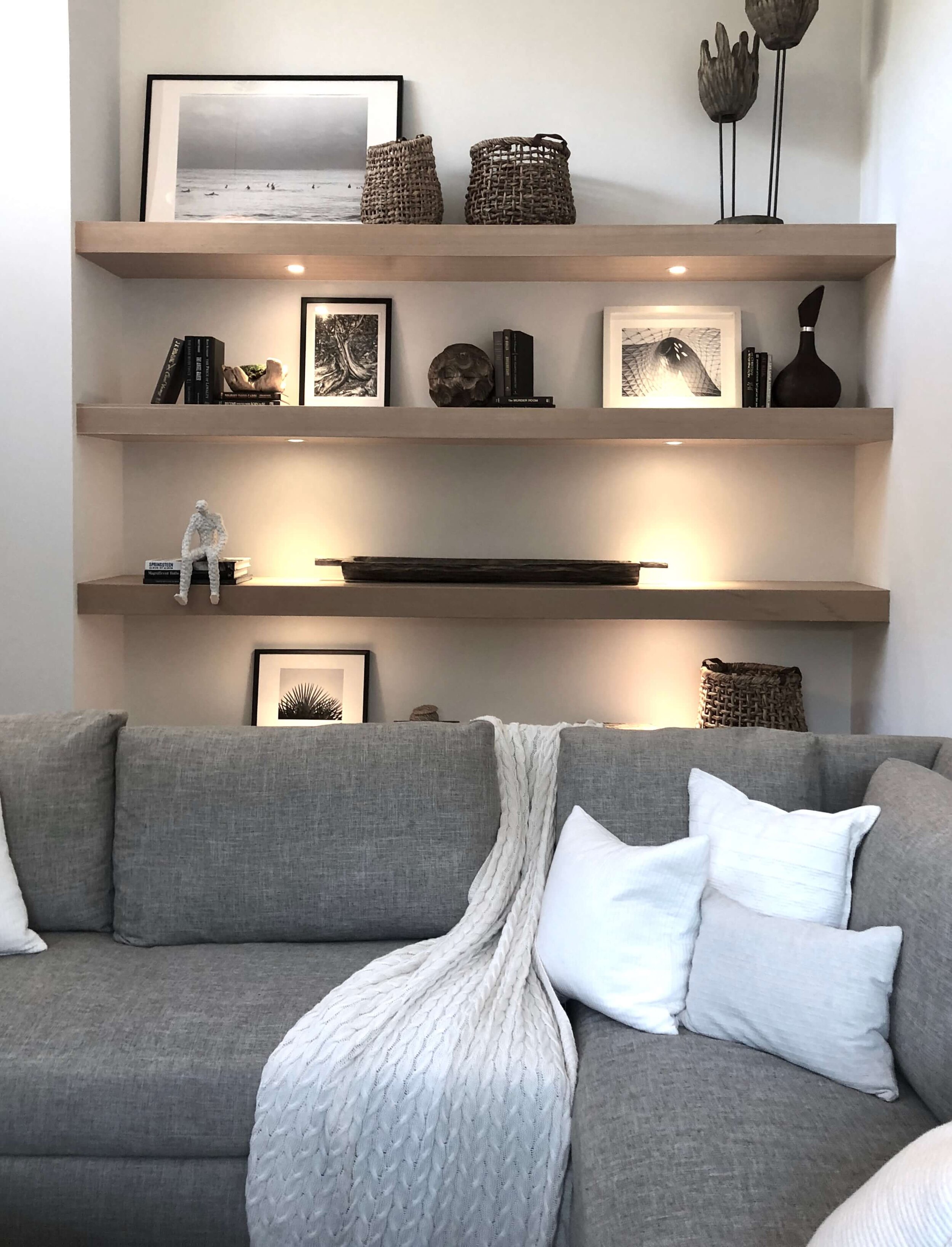
This modern home by Vitus Mitare, seen in the Malibu Dwell by Design Home Tours in 2019, had a niche of floating shelves in the lounge.
Floating, open shelves in a home by Vitus Mitare, seen at the Malibu Dwell by Design Home Tours.
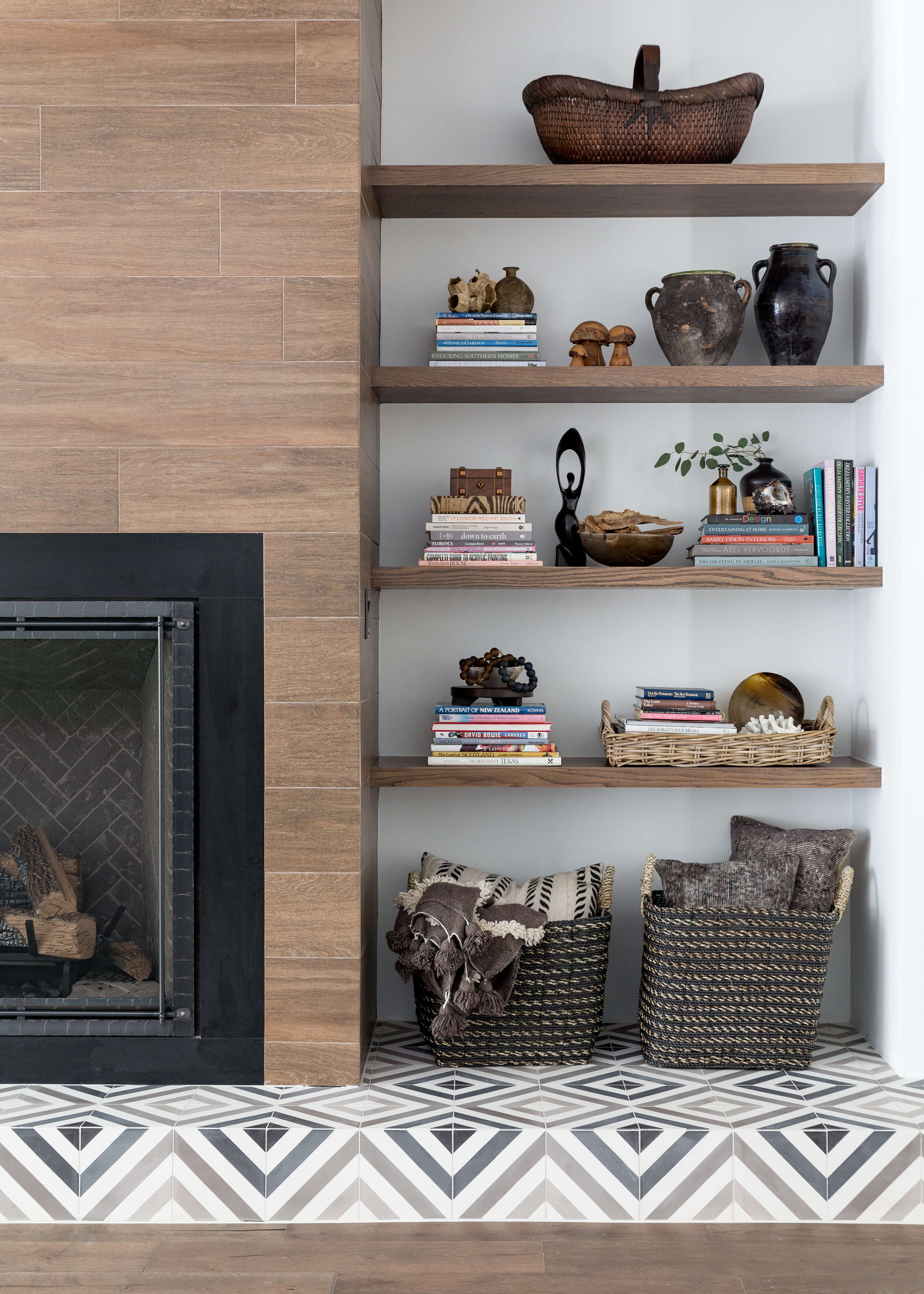
Floating open shelves look great next to the fireplace in this family room. Designer: Carla Aston, Photographer: Colleen Scott
Kitchens with open, floating shelves
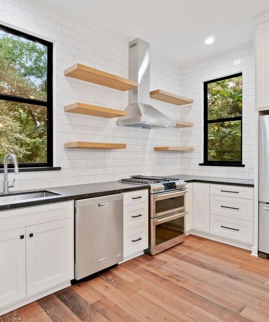
In these kitchens, below, we opted for some open shelving in lieu of the typical cabinetry, again, to lighten and update the space.
It also provides a place where some personalization can occur, on the shelving. Even two or three open shelves can add a special moment in a kitchen where items displayed can make the kitchen look more unique and less generic or builder grade.
Flip House Kitchen
This kitchen was in a home that was flipped by a local contractor I work with. I gave him the ideas for this kitchen’s redo and he did a great job and sold it within two weeks of going on the market.
Here’s the link to more about this home’s remodel.
BEFORE REMODEL - Builder kitchen with odd looking boxed cabinetry over a cooktop.
AFTER REMODEL - Open, floating shelves really open up this kitchen’s look and gives it a big update. carlaaston.com
Client wanting a lighter, brighter kitchen without redoing it all.
This kitchen, below, had lots of dark wood cabinetry. The homeowner wanted a brighter, more coastal feel while keeping some of the existing cabinets.
We opted for a two tone look, with some cabinets painted and some stained. The open shelving in lieu of the dark wood uppers on the wall by the fridge, helped achieve that goal.
See more before and afters of this kitchen remodel here.
BEFORE REMODEL - Builder kitchen with lots of dark wood cabinetry.
AFTER REMODEL - Open, floating shelves really open up this kitchen’s look and gives it a big update. carlaaston.com
AFTER REMODEL - Open, floating shelves give a chance for personalization in this kitchen, with dishware and collections. carlaaston.com
Open, floating shelving was the perfect solution in this kitchen.
This kitchen was full of dark cabinetry too. The area at the sink, in particular, felt crowded with full cabinets on both sides.
Since there were lots of cabinets for storage, we opted for open, floating shelves to give a lighter look and so the homeowner could add some of her own items for display.
You can check out more of the before and afters images of this kitchen here.
BEFORE REMODEL - Dark wood upper cabinets overwhelmed this space.
BEFORE REMODEL - The space at the sink seemed crowded by the dark wood upper cabinets on both walls.
AFTER REMODEL - Open shelving opens up that corner sink area and helps add personality to this kitchen. Carla Aston, Designer | Tori Aston, Photographer
AFTER REMODEL - Open shelving breaks up all the white cabinetry in this kitchen, with an interesting wall display. Carla Aston, Designer | Tori Aston, Photographer
Floating Shelves Add Interest
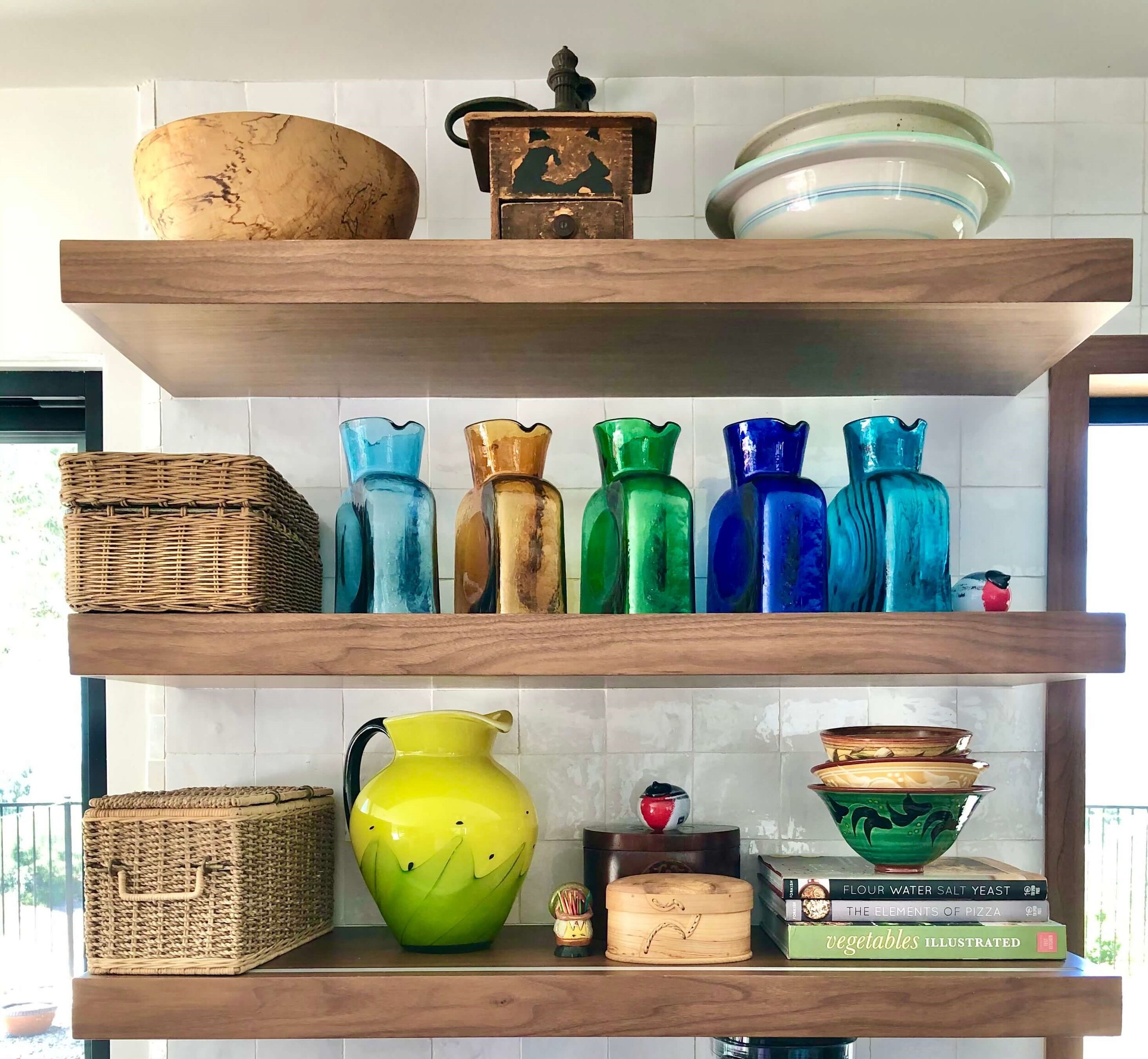
I was in California last week and visited this former client whose kitchen I’d designed for them, before they moved there. They took the plan and ran with it themselves, but I was happy to see their floating kitchen shelves on the zellige tile, as we had discussed some three years ago.
Floating shelves are a way to add color and collections to a kitchen, to personalize the space. carlaaston.com
Need some tips on shelf styling? Grab the FREE Guide, below, when you subscribe.
Pin this to Pinterest to save for later reference!

