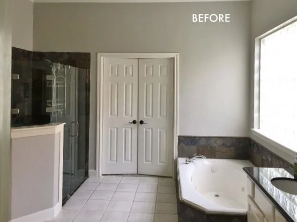
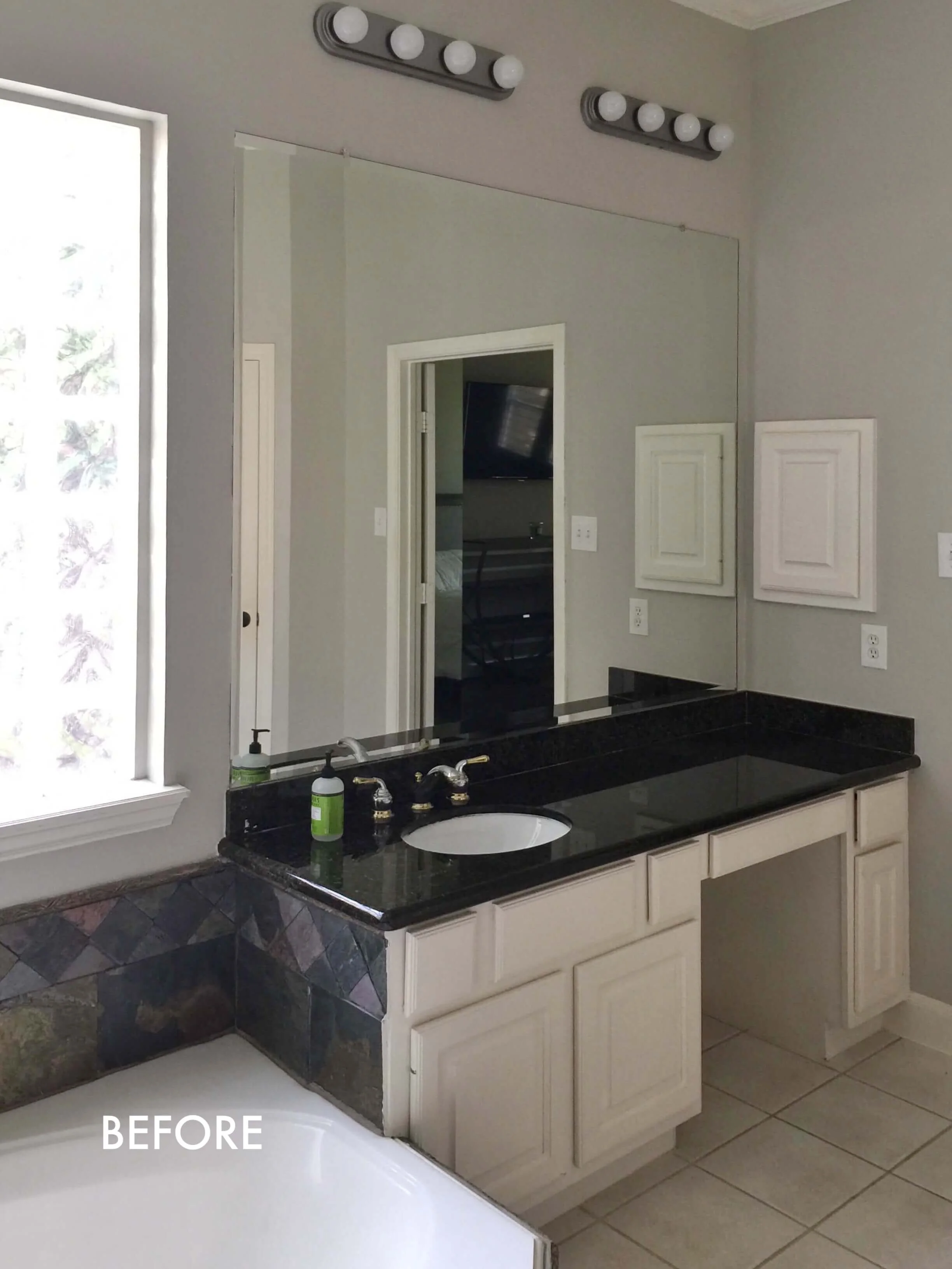
You can see from the BEFORE pic of this master bath that it was spacious and light filled, but it lacked something more…..good design.
What were the worst offenders in the design of this space?
The materials and the transitions of those materials, basically the careless way it was put together.
That’s what can make or break a bathroom remodel project and that’s why you hire a designer, like me ;-), to think through those transitions and select quality products.
That “design” will make for a beautiful and functional bathroom that you will love, one that even a few years down the road, you will be glad you spent the money on.
That’s the deliverable of good design. ;-)
And I know all you design lovers out there who read this blog know that. I’m preaching to the choir here, right?
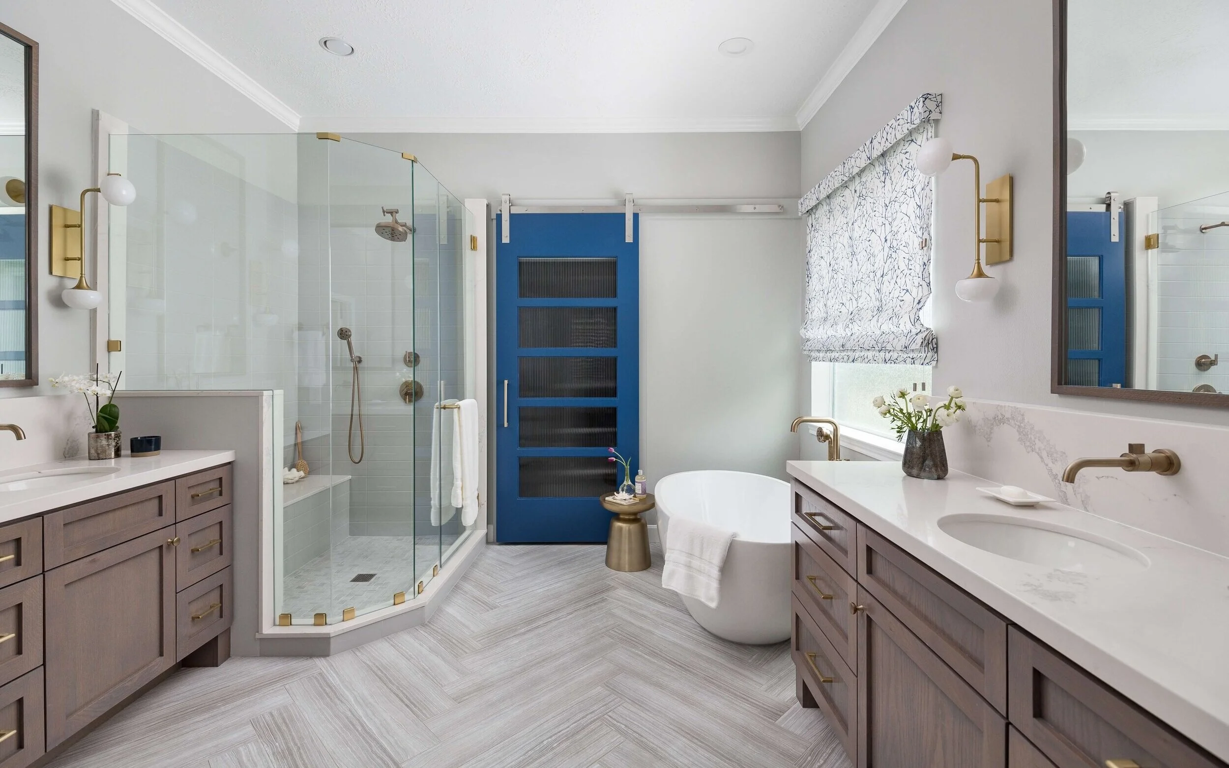
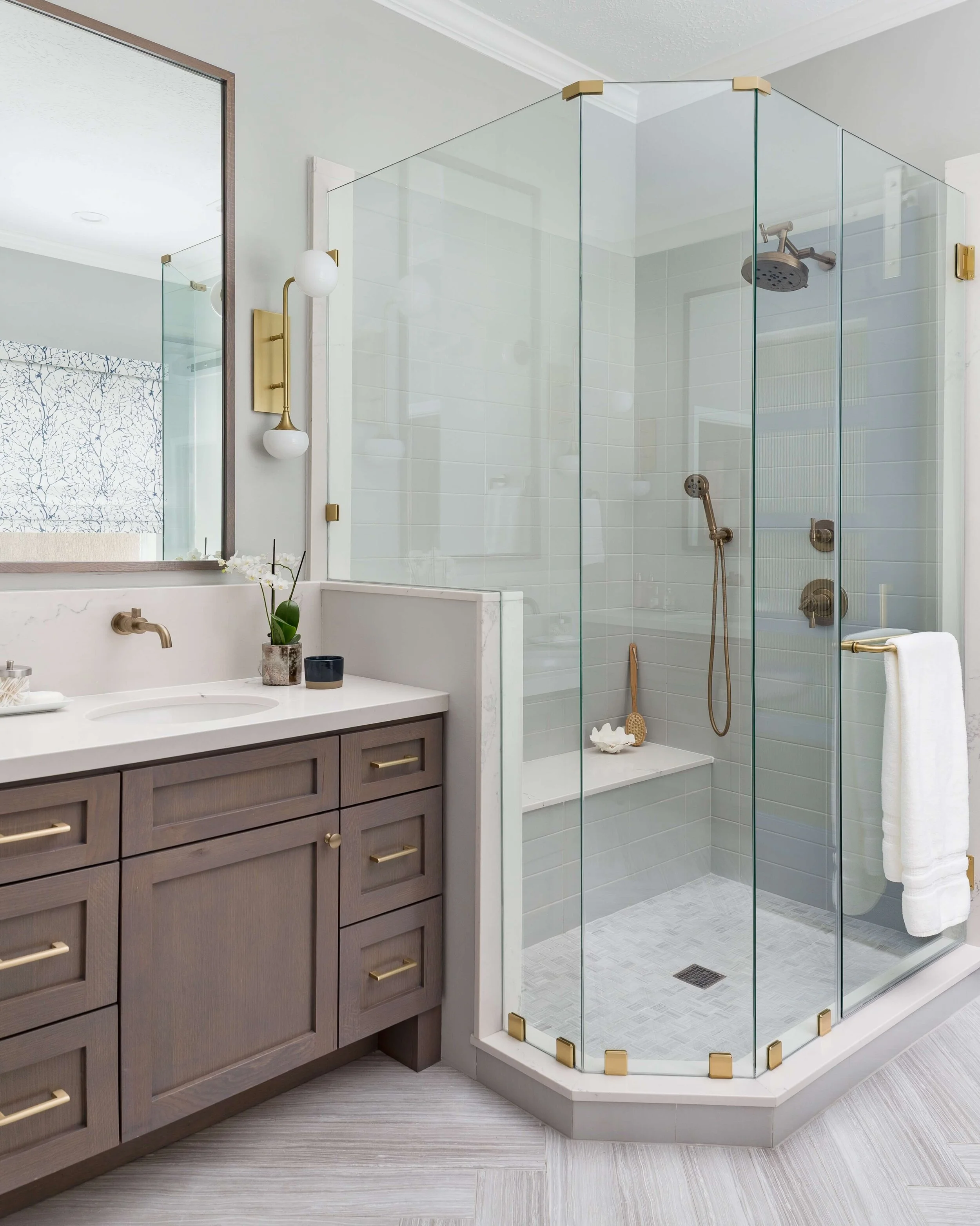
So, what does this master bath look like today?
It looks like this.
Here are a few more close ups of the what the bathroom looked liked before.
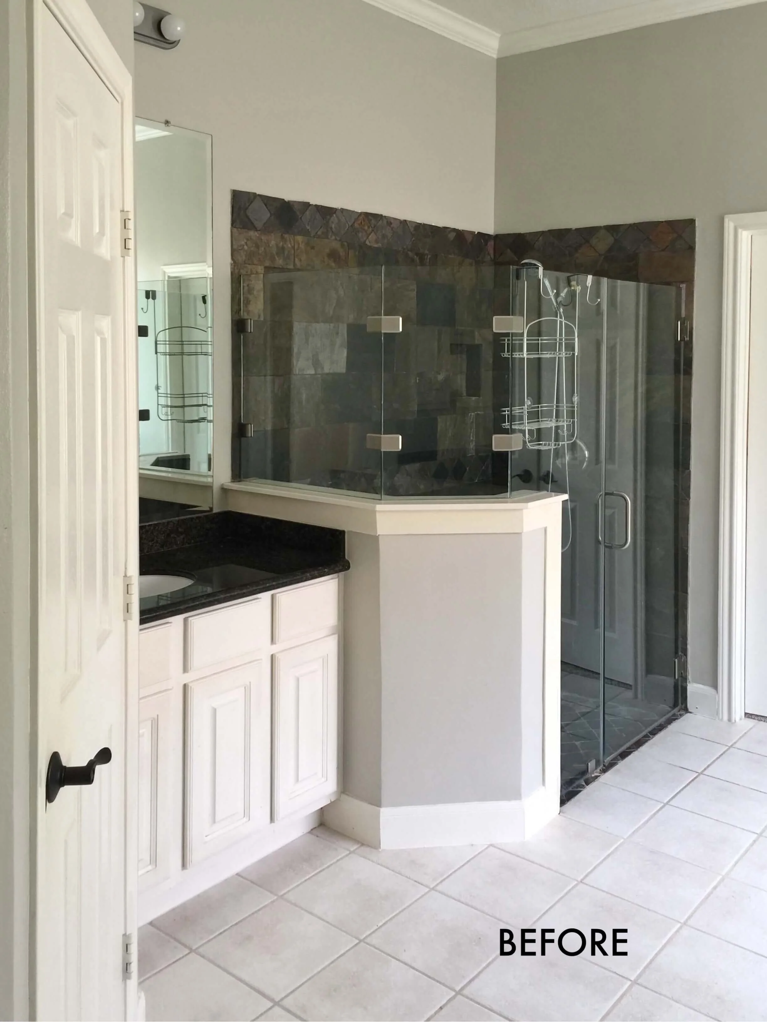
BEFORE REMODEL - The shower was dark and dated. The homeowner wanted to expand the shower in this ample bathroom.
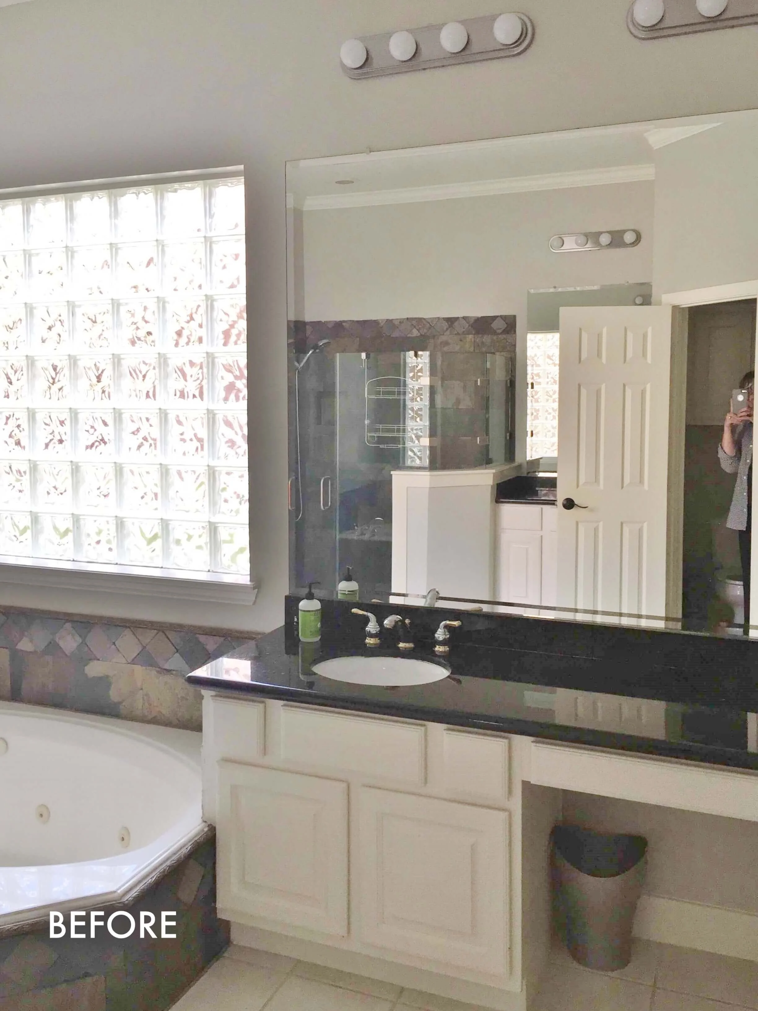
BEFORE REMODEL - The dated glass block window, tub with a poor tile installation, and unused short seated vanity area had to go in this bathroom.
BEFORE REMODEL - This unused seated vanity area, the dated lighting and awkward tile installation left much to be desired in this bathroom.
I’m guessing you can see the transitions and materials that make this bathroom less than stellar?
That tile on the side of the cabinetry, the cabinetry, the cheap lighting, the big slab mirror just glued on the wall…..all these are items we wanted to address in this remodel.
Here were the bathroom’s functional concerns.
There was room for a larger shower and it was warranted here.
The closet doors remained open most of the time and the door swing pushed into the closet, where they were in the way.
Double doors there are nice, but not really a beautiful feature right across from the entry to the bathroom.
The glass block window needed to be replaced.
The cabinetry didn’t really have much storage and the knee space wasn’t desired here.
The old, dated tub had yellowed, wasn’t functioning properly and was taking up a lot of square footage.
Here’s how the design solved those issues.
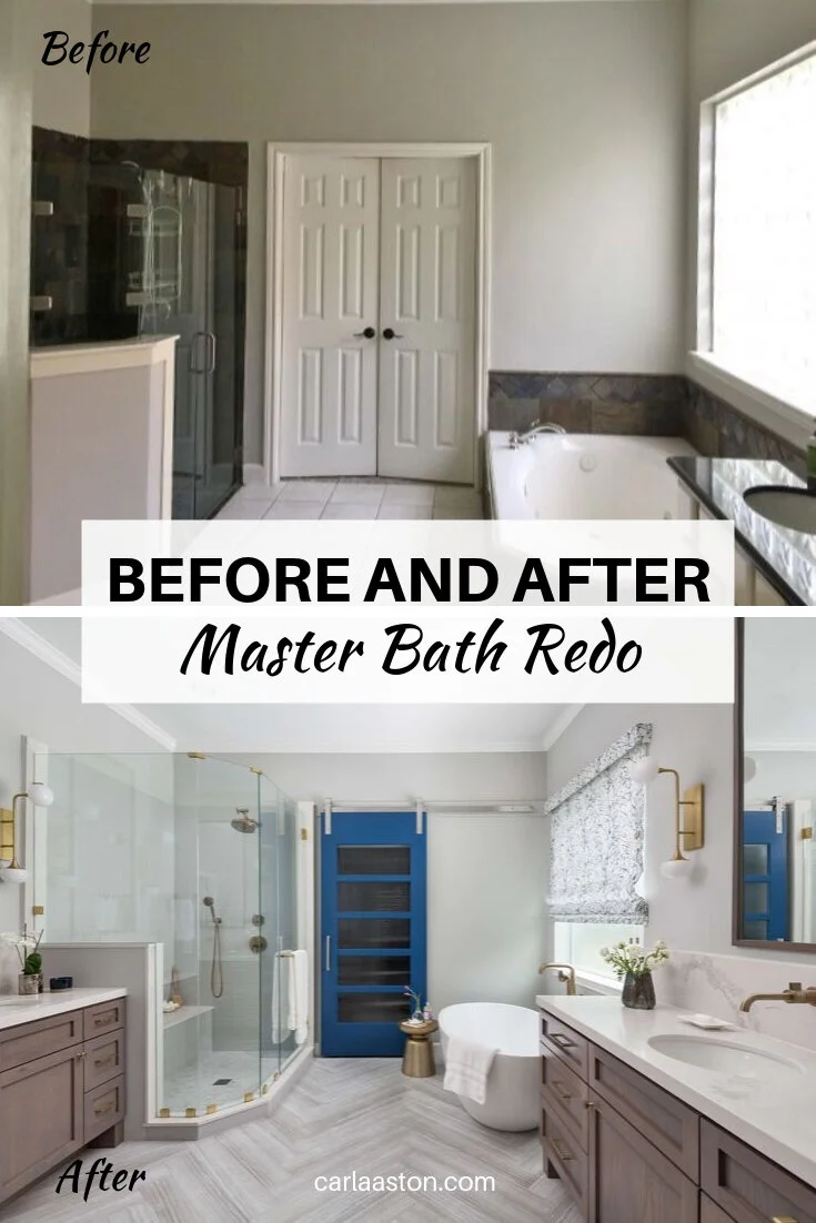
By shrinking the opening of the closet doors and doing one large barn door that slid over for access (in the slot behind the tub), we allowed for the shower to grow that direction and the new door to become more of a statement.
Beautiful oak cabinetry was custom made to add some warmth and better storage here for these homeowners. While we had painted cabinetry in their kitchen in that recent remodel, I thought going stained wood in the master bath would eliminate too much repetition of design in their home.
It turned out to be a really nice way to add interest and keep the bathroom from looking too one dimensional.
The glass block window was replaced with a rain glass fixed window and a pretty Roman shade that adds some pattern and color to the space.
The tall, wood framed mirrors make use of the high ceilings and the special brassy modern sconces feel very fresh and enhance the new look.
While I love a shampoo niche to add some style and design to a boring shower wall, these homeowners wanted to hide their niche and all the products that tend to clutter up the shower.
So, we tucked it in the pony wall behind the cabinet. :-)
Lovely brass plumbing fixtures were used to bring warmth to the overall cool gray bathroom. These Brizo fixtures are some of my favorites and so well designed. I mean, how cool are the towel “rings” at the vanities?
And I love how the wall sconces work so well with the design of the plumbing fixtures. Yes…..intentional. :-)
The eye-catching barn door became a real design feature in the room. Painted a blue color, Benjamin Moore New York State of Mind, it was slightly brighter and had more green in it than the blue we used in their kitchen.
I think it adds some fun and usefulness.
The free standing tub is a winner here, for all the reasons I mention in this post about free standing tubs.
See how the light flows around the tub and the pretty herringbone floor pattern spreads out across the room? I love this light and airy look.
It also serves the functional purpose here of providing a slot for that barn door to slide into.
Master Bedroom Peeks!
We did some new furnishings in the master bedroom while we were at it.
The bed, night stand and pretty glass lamps look lovely with the freshly painted bedroom walls. That color is magical! It’s SW Meditative.
Perfect for a master bedroom, no?
Here’s one more peek at the before and after….
Photographer “After” Images: Colleen Scott
General Contractor: Knepper Enterprises
Care to see some of the other spaces in this home? I’ve got them linked right here.
My blog contains affiliate links. Any purchases, at no additional charge to you, are most appreciated and make this blog possible. Here are some of the products used, below.




I’ve already posted the kitchen before and after pics from this pretty family-friendly home, but now I’ve got the adjacent family room, a peek at the powder room and a sweeeet bench we had made for the long entry hall.
Take a look…..