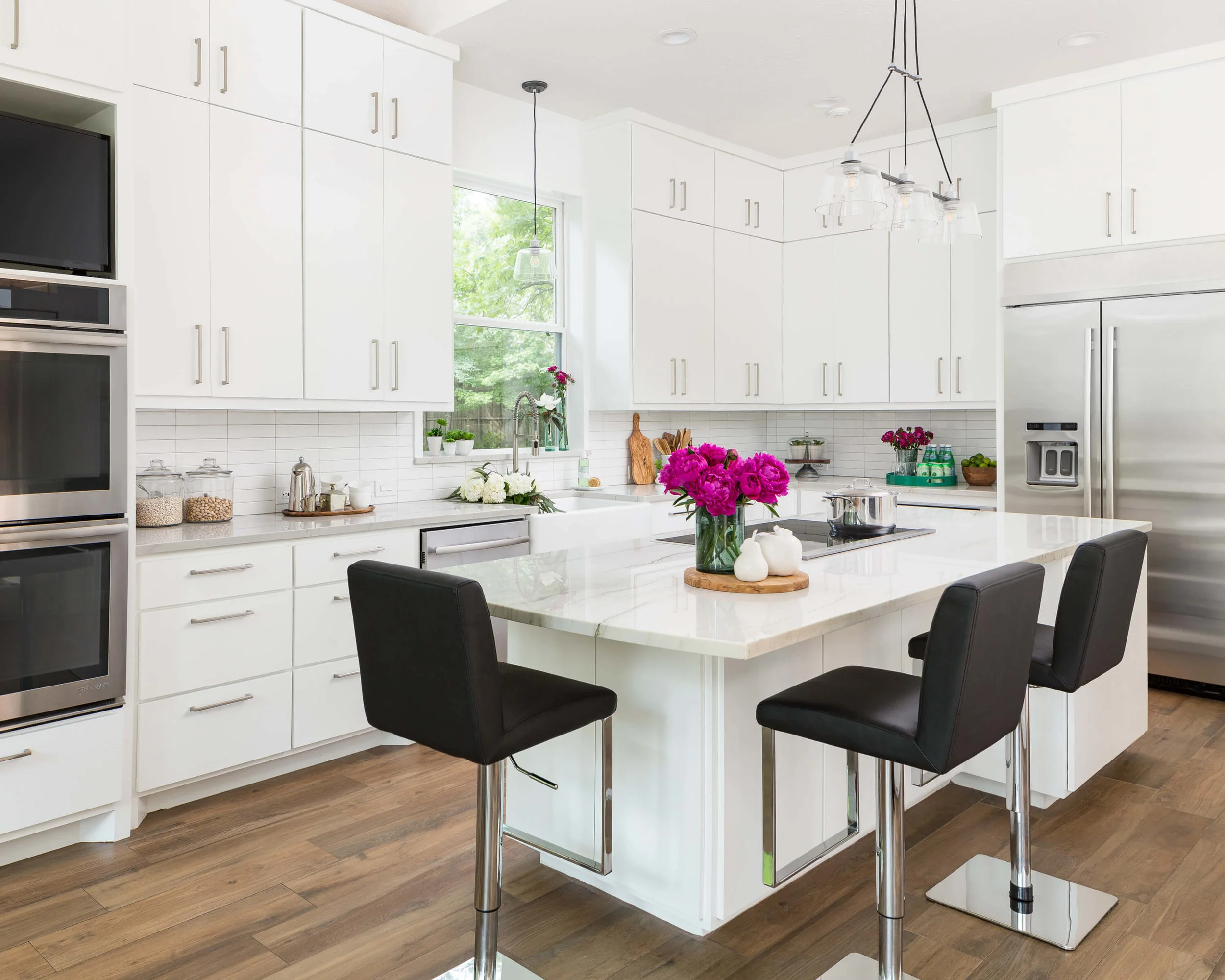
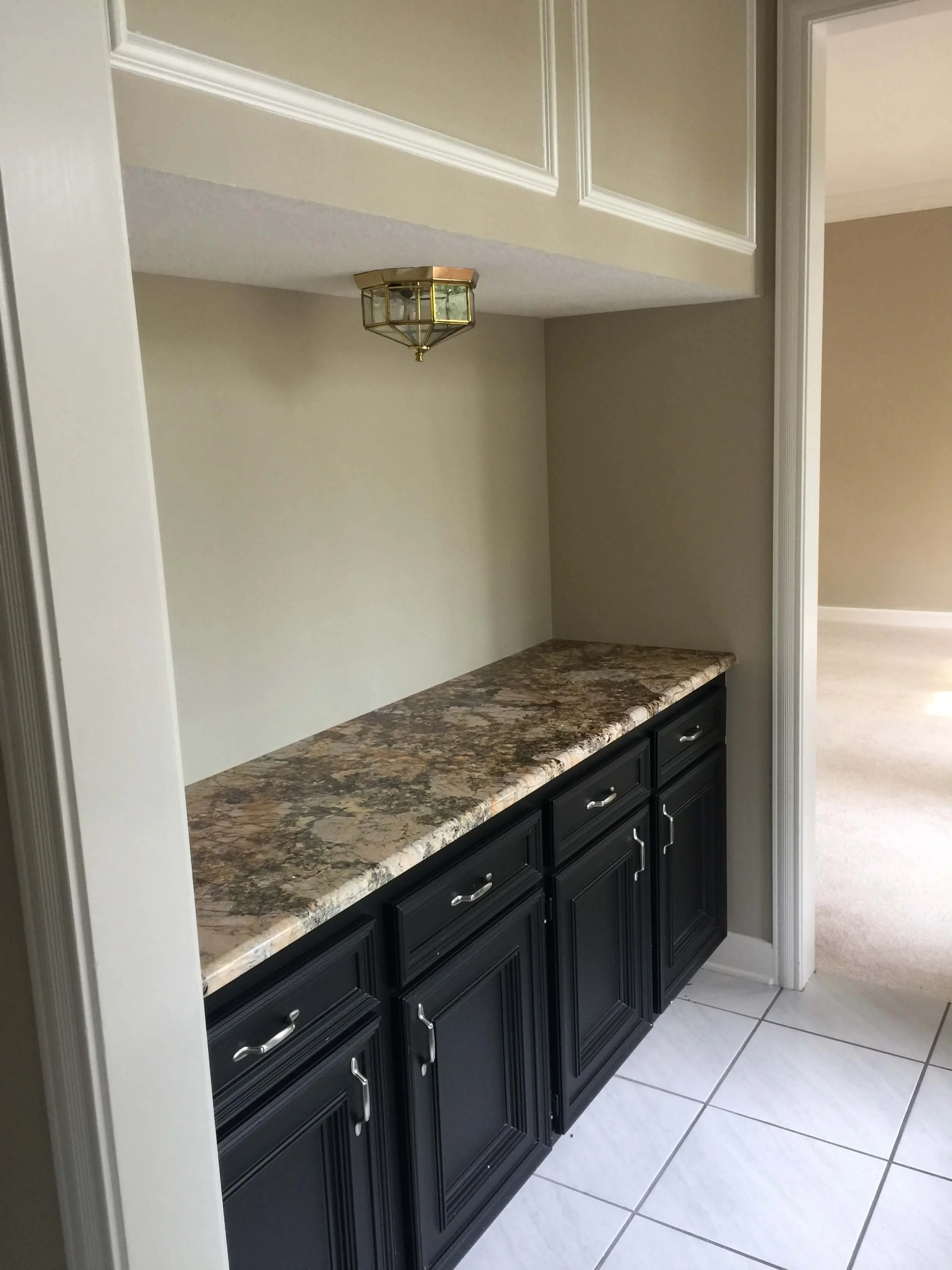
This before and after remodel will make you blink twice to wonder if it is the same kitchen. The change from a dated wood kitchen to a light, bright, white kitchen is quite remarkable!
You might have seen me post a before pic or two of this kitchen at some point if you follow my Instagram. This project was on hold awhile before construction, but I think you’ll agree, it was worth the wait.
The problems and features to address here…..
The homeowner wanted a bright white kitchen.
Clean lines and a more contemporary look were desired.
Kitchen island and cabinetry had room to grow in length of space.
Kitchen window would be better as a single, taller window.
Cabinetry details in the hallway, under the stairs needed to be cleaned up.
Get rid of the light box and that bulky corner oven cabinet!
Basically, they wanted to bring this kitchen, built about 25 years ago, into this day and age.
Here are the before pics…
BEFORE - The dark wood kitchen needed a new, fresh look. The light box and bulky corner cabinet really needed to go.
BEFORE - The kitchen window was chopped up with the transom above. A taller window would be the way to go here to make this kitchen feel more open and lighter overall.
BEFORE - Bulky corner oven cabinet had to go, along with the old original ovens.
BEFORE - These cabinets under the stairs felt short and squatty because of the landing above. That light fixture was right at about eye level.
And here are the final results!
An all white and bright kitchen…..at your service.
AFTER - This all white and bright kitchen was a big transformation from the dated wood kitchen here previously. See the transformation! Carla Aston, Designer | Colleen Scott, Photographer #whitekitchen #kitchenideas
AFTER - This all white and bright kitchen was a big transformation from the dated wood kitchen here previously. See the transformation! Carla Aston, Designer | Colleen Scott, Photographer #whitekitchen #kitchenideas
AFTER - The homeowners were after a white kitchen and that is exactly what they got! Simple details, white cabinetry and a linear stacked tile make for a simple look. Carla Aston, Designer | Colleen Scott, Photographer #whitekitchen #kitchenideas
AFTER - You can see that we just filled in the opening under the stairs with full height cabinetry to minimize that look of the short space. It provided a lot more storage too. Carla Aston, Designer | Colleen Scott, Photographer #whitekitchen #kitchenideas
More design considerations…
New wall ovens and a tv integrated into the cabinetry tower at the end, pictured below, help lengthen the cabinetry along this wall and added a nice bookend to the cabinetry run.
The homeowner loved their pots and pans in open storage, so to keep the look from cluttering the kitchen, the open shelving was placed at the end of the island, facing the fridge.
With the downdraft located below the cooktop and a built-in trash drawer on the sink side of the island, this was the best place for that open storage.
Adding in some warmth to an all white kitchen
While we kept a simple, clean white palette with the finishes here, I also wanted some relation to the more traditional house and area.
In this instance, I thought we needed some movement and a natural element in this kitchen, so we went with a natural stone quartzite counter, Macabus White, for some variation. It has a slight gray coloration and some nice veining that runs the length of the countertops.
Wood look tile that runs through the rest of the downstairs, also provides a warm look but holds up to the homeowner’s pets.
AFTER - The desired open shelving for pots and pans was tucked in at the end of the island to hide the clutter and make these easily accessible for the homeowner. The new taller window and farmhouse sink are nice additions. Carla Aston, Designer | Colleen Scott, Photographer #whitekitchen #kitchenideas
Simple details are sometimes the most important.
There are some simple details here that I incorporate a lot on my jobs.
First of all, many homeowners love to set items up on the sills of their kitchen windows. Often it is some flowers or plants, even kitchen items that might be wet. We make sure that sill won’t be ruined with water by putting the same countertop material there at the sill too.
I’m always careful to “dogear” the sill so that the window moulding on the side travels down the window and dies into the top of the sill.
Here, we waited until the sill was in and made sure it aligned with the end of the cabinet there, then the wood trim was cut to fit on each side.
It provides a clean detail that leaves no exposed sheetrock or odd cuts.
AFTER - Simple, stacked linear subway tile makes for a contemporary look in this white kitchen. Natural stone quartzite countertops add some warmth and a natural element to the contemporary space. A sill made in the same counterop material adds protection from water at the kitchen sink. Carla Aston, Designer | Colleen Scott, Photographer #whitekitchen #kitchenideas
Low, horizontal outlets and switches don’t stand out so much on a backsplash
I’m partial to low, horizontal outlets and switches too, on a backsplash. It keep cords from hanging down if items are plugged in to high outlets and usually they can be disguised easily with items sitting in front of them on the counter.
The white outlets on the white tile blends in nicely here. I purposely styled this photo below to show how I like to place these outlets.
AFTER - Simple, stacked linear subway tile makes for a contemporary look in this white kitchen. Natural stone quartzite countertops add some warmth and a natural element to the contemporary space. Outlets are mounted low and horizontal to minimize their appearance on the splash. Carla Aston, Designer | Colleen Scott, Photographer #whitekitchen #kitchenideas
Kudos to the other pros on this job.
JItka Mayorga - Jr. Designer
Colleen Scott - Photographer
Carmona Remodeling - Contractor
If you live in The Woodlands, TX area and want a completely new kitchen in your home, check out my full service offering here. I’ll be taking on a couple of new projects later this summer. :-)
See more of my recent kitchen remodels at these links, below.
And please pin a few of these images to Pinterest for me if you would be so kind! :-)
Shop This Look!
My blog may contain affiliate links. Any purchases, at no additional charge to you, are most appreciated and make this blog possible. :-)


I’m so excited to share a dramatic kitchen and family room remodel and makeover with you today!
This home no longer looks like all the other homes in the neighborhood. It has a customized, dramatic, striking appeal that more closely matches the taste of the homeowner. It is updated with a beautiful look that will last. :-)
Value was added to the property and well, I think things are purposefully all tied together now. Take a look……