I’m excited to share this coastal style kitchen remodel with you, that was recently completed.
This was a partial kitchen makeover, but I think you’ll see there isn’t much left to remind you of the old, dark wood look that was here previously.
Dark Wood Kitchen - BEFORE
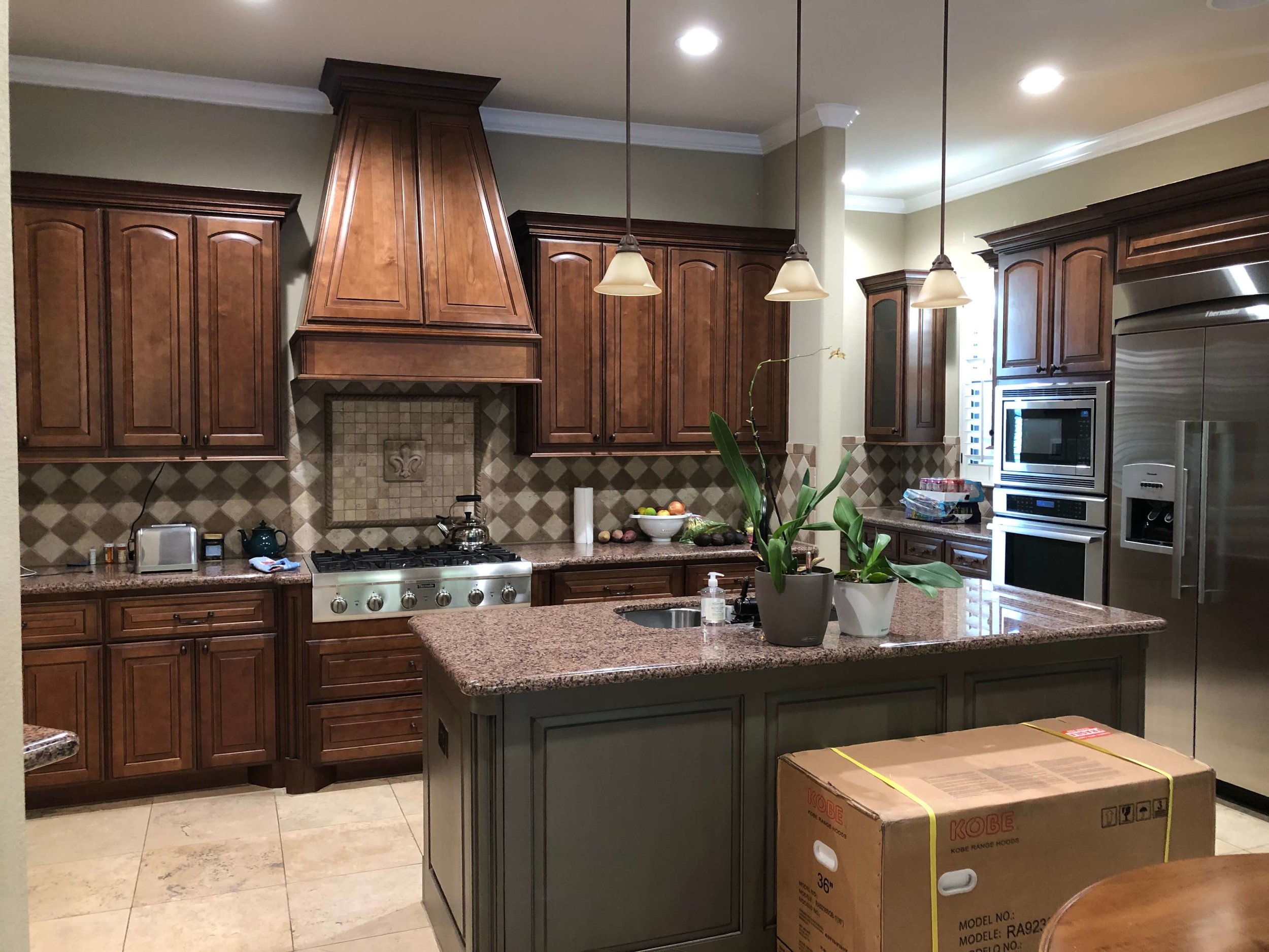
BEFORE - Kitchen to be remodeled. The all brown/warm toned look did not appeal to this homeowner.
BEFORE - Kitchen to be remodeled. The all brown/warm toned look did not appeal to this homeowner.
This homeowner wanted a lighter, fresher look. They were tired of how brown everything felt and the checkerboard backsplash combined with the pinkish toned spotty granite just didn’t work together.
They loved a coastal, somewhat more whimsical look…..something that felt younger and more up to date.
BEFORE - Kitchen to be remodeled. The pinkish toned granite didn’t work with the warmer toned backsplash or floor.
The biggest issue was that they didn’t want a completely new kitchen. They were thinking of painting the cabinets, getting new counters, splash and lighting.
That travertine floor was existing and although we were also taking down a partial wall (that divided the kitchen from the living room, causing the floor to have to be patched) they needed to keep the floor because it ran all through the adjacent living room and hallways.
They also wanted a new hood. That wood hood projected out at just the wrong height that it was uncomfortable for the homeowner to cook there. That sharp corner was a real nuisance and needed to go.
So, how could I achieve a fresh new look, update according to their wishes and not go too overboard?
Here’s what we remodeled in this kitchen….
Upper kitchen cabinets
I wanted to take those uppers to the ceiling to give this kitchen height and make it feel lighter and airier. The brown horizontal stripe of cabinets in this kitchen was dividing it in half so I wanted to trick the eye and make the top half of the kitchen feel more open.
IN PROGRESS - Here was the first demo. the kitchen already felt more open!
I also felt there was another way to lighten the look of this kitchen, to delete the run of uppers along the fridge wall and do some open shelving.
I just thought it would break up the monotony, enable us to add some personality into the kitchen for a touch of that whimsy on the shelves, and would go a long way to making this kitchen look more custom and less like it’s neighbors.
IN PROGRESS - The first demo of upper cabinets.
We gained a lot of storage that wasn’t there before, in the cabinet above the fridge and ovens (we redid that section and took it to the ceiling too).
We also took the lower desk area up to the same height as the counter, reusing that drawer section. We then remodeled that adjacent lower cabinet to accommodate a new undercounter beverage fridge, an appliance so many of my clients are opting for in their kitchen remodels these days.
The New Finishes Mixed With The Old
Okay, I don’t want to get too long winded here, explaining how I came up with a 3-toned kitchen, but it had a lot to do with the travertine floor.
I just couldn’t see the white cabinets on top of that floor, especially with the island, something we were going in with all new.
Then, while I originally was trying to hunt down some Taj Majal quartzite for the counters, the slabs I was finding weren’t ideal in color for this job.
Taj Mahal wasn’t doing anything to enhance the look of the floor. I didn’t want it to look like a “sort of” match, that was what they had before!
So, when all else fails and color tones aren’t working, I know it is best to go with high contrast.
IN PROGRESS - Kitchen remodel with quartzite countertops on new painted kitchen island with X design panels | Carla Aston, Designer
So, we went dark.
I found this quartzite, Tungsten Blue, and it looked beautiful with the travertine. (The pic doesn’t do it justice!) It was a dark green/blue color with some pretty direction and flow to the grain of the slab.
That color then led to selecting the color for the island and bar table base, to more or less match that dark finish.
It made a good interruption into the travertine filled space and emphasized that color aspect of the kitchen.
The Kitchen Layout
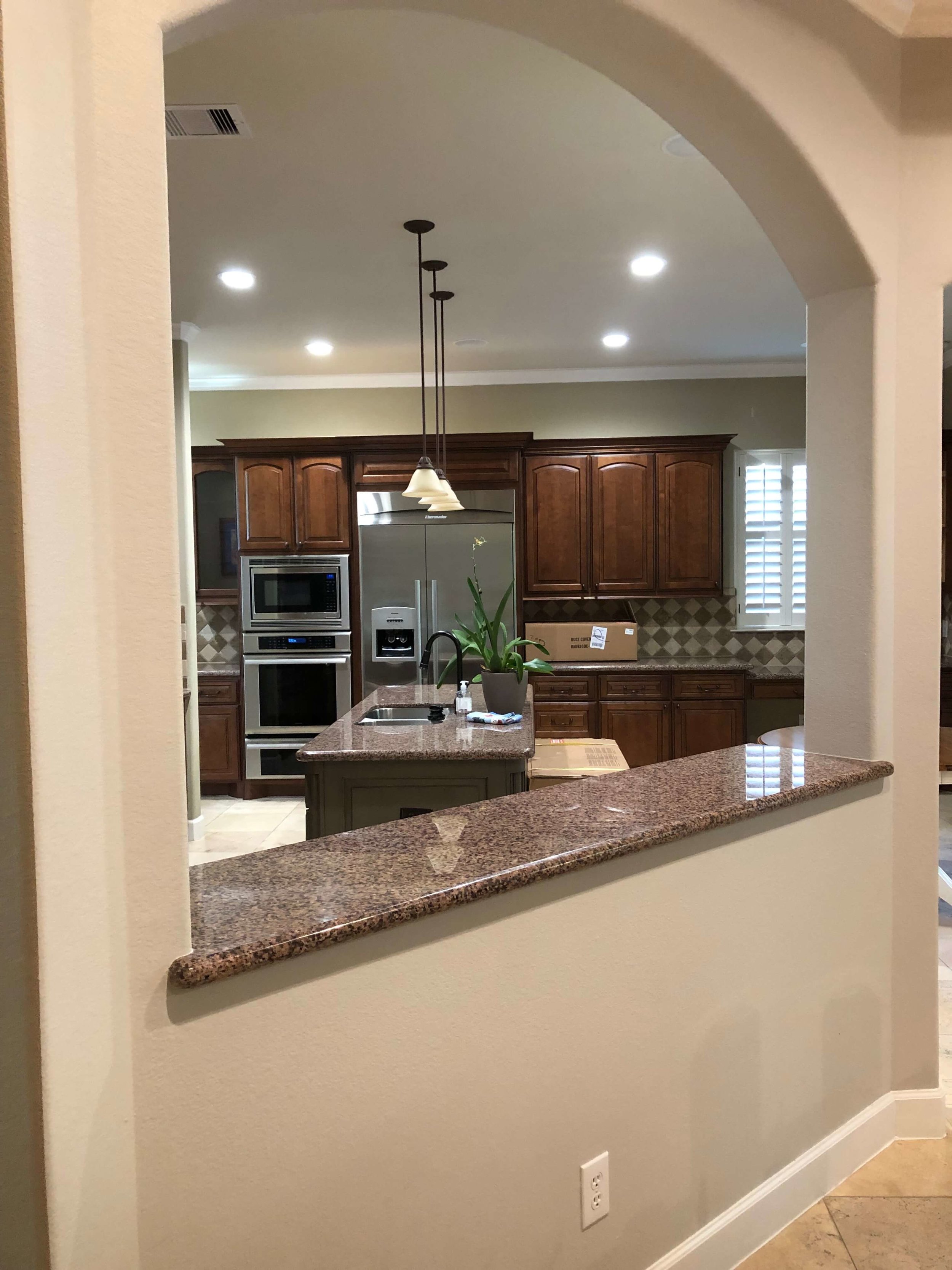
BEFORE - We took down this short bar wall and the arch to open the kitchen up more to the family room. #kitchenremodel
The homeowner didn’t really want a separate table in there anymore, they wanted a bar that would work with the island.
This kitchen has an angled wall that really cuts into the breakfast area. And even though we took the partial wall down, the columns had to remain.
I worked and worked on that plan, trying every configuration possible, turning that island on an angle, etc. It just felt too far away from the cooktop, that had to stay in it’s location.
It just looked pinched at some points, shifting that island around, no matter where it moved.
IN PROGRESS - Here you can see, we removed the partial height bar wall and the arches to open up this kitchen more to the adjacent family room and create a better flow. Don’t worry, those opening are the same height now. :-) Carla Aston, Designer | Shaun Bain, Contractor
So, I designed the bar as kind of an L shape.
It laid out beautifully and now works really well for the homeowner.
There is plenty of seating and it feels like a table, where you are sitting across from someone, rather than just sitting at a bar looking into the kitchen.
I originally planned for a butcher block wood top there, but the homeowner found a local supplier for these old wood planks and our contractor turned it into a beautiful, reclaimed wood table top.
Every little detail contributes to the overall effect of this coastal style kitchen.
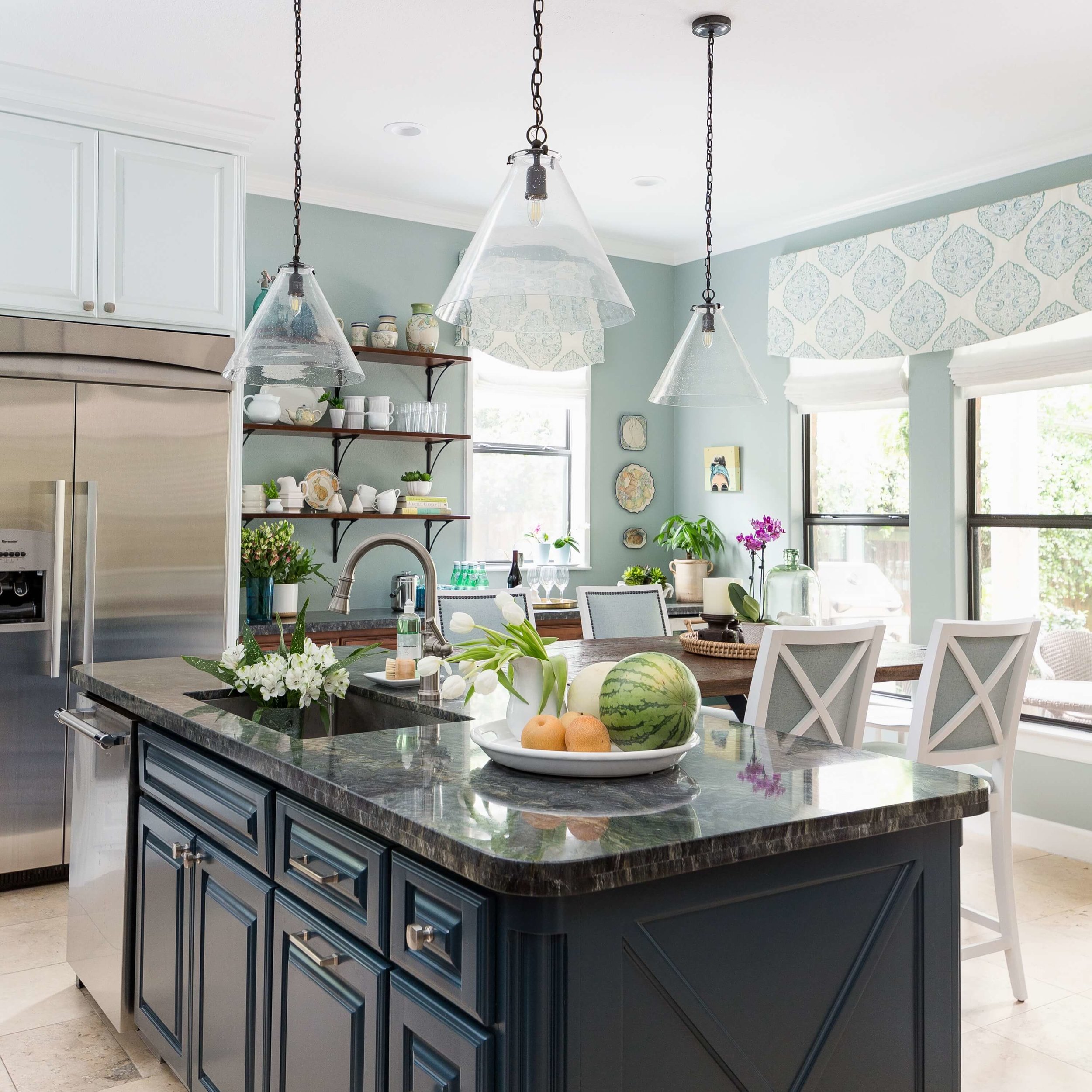
The new, soft window treatments were hung higher than the windows to add height. The lightness and fabric add a softness and contribute to the overall coastal style.
The wood shelves repeat the wood finish in the lower cabinetry to add some definition to that wall’s elevation. Those black brackets relate to the window framing finish.
Seed glass cone lighting is almost invisible but hints to the shape of the X design of our upper cabinetry and seed glass is, well, very coastal and natural feeling.
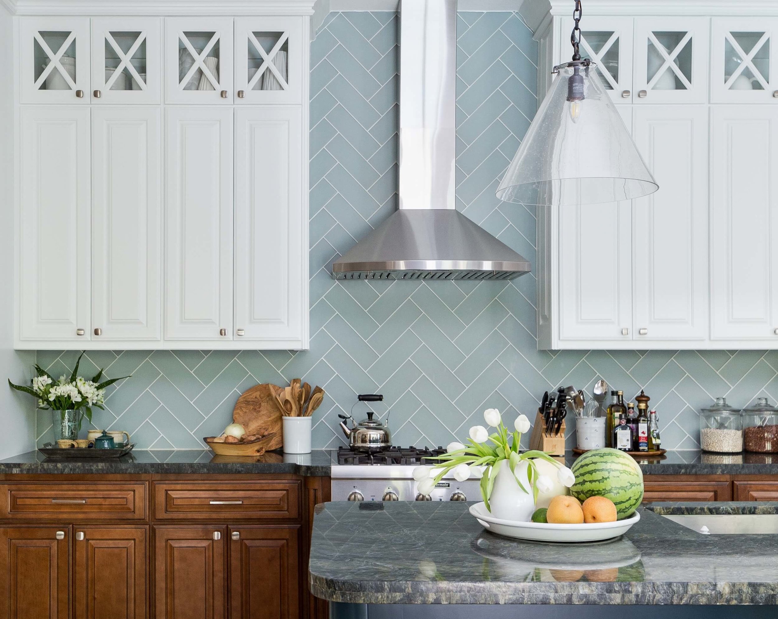
That new hood has a more minimal presence in the space with a curved front edge and the stainless look adds a cool tone to that wall.
The etched glass tile backsplash in that soft turquoise color lends itself to our coastal look and repeats the paint color so that the space flows nicely. The herringbone lay brings your eye up the wall, again, accentuating height in the space.
Okay, I’ll hush now and let you just oggle (and pin….ahem….) these pics of our finished coastal style kitchen. :-)
Coastal style kitchen makeover w/ open shelves and reclaimed wood countertop - Carla Aston, Designer | Colleen Scott, Photographer | #turquoisekitchen #coastalkitchen #openshelves
Coastal style kitchen makeover w/ open shelves and reclaimed wood countertop - Carla Aston, Designer | Colleen Scott, Photographer | #turquoisekitchen #coastalkitchen #openshelves
Coastal style kitchen makeover w/ open shelves and reclaimed wood countertop - Carla Aston, Designer | Colleen Scott, Photographer | #turquoisekitchen #coastalkitchen #openshelves
Coastal style kitchen makeover w/ open shelves and reclaimed wood countertop - Carla Aston, Designer | Colleen Scott, Photographer | #turquoisekitchen #coastalkitchen #openshelves
Coastal style kitchen makeover w/ open shelves and reclaimed wood countertop - Carla Aston, Designer | Colleen Scott, Photographer | #turquoisekitchen #coastalkitchen #openshelves
Coastal style kitchen makeover w/ open shelves and reclaimed wood countertop - Carla Aston, Designer | Colleen Scott, Photographer | #turquoisekitchen #coastalkitchen #openshelves
I have just one more (or two) more spaces to share. ;-)
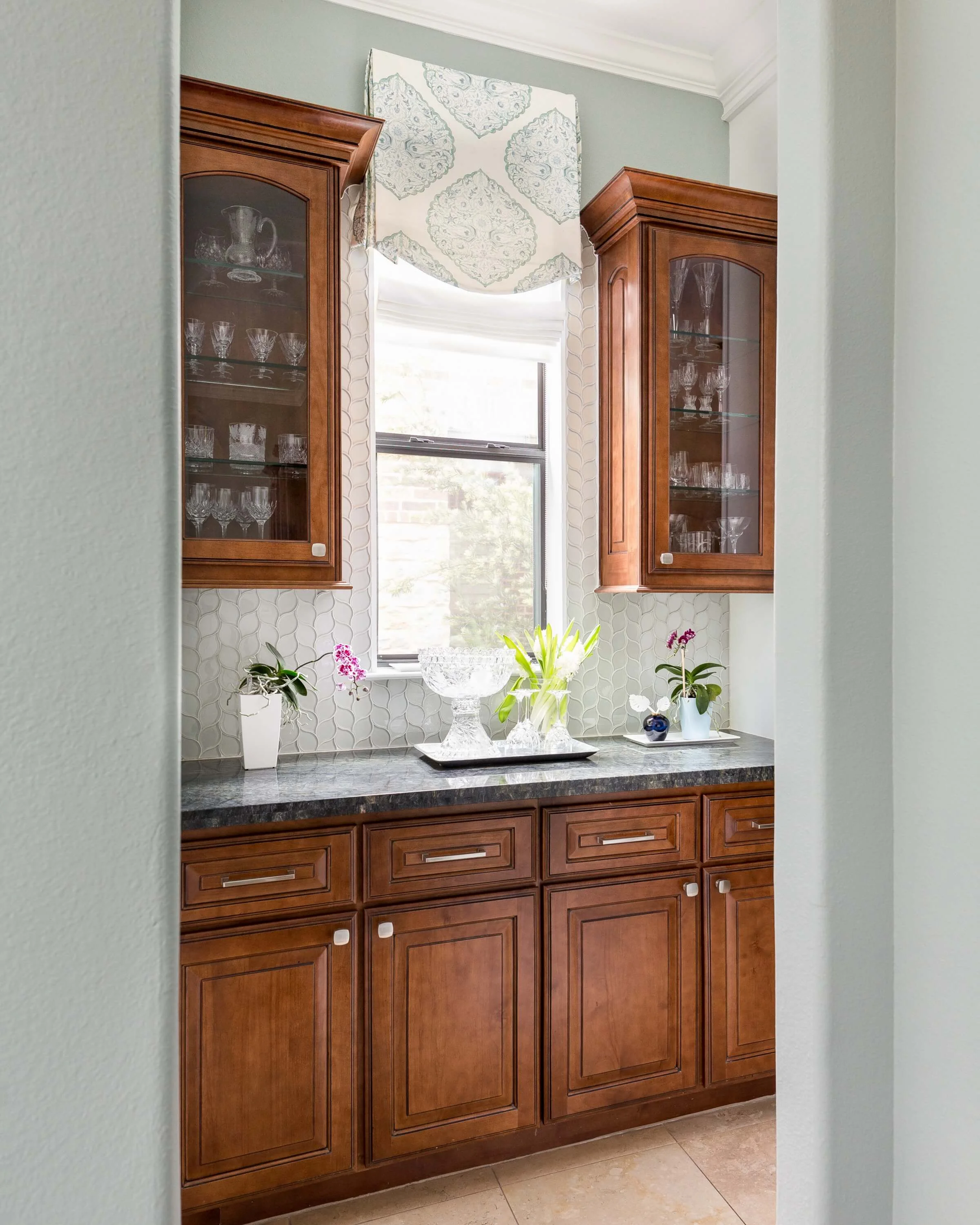
In the butler’s pantry, off the dining room and just beyond the fridge there, I elected not to take out the uppers. I felt like it wasn’t necessary and contributed to the “collected” look of the space.
We did the dark blue/green counter in here, some new glass tile that added vertical direction and reflection, then added fresh window treatments to match the kitchen.
The more modern, light, brushed nickel hardware adds a freshness to the wood cabinets throughout.
Coastal style kitchen makeover with wood cabinets and glass tile in Butler’s Pantry - Carla Aston, Designer | Colleen Scott, Photographer | #turquoisekitchen #coastalkitchen #openshelves
There’s more on this home’s coastal style makeover.
You can see this shot, above, was taken from the dining room looking into the Butler’s pantry.
We brought the color of the dining room into the kitchen to provide some continuity and well, it was just working so well in there, we wanted more. ;-)
You can see what we did the dining room, entry hall and powder room last year, in this post, linked below. We finished up with new drapery in there this year, when this remodel was complete.
And, I’ll be back with more!
We’re getting ready to tear out the fireplace and entertainment center wall in the living room now!
(You have to go look. It’s another great before and after! :-)
Kudos to the other pros involved in this project:
Shaun Bain - Contractor
Colleen Scott - Photographer
Jitka Mayorga - Jr. Designer
Do YOU see a new kitchen in your future?
I’m not taking new clients right now, but will be in the summer. Until then, you can use my Designed in a Click Q&A service to ask me up to 4 pressing design questions about your project. :-)







This is such a pretty before and after makeover of a dining room and foyer, you are going to love it!