This is such a pretty before and after makeover of a dining room and foyer, you are going to love it!
My blog may contain affiliate links. Any purchases, at no additional charge to you, earn me a small percentage, are most appreciated, and make this blog possible. :-)
I first went out to this local client's home and did a consultation for design services.
At the time, about a year ago, I had some time but not much, to work on this project. I didn't have enough time to devote to full service, but I found the project interesting and knew I could treat it as sort of a hybrid project.
I actually rarely do this anymore, it is just normally not profitable and not the way I prefer to work, but this just hit me at the right moment when I could do a little bit of help here and the homeowner could finish up on her own.
Plus, they had a larger kitchen remodel coming up. :-) We've actually just met about starting that project now.
They wanted to get this makeover done before they embarked on their bigger job and needed some assistance updating this dining room and foyer to bring a lighter, brighter, more coastal style to the space.
Here's the look they started with.
Foyer Makeover - Before
BEFORE - Foyer / Entry Hall
BEFORE - Foyer / Entry Hall
This homeowner was going for something coastal-inspired, a bit of a beachy look, and wanted to get the heaviness out of these spaces.
The foyer was dark and the treasured French antique piece was not helping that condition.
Situated where it was, right across from the stair, it was really just too much dark wood and basically caused the space to feel tight and confined.
The iron lantern wasn't doing much to help either. I felt that some fresher furnishings might open this space up and make it feel more inviting. Here's what I proposed.
Coastal Style Foyer Makeover Sketch - Carla Aston, Designer #sketch #foyerideas
Lighter Furnishings Proposed For The Dark Foyer
First, I thought a stair runner in a textural carpet would do a lot to brighten the dark wood mass of the stair. This space is basically an interior room since the door has no glass, and that big swath of dark wood just made it feel even darker.
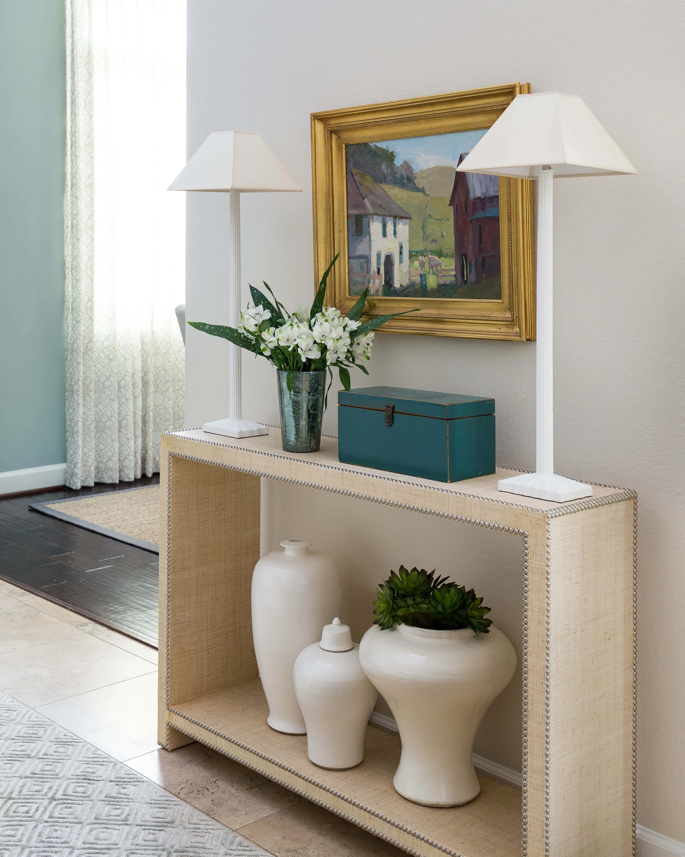
I proposed this console with the rattan finish, some narrow, white buffet lamps that wouldn't bulge out into the space, some white ginger jars and then a colorful rug to brighten things up.
The shell covered lantern would really stand out above in the midst of the dark stair and add the coastal feel they were looking for.
The homeowner had a pretty painting she wanted to use and feature here in the foyer, between the two lamps. These furnishings would give it the attention it deserved.
Foyer Makeover - After
Here’s my pic of the entry before we styled it. This pic shows the shell beaded lantern that I really want you to see.
Here’s my professional photo, below, taken by Colleen Scott, when we finished the kitchen.
Turned out nice, didn’t it?
Coastal Style Foyer Makeover - Carla Aston, Designer | Colleen Scott, Photographer #foyerideas #entryhallideas
I’d still love to see a stair runner, but this foyer has definitely came a long way without too much trouble. :-)
Dining Room Makeover - Before
Now, that French antique needed a place to perch. The dining room was the obvious choice, however, there was already a lot of furniture in the dining room. A "set" of furniture actually.
BEFORE - Dining room in warm tones
BEFORE - Dining room in warm tones
This furniture was from a previous home and the homeowners were really ready for something fresh and new. The warm tones were a little overpowering for them.
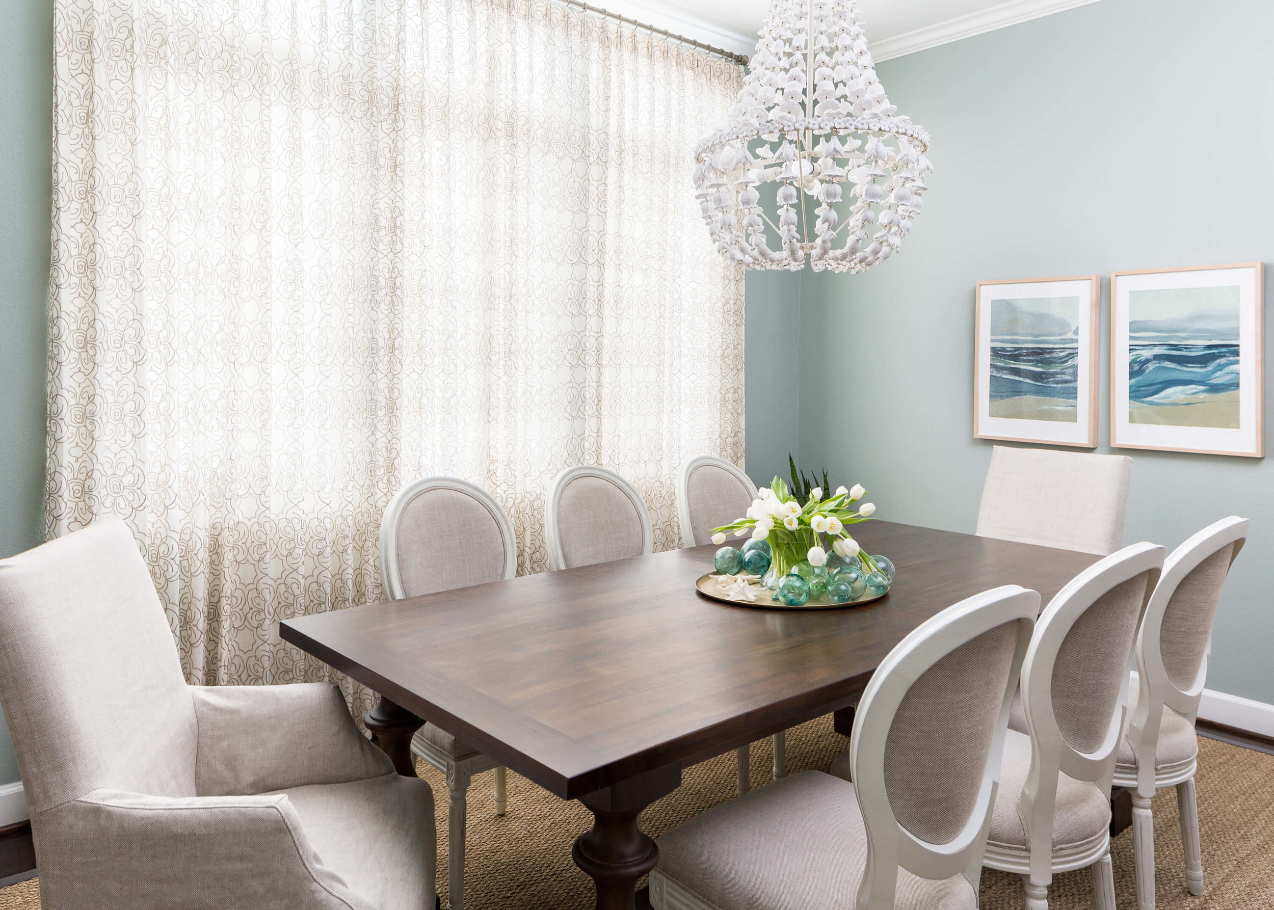
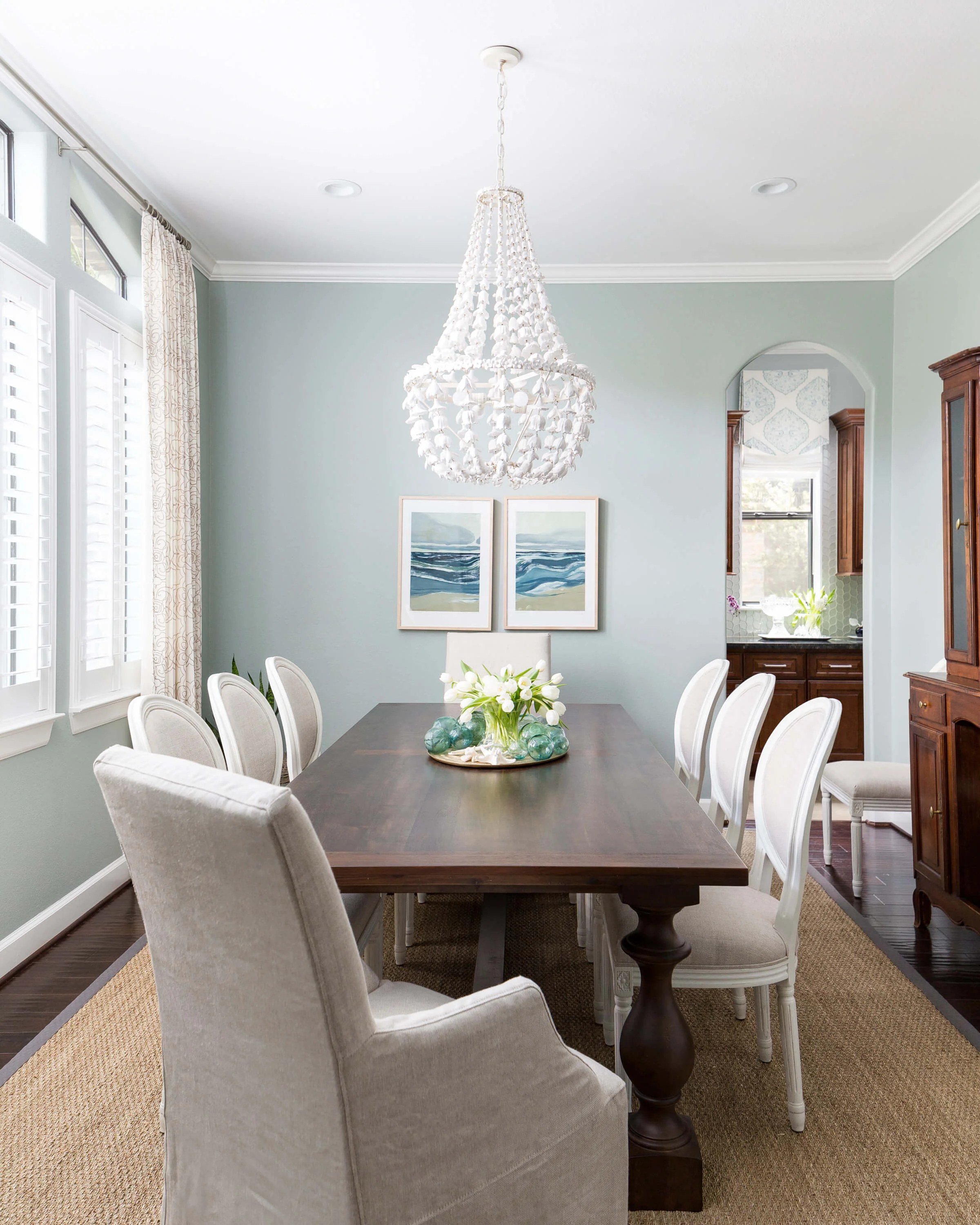
They had painted the dining room a great color as a start, Sherwin Williams Silvermist. I was looking for a kind of sand and sea combination here, to bring in some lightness and that coastal vibe.
I thought some new dining chairs with a light colored upholstered head chair, a seagrass rug, some coastal look art, and a pretty chandelier that the homeowner personally loved, would make a significant change in direction here.
I felt that this dark table would relate to the antique piece, and even proposed they could keep the table they had with these additions, if necessary.
I also proposed some sheer drapery with a crewel embroidery on a skinny iron gilded rod to add some softness to the room. They ended up completing that once construction was finished with the kitchen.
Coastal Dining Room Makeover - Carla Aston, Designer #diningroomideas #coastalstyle
Here's where it ended up.
Dining Room Makeover - After
Coastal Dining Room Makeover - Carla Aston, Designer | Colleen Scott, Photographer #diningroomideas #coastalstyle
Coastal Dining Room Makeover - Carla Aston, Designer #diningroomideas #coastalstyle
We also included the powder room in an update, with some new wallcovering, artwork, mirror and lighting. Pretty, no?
Powder room with turquoise grasscloth and round zinc mirror | Carla Aston, Designer | Colleen Scott, Photographer #powderroom #powderbath #grasscloth
I think this dining room and foyer came a long way.
And now, click on over to see the incredible kitchen makeover! :-)


