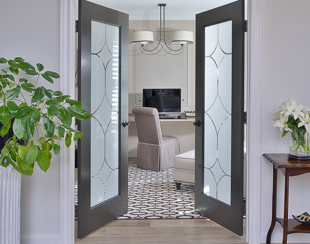
It was over a year ago when I first posted about my home office remodel.
While it has been finished for awhile now (not that long though), I recently had it and my upstairs bath photographed. (I'll share the before and afters of the upstairs bath in a week or so.)
I’m so excited to have these projects done so I can finally share them with you. (See, clients? I really do know exactly what you all live through when you remodel! Believe me, you have my sympathies! ;-)
Click to enlarge image full-screen.
I’m really embarrassed to show you how this space looked about 5 years ago.
At the time I was working out of my home, but I'm going to go ahead and give you a look anyway.
Besides... I share my client's before pics all the time. I suppose it's now my turn to feel the shame!
RELATED: How I Came To Have A Studio Outside My Home
This post describes how the clutter and stuff I use to do my job finally forced me to move my business out of my home. I am still so glad that I did.
When I first turned this space into an office — after it initially being a formal living room — I added the tackboards into the framed applied wood mouldings on the walls. It’s homosote board that's covered with linen - there's more about these at this link where I talk about my office tack boards.
I also added some track lighting and a built-in counter along the back wall. That served me well for awhile, until I got really busy and the trappings of my work took over.
My office was open to my front entry hall. Yes, it was right there, immediately visible when you walked into my house!
(I know...I looked like a hoarder.)
You see, this house was built in the mid-90’s when they were still building a lot of small formal living rooms and not yet doing home offices so much. My mother-in-law would comment on it when she stopped by: “Dear, how about adding some curtains here, or something else to hide all this?”
The space was perfect for a home office.
In this recent remodel I wanted to enclose it and add some doors. Because I was getting my new wood floors placed throughout most of the downstairs, I took those into this office space, too, had built-in cabinetry installed, changed out lighting, and added some furnishings!
The ellipse rug from Stark was my inspiration for the enlarged pattern on the doors, and the detail of the light fixture repeated that design. I love a little repetition to help tie everything together in a room. That pattern on the doors was window film done on clear glass panels.
I designed the pattern and Sunset Glass Tinting produced and installed it for me. I just love how the doors turned out.
Home office designed by interior designer Carla Aston
Below is a gallery full of even more "after" images.
Included are photos of my gorgeous wood floors in the entry hall, as well as the dark doors I had painted Sherwin Williams Black Fox.
Now that you know my remodel's backstory, have a look below at more "afters".
I’m so glad to have this complete! It's a big improvement from what it was 5 years ago, isn’t it?
The desk countertop is solid bleached oak. They cut the curve on site. Beautiful!
I love all my storage. We had to have filing space and I was so tired of the plastic file boxes we had stashed under my desk! Now we have all these nice big lateral file drawers.
If filing could be fun, it will be here.
Here is a link to the wood floor. I’ve has so many questions about it. It’s held up really well and we love it.
Need help finding the perfect floor or the perfect paint color for your home? I’ve got some handy guides to help you. :-)


