I’m sharing another Designed in a Click Q and A done recently on one of my most popular topics, kitchen backsplash design and selection!
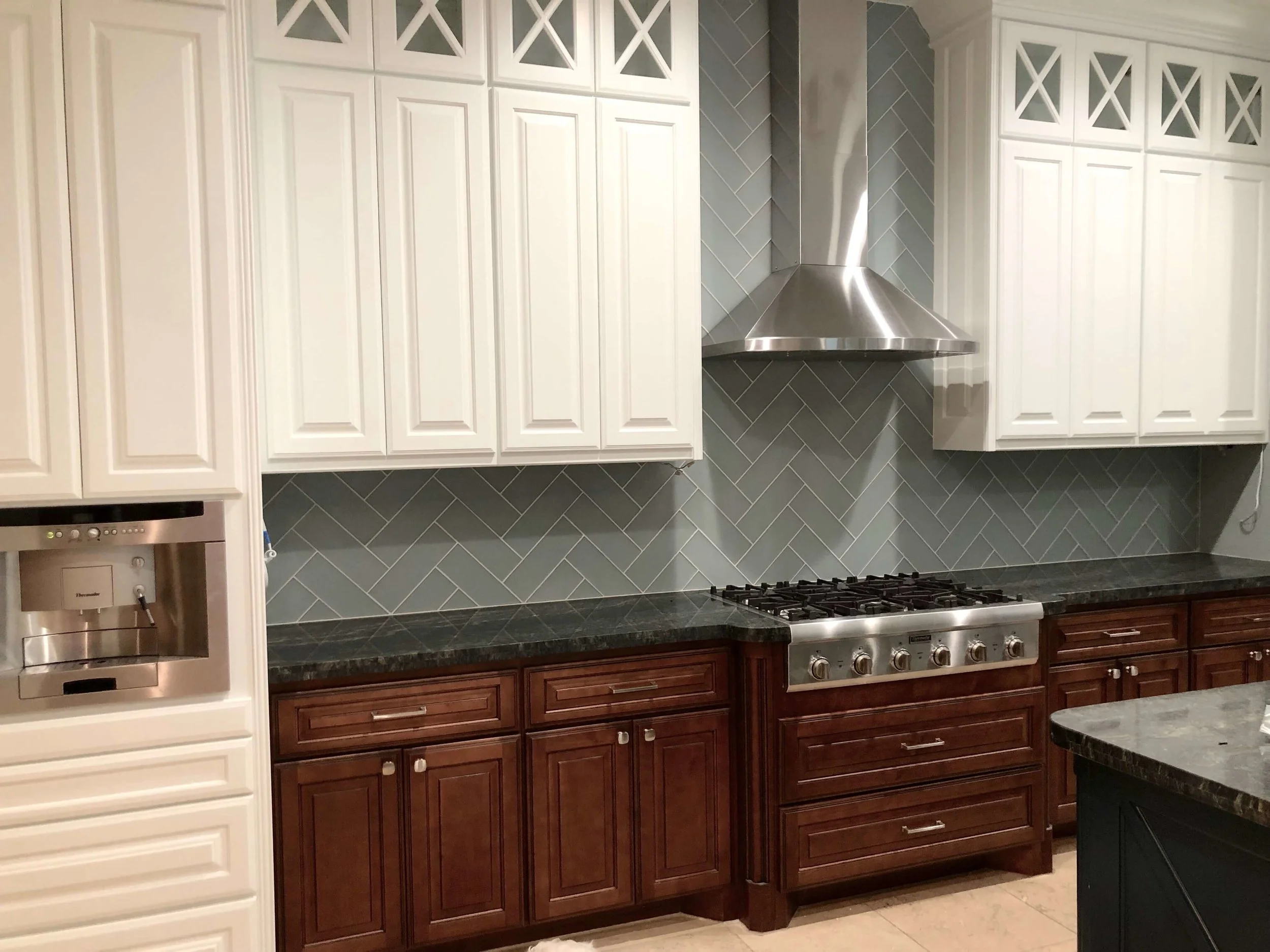
This was a new home, only 4 years old, but she thought the backsplash in the kitchen was too busy compared to the natural stone counters.
They were also replacing the cabinet above the stove with a hood in steel, like this one, pictured below. It will be a dark finish and go all the way to the ceiling.
Steel venthood from Raw Erth Designs
Here were her questions.
1. Is the color of the Chevron style tile I have in the picture better?
2. I like a Subway pattern, should I keep it simple and do the light color in a Subway pattern and maybe add a frame of herringbone or Chevron above the stove?
3. I also thought about doing long brick shaped tile vertical, thoughts?
4. I've also seen a herringbone design used with a plain tile for the entire area that look good. Some with small tiles and I've seen others with larger tiles. Thoughts?
Backsplash Q and A - What tile backsplash would help update this kitchen?
Backsplash Q and A - What tile backsplash would help update this kitchen?
Backsplash Q and A - What tile backsplash would help update this kitchen?
Backsplash Q and A - What tile backsplash would help update this kitchen?
my Response to Questions
Well, I am so glad you are getting a new hood that goes to the ceiling. Kudos for that decision!
You've got a nice high ceiling there and the short hood that is at the same height as the cabinets just cuts off the height of the kitchen.
There was a similar situation in this kitchen remodel I did years ago. You can see you will have an incredible difference in the overall feel with that new height.
BEFORE Kitchen Remodel - cabinets were slightly raised at range, but not significantly enough to make an design impact
AFTER Kitchen Remodel w/ new hood, island, counters and backsplash, paint on existing cabinetry | Carla Aston, Designer | Tori Aston, Photographer
The only thing I'm worried about with the chevron or any smaller tile, is that it might fight with your busy patterned countertops a bit. That, and I think it might be a little too light.
Because you have so much natural stone, I would have a tendency to go with a ceramic tile of some kind, for a less textured, less mottled look.
You can see in that job in the link, I did a solid, larger scaled subway tile in the same color, basically, as the wall color.
I wanted very little variation there because we had natural stone counters and the hood had the variation too. I wanted to simplify the look by repeating the wall color.
AFTER Kitchen Remodel w/ new hood, island, counters and backsplash, paint on existing cabinetry | Carla Aston, Designer | Tori Aston, Photographer
What tile layout did I suggest for this backsplash?
I would not do a subway in a vertical layout, nor would I frame out anything above the range. That's a trend that we are no longer seeing in kitchen backsplash design.
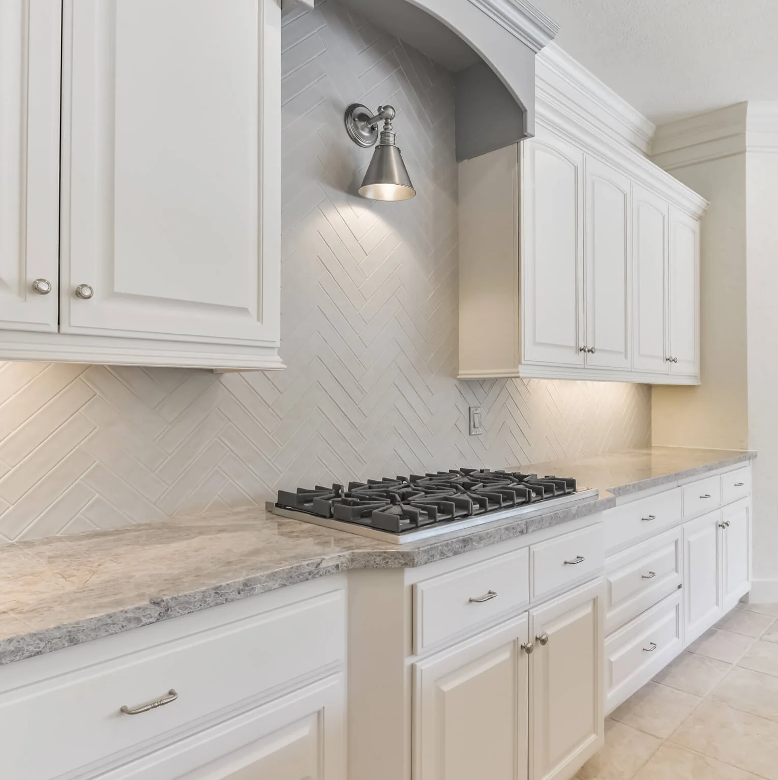
I like the idea of a herringbone, but again, in a ceramic tile and in a bigger size. Here is a pic of a 4 x 16 tile in a herringbone I'm doing on a job right now. It looks great and the verticality and direction of the pattern draws the eye up.
Here’s a project, pictured below, that is under construction now, just finishing up.
Proposed drawing for kitchen remodel with herringbone backsplash
IN PROGRESS - Kitchen remodel with herringbone backsplash, 4 x 16 tile
Here’s a project completed last fall where we did a larger scaled subway tile in a herringbone and it looks great.
Herringbone tile backsplash updates this kitchen in a remodel to help sell the house
If you are interested in getting a professional opinion on your project, even just a little look-see to verify you are on the right track, you can find out more about my service right here.


