I had this question come up about upper kitchen cabinets of varying heights recently, with several different consultations I’ve done.
Most kitchen cabinets are built as individual boxes that are then mounted to the wall. There was a time when having upper cabinets of varying heights was done to sort of add interest or give a taller look to a kitchen. It was a trend some years ago, before you started seeing more than just luxury kitchens with taller upper cabinets.
It was sort of a reaction to really short upper kitchen cabinets that looked squatty and gave a very horizontal and rather uninteresting look to a kitchen. I think it was also a remedy for those kitchens with short uppers and a soffit or furr down above.
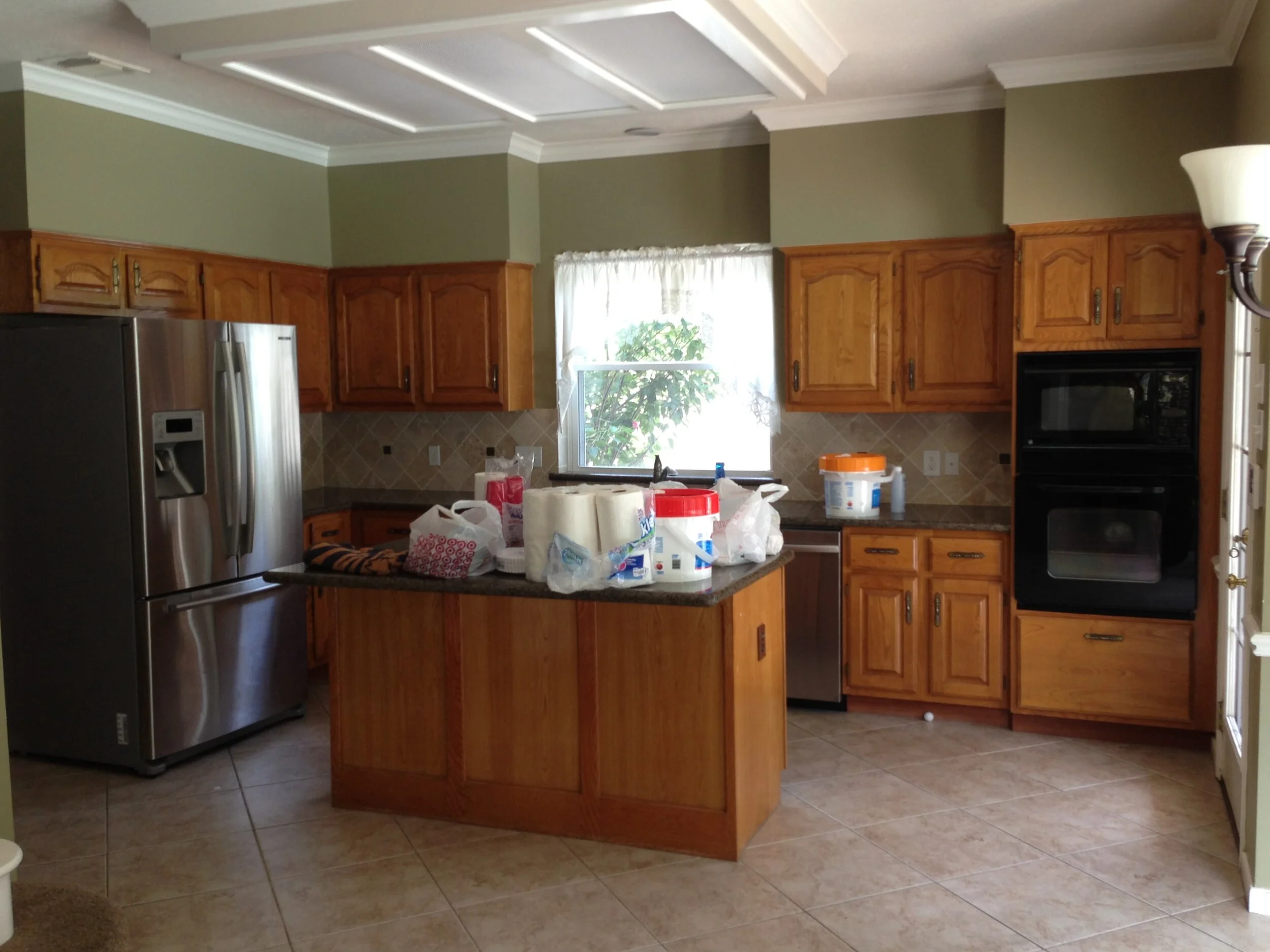
A dated kitchen with short upper cabinets and soffit or furr down above.
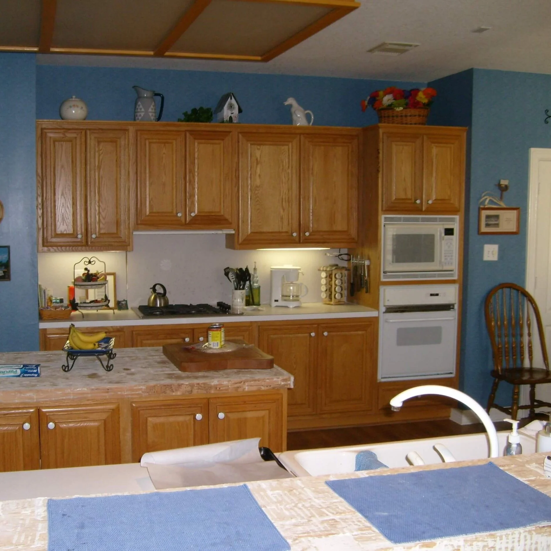
Kitchen with short upper cabinets.
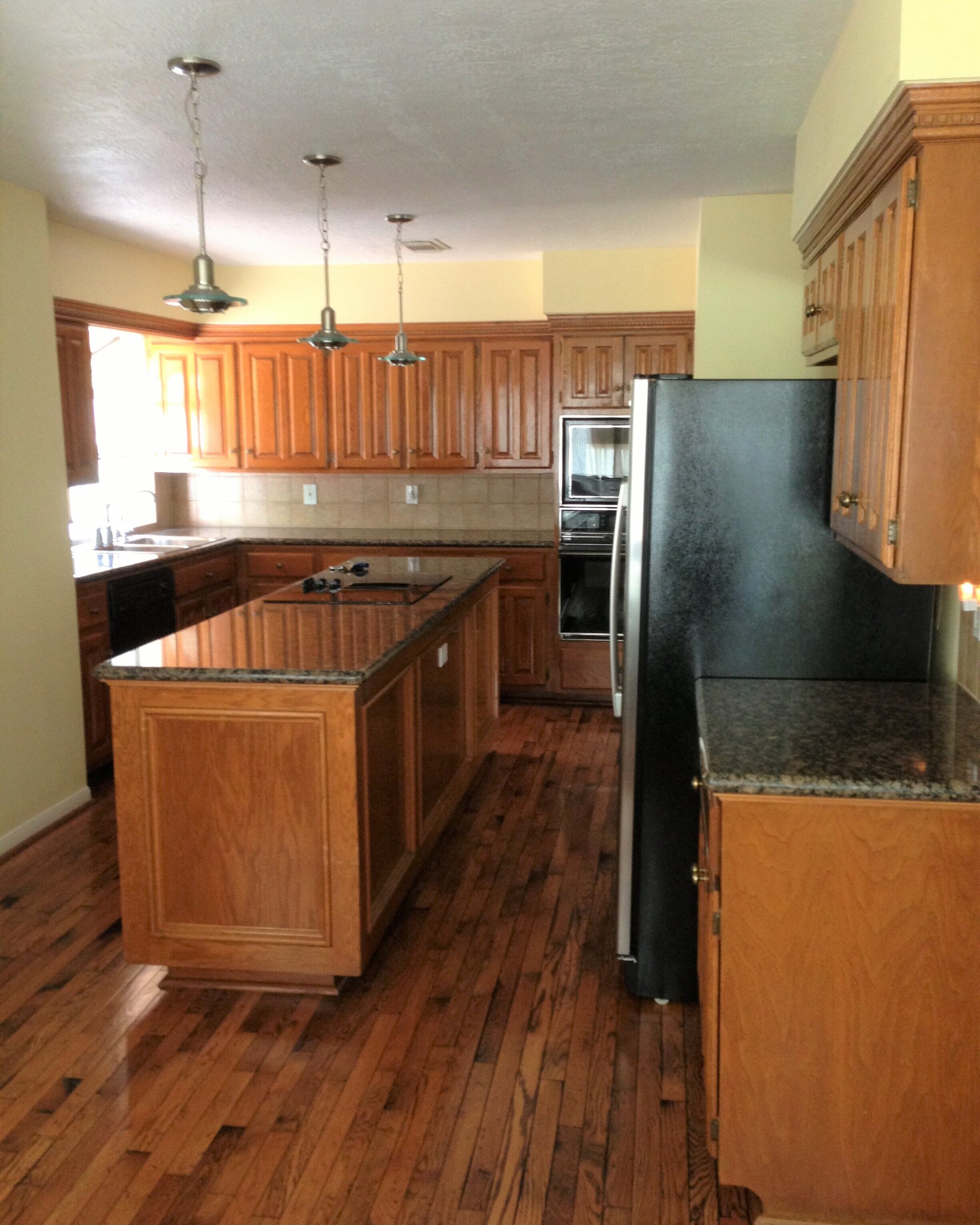
Short upper cabinets with soffit or furr down above.
Now, we use other ways to break up a long run of cabinets to make a kitchen more functional and interesting. I would say that the trend of varying heights of each box of the uppers is long gone.
Upper Cabinets Indicate Need To Remodel
Upper cabinets are one of the things I look at closely when doing a consultation on a kitchen. While you can paint the lower cabinets and have them sort of fade out of sight, the uppers are right there in your face, at eye level. And if they contrast heavily with the wall color, then that feature can really stand out.
The look of the upper cabinets is many times what prompts me to tell homeowners to either keep the cabinets or ditch them in a remodel.
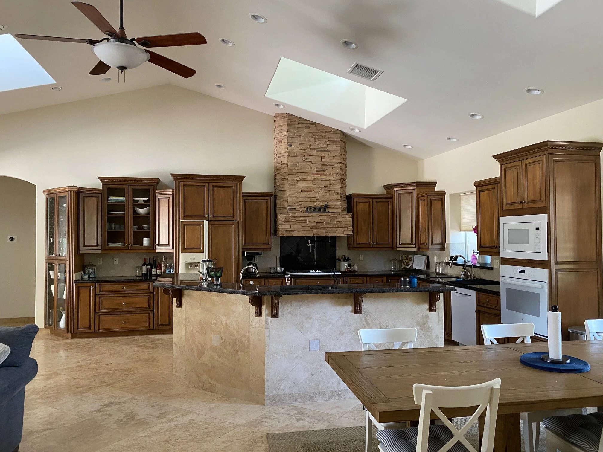
Here’s a good example of a situation where I told the homeowner that these were a rather outdated style.
This homeowner was going to do a new island and hood for sure and needed to keep the light travertine floors. She didn’t mind the dark cabinetry and didn’t want to spend getting new countertops and splash if keeping these cabinets would look too dated.
Here’s what I suggested.
Since her ceilings were quite tall, the space really open, and there was such a big contrast between the dark cabinetry and the light walls, the varying heights of these uppers was very noticeable.
I felt like doing new uppers to 10’-0” would help relate to the volume of space better and would provide a nice consistent look.
Although I will sometimes recommend just changing out the hood to go to the ceiling in a situation with shorter cabinets when the budget it tight, in this instance, I felt there was just too much variance in height.
I recommended that she not take the hood to the ceiling, because of the asymmetry of the peaked ceiling. The big stone hood before felt too tall and heavy to me and having it on the angle at the top looked a little off as well.
As a white plaster hood, this new one would blend into the wall some and be a nice break in the wood cabinetry, while still providing a focal point for that kitchen wall.
Need some tips or guidance for your next home improvement project? Check out two of my popular guides, below.
Pin this pin to Pinterest to save for later reference!


