The opportunity to rethink this kitchen’s design came into play after frozen pipes burst and then flooded a home in Texas during the recent deep freeze.
We all know how water damage from burst pipes can destroy a home. This happened all over the state of Texas when we had our big freeze this past winter with no power for days and some even longer.
In this consultation I did for a homeowner that suffered a major loss of all of her kitchen cabinetry, I advised her to make some bigger changes. I felt they could really improve the kitchen design and would be worth an additional investment.
Since she was starting all over, I felt it was just too good of an opportunity to make something right that was actually quite awkward with the layout.
My blog contains affiliate links. Any purchases, at no additional charge to you, render me a small percentage, are most appreciated and make this blog possible. :-)
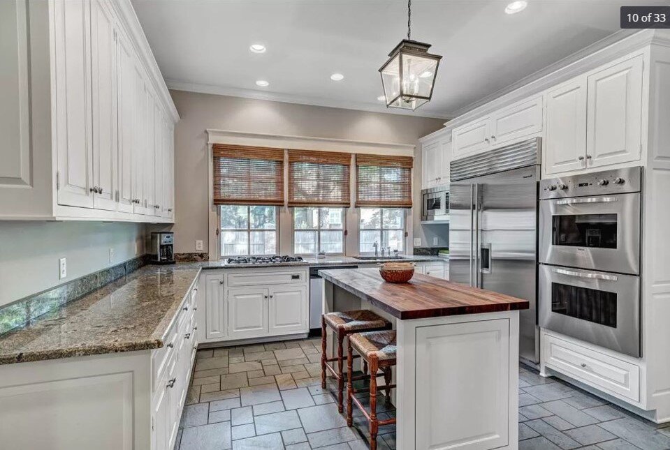
Here was the kitchen as it was before the flood.
This kitchen was condemned after a flood from burst pipes during the Texas deep freeze. carlaaston.com
It’s a pretty kitchen, by most standards, right? But it had a few issues.
The island, although handy as a worksurface, did not have an outlet and really crowded the kitchen, especially on the fridge side there. It had been added after the original build.
Can you see the next big problem?
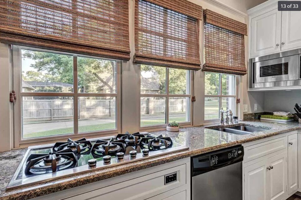
The sink and cooktop are on the same wall at the window.
This odd layout of the sink and cooktop adjacent to each other on the window wall needed some design attention. carlaaston.com
That wouldn’t normally be too much of a problem with proper handling of all the details there, but the sink is crowded in that corner with the fridge right behind there and the microwave stuck in the corner.
I mean, imagine you were at the sink with the dishwasher door open and someone was at the fridge with the door open behind you and then someone wanted to use the microwave. :-)
It’s just not a good spread of function around the space available in this kitchen.
This area of the kitchen was crowded with functional use, while the opposite side of the kitchen had no appliances, or water. carlaaston.com
Although there is a downdraft at the cooktop (which are pretty ineffective really), the window treatments right above the gas cooktop make me nervous. And since I know how much grease can still get all over the area around a cooking appliance like this, I’m sure the window needed a lot of regular cleaning there.
I just felt like that cooktop needed to move and the kitchen’s layout needed to loosen up a bit.
And you know how I think going to a full range with ovens below in lieu of wall ovens can help make a kitchen feel bigger and allow more countertop space! In this kitchen, she could do a microwave drawer and move that fridge down the wall to open up more counter space on the right side of the kitchen.
Plus, look at this rather plain, uninteresting wall with nothing functional going on. Hmm, a good place for the cooking appliance, no?
This side of the kitchen was sort of screaming for a focal point, in my opinion. Relocating the cooking appliance here made perfect sense. carlaaston.com
Consider this first when changing a kitchen layout in a remodel.
The one thing that was staying and intact, were the slate floors, which I did think were just fine. And the great thing about the floors were that they went all the way under the island and the homeowner had more of the tile left from the previous homeowner.
Whenever I look at kitchens and layouts with remodels, I look at a few key things first to see what changes I can make. One of those is how the footprint or flooring will be affected with any layout or cabinet changes.
Many times, especially in a certain price range of home in Texas, builders installed the kitchen cabinets on top of slab foundations, then tiled up to the cabinetry. So, if you want to keep your floor and it has been discontinued or is no longer available for patching product in, then you have to stick with the same footprint or cover any holes created with a new layout with a larger cabinet element.
The other option is to get a new floor. :-)
And for some, with the same flooring type running through the rest of the house, like in this job of mine, that can be a big problem or an expense they don’t want to incur.
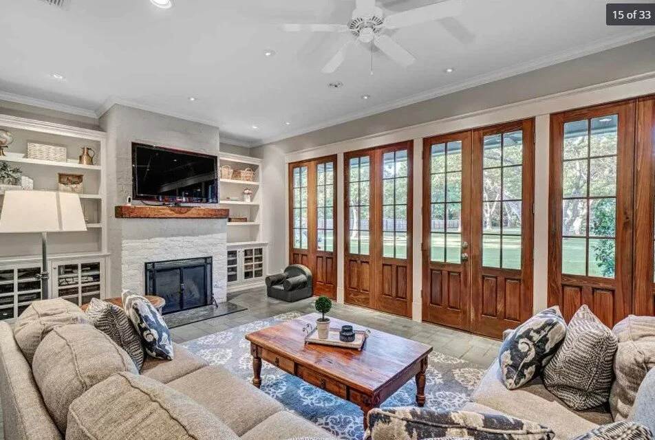
Here, the slate floor just went through into the family room, but with everything they had to do here and the fact that the look and color of the floor was fine and it did survive the flood (most natural stone floors on slab do), the homeowner wanted to keep it.
Family room adjacent to the kitchen with slate floor running throughout. carlaaston.com
You can see the slate floor running into the family room here from the kitchen. carlaaston.com
Main Kitchen Question - What Cabinet Finish?
Even though the homeowner didn’t spell out the layout issues except for the issues with the island (and she even questioned about doing a small peninsula), I brought that up at the get-go. It makes a difference in how I address the other questions, if I can understand more about the project.
Turns out she had the same thoughts and misgivings about the kitchen, so we were on the same wavelength there! And, she checked things out with the venting, etc. through her contractor and making some changes in layout seemed very workable for them.
Her design questions centered more around finishes.
The previous homeowner had painted all the cabinetry white in the house, these cabinets had been a beautiful wood. Now that these were gone, she was wondering if she could go back to wood with all the other white cabinetry in the house, or if she should match it all.
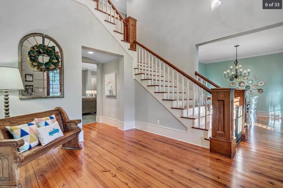
The wood she liked was not necessarily the color of the French doors there in the room (which was actually darker in person than it appears in these MLS shots), but the color of the wood floor in the front part of the house.
The homeowner liked the warmth of the lighter wood floors in this home for her kitchen cabinets. carlaaston.com
She was considering some kind of dark or black finish cabinet pulls and then black granite counters. She just was unsure how all this would look and then what backsplash to use.
some solutions for this kitchen
I did a sketch of the hood/range wall, to show how I think that should look.
Here was my reply:
You don't have a ton of kitchen cabinets, so it would be great to take them up to the ceiling on both sides. I would also like the hood, in your case, built out of cabinetry, because dividing that wall up with a metal hood or some other style would contribute to a more chopped up look.
I would tile all the kitchen walls, up and over the windows too. It's not that much tile, and it will make for a more consistent look and not break things up so much.
I drew in a lighter-weight look for an island, something more like a counter height table. That could be a painted base with a butcher block top, maybe you could repurpose the top you have?
This kitchen sketch shows the cabinetry layout and moves the cooking appliance to this side wall. The sink can now be centered in the window, making for a more spacious area for both functions. carlaaston.com
I like the idea of it painted in black, to tie into the cabinet pulls and just contrast some with the floor. You could make the top 24" deep overall and then the base would be like 22", so it would be more narrow than what you had.
I think it should be unattached to the floor so you could move it slightly out of the way if you need to, etc. With no outlet there, I think being able to move it around is a good idea.
You can adapt this idea to be something else, the island could have some drawers, it could be on casters, it could even just be a purchased French baker’s table or something like that. I do like this idea better than adding a small peninsula though.
See these kitchen islands available online, below.
Wood or Painted Cabinets?
As far as whether you should go with a wood tone look or painted cabinets, I think you could do either, just depending on your preference. I think the wood would be fine (keep the white window trim). It would be a warmer looking kitchen overall.
The white would be more typical, but I think you could go with wood in here and keep the white cabinets throughout your home as is.
The wood works great with the slate floor. I have a little storyboard I put together of the finishes with wood cabinets.
These kitchen finishes work together nicely with wood cabinetry. carlaaston.com
You could just do a white tile backsplash of some kind, maybe a handmade zellige, or I have a Walker Zanger tile there on the board. It's the 6th Ave collection and it comes in lots of different shapes and colors.
The color I have there is French Clay and it looks good with a greenish-gray slate tile I have here in my studio.
I know this homeowner has a long way to go. With all the homes damaged by flooding in Texas and all the shortages in products because of world-wide supply chain disruption currently, no doubt her project will take awhile.
She’s promised me “after” pics though and I can’t wait to see how this one turns out! If you’re not signed up for my email list, do so below so you won’t miss the results!
Check out my Designed in a Click email consultation service. It might be just what you need for a decorating or design dilemma.


