Since my recent trip to Highpoint, I’ve had warm tones like terracotta, golden yellow, blush, cinnamon, etc. on my mind. I happened to receive some rug samples I’d ordered awhile back just this past week, and I put together a couple of schemes based on these colors.
I hope you likey!
(I’m sharing the details of all the products, in my guide linked at the bottom of the post, because I have so many of you that ask. :-)
Color Palette #1 - Cinnamon, terracotta, blush, raisin
I fell in love with these warm tones again and the rug sample I received provided a perfect base for this look. I think combining the cinnamon, raisin and a blush tone together makes this warm look feel up to date and fresh.
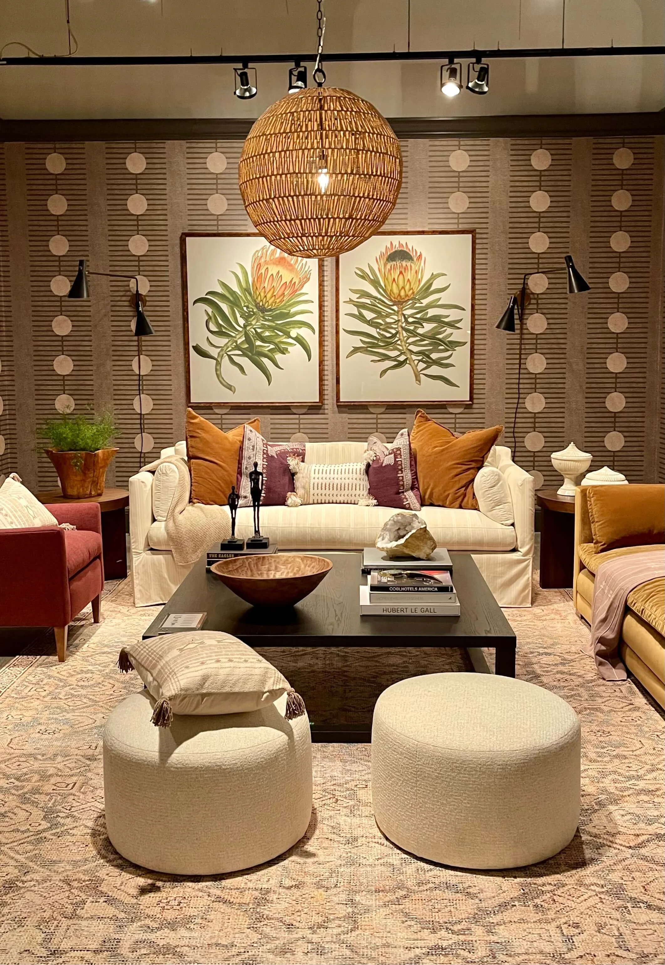
This palette embodies the best of what I think is a current look these days. This room below, designed by Alison Giese in the Rowe showroom incorporates many of these colors.
Warm toned room at the Rowe showroom at Highpoint Market 2022, designed by Alison Giese.
These are analogous color schemes, which means they are all colors that are close together on the color wheel. So, while you may not thing a red, pink and terracotta might work together that well, but they do seem to magically combine beautifully. Since some of the fabrics have a variety of those warm colors, it helps to makes sense of the mix.
This cinnamon - terracotta - blush - raisin scheme, and adaptations of this, were seen at various showrooms at Highpoint Market. carlaaston.com
That terracotta tile is actually porcelain, which is super durable and easy to maintain. Looks like real terracotta, no? It’s much thinner though, like a regular porcelain tile.
I like including some odd accessories or bits of my collections from around my home in these moodboards.
The small reddish bowl is one my daughter made in a ceramics class in college, the brass key is from a ring of about a dozen of those I have collected and the snail shell is from a small lake near Brenham, TX, believe it or not! We grow big snails in Texas. :-)
Color Palette #2 - Terracotta and Cream
This one is keeping it simple with terracotta and cream. Charcoal gray works well to ground this palette. It feels modern and not like a throwback to the warm toned looks of years ago.
Even though this terracotta is dark, more of a cinnamon, you get the idea for my inspiration.
A deep terracotta and cream makes for a striking vignette in the Rowe showroom. carlaaston.com
I developed this look as a possiblity for adding some trending color to a kitchen with creamy colored cabinetry. With this combo, you could have all your hard surfaces as neutral, creamy cabinets and backsplash, charcoal quartz counters, a light neutral, textural rug and then bring in the color with fabrics for window treatments and upholstery.
Both the Dekton slab material and the greige marble have warm terracotta veining which ties in the warm finishes. The backsplash tile has a terracotta color edging that is barely detectable. Add in some grout of that color and it would be a distinctive way to add color to an otherwise neutral space. The coppery hardware does a lot to make that color statement too.
Terracotta and cream combine with a dark gray to add some warm color in a fresh look. carlaaston.com
Color Palette #3 - Warm tones and navy
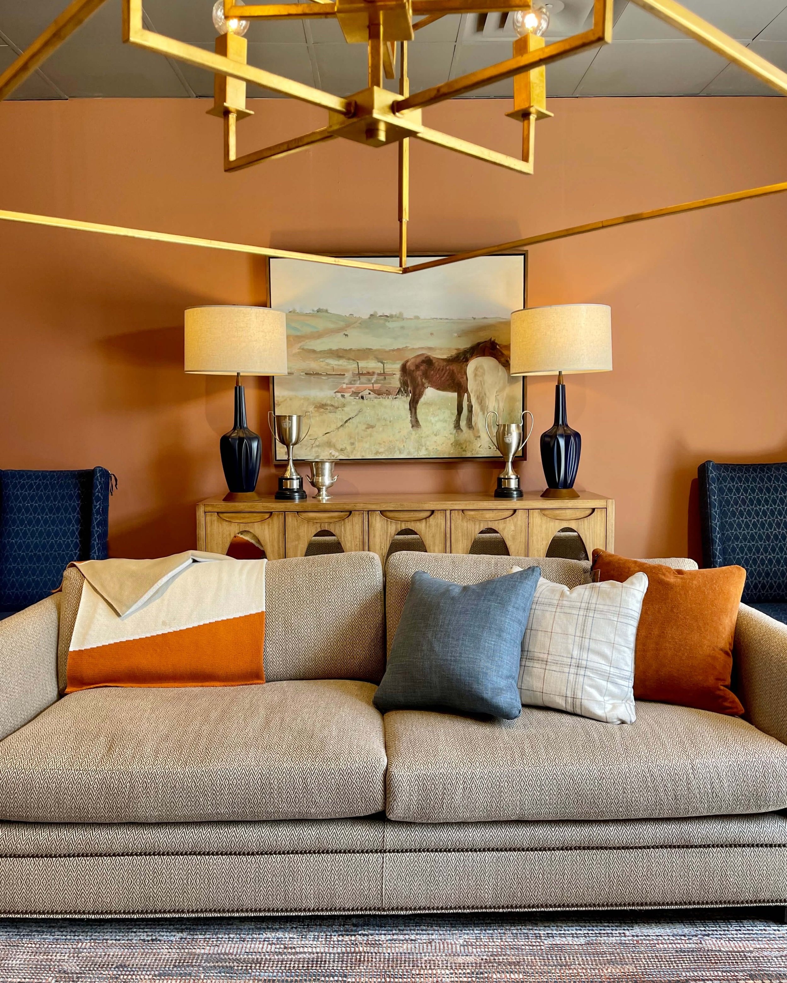
I was surprised to see so much of this orange at market. I do think a bold orange goes well with blues, like the navy below.
Terracotta walls and orange pillows contrast with the navy elements in this vignette in the Wesley Hall showroom.
These rugs from Feizy have a lovely combination of navy and warm tones.
They are opposites on the color wheel, so that makes them work so well together. Many people have adopted blue and/or navy as more of a neutral in their home, so I developed a palette that would work with that.
I didn’t go with this bold orange this time, I went with more of an ochre or gold-toned beige with navy. I think it is sophisticated and if you have navy and gray in your home, here’s how you can add in warmer colors if you want them.
Navy with ocher and warm beige tones is a beautiful color palette that combines cool and warm tones. carlaaston.com
This navy moodboard above has a small brass teapot from a samovar, an old burl wood box and an antique tea tin in navy and brass (all handed down from my MIL).
Color Palette #4 - Soft Rose, Terracotta, peach, Taupe
This room was so appealing in the Wesley Hall showroom and the fabrics and colors were used so effectively. I had to pull together a scheme for you that represented this palette of soft rose, terracotta, peach, beige and taupe. It’s subtle and easy to live with.
Soft warm tones like in this vignette from the Wesley Hall showroom at Highpoint Market 2022 were popular this season. carlaaston.com
Taupe is such a long-living neutral color in my opinion. In my own home now, I have SW Balanced Beige in my home office and it is a nice taupe, very close to a natural linen color. I have natural linen on the tackboards in there and wanted them to blend with the walls.
Taupe can work with a more cool tone look or a more warm tone. It’s one of those color families that straddles somewhere in the middle and works with almost anything.
The rugs below, one from Jaipur Living and one from Stark, ground this palette with a neutral taupe.
Soft rose, terracotta, peach and taupe combine to make a soothing color palette for the home. carlaaston.com
In this moodboard above, I included a small antique terracotta pitcher from France I bought many years ago, a quartz I bought at Dallas market and use for styling photoshoots, along with some decorative beads. I loved the rustic color of that pitcher and how it repeats the color of the velvet.
Color Palette #5 - Ocher and gray
I didn’t see a lot of this particular combo at market, most were in the terracotta family with ocher added in. But I love this color scheme, especially for adding some warm colors to a gray interior. It just naturally works well.
This warm toned leather sofa works well with the gray walls in the Century Showroom at Highpoint Market. carlaaston.com
These fabrics look great with a rug from Jaipur Living that has cream, gray and ocher. I just love the warmth this color can bring to a gray interior.
Ocher and gray pair nicely to bring warm and cool color tones together. carlaaston.com
I have a graduated stack of these horn bowls that I bought at Round Top one year, they are lightweight and easy to take to photoshoots for styling. The bells are from my MIL, she lived in Algeria for a time and picked those up there.
Want the sources of these materials in the moodboard flatlays above?
I’ve combined them with all the other flatlays I’ve produced in the last year to create a package of these sources. You can check out my Flatlay Sources Guide here.


