I occasionally do some home decor styling dilemma Q&A in my stories on Instagram.
I last did one of those in January and I’m thinking about opening up the inbox for questions this weekend, so you might want to follow me there.
If nothing else, it is interesting to see all the different design situations that people are having problems with. Some of the questions are really tough!
My blog contains affiliate links. Any purchases, at no additional charge to you, render me a small percentage, are most appreciated and make this blog possible. :-)
Received an “After” pic!
I recently heard from one person who sent me a question then and she also sent an “after” photo for me. Her question was about styling the console behind her sofa. She wanted to know if there was a better arrangement that could be made.
Here’s the pic.
Before pic - console styling tips requested
Here’s what I advised.
Use only one lamp on the left. Two are great on a console against a wall, but floating in the room it is too much.
Stack books neatly. Staggering is fine on a large coffee table, but not on this more narrow console.
The typewriter is probably too big here. Relocate that somewhere else.
Move the plant to the end and add another one to cluster some greenery there and balance the lamp.
She was already getting some stools and they worked out nicely underneath. I especially love the knot she topped her books with. She did great!
This new styling on top of the console looks great!
I’m featuring a few more of those here today, to give you a taste of what they are all about. (Now remember, these are quick and I sometimes sketch on the photos on my phone, so they’re rather sloppy. :-)
1) Entry Hall Console Needs Styling Tips
I posted the questions that people asked on top of the photos in my stories. I just uploaded those here, just like I shared them on Instagram.
3 Home Decor Styling Dilemmas Solved on Instagram Stories - carlaaston.com
3 Home Decor Styling Dilemmas Solved on Instagram Stories - carlaaston.com
I really love tall branches to create drama and height on a console. I also like a lamp, especially in a niche like this, however we can’t have two really tall pieces on this chest that is not so big.
Here, I preferred the taller element to be branches and to keep the lamp small for this intimate space. Using a few vertical accessories won’t take up a lot of table top.
These are the marble discs I was mentioning.
2) More questions about consoles for this living room
This homeowner was in the process of furnishing her living room and felt like niche area with the console felt bare even though it had a console and a tall piece of art.
3 Home Decor Styling Dilemmas Solved on Instagram Stories - carlaaston.com
She’s got a good start, for sure. I just think there needs to be more on that wall. (And big plants always help.)
3 Home Decor Styling Dilemmas Solved on Instagram Stories - carlaaston.com
As I note on the photo, I like the idea of doing two consoles together on that wall.
While that is a nice piece she has there, it could be better to have two consoles butting together to make it appear that there was one long piece of furniture there. If that was done, it would be better to have a console that didn’t have moulding details on the side, but was flat.
Here’s an example from my showhouse living room done for the Seasonal Living Virtual Showhouse in 2020. These consoles were from Howard Elliott and butt together nicely.
3 Home Decor Styling Dilemmas Solved on Instagram Stories - carlaaston.com
I did the same thing here in a recent project. Two consoles were butted together and a single wood top was laid on top to help unify the look.
3 Home Decor Styling Dilemmas Solved on Instagram Stories - carlaaston.com
3. TV Cabinet Styling / Decor
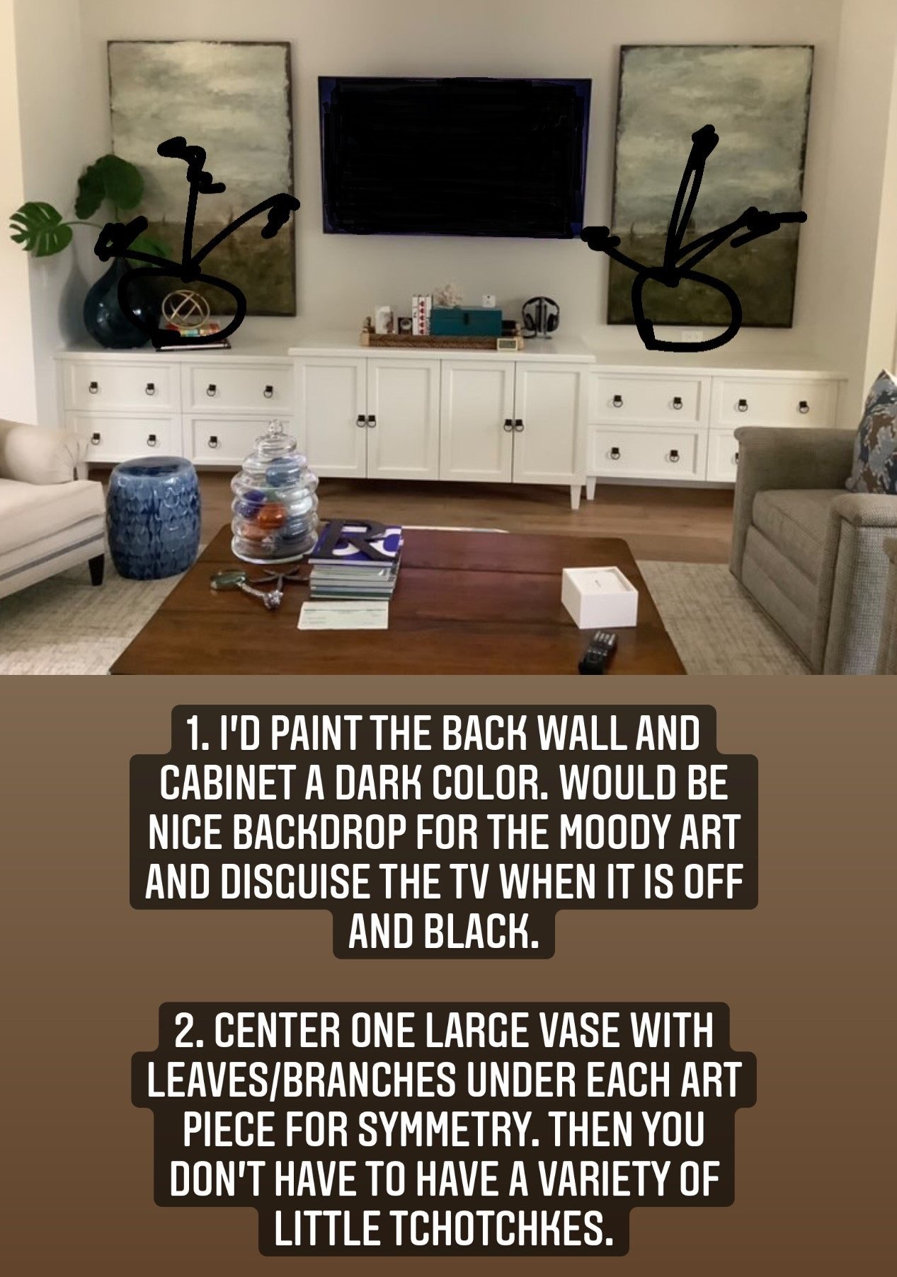
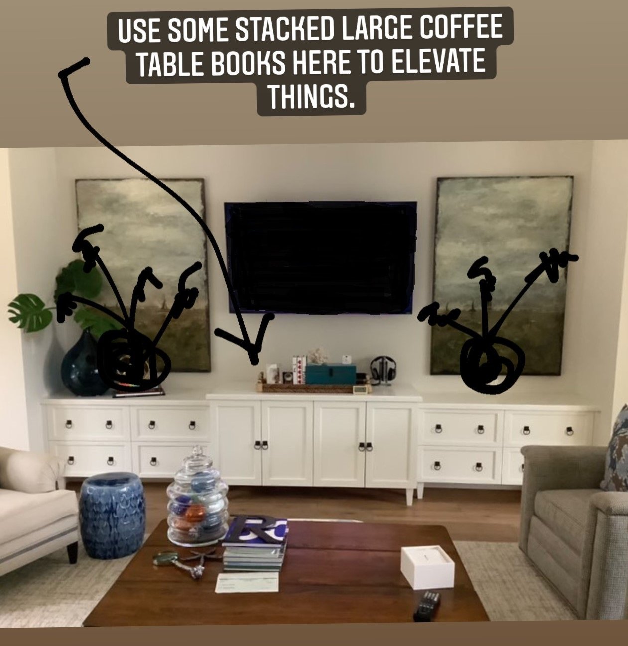
Here was a question about how to better decorate this tv wall.
3 Home Decor Styling Dilemmas Solved on Instagram Stories - carlaaston.com
I really like the idea of painting the back wall and the cabinet all a darker color, to contrast with the white walls. That will camouflauge the tv and highlight the darker wall decor there better.
The dark big vase there on the left with the leaves works well and I would like to see a second one on the other side, to have a symmetrical look. Since the cabinetry and art are identical on both sides, it makes sense for the decor to be the same.
I like the single element on each side there, it creates a stronger dynamic than mixing in lots of smaller accessories.
3 Home Decor Styling Dilemmas Solved on Instagram Stories - carlaaston.com
Stack some coffee table books to elevate items a bit in the center. The tv should probably be lowered some so it doesn’t float so high above the cabinetry.
3 Home Decor Styling Dilemmas Solved on Instagram Stories - carlaaston.com
Your styling dilemma solved in my Instagram Subscriber Group.
Check me out on Instagram and join my subscriber group there (link on my profile there) to ask your design or decorating question once a month.
In the meantime, check out these questions below.


I loved getting to weigh in on how to finish up these contemporary, luxury rooms in my recent Instagram Q and A. These were two different homes, one concerned the dining room and the other, the entry hall.
These were both new homes, both homeowners had recently moved in and were adjusting their existing furniture to work in the new spaces.
Both had questions about how their existing furniture would work and how they could “finish off” these spaces. See what I advised……..