It’s been a busy Fall for me. So busy, in fact, that I haven’t gotten around to professionally photographing any of my most recent work. There's just too much going on right now!
But that doesn't mean I don't have some fabulous looking amateur shots ;-)
The pictures you're about to see have their photographic flaws, but the items and areas featured within them contain lots of pretty! They are but a few of the projects I'm working on that are currently in progress, and my hopes are that they'll inspire you to consider some projects of your own for the new year.
Take a peek...
This custom ottoman and beautiful wool rug for my Americana style game room job has been installed, along with all the other furnishings too.
RIGHT - The last items to arrive were these fun red chairs for the game table from Somerset Bay.
A photo shoot of the whole space will be coming soon!
Here’s a bathroom remodel that's now under construction...
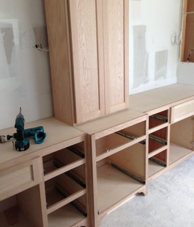
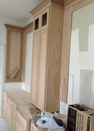
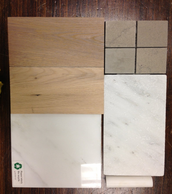
The cabinets went in last week. We're going for a Restoration-Hardware-kind-of-look. You know: Gray-washed oak with white marble counters and splash, a sumptuous leather finish on the greige limestone tile that just feels wonderfully weathered and textural under bare feet ;-)
When I get around to publishing the images of this project I'll show you the stain we used. It’s perfect.
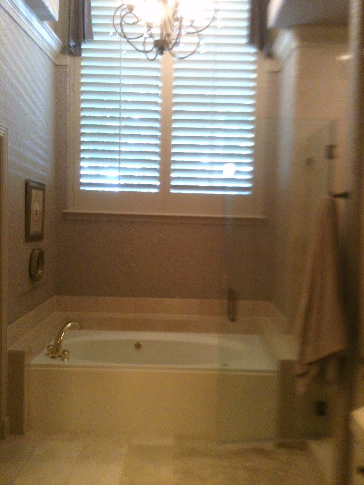
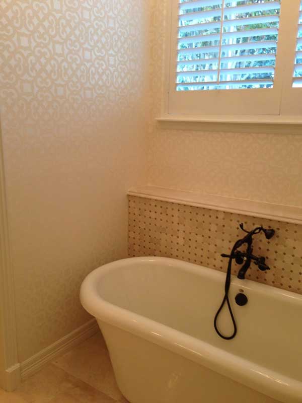
Here's one of my bathroom remodels.
Time for the old cultured marble built-in tub to-go.
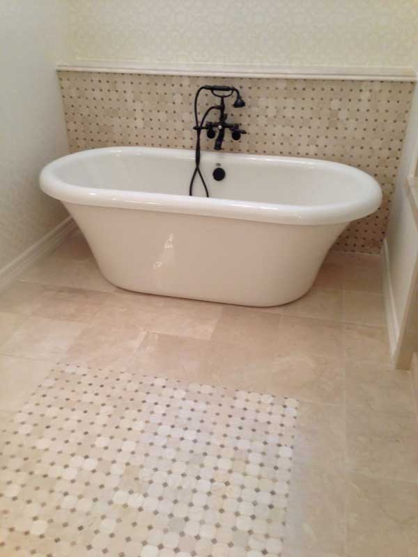
A new freestanding tub was installed, along with some mosaic tile, inset into the existing crema marfil floor. A short wall of the mosaic topped with a slab of crema marfil was built to create a ledge for some pretty accessories and the wall mount faucet.
Read about our quest for those mosaics HERE. You'll be able to see why I wanted this EXACT color so much!
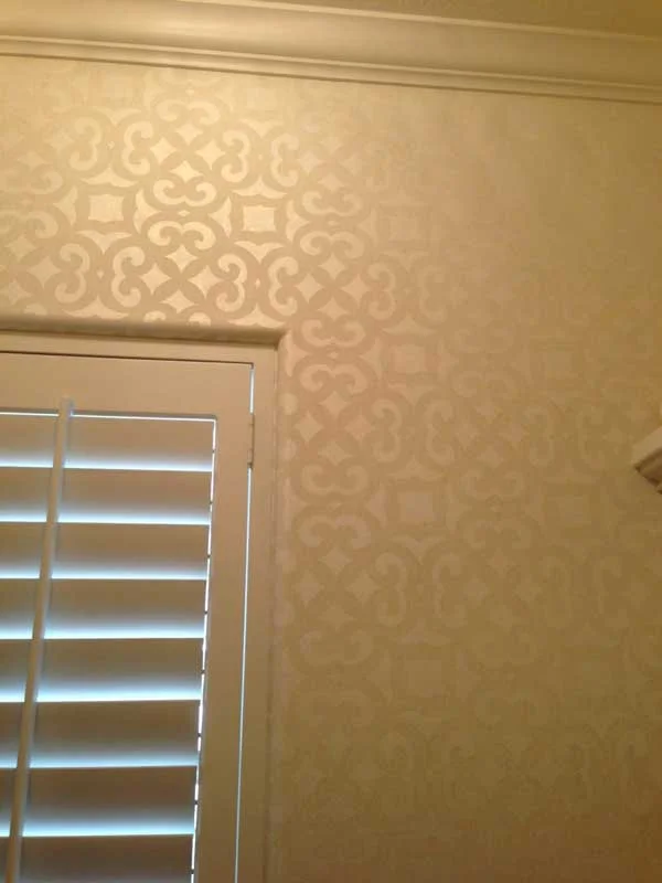
Oh, and we also did some beautiful Stroheim wallpaper too!
All in all, I love the sophisticated tone-on-tone look this bathroom now has. Once our chandelier comes in (sometime in February), the remodel will finally be ready for its professional photo shoot.
Do you know how a stair handrail gets curved to match the curve of the stair?
...With LOTS of work. That's how!
My carpenter did an incredible job with these stairs...
To match the curve of stairs, the handrails have to be curved in slivers if they're to match correctly.
RIGHT - Each of these pieces is carefully bent to fit the curve of the stair, glued together, then placed in a jig to cure them into just the right shape.
ABOVE - These are brackets attached temporarily to the existing stair. The railing will rest in these brackets to mold to the curve of the stair.
BELOW - See how this slight curve on the stair is getting matched up exactly with the railing?
...Quite impressive, isn’t it?
Do you now see why stair railings are so expensive now?!
We debated using an iron railing (which everyone seems to be using nowadays), but this client loves a crisp, white coastal look, making this style -- a plain, wood railing and balusters -- much more appropriate. I hope to have before/after pictures for you soon...
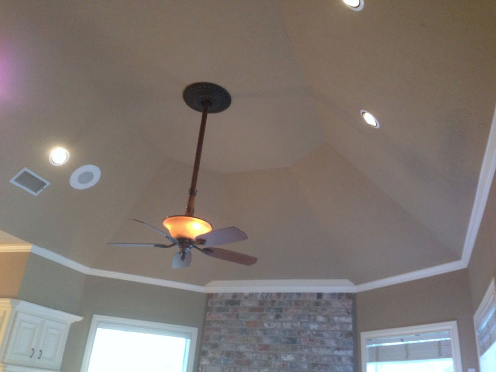
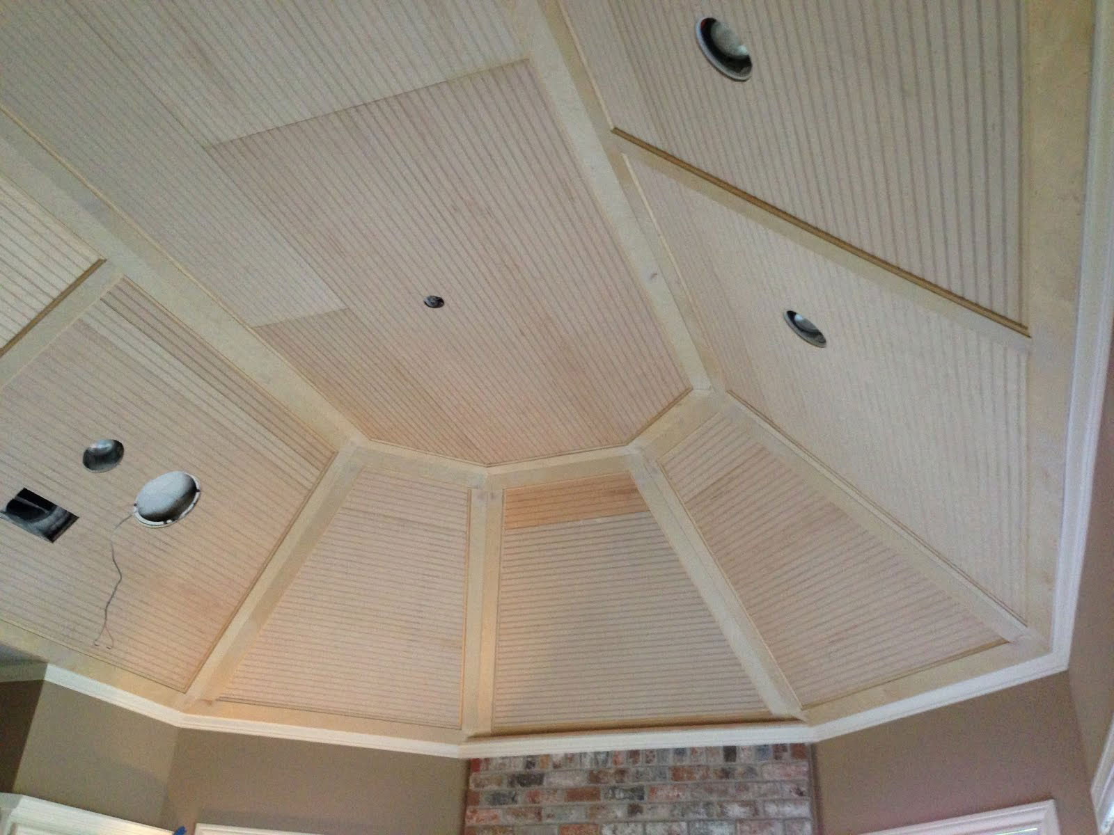
In the same project, we also had an odd ceiling in the family room that wasn't very WOW-worthy. So we decided to bring more of a coastal style into the space by panelling it with beadboard.
The wood is up, waiting for paint. It looks better already. It makes the shape of the ceiling look more purposeful, doesn’t it?
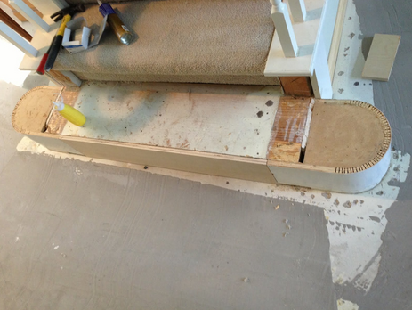
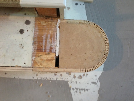
Here’s a stair on another job that's being redone. The bottom step, which was carpeted, is being replaced with wood.
Have you ever seen inside those steps to see how they are constructed?
That gorgeous, solid piece of oak to the left is going to be done in a bleached finish to gray it down.
All of the above woodwork is being done by my expert carpenter, Victor Reachi. I HIGHLY recommend him!
Victor Reachi
713-499-9716
281-303-5294
Here’s a great little ranch style house we're working on that's located inside the loop in Houston.
Typical of ranch style homes built in the 50s, it was chopped up into a lot of small rooms. Understandably so, the homeowner wanted to bring it up to a more current and liveable style.
Here's its original layout...
Even though we couldn’t move windows, we were able to dramatically change the orientation of the house and open up its floor plan into what you see here...
Now, not only is the kitchen more spacious and open to the living areas, but there's finally a proper place to put the TV!
This project is still under construction, but we're well on our way to creating a much more, open home. The before/after pictures are going to be great!


