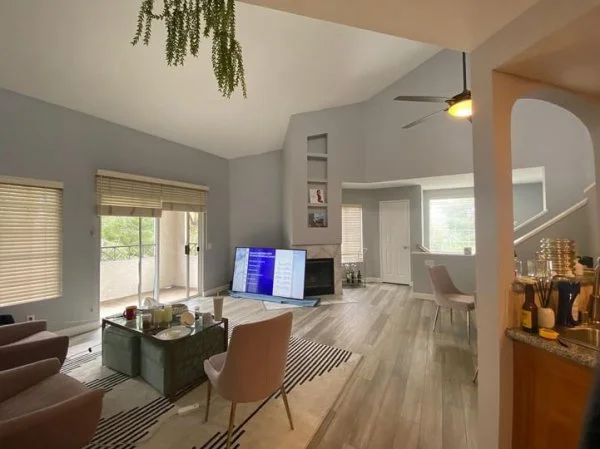
This apartment living room has some wonky walls at the fireplace. There are all kinds of angles and odd shapes to complicate things for an easy furniture arrangement.
Of course, you can’t do any remodeling in an apartment. So, we’re going to help solve the design dilemmas here with some decorating!
My blog contains affiliate links. Any purchases, at no additional charge to you, render me a small percentage, are most appreciated and make this blog possible. :-)
Furniture Arrangement
This is a nice, big open space and I do like all the light and high ceilings. Looks like a great balcony too!
You can see with the arrangement they had, the tv couldn’t be located on the wall with the fireplace. Unless it had been a small tv that could have been put on a stand in that niche, it wouldn’t have worked.
However, it wouldn’t really have worked then either because the tv is just too far away from the seating for good viewing.
The best solution here is to move the tv to the opposite wall and then float the furniture in the room.
I did a mock up to show them what it would look like.
I like how the tv viewing area feels more intimate now.
Luckily, there is plenty of room here to float the sofa and then put a sofa table behind it. I love doing that when the back of the sofa is quite visible from an entry. It just adds interest and makes it look more finished.
Fireplace Wall
Now let’s deal with the fireplace wall.
Those niches bother me. I’d rather have a cleaner, more subtle look over the fireplace.
The best thing to do is just cover them up. Finding such a tall, narrow piece of art or panel is difficult though and could be pricey.
I found this piece that fits over the niches amply, when hung vertically. With two of them, stacked one on top of the other, it sort of creates a textural panel, which I like here.
These are also pretty budget friendly too.
I rather like the warm beige tone as it is a nice contrast against the gray walls and works with the tile too.
Then, I’d tuck a tall bookcase or cabinet in to the niche and soften the corner of the fireplace hearth there with a chubby plant. :-)
This looks intentional and I think, minimizes the angles. The nice advantage here is they can take all of this decor and furniture and use it anywhere, on down the road.
I like this better than trying to find things to go into those niches.
Here is a post where I recommended the tv be moved away from the fireplace wall to create a more intimate seating group and better viewing in the large living room.
I have some links below to a few of the furnishings items.
This blogpost was thoughtfully written by me, Carla Aston, and not by AI, ghostwriters, or guest posters.


I’m sharing 3 fairly recent design challenges today, I just love a Q&A! I want to know with these, what would you recommend?