TV placement can be difficult, especially when dealing with a fireplace or bookshelves.
It’s all about composing a wall in a pleasing way, as we learned last weekend!
My “Wall Decor Weekend” was a hit here, on the blog, and on Instagram, in my stories.
If you missed it, you should check it out in my Instagram Highlights to see all the submissions and then my tips on how to deal with some of those blank or awkward walls.
If you submitted a photo and I somehow didn’t get it published or get back to you, please contact me via email here. I had so many I was not quite prepared. :-)
I saved a few to publish here today because these problem walls dealt with not only the walls but with tv placement.
I thought these sort of deserved their own post. :-)
My blog contains affiliate links. Any purchases, at no additional charge to you, render me a small percentage, are most appreciated and make this blog possible. :-)
TV PLACEMENT #1
This homeowner had a problem with where to put the tv. She recently moved in here and they have the tv in the corner for now. There was another blank wall, across from the living room sitting area and that was another possibility they were considering.
The nice fireplace that we don’t want to disturb. The tv will have to go on the side, but on a piece of furniture or built-in.
Here was an empty wall opposite the seating group. Should the tv go here?
Here’s the seating group which can remain as is, although I’d recommend scooting the sectional in a bit and adding a hefty end table with lamp and then a coffee table. A tall floor lamp can be added in the corner.
First of all, I think she needs to keep the tv where it is. Although it might be better suited above the fireplace, the fireplace mantel is high and has pretty sconces and paneling. Not worth messing that up.
The opposite wall there has a main traffic flow in front of it, so there would likely be people passing in front of the tv from the front door and stairs, to the kitchen area on the other side.
So, with the tv on a cabinet that could be pulled out and angled a bit if need be, I think this arrangement could work. I like that the fireplace has style and is a really dominant focal point of the space.
Location of tv to the side of the fireplace on a media cabinet. We don’t want to destroy the lovely look of the fireplace area by putting a tv above it.
This console cabinet is 56” wide, so I think might be a good size for that corner. Don’t want to go too big and jam it in there, it needs to breathe a bit.
Possible media cabinet for the tv in the corner, at only 56” wide.
This is also a nice chest, below, a little more tapered and narrow at 50” wide. It would be great for a 55” tv, which is actually 47” wide.
When I received all these pics in, I didn’t have the time to ask questions and clarify needs, as this was designed to be a quick look, nothing more. So, I didn’t have dimensions of that niche area.
Probably the ideal option would be to build in a cabinet to house the tv. She could do a wall mount tv on the cabinet back, so you could pull it out and angle it if necessary.
It just makes the tv placement appear to have been addressed more carefully, in this situation.
I’d put the tall plant over on the opposite side of the fireplace, to balance that wall out and kind of hide the outlets there.
A built-in would be nice here to house the tv in the corner, beside the fireplace.
The other blank wall can get a more open look console. I like a dark finish to reiterate some of the black elsewhere in the room. A round mirror above would be nice, to reflect the light from the windows. Add some lamps and that would fill out the wall.
You could pull a few small stool type ottomans under there for extra seating too.
Console with round mirror above to reflect light from windows works best on this wall.
I’d also scoot the big sectional in a bit, just so it doesn’t look so pushed in the corner. An nice big end table and coffee table or ottoman in the middle and she’s good to go!
See suggestions in this post about how to handle fireplace walls with a tv above the mantel.
And here’s a great post that shows how a false cabinet wall is created behind the tv, so wires can be hidden and the bracket installed on something sturdy.
TV Placement #2
This homeowner had a tv and a big wall to put it on. She wanted to know how she could make this wall more attractive, what else she could do to make it look better.
The dog crates needed to stay because those babies have to have their beds somewhere, don’t they? And often there just isn’t another place!
Vacant looking tv wall in family room. How do you address this wall?
In looking at this wall, one thing I did not want to do is recommend a bunch of art or wall decor surrounding the tv.
You see that sooooo much out on the web and I often just don’t think it is a good solution to the tv problem.
That would end up just looking busy and cluttered here. She would spend a lot of money on likely meaningless stuff just to fill the space.
One way to balance all the negative space here is to fill it with a substantial piece of furniture.
In essence, we are doing the same thing we did with the first big wall in the wall decor blogpost. We are going big with a cabinet or case piece to scale with the wall.
Here’s how I’d address this tv wall. A bigger cabinet for the tv with artwork on each side.
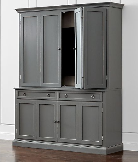
This was the media cabinet I recommended to her. I liked the gray because it wasn’t brown like the sectional. No need to have more of that color introduced here.
It actually comes in a variety of colors, including an indigo, a red/currant color, whites, and various wood tones.
There needs to be more cabinets like this out on the market! Something tall and slim is hardly available anywhere! I like the painted version too.
I also liked that it wasn’t a whole wall of cabinets, she needed height mainly, not necessarily an extra wide unit.
This leaves room on either side for more manageable artwork selection, smaller pieces that can be stacked. These could even be enlarged photographs, but some color would be nice.
I think that wall is more pleasing to the eye and feels more finished, even with the puppy homes! :-)
TV Placement #3
Here’s an example of how putting a bunch of wall decor around a tv can look kind of patchy and busy. This homeowner is ready for a big change!
TV on wall in family room with lots of wall decor surrounding it. Surrounding a tv with decor can look cluttered and disparate fast.
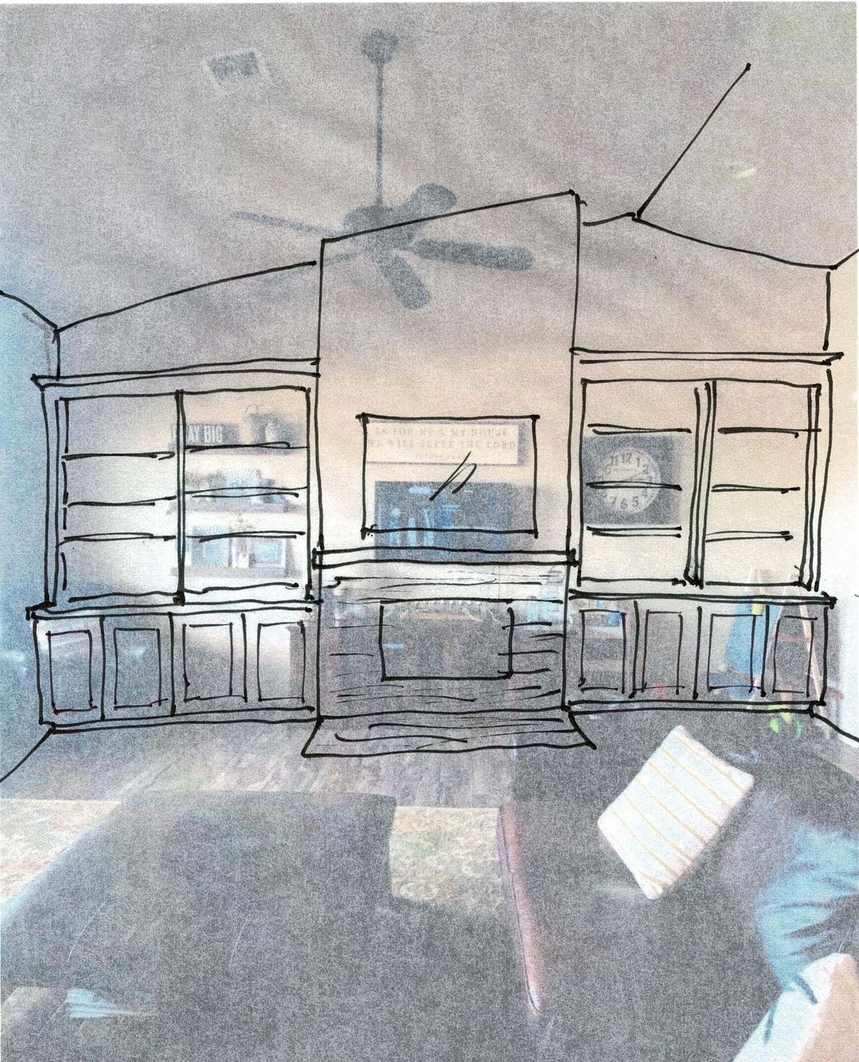
They actually want to put in a fireplace on this wall and they need storage and shelving in this room.
A central fireplace with low mantel and larger tv above will do the trick. Cabinetry on both sides with low storage for toys and then open bookshelves above to display some objects and books will give them the storage they need.
Central fireplace with tv above and cabinetry on each side makes for great storage and a beautiful focal point in this room. It also adds so much value to this home.
Instead of doing a surrounding mantel with “legs” on both sides, I opted for a cleaner approach, tiling the whole width up to the slim, top cap, mantel. That keeps less bulk between the firebox and the tv, so the tv can be lower on the wall for better viewing.
It is much like we did in my remodel project here.
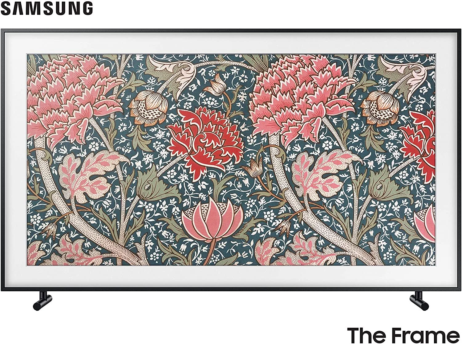
BTW, Samsung’s “The Frame” TV lets you use images on your screen when the tv isn’t on. I would love to have one of these in my bedroom! I just don’t watch tv much in there but would miss it if I didn’t have one. I’d prefer to be seeing some art or beautiful images most of the time!
Subscribe below to receive more fun posts with all these design dilemmas. I’ve got some images that trickled in from people at the end of the weekend. I’ll be sharing those next, right here. ;-)


