While I’m a fan of saving money and landfill space with a partial kitchen remodel when you can, I’m also the first one to advise someone just the opposite when I think they need to just bite the bullet and do it all.
I’ve got lots of both kinds of examples on my website with full service clients and consultation clients, and I’m linking to a bunch of those at the bottom of this post, for further reading.
For now, I’m sharing this one recent consultation client that I advised to go all in and why.
BTW, this is the last day (Jan 31) for the $5 off my Wall Decor Guide! >>> Wall Decor Guide
Client Consultation - Painting and Kitchen partial Remodel
Here was one of my recent email consultations that concerned a kitchen.
This homeowner had just purchased a home and wanted to get some work done before they moved in. She knew she wanted to paint the whole interior of the house because she didn’t like the paneling, wood trim and cabinetry.
It was all dated and tired looking and needed some freshening up. She was getting new wood floors too, darker than this paneling, and didn’t want multiple wood tones in the house.
She asked about some possible paint color options for the house, particularly the paneling.
Living room with paneling and carpet that homeowner is wanting to update before move-in.
More paneling and off color wood that homeowner wants to change before move-in.
She also asked about the painting the kitchen.
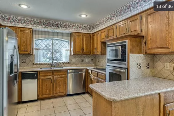
I took one look at the kitchen and realized, she needed to do much more than just paint it.
Actually, painting those cabinets is the last thing I would spend my money on.
Why? Because of the big oven sticking out in the room there, blocking the countertop on the other side from being useful to the kitchen.
It’s just a very awkward placement, right? It looks like a mistake, really. With all the kitchens I’ve seen, I’ve never seen a wall oven placement like that.
Don’t spend on the kitchen before big changes can be made
I told her to wait on painting the kitchen until she could afford to go all in. It’s just not worth spending a dime on this kitchen until she could fix that oven situation and help the overall layout first.
I look at situations like this and immediately think about what I would do, if I was given free reign in this kitchen or if this kitchen was mine. What improvements and changes would I make?
I’d do a single range, combining the oven and the cooktop in one unit. It looks like there’s a downdraft, however I know there is no second floor above this kitchen, so it is highly likely that a venthood could be drafted up and out. Then I’d do a drawer microwave, popular now in even the chicest and most luxury properties.
That would allow a long countertop level surface there, much more useful than what is there now.
I’d center the new range in that cabinet run, to give the blind corner by the dishwasher a more useful pull-out or lazy susan storage situation too.
I’d do everything I could to see about removing that furr down or soffit and take some new upper cabinets to the ceiling. That will add much more storage and make the kitchen feel larger and taller, overall.
I’d enclose the refrigerator in a full height cabinet. I’d make sure to get a counter depth model refrigerator and then do some nice cabinetry that sits flush with the face of the refrigerator. I usually do vertical dividers there for my clients.
I’d do a trash drawer instead of a trash compactor there by the sink.
I’d likely do away with the peninsula, I would even prefer a narrow stainless table as an island that could be movable. There doesn’t look like much room for a built-in island, but I’d definitely check on that. This would open up the kitchen even more to the breakfast area.
There could be other improvements made, like the windows, but overall, these changes would really make a difference in how this kitchen functioned and looked.
There would be no way to affect the change of a range instead of a cooktop and wall ovens, without doing new cabinetry, counters and backsplash.
Here are some kitchens where I had similar thoughts about going in big for the overall remodel.
Basically, I told the clients that if they didn’t go in big, they would likely regret it.
Kitchen #1
In this one, the client wanted new doors and drawer fronts, a whiter color overall, new counters and backsplash.
BEFORE REMODEL - This kitchen with the heavy sheetrock arch hood area robbed this kitchen of some much needed storage and a more open feel.
BEFORE REMODEL - This window to the hallway provided no real purpose and this space could have been better used for some upper cabinets.
BEFORE REMODEL - The deep microwave in the upper cabinetry made for an awkward corner in this kitchen.
What I could see that would make big improvements:
The big wide, arched hood area design robbed this kitchen of some much needed storage and the low, oppressive feel it gave the space.
I could see how the microwave placement made for an awkward rather unusable corner, when it a drawer model could be used for a more open feel there.
I could see how that little window to the hall wasn’t serving any significant purpose, and upper cabinets there would be so much more functional.
So, when you take into consideration all the cabinetry changes that could make some significant improvements here, it seemed worth the spend for this family.
AFTER - Kitchen remodel with new cabinetry, hood, counters and splash for a more open, modern feel. Carla Aston, Designer | Colleen Scott, Photographer
AFTER - Kitchen remodel with new cabinetry placed in the area where the “window” opening was before and a drawer microwave for a more open feel in the corner. Carla Aston, Designer | Colleen Scott, Photographer
Check out more before and afters of this kitchen remodel here.
Kitchen #2
In this kitchen, the client wanted a much more clean-lined look and all the traditional details on the cabinetry just didn’t work for them, style-wise.
BEFORE REMODEL - The deep corner cabinet was awkward and interrupted work flow in this kitchen. The traditional style did not work for this homeowner.
What I could see to make big improvements:
The giant corner cabinet with the dated wall ovens were in a bad location for the functionality of this space. The solution was to bookend the cabinets with two towers, the refrigerator cabinet on one end and oven cabinet on the other, to create a wide open counter for a much more functional work surface and storage.
We also lengthened the run of cabinetry and the island, to add more cabinet and counter space overall and to work better in the room. The island got longer and more narrow.
I didn’t think any of the previous kitchen was worth keeping, considering some of the major cabinetry work that needed to be done.
AFTER - Kitchen remodel with new cabinetry, with refrigerator and oven tall cabinets on each end for a more useful layout. Carla Aston, Designer | Colleen Scott, Photographer
Check out more before and afters of this kitchen remodel here.
Kitchen #3
This kitchen had such a huge odd island that just really had to go. Although refrigerator and cooking area stayed in approximately the same location, the sink and island situation had to change.
BEFORE REMODEL - This awkward kitchen island had to go for a better overall layout.
Here was where I saw improvements could be made:
We changed the cooktop to a range with a beautiful custom hood that became the focal point of the kitchen.
A new layout including moving the kitchen sink to the outer island was in order, creating a smaller island in the center of the kitchen. This situation defined the kitchen perimeter better in this large area and made a more useful space.
Taking the cabinets all the way to the ceiling created a luxurious, tall space and felt much more up to date and in keeping with the quality and value of this property.
This kitchen is positioned in the corner of a big, open family room and breakfast room. It needed to feel more “defined” in the space and a tall, 42” high bar was just the solution.
AFTER - Kitchen remodel with a new layout that defines the kitchen perimeter in a big open space. Carla Aston, Designer | Colleen Scott, Photographer
AFTER - Kitchen remodel with a new layout that works well with a 42” high bar. Carla Aston, Designer | Colleen Scott, Photographer
Check out more before and afters of this kitchen remodel here.
Kitchen #4
I have another job that was just finished up before Christmas. I’ll be photographing that one soon and can’t wait to share, but here are the before pics that made me determine that we needed to do a full redo of the layout.
BEFORE REMODEL - Wall ovens - we can get more countertop space and a more open feel with a range.
BEFORE REMODEL - There was almost too much open floor space in this kitchen. It didn’t function well and the sink and cooktop being side by side created a crowded work area.
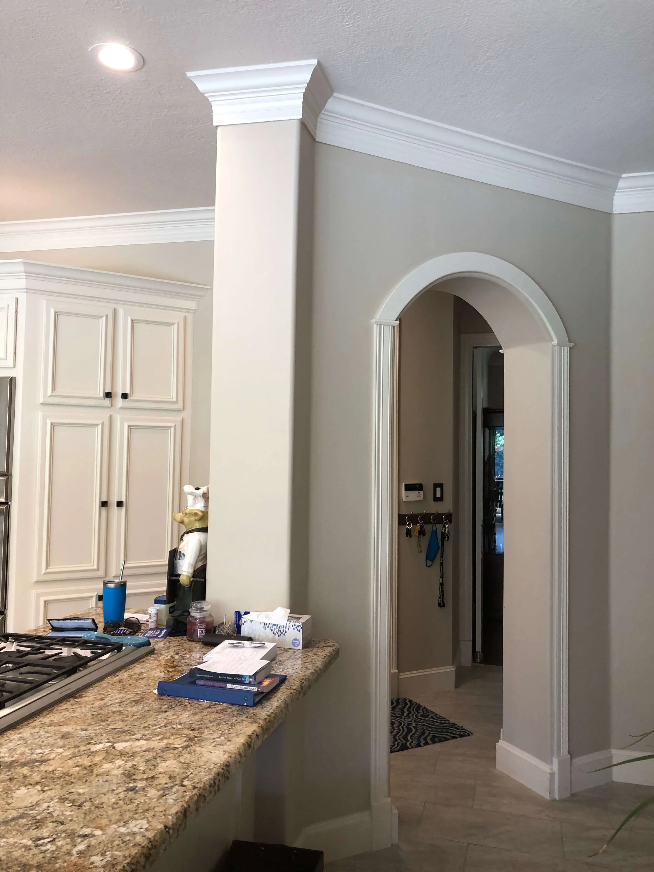
BEFORE REMODEL - The column and arched opening served no real purpose and wasted space.
Here were our major changes that determined a complete redo:
Arched opening had to go. That required some structural work, so a bigger remodel was necessary. It also would leave a void of space that could be reused more efficiently in a new layout.
A new pro range was desired and could achieve a more open cooking area if relocated on the wall where the wall ovens were.
Since the island, arched area and wall of cabinets at the ovens were going, there wasn’t enough left to save of the old kitchen. Plus, taking the cabinets to the ceiling would be so nice.
The existing door and drawer style in this kitchen is a little dated and clunky. The homeowner was ready for a cleaner look.
It turned out great and my client told me it functions sooooo well now. :-)
Check out more of the before and afters of this project here.
If you are interested in a consultation for advice on a remodel, check out my in-person consultations for local projects, or my Designed-in-a-Click email consultation service.
If you are interested in how you can successfully do a partial kitchen remodel but still make a big impact, this post has some great tips for partial kitchen remodels!
This blogpost was thoughtfully written by me, Carla Aston, and not by AI, ghostwriters, or guest posters.


