Oops! These family photos are hung a bit too high and need some adjustment.
I had lots of blank walls submitted for ideas during my wall decor weekend freebie in mid-April. I asked for your problem blank walls and had many responses, some were really rather tough!
Many of those included a wall was really wide. With little or no art to hang, people ended up becoming really confused, not knowing where to start.
I’m sharing one trick here that was mentioned before in my posts - use furniture and furnishings placed in front of the wall to help break it down into more manageable chunks or sizes. That makes a wide wall much easier to deal with.
It was included as a tip in this first post I did, where I talked about how to use furniture placed in front of the wall to break up the space.
Wide Blank Wall #1
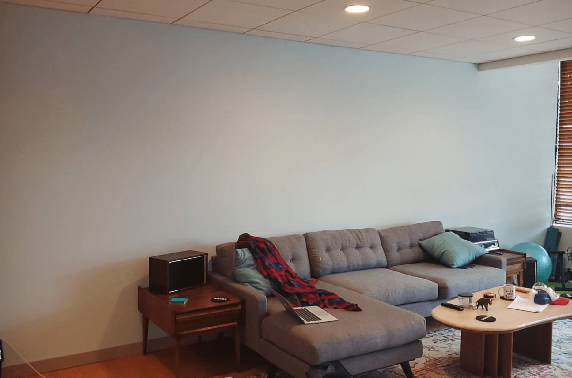
Here was one of the images I was sent with a wide blank wall.
MId-century modern style sectional sofa in front of a big blank wall. What can hung on that wall that makes sense?
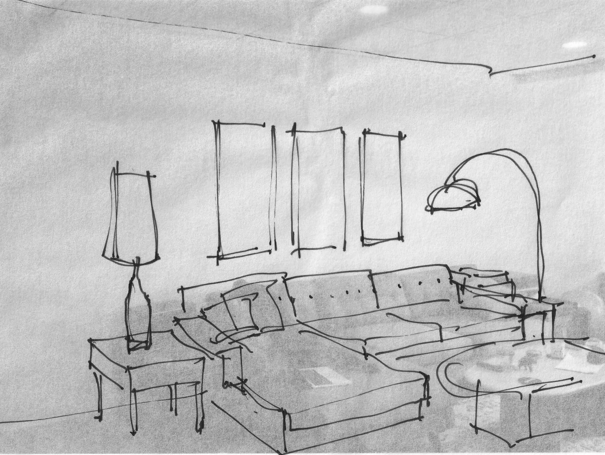
I proposed a tall mid-century style lamp on one of the end tables. The speaker could go on the floor below the table. It looks like it would work just fine there.
That helps give us a good start.
On the other end, I’d do an arc lamp. They’re graceful, create a nice shape on the wall, and work well with this style of furnishings.
Once those have been added into the mix, a tryptich of vertical art pieces can be centered above the sofa for a pleasing wall composition.
3 vertical art pieces are framed in nicely above a sectional sofa in the mid-century style living room. The tall lamp on the left and the arc lamp on the right frame in the space to receive art and make it a more manageable section to deal with.
Wide Blank Wall #2
This homeowner asked about putting her tv on this blank wall. With the ceiling angling up and the width of that wall, I thought even their big tv would feel small here. I thought she could also use more seating and a more useful arrangement of furniture too.
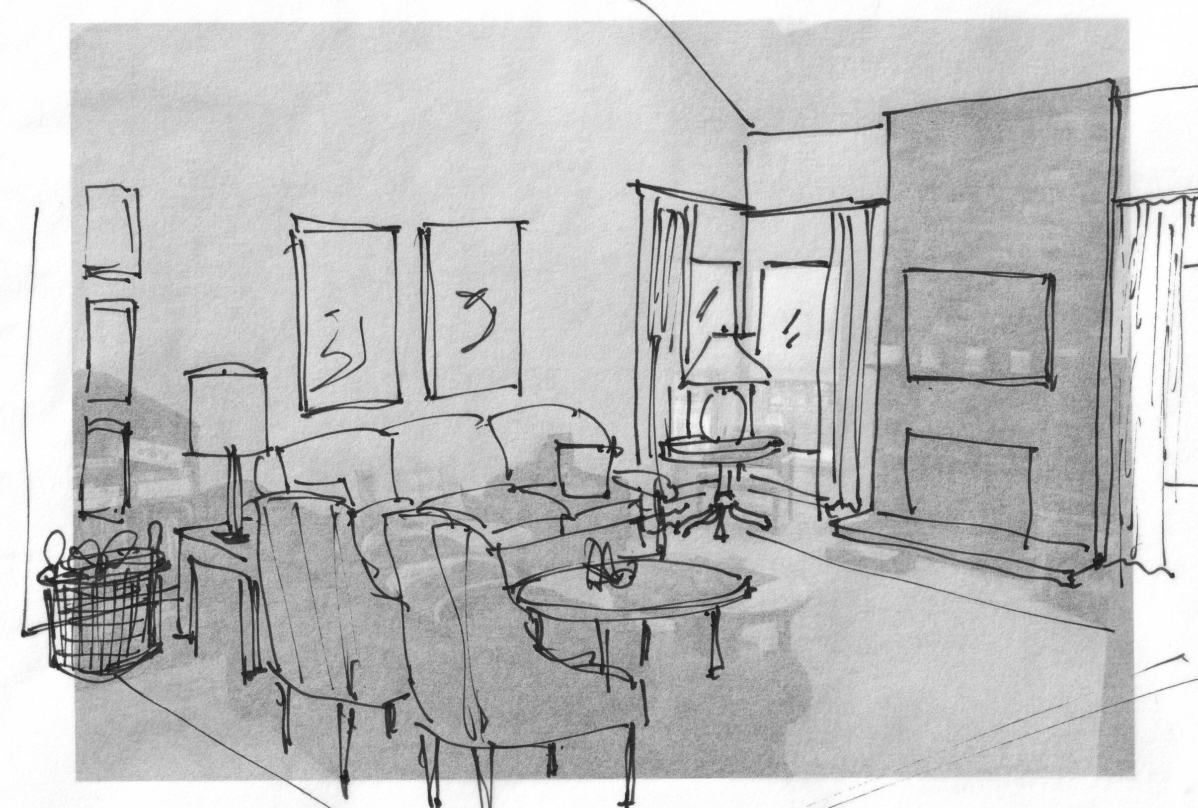
Pushing the sofa against the wall here was the best option for a furniture arrangement. She could get two comfortable chairs in and feature two groupings of purposefully arranged artwork on the big wall.
We talked about hanging the tv above the fireplace, even getting rid of the mantel to lower the tv some. She was considering painting the fireplace or even remodeling some there, so the tv could be hung in that spot.
Two vertical companion pieces above the sofa, and then a vertical stack of smaller pieces on the other side of the lamp work well here. Drapery panels would add height at the end of that wall too and fill that corner nicely.
Do you see how the lamp and draperies serve to frame in the wall space to be dealt with? Much more manageable.
Wide Blank Wall #3
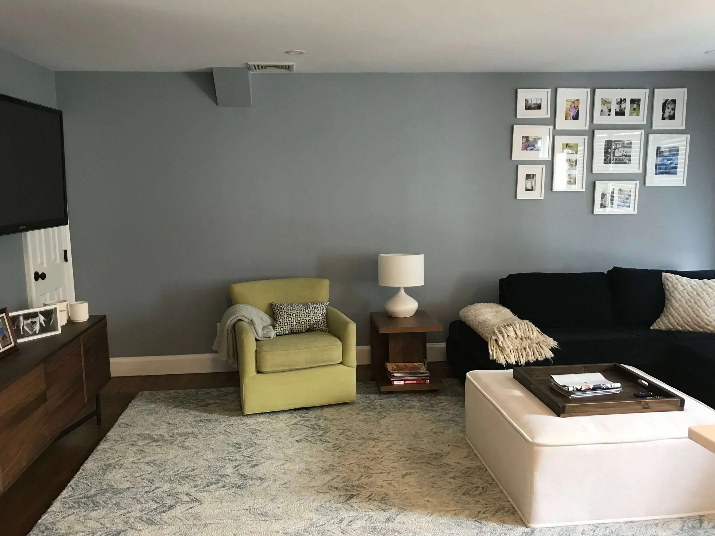
This upstairs den or game room had some nice furnishings with framed family photos, but they were hung way too high. Even if they wanted to add on to the wall collage as time went on, they would be better hung lower at the start and added on to from there.
It also was pushed too far to the right, over the sofa. Over in the corner there, I felt like it wasn’t best for viewing the smaller family photos.
This family photo collage was hung way too high on the wall above the sofa.
Even with the door open here, the collage was pushed too far over to the right, above the sofa.
I suggested clustering the photos over the citrine chair, at a lower level, and then adding a large “Gray Malin” style beach photograph framed in white. It would relate to the other framing and pick up on the fresh look of the citrine upholstery and white upholstered ottoman.
The room feels kind of coastal to me, so that would work well.
Here was my sketch showing the wall decor placement.
I recently received a photo of the new wall decor placement from this homeowner. Looks great, doesn’t it? And there’s still room to add some more family photos as time goes on. :-)
AFTER - Here’s the new wall decor layout! It looks much better!
Do you need more help for your blank walls?
I’ve got the full comprehensive wall decorating guide with lots of case studies, tips and tricks, designed to help you design your own walls. :-)

