I’ve been going through your emails with your tall blank wall dilemmas, as I invited you to send me at the bottom of my wide wall dilemma post recently.
I’ve selected a few to share here today and will share some more next week.
My blog contains affiliate links. Any purchases, at no additional charge to you, render me a small percentage, are most appreciated and make this blog possible. :-)
Tall Blank Wall Dilemma #1
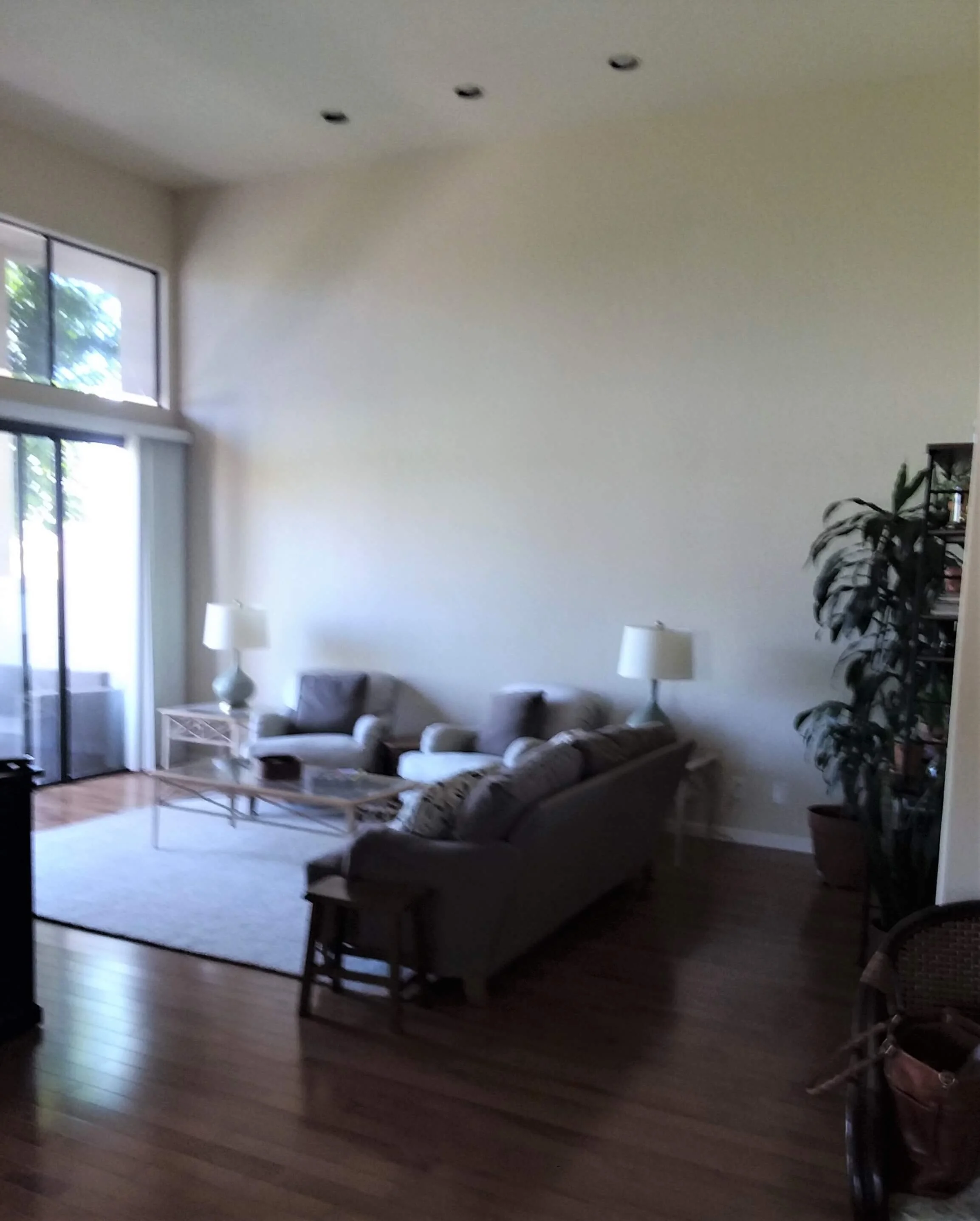
This living room has 12’ high ceilings and the wall is not only tall but wide too. The tv and a corner fireplace is located across the room from this wall.
The homeowner had purchased the furniture online and the sofa was not comfortable, so they wanted the chairs against the wall for tv watching. They didn’t know how to fill their wall and make the space feel more welcoming and well, like home!
The pics are a little blurry, but you get the idea. They have a nice view of a golf course and love the natural light.
Tall, wide wall in living room. What to do with this tall wall?
Tall living room wall needing some wall decor.
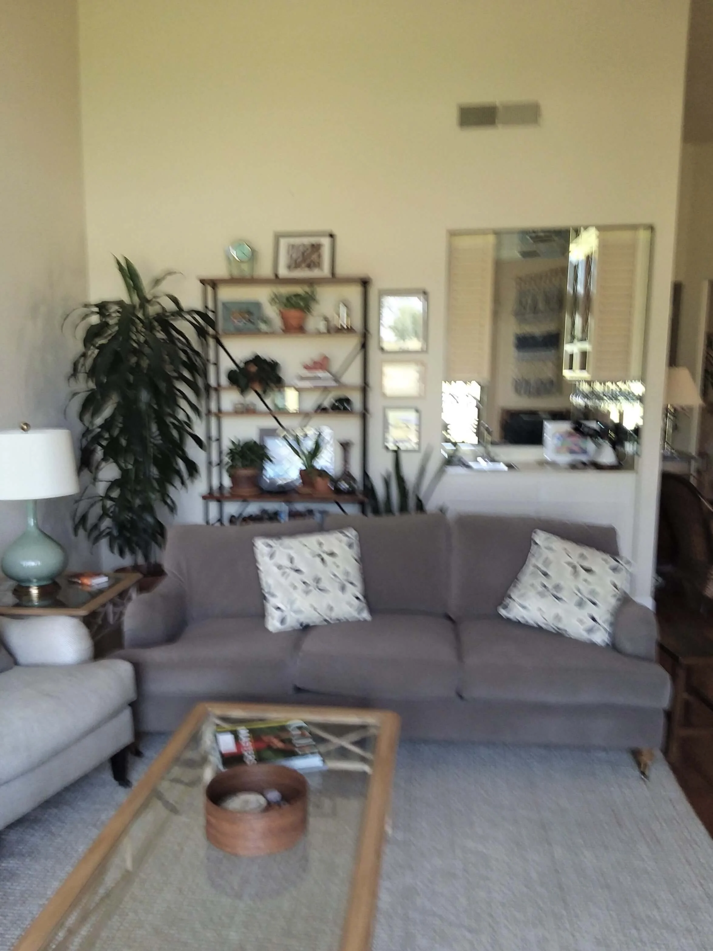
You can see they have a tall etagere or bookcase on this wall behind the sofa, a tall plant, and there is an opening to the room beyond.
There are lots of items on this wall and it almost looks a little cluttered and overcrowded. (Sometimes smaller walls are easier to deal with so we deal with those first. It is those really big ones that can be hard to tackle.)
View of living room wall behind sofa, full of objects, furnishings and plants.
Here are my recommendations:
I would recommend moving the bookcase to the big blank wall on that end, behind the sofa. Stacking that piece full of solid type items like books, chunky vases or jars, boxes, baskets, will help that bookcase create a mass overall there. I would prefer it not to look too open, but have items overlapping with a full look.
I’d move the plant to other end, down by the window. Now there will be two tall items on either side of the seating arrangement that help to minimize the wall and make it more manageable to decorate.
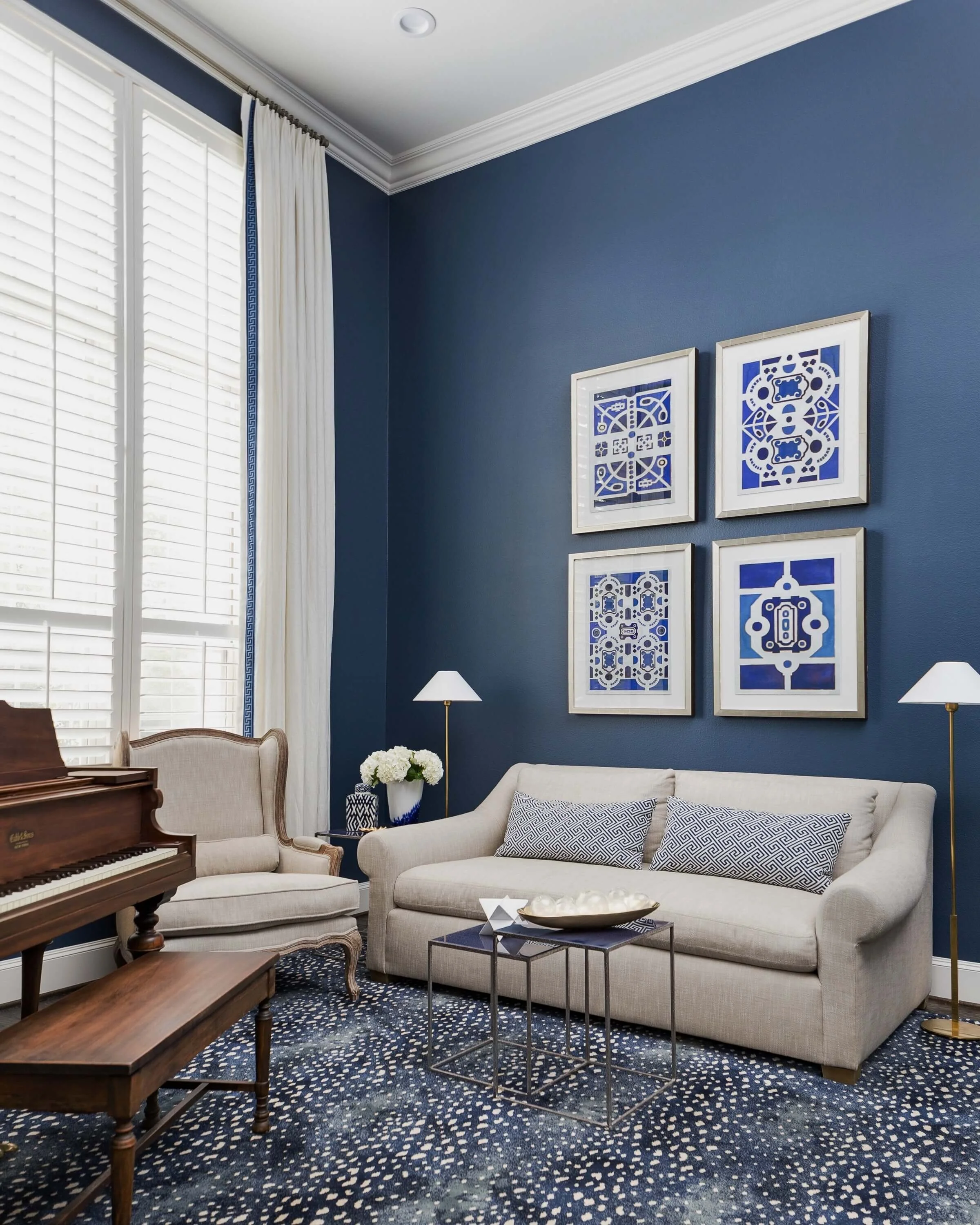
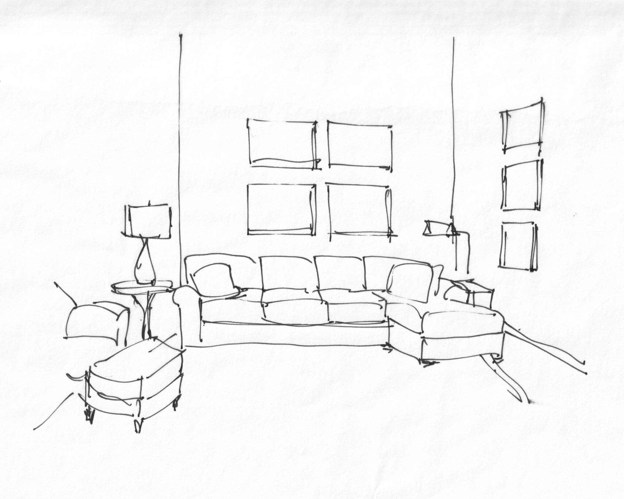
Four vertical companion type art pieces, similar to what I did on the tall wall in this project, would work with the height there and would fill that space nicely.
I’d put a more substantial round table in the middle, between the two chairs with one of their table lamps. I’d do a new floor lamp (for a bit more height) in the corner, between the sofa and chair.
I’d also look to add a large, airy style chandelier or even a modern ceiling fan, if preferred, to add some detail at the ceiling and upper part of the room. It just completes the space and feels much more purposefully designed, I think.
Here’s how it looks sketched up.
Sketch of living room with wall decor layout. Carla Aston, Designer
That bookcase was previously not in a position to really be seen much before, behind the sofa and around the corner, so having it on the big wall can create a nice display there and show off the homeowner’s items properly.
I’m envisioning that grouping of four pieces to look something like this, pictured below, over a sofa in one of my projects.
A grouping of vertical art pieces above a sofa with two matching floor lamps on each side, helps fill this tall wall space. Carla Aston, Designer | Colleen Scott, Photographer
Shop my recommendations:
Tall Blank Wall Dilemma #2
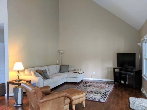
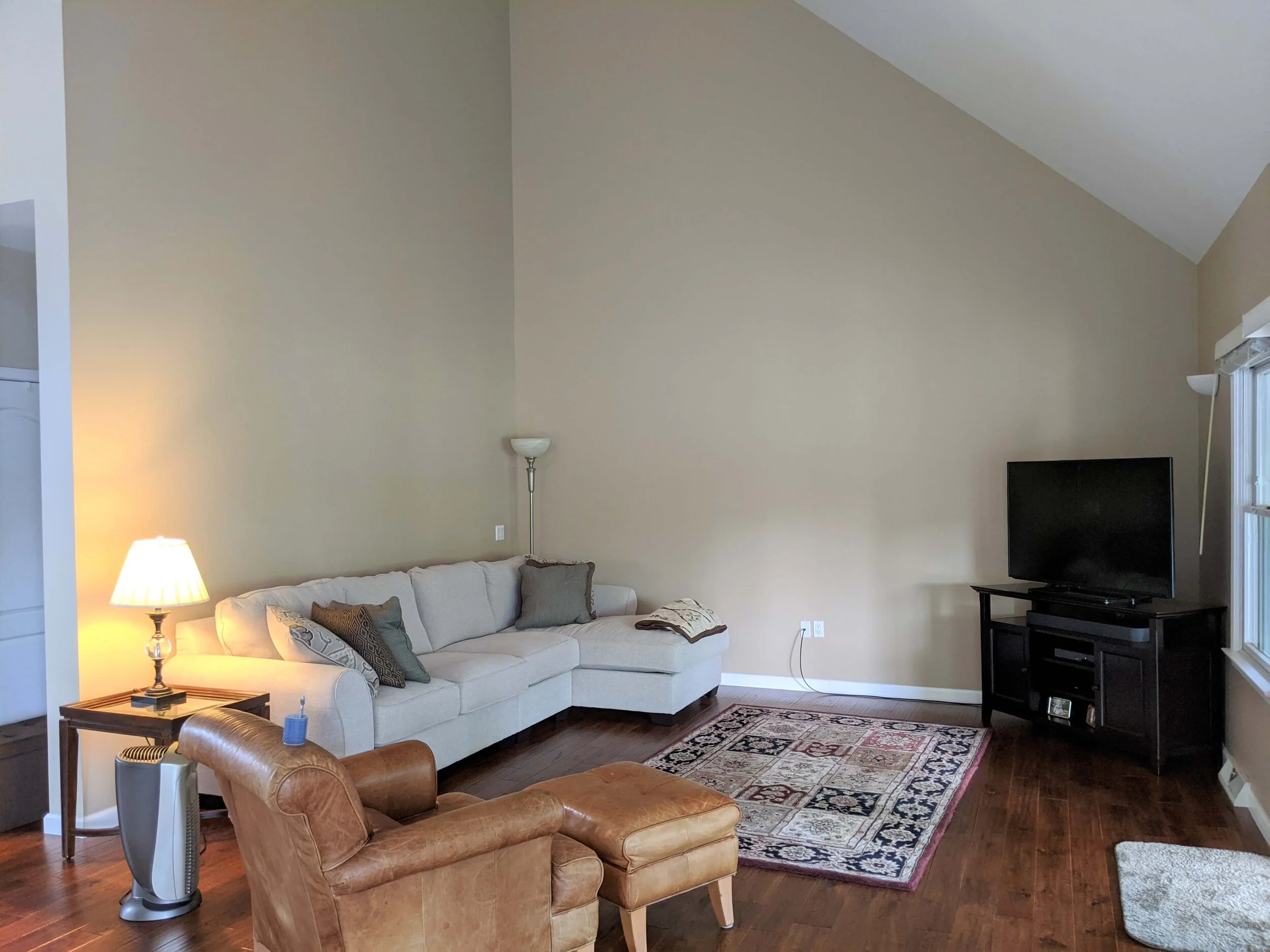
In this home, the tall walls were puzzling the homeowner. They wanted to have the tv in the corner there and their new long sectional sofa against the wall.
They didn’t know how to treat the walls or what to hang on them.
What to do with these tall walls? The homeowner was intent on having the tv in this position. The sectional sofa with the chaise on the end seemed sort of buried into the corner there.
What to do with this tall wall above the sofa?
I always pride myself in trying to work within the constraints of what people are requesting……up to a point.
In this case, there was a point.
That tv in the corner and the furniture layout, in general, just doesn’t work with the architectural features of this room.
However, I did think I could make some small adjustments and recommendations without changing things too dramatically.
Move the sectional sofa out of the corner, away from that back wall a bit, so that the other end of the sofa aligns with the end of that wall. It needs some breathing room back there in the corner.
Once that is done, then a horizontally oriented grouping of framed art pieces, or maybe a gallery wall look, can be hung above to relate to the long width of the sofa and fill the wall.
The tv needs to be moved against the angled wall if the space is to feel purposefully designed. It can be slightly off-center toward the windows, but really, I don’t like the idea of a big gap between the end of the sectional sofa and the tv cabinet.
Place a tall plant in the corner to balance the room and add some softness.
Add some stacked art pieces above the end of the sectional for some height there. A small end table back there and a pharmacy style floor lamp will help fill that corner.
An extra chair can be added at the window to face the tv and/or seating group.
The leather chair and ottoman basically remain as is. I’d do a round pedestal table between the leather chair and the sofa, to keep it rather open feeling and to create a softer corner there.
I would mount the tv on the wall with a fully adjustable bracket. TV brackets can give all kinds of flexibility for tv viewing these days, so don’t let a necessary angle on the tv keep you from achieving a well-designed look in your room!
The tv is moved to the tall angled wall for a better position in the space. It can be mounted with a bracket on the wall so that it can be pulled out and angled for better viewing from the sofa, as needed.
Small side table and pharmacy style floor lamp tuck into the back corner to give the wide sectional sofa some breathing room. Art is positioned above the sofa in two groupings.
Shop my recommendations:
Tall Blank Wall Dilemma #3
Here is a bedroom with some tall walls. The homeowner wanted to know if they should paint the angled areas of the ceiling and then what to do with the wall decor on the bed wall.
Question for this bedroom’s design - Should this angled ceiling area be painted to match the wall?
Here is my recommendation:
Yes, paint that ceiling! All of it, not only just the angled area, and do it the same color as the walls. It will feel bigger and more luxurious and the warm wood of the bed will stand out more.
If the artwork beside the beds is meaningful, then they can be relocated to the center, removing the little curly ironwork piece. If they aren’t special to the homeowner, then they could get something slightly larger with a softer look. The black framing is a little bulky and harsh. At the least, I would get those reframed.
Go for some new lamps. I’d love to see a gourd shape here with a slight angle on the lampshade in a cream color to match the coverlet. It’s a traditional look that will soften the bedroom and brighten up the nightstand area. I would back those with a nice mirror on each side too. I like that one with a small gilded frame in that scalloped shape. It adds some curves to the boxiness of the four poster bed.
Bedroom with tall, angled ceiling. Should the angled wall be painted to match the lower walls?
Shop my recommendations:
Tall Blank Wall Dilemma #4
This is my last one today, I’ll share more next week.
This homeowner has a really big, open room and had already purchased some frames for some photos.
She had tried laying them out but wasn’t too happy with it and questioned what to do.
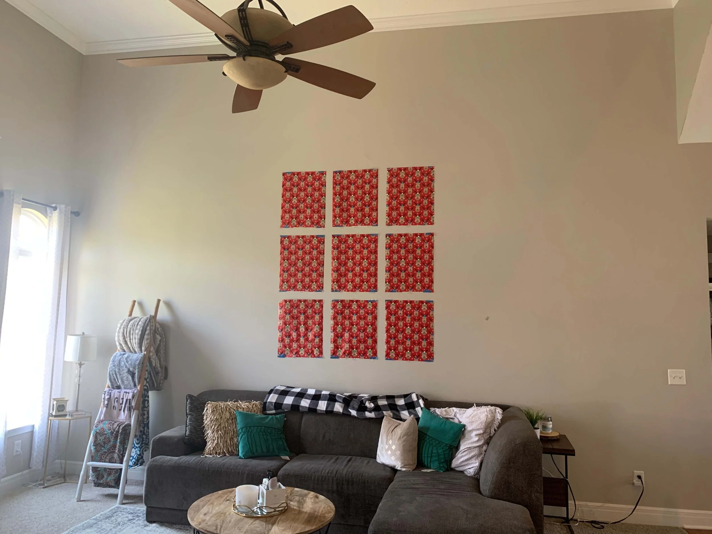
She had a good idea, BTW, with mocking up her layout first. Before you start pounding nails into the wall, tape up the size and shape of your pieces in paper, to get a look at how they will work.
It’s a good idea to tape up the shapes and sizes of frames to go on the wall before you get out the hammer and nails. This huge empty wall needed more than just a grouping of 9 frames though.
This homeowner blocked out the frames on the wall to see how it would look once installed. It’s close, but needs something more.
First of all, even though the overall size of the grouping fills the height of the wall okay, it just still feels empty.
It needs other things up against the wall on either side to cut down the overall width some.
The sofa is really wide, because it’s a sectional. While it fits the room, the overall shape of the grouping on the wall doesn’t really relate to the sofa underneath.
Here’s my recommendation:
Add another vertical row of frames to the wall arrangement. The grouping is just too narrow for the sofa and for the wall. I sketched over this many times before I came to this conclusion and really, it just needs to be wider.
This display cabinet would make a great addition to the wall to fill in and add balance. I like that it is enclosed and a solid look, even with the glass doors. It will make a great place to display small pictures, books and objects that can really be seen there at the bottom of the stairs and the entry to this room.
I like the idea of a few plants by the window on the other side of the sofa. It just balances things out and adds some softness.
Adding in an adjustable floor lamp on the right side of the sectional sofa would help to add some lighting there and fill in the wall space there.
The room is big, and the sofa is a large and chunky mass, which is fine. Scale the other items in the room accordingly. The coffee table could have more visual weight and be slightly bigger in size too.
I would aim to get some new drapery panels at some point, to be hung just under the crown of the moulding at the fireplace. Some tailored sheers would be nice if privacy is not needed. That added height there will help the overall feel of the scale in this room.
Another vertical row of frames will add needed width so that the grouping relates well to the sofa below. Adding in tall plants, a floor lamp and tall cabinet will also help fill out the wall space.
Always remember, with tall furniture items, bolt them to the wall if you have young children in the house.
Shop my recommendations:
Need more help with your big, blank walls? I have all kinds of scenarios included in the pages of my wall decorating guide, below. You can find out more and purchase here.

