We just got back from California where we visited some family and friends out there, and I’m so excited to share with you the house we stayed in.
The house was in Ventura, California and it was absolutely beautiful. The balcony, the view, the everything! It was truly breathtaking.
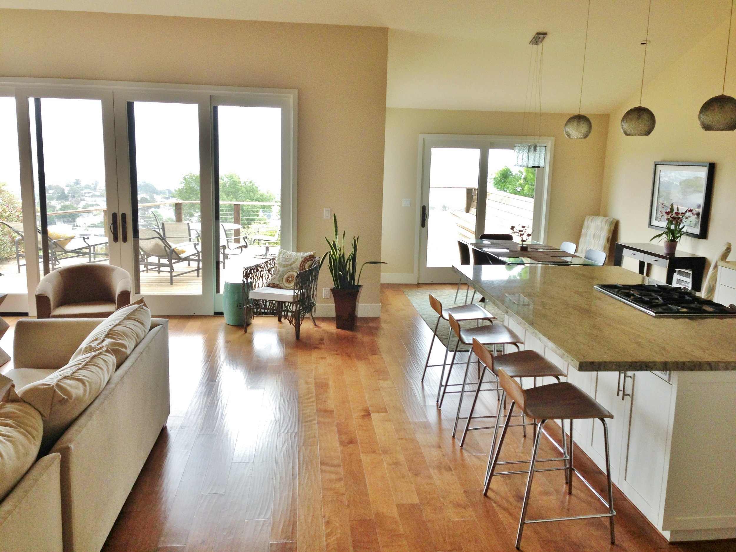
Built only a few years ago, everything still felt all fresh and like new. From top to bottom, it was immaculate, making us feel like we had just walked into a brand new home with all the most-wanted amenities right there waiting for us to enjoy. It just had that perfect California feeling: spacious, open, coastal and relaxed.
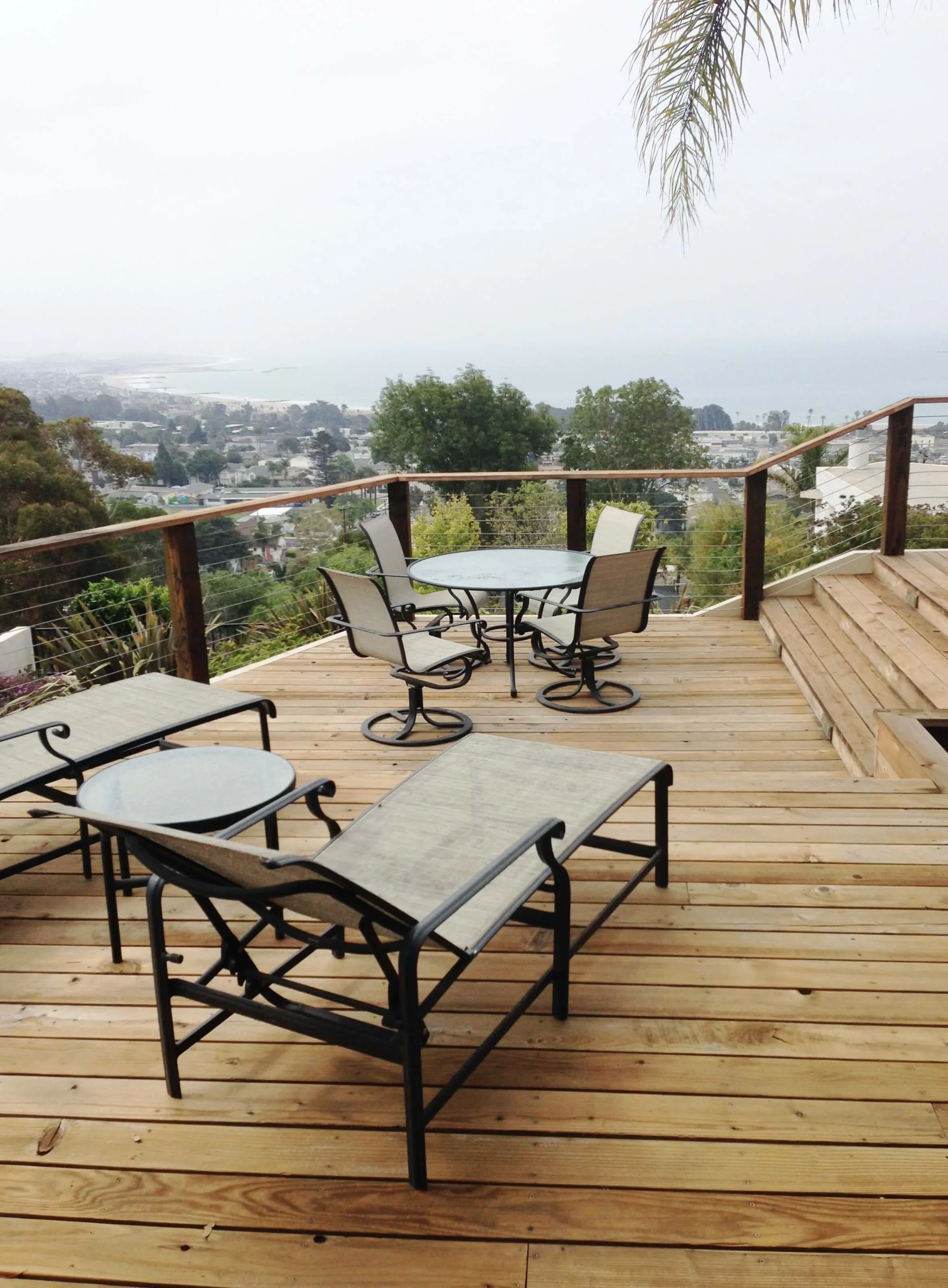
The Deck, That View!
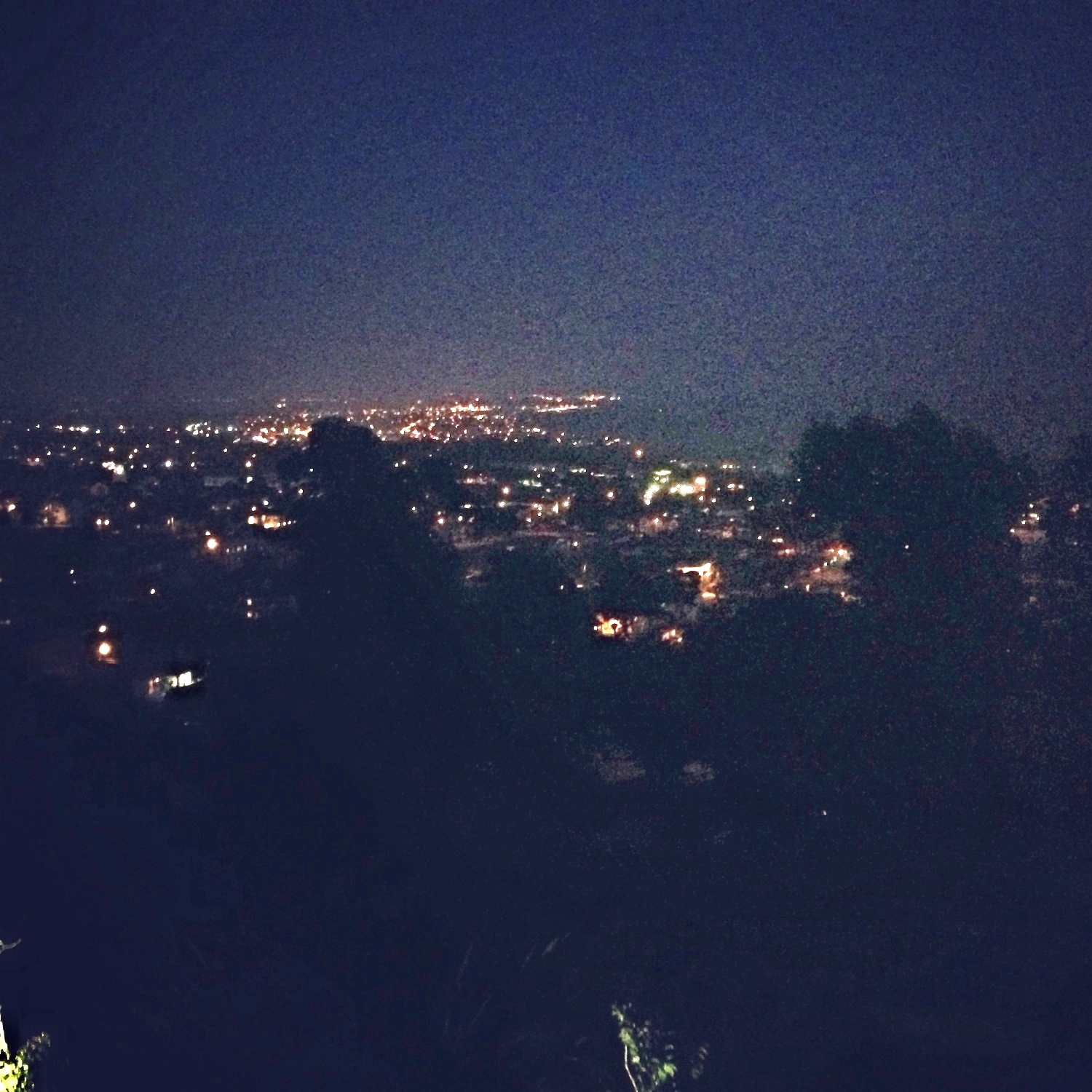
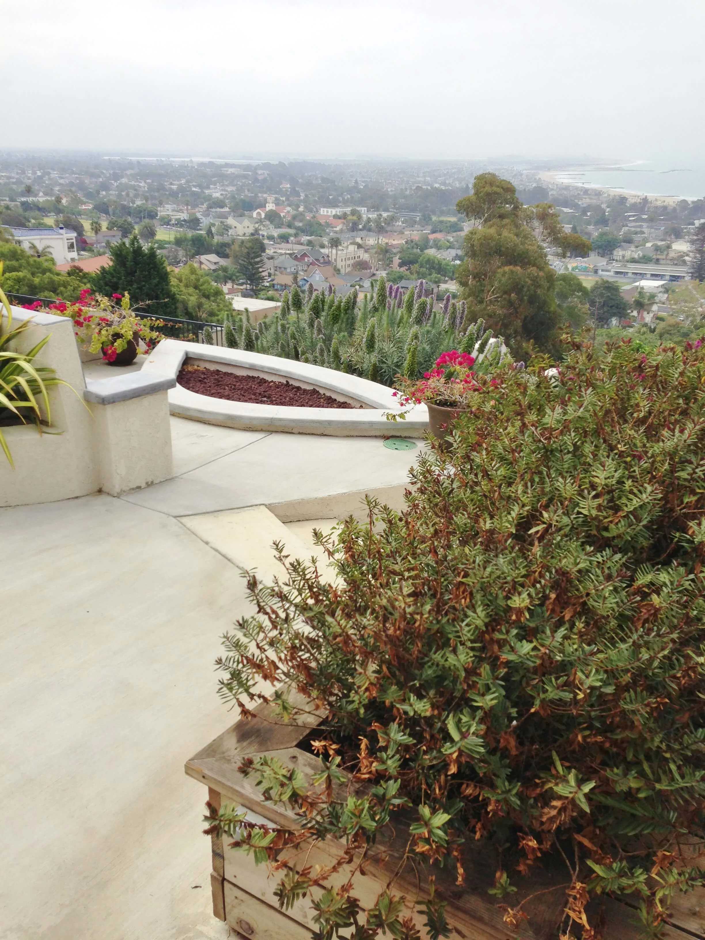
Perched up in the hills, we felt like we were on top of the world as we enjoyed our stay on top of the coast.
We stayed here because it was centrally located to some relatives we came to see, and some other places we wanted to visit: Ojai and Santa Barbara. Honestly, I would say the house we stayed in certainly ranks as a destination itself.
Orange tone wood floor - Ventura California rental house review tour
The Wood Flooring
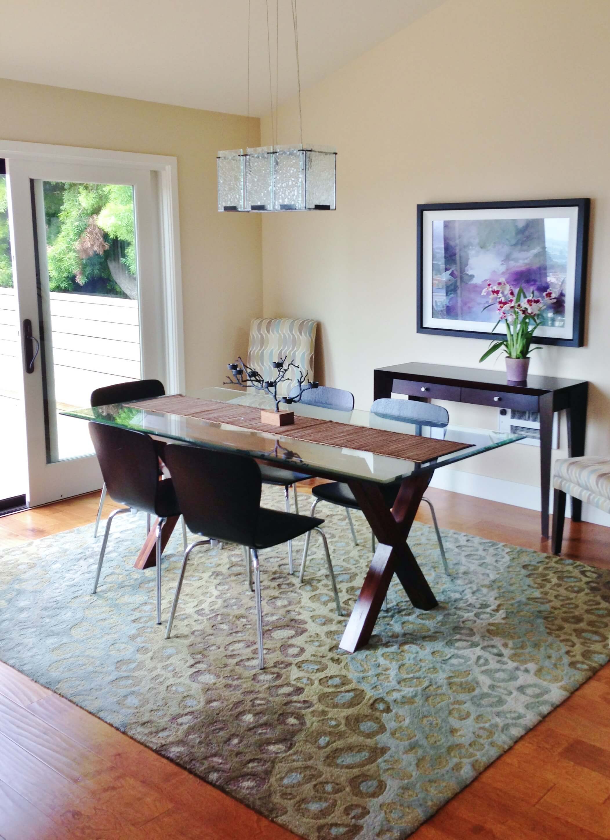
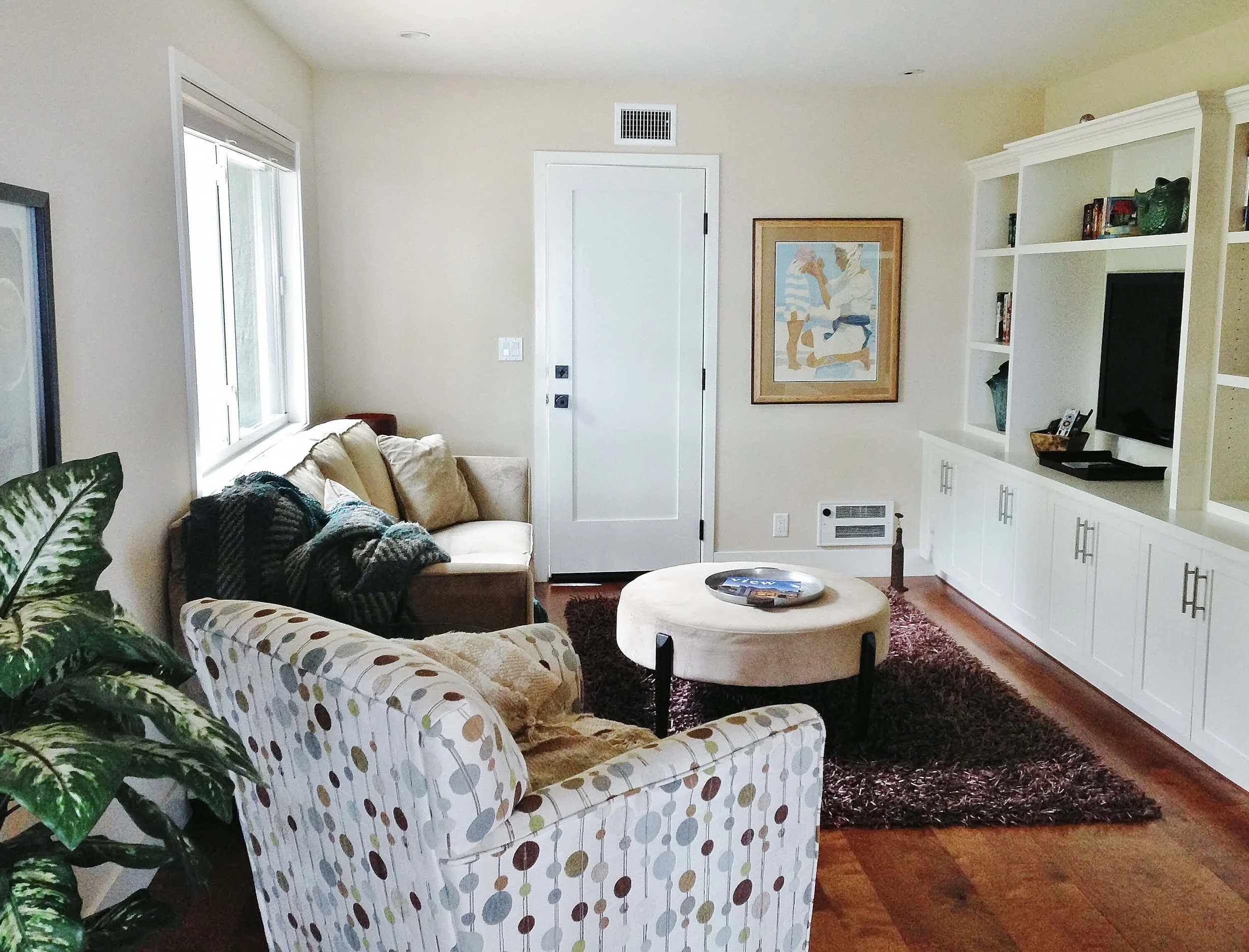
First off, I don’t often recommend orange color wood floors, but here it works. The color has a nice balance with its soft green and turquoise palette. A dark wood would be too heavy for this house.
Granite countertop - Ventura California rental house review tour
The Granite
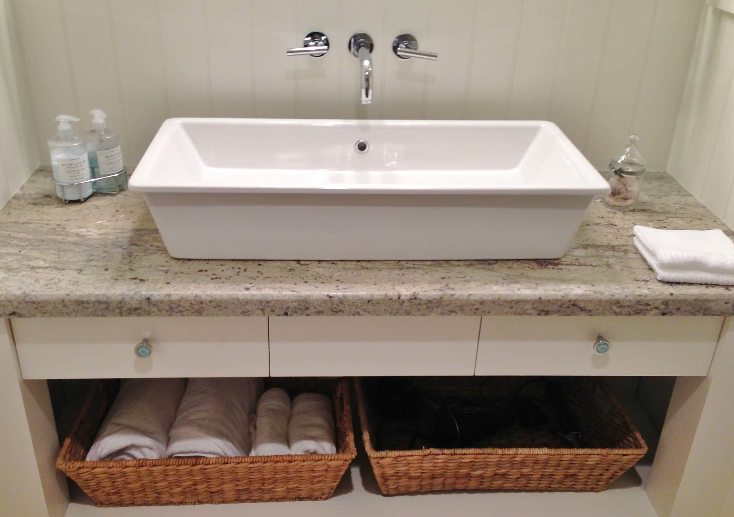
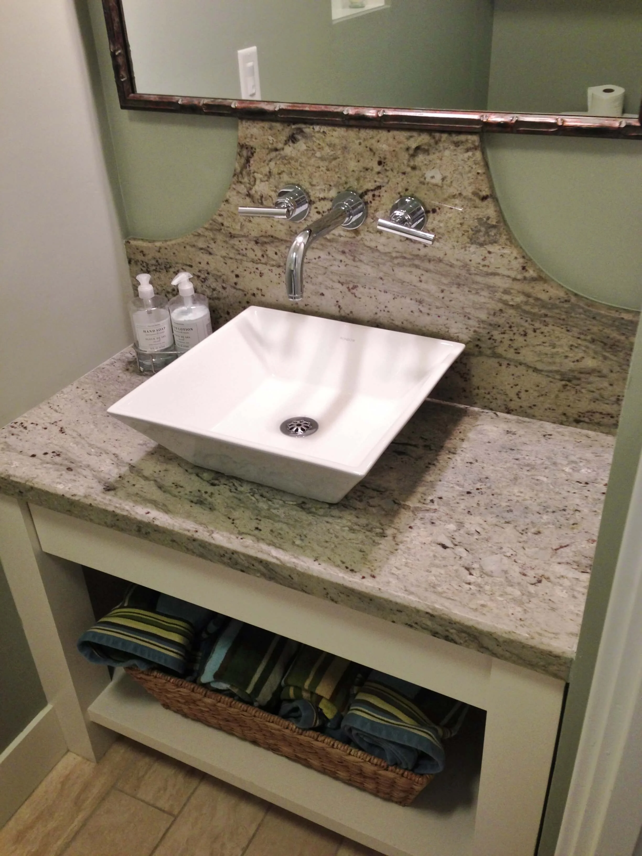
I feel like the granite was a stepping off point for them for their color choices. It was perfect. I’ve used this granite before on a job as a remnant but, for the life of me, cannot recall the name. I haven’t seen it around in the yards very often here in The Woodlands area either. (If anyone can identify it for me, please do so in the comments below!) It was a seafoam green colored background with some purple/maroon flecks and a nice neutral veining.
White kitchen cabinets with glass backsplash tile - Ventura California rental house review tour
The Kitchen
The same granite was used throughout the house, on the kitchen island and in all the bathrooms. They used a quartz material for the perimeter countertops in the kitchen. The granite would’ve looked great there, too, and the glass backsplash tile would’ve also worked beautifully.
I have a feeling that’s a Lunada Bay tile from Walker Zanger on the backsplash.
Master shower Lunada Bay Sumi-E glass tile Walker Zanger - Ventura California rental house review tour
The Master Shower
I know that’s Lunada Bay’s Sumi-E glass tile from Walker Zanger in the master bath. I have that same tile in my bathroom!
⬇
Single bowl stainless steel kitchen sink, plumbing fixtures: Hansgrohe, Toto - Ventura California rental house review tour
The Kitchen Sink
A telltale sign that quality was built into a job often comes from the products that were used. All the plumbing fixtures were Hansgrohe and Toto, and they had a Bosch dishwasher. I couldn’t find the name of the cabinetry, but they had self-closing glides. There was a great little pantry with pull-outs, much like some of the pantries in cabinetry I’ve designed lately. I also loved the single bowl stainless sink. I still have a double and I can’t wait to go for a single when I finally get around to redoing my kitchen.
Sliding French doors to balcony deck off dining room - Ventura California rental house review tour
The Sliding Doors
We loved the sliding glass doors. These same ones were used on one of my jobs to open up the house to the outdoors, and I’ll say that these work just as beautifully. We felt the patio/balcony was an extension of the home, and they were so easy to open and close. (Yes, we needed to close them up at night because it got rather chilly! Love that! ;-)
⬇
So Many Amenities!
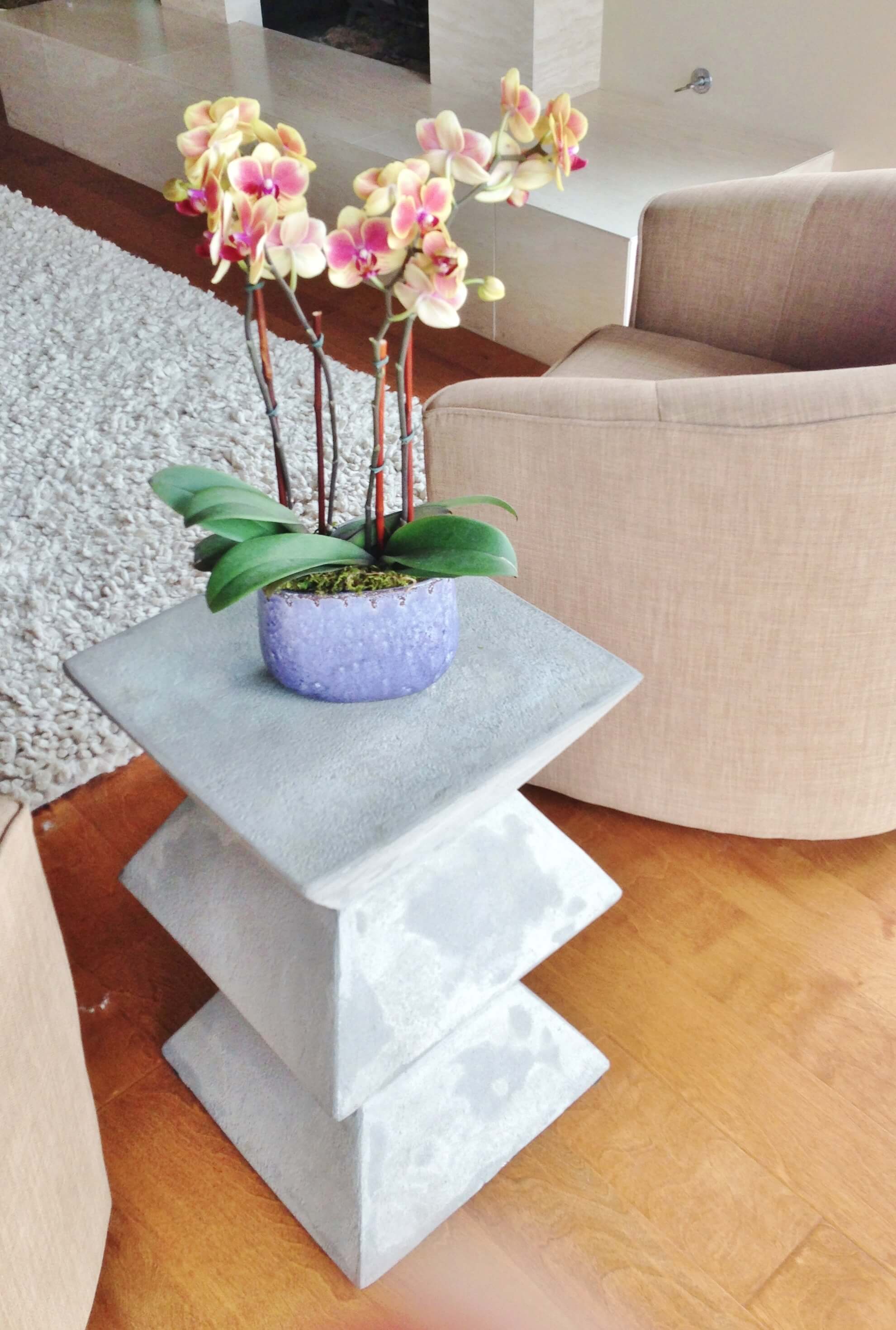
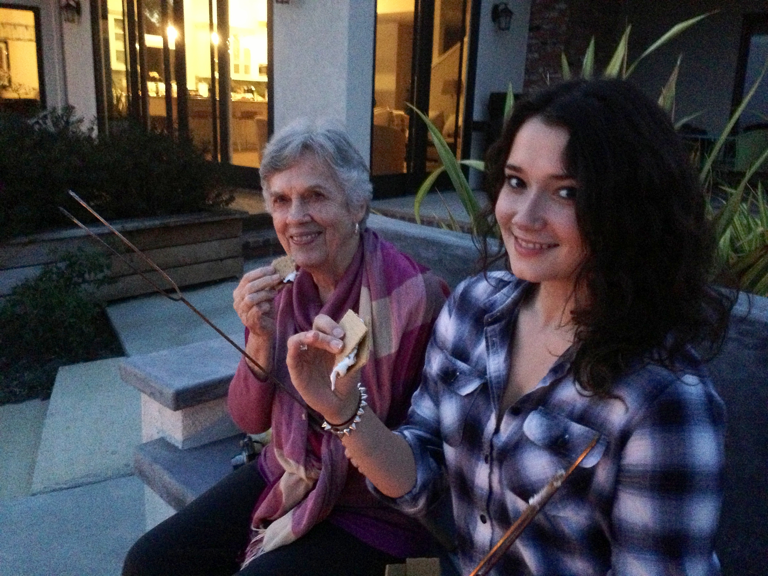
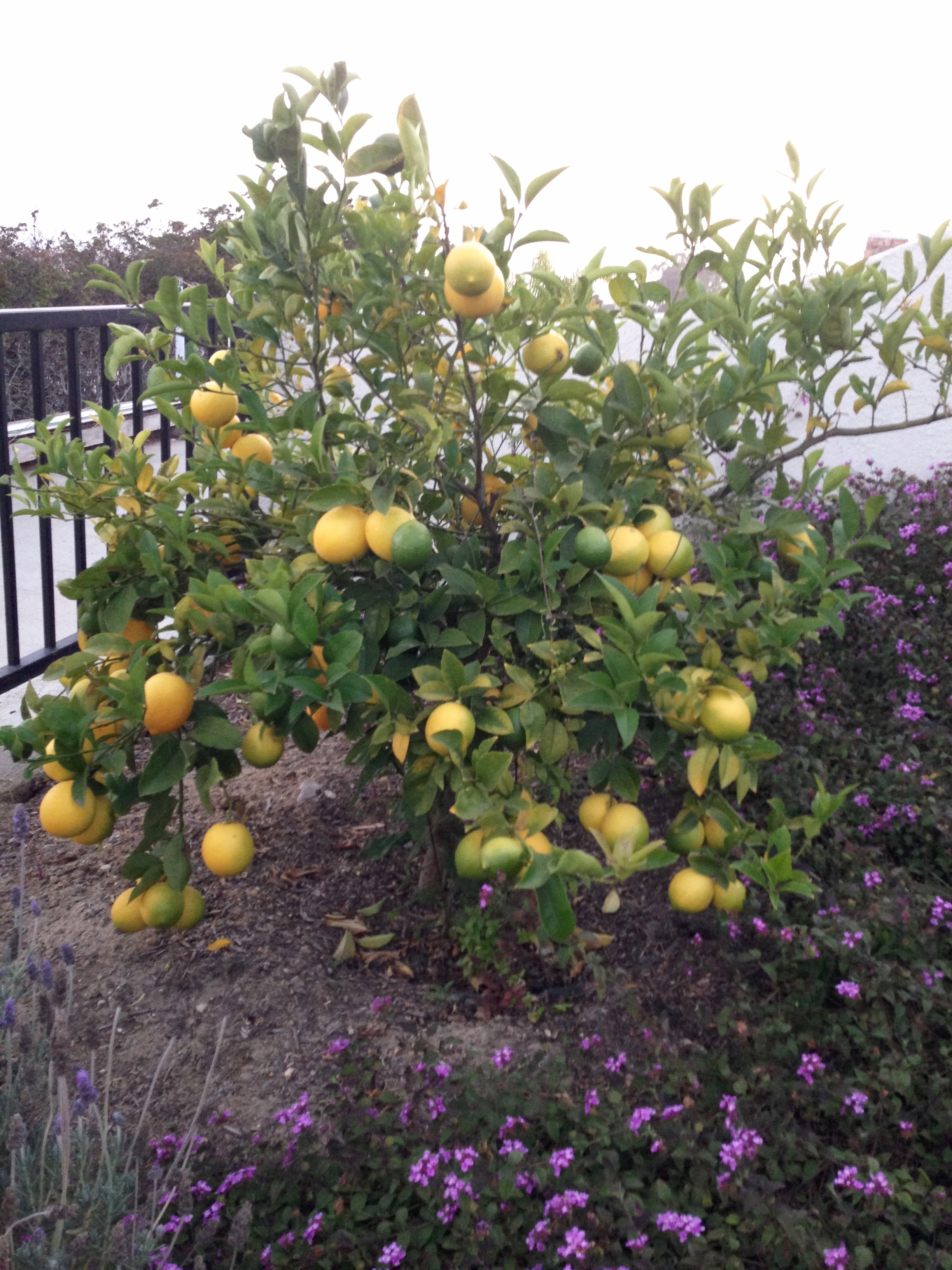
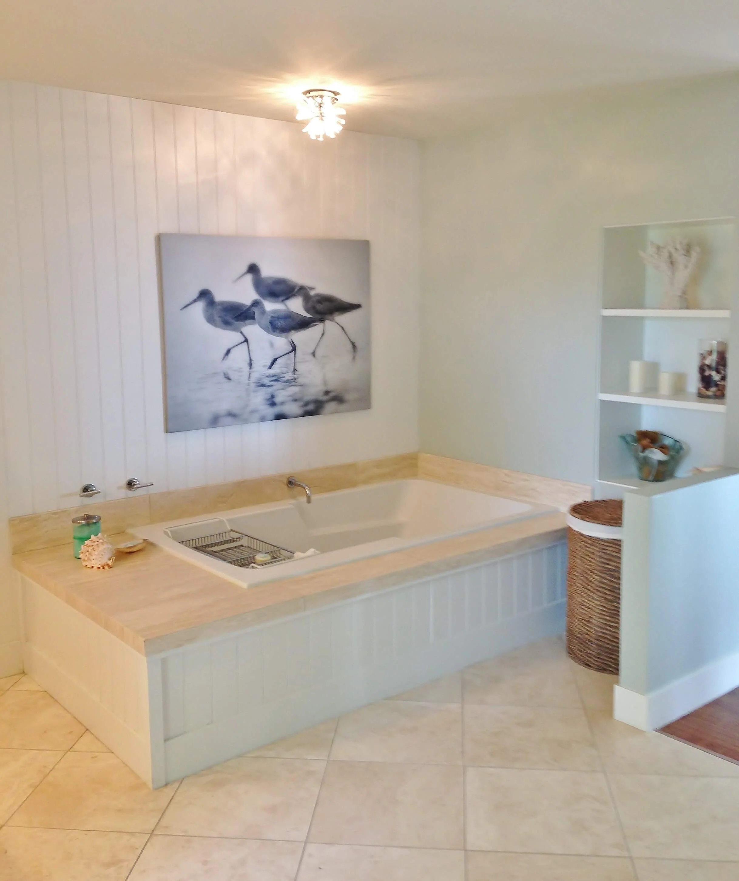
Fresh orchids were scattered throughout the house without a brown bloom upon them. There were plenty of fluffy white towels, pillows, and spa bathing products. The kitchen was well-stocked for preparing any type of meal, from smoothies to slow-cooked stews. There was a fabulous grill for cooking out; citrus trees on the property loaded with fruit to use; and the fire pit came complete with skewers and all the fixins for s'mores.
Jealous, aren’t you! ;-)
More Pretty!
I could go on and on about how wonderful our rent house was, but the time has come for me to finish this up. Instead I’m just going to shuffle through the rest of the pics I took to give you more of an idea of the type of vibe we enjoyed so much.
Unfortunately, this home is no longer on the market for rent as of August 2017. :-(
Click each image below to enlarge fullscreen!


