I’ve got a kitchen remodel design from my Designed in a Click™ service to share today. This homeowner had a good start, but the overall design needed further development and some thoughtful tweaks to give it a lift.
They were getting new cabinets, counters, splash and lighting, but keeping the travertine floor. They were keeping the basic layout too, with the peninsula to be used more as a bar counter.
My blog contains affiliate links. Any purchases, at no additional charge to you, render me a small percentage, are most appreciated and make this blog possible. :-)
Before Pics of Kitchen to be Remodeled
BEFORE Kitchen Remodel - kitchen to receive new cabinetry, counters, splash, lighting, and appliances.
BEFORE Kitchen Remodel - peninsula bar with dining area beyond
BEFORE Kitchen Remodel - kitchen sink and window area
BEFORE Kitchen Remodel - peninsula bar
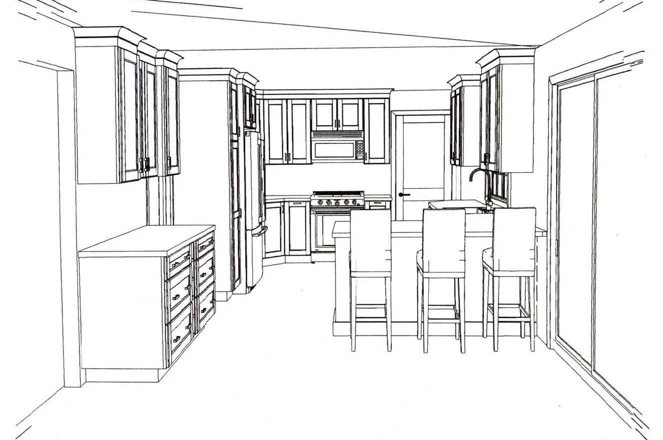
Here was the cabinet drawing that had been done for her new kitchen cabinets by the cabinetry vendor. The dry bar is on the left, beyond the refrigerator there, opposite the peninsula.
Kitchen cabinet perspective drawing from the cabinet vendor. The dry bar is on the left there.
She wanted to lean into a coastal look and was thinking about creamy white cabinets with the dry bar cabinetry to be done in a dark blue-green shade, Maritime.
Here is a pic of the cabinet door color/styles she was going with.
Cabinet color of the kitchen cabinetry- off white
Cabinet color for the uppers and lowers at the dry bar only - Maritime
I loved that bold color, perfect for the coastal look and a good way to build an interesting kitchen design.
This whole kitchen sort of reminded me of this coastal style kitchen I worked on a few years ago, where we did a similar color on the island when they were keeping their travetine tiled floor.
Their questions for this Designed in a Click™ service:
1) Suggestion for countertops and backsplash for main kitchen and dry bar. Should they be the same? I prefer quartz and glass. I think I would like lighter colors since I’ve had dark countertops for the past 15 years. This is where the bulk of the remaining budget will go.
My Answer:
The counters for the kitchen and dry bar should be the same here, not necessarily the backsplash. If your kitchen was bigger or there was an island where you could do island top and dry bar in similar finishes to contrast with the perimeter, then I would do them differently, but not as is.
I can't pick definitive products for you with regard to color. Unless I have the exact cabinet color in hand and can compare with countertop colors, I can’t give you exact choices. I can give you some suggestions of what to try, based on seeing it online, but you must get your own samples. Here are some suggestions.
Since you prefer a light quartz and you are keeping your travertine floor, then you might try Calacatta Nuvo from Caesarstone. Really, the idea is to just try to match the countertop to the white cabinet color, so that it sort of all blends together. In this design, the countertop will not be the big focus. You'll have to do that by getting an actual sample of the cabinet color and matching it up to a quartz product you like.
I like this glass tile then for a pop of color. There are choices out there that might be more budget friendly, but a bold glass tile color (it could also be a ceramic) would be a way to bring the Maritime color over to the other side of the kitchen.
I’m not sure how that particular color compares to the Maritime, but you see the design intent. Repeat the Maritime color in the tile backsplash and blend the countertop into the white cabinet color.
In this look, I would really love to see more of the backsplash above the range with the microwave relocated.
(Prior to the consultation, I had asked about the possibility of relocating the microwave to the dry bar since there seems to be room there, and doing a drawer model. They had looked into it, but didn’t have a way to vent out there at the range, only a recirculating vent was there in the microwave, so they had decided to leave the microwave there.)
2) Suggestion for new lighting: above sink, peninsula, and dining area. Would prefer budget-friendly options.
My Answer:
Fixture for over peninsula - I like doing two pendants here. These are nice with seed glass and a brass finish. I like that they don't take up much visual space, since you can see through them, but still feel coastal with the seed glass.
I like this chandelier for over the table. It has a woven abaca frame with a brass finish. It might be a little large, check it with your table size there but you will need more light over here from a fixture, so something with 3 or 4 bulbs would be best. This fixture would be so on trend these days, as I reported from Lightovation market last summer.
I would stick to a surface mount over the sink, you don't have really high ceilings and I wouldn't want anything to feel in the way there. You could end up doing a fabric valance at some point, which could soften the overall look and add some fun pattern and color to that area of the kitchen. It could even be a fabric that echoes the "maritime" color of the dry bar cabinetry.
This is a nice surface mount fixture. I really like this combined with the other fixtures.
3) Suggestion for wall color. Adjacent room is “technically” the dining room which I recently updated and converted to my office. (Paint color above chair rail is SW Sleepy Blue; below chair rail is BM Snow White. Gray/slight blue/off-white rug with covered drum chandelier.)
My Answer:
I will refer to my comment above about selecting a color when I don't have the cabinet colors to see in person. Also, I would suggest you get countertop and backsplash tied down before selecting a wall paint color.
I rather like SW 7616, Breezy, but it would depend on how it looked with Maritime and the backsplash tile. I like the idea of a lighter version of Maritime though, in that medium value (lightness/darkness) range like Breezy, to give a real contrast to the pinky-beige tile floor. In this case, I want your wall color to look purposeful, not just another form of white or cream.
4) Suggestion for seating: barstools at counter and dining table and chairs. Need seating for 6 at table. Current dining table and chairs are all wood. Could paint them.
My Answer:
I would definitely paint the table base to match the Maritime and then strip the top for a whitewashed type wood finish if at all possible to achieve.
I would do something lightweight for the counterstools. Maybe bring in a light whitewashed wood tone. Doing bulky stools will feel a little tight I think. These have a nice wood tone and come in a counterstool (not the black version).
These are nice for a backless counterstool. People can then sit turning both directions easily with backless stools, facing the kitchen or the table area. They give you lots of flexibility.
I really like these dining chairs as they are a woven rattan finish but they aren't too gold toned. The finish looks to be more of an off-white, so it would reflect the finish of the whiter kitchen cabinets. I'd reupholster the seats eventually in a fabric that would work with your Maritime cabinet color, some kind of pattern would be nice.
Additional General Recommendations:
I think the dry bar really stands out with the contrasting color, but I think it needs some extra detailing to make it feel more like a custom piece of cabinetry.
Some brackets on the sides to sort of "connect" the top and bottom unit and then side panels that reach the floor and don't have toe kicks on the sides, will make it feel more special and well designed.
I would definitely panel the sides of the cabinetry there too, as it presents a more finished look.
I like the idea of breaking up all the blue green on the dry bar with a light countertop, but I think the splash should actually just be paneled, with the same finish as the cabinetry, so that the whole piece looks like a painted piece of furniture. It feels more vertical and tall then, less boxy and horizontal.
See how this end cabinet was done on this long wall of cabinetry on another job of mine? We didn't need a tile backsplash as there was no water there, just like yours. It gave that cabinet on the end a more vertical, taller look with the way it was detailed.
Addressing cabinet details in a different way, with brackets, a different upper cabinet arrangement and backsplash, can help divide up a long boring wall of cabinetry and make it more interesting. carlaaston.com
You can do a recirculating vent in a wood cabinet hood above the range. Microwave/vent combos have that capability, which might be what you have if it doesn’t vent out now. I would do that and really make a statement at the hood, all the way to the ceiling, with the contrasting color.
You could also take your upper cabinet on the right side of the sink all the way down to the end of the countertop, so that your backsplash will then align with your uppers there and you won't have to stop it short of the countertop. That will give you more upper cabinet there too, unless you think someone will be sitting right there in the corner and it would be in the way for them.
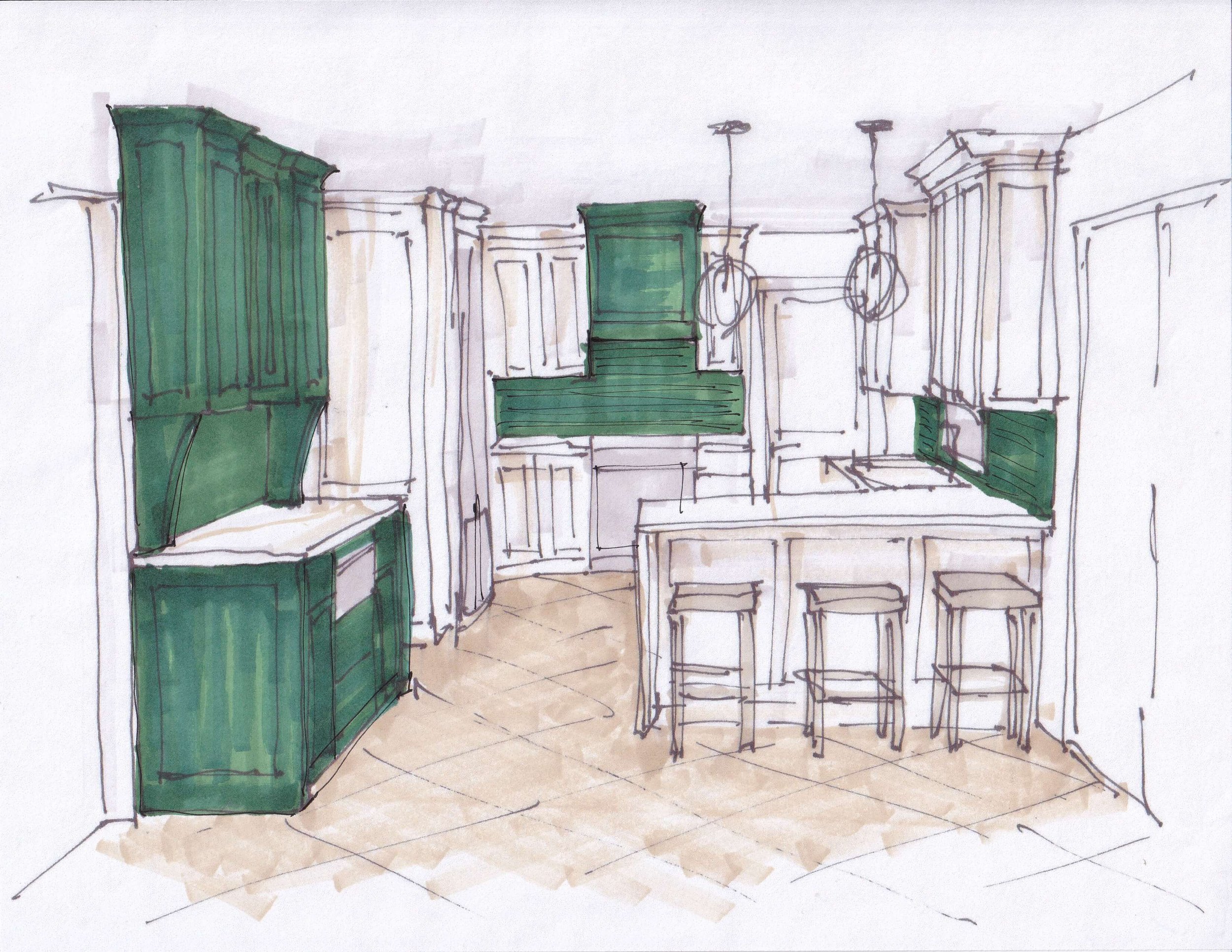
See my sketch of how the cabinets would work and how the Maritime color would carry through the kitchen, below.
Sketch showing how color is spread around this kitchen with material choices and a two tone cabinetry look. carlaaston.com
I hope she sends me pics when done! I think this will be a smart looking kitchen.
If you are looking for more of an eDesign situation with multiple selections like this service demonstrated above, then read more about my Designed in a Click™ offerings. There are now two pricing levels, $450 and $900.
January is always my busiest month for these and I can get a little bogged down then, so get the jump by doing your Q&A in December, so you can be ready to go with your project when the new year hits! :-)


