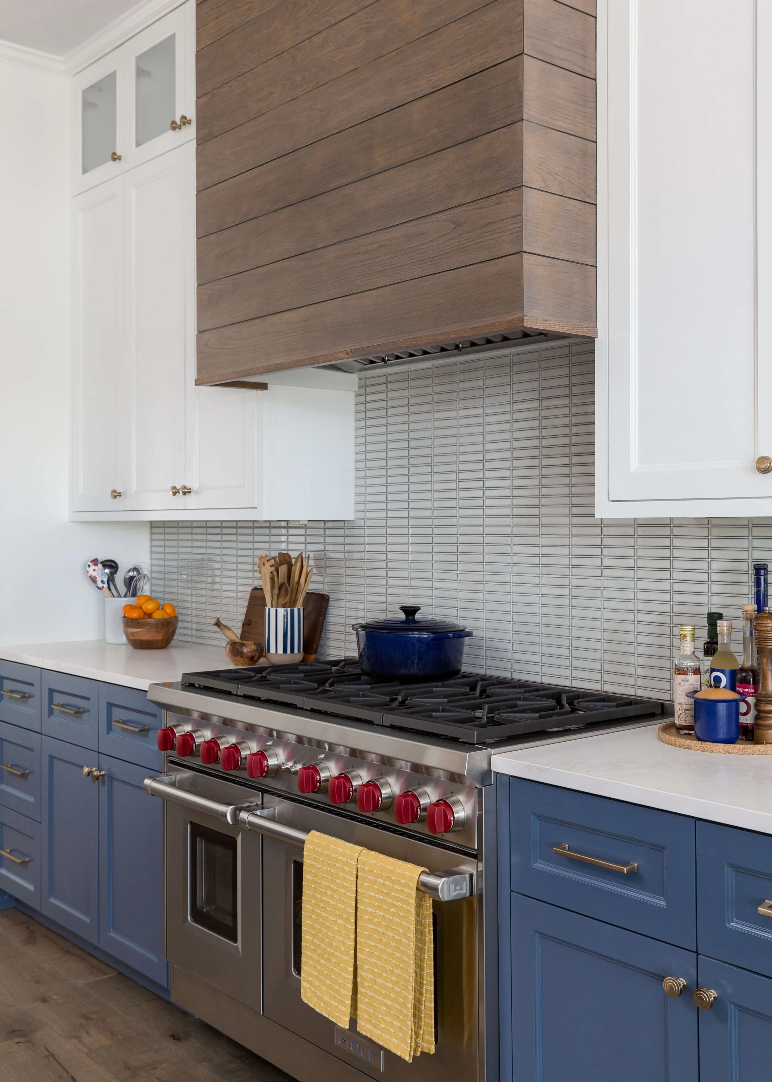
It's the sweet spot for a change in materials:
The inside corner.
It’s the perfect place in an interior, or in any type of architectural structure, to transition from one finish to another in the smoothest, most logical way possible.
I try to do this when I transition materials or paint colors whenever I can. Overall, it makes for a cleaner, more thoughtful, tidier look.
It gets rid of uneven edges, as well as that finish-change at the “outside edge," where it appears something hasn't been well thought out.
But, ultimately, it creates a more seamless approach to material changes.
Take a look below to see what I mean.
Transitioning Materials on the Inside Corner - Examples
I know sometimes you just can’t help having to transition materials on an outside corner. Architecturally, there is just perhaps not any other option.
Wallpaper
Not only is the wallcovering only applied on the back of this niche so that it dies into the inside corner, but the wood paneling that is applied to the sides of the niche also wraps around the outside corner to die on the inside corner. That recess there was created just for the beautiful transition of the paneling it made.
Transitioning materials creates a well-thought out design. Designer: Carla Aston
Grasscloth on the back wall of this niche creates a cozy, textural look and the transition of material is clean and tidy. Designer: Carla Aston
See how the inside corner of this niched area in a showroom at Highpoint Market makes for a tidy transition of color.
Here’s a tambour wall treatment that was done inside the niche behind the bed, on the back wall, so no exposed edges are seen. High Point Market showroom
Sometimes you want to wallpaper a room, like this dining room below, but there is no door casing at the openings to the room, so it the wallpaper would have to end on an outside corner. We have this kind of situation a lot here in the suburbs of Texas with a lot of production homes.
Well, you can always add some wood trim the face of the opening (sort of a fake door casing) to help provide a nice place to end the wallpaper.
Having wallpaper end on an outside corner is just inviting it to peel back someday, in my opinion.
Wallpaper transition around corner stops with applied flex moulding. Carla Aston, Designer
Wallpaper and moulding details in dining room, Carla Aston, Designer.
To create a neat transition of material between the wallpaper and the opening, we added flex moulding to the face of the wall only at these arched openings. The opening’s edge had a curve to it and we didn’t want the whole opening with wood casing, as it would change the look in the hallways and entail having to treat other openings that way. That would have been a significant cost to the job.
This keeps the wallpaper and paneling treatment contained in the dining room, without affecting other openings coming off these hallways and the wallpaper dies into the wood trim nicely.
Backsplash Tile Transitions
Transitions are very important when detailing kitchens and bathrooms, especially where tile is installed.
I do not like a side backsplash because of the unfinished look it can have. Keeping the tile in a kitchen backsplash only on the back wall, makes for the neatest transition.
More on this topic of side backsplashes with examples here.
Designer: Carla Aston
The wood look tile hood material turns the corner and travels back to die on the inside corner at the cabinetry.
Designer: Carla Aston
Kitchen Backsplash at Window
Common areas of transition at kitchen backsplashes that tend to get messed up at installation is the splash at the window. The way this window sill (made in the countertop material) is done with wood trim on the sides of the window that dies into the sill if perfect. It basically creates the neatest little inside corners for tile to die into.
I’ve written a blogpost about this topic, detailing the kitchen backsplash at a window.
Designer: Carla Aston
Fireplace Cladding
Fireplaces that only have tile stuck to the wall or the face of the fp are another pet peeve of mine. If you are cladding the fireplace wall with tile or stone, you need to wrap the corner and die it back into an inside corner.
I’ve written a more detailed post with examples of fireplace cladding here.
The wood look tile wraps the outer edge and dies back on the back wall of the niche, at the inside corner. Designer: Carla Aston
Here’s an example of the wall finish dying on the outside edge. It’s okay, but doesn't appear as neat and tidy as the other examples, does it? Not only will that edge fray and possibly peel over time, but, upon close examination, it probably has a rather imperfect edge. It is much more difficult to get a perfect line or edge with an outside corner than an inside one. Image via: Lowe's
Image via Lowe’s
While you may run into situations where changing finishes on an outside corner are necessary, that inside corner is still the sweetest spot!
This blogpost was thoughtfully written by me, Carla Aston, and not by AI, ghostwriters, or guest posters.


