I'm working on a kitchen remodel right now that is going to be such a great improvement for this homeowner. They will love the major things we've specified as well as the little things (that still cost money) but make the job worth it.
Those extras go such a long way to make you feel like your remodel was worth doing, even if they don't seem to make a huge visual impact. If you're going to go through the process, spend the money and tear up your house, you might as well get the little things done to make it feel more complete.
That's what we've done here.
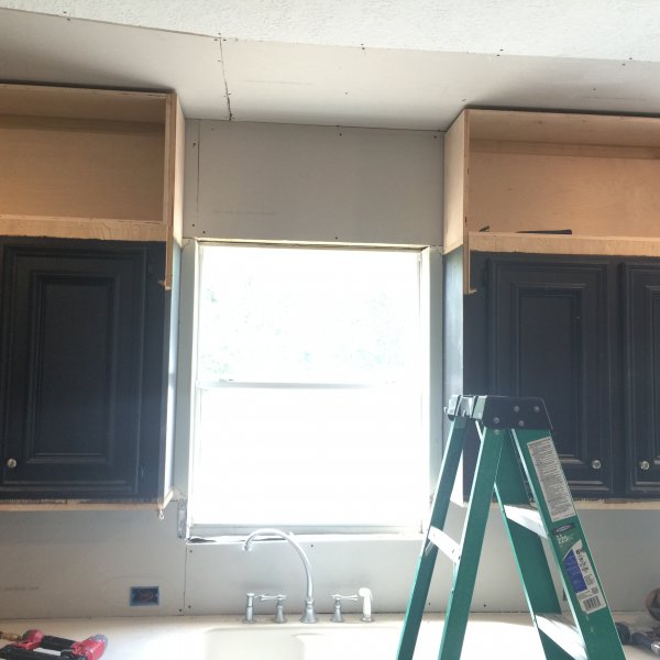
This job is much like this project I worked on last year. We're adding to the top of these existing cabinets to take them to the ceiling. These have the same kind of upper cabinet details (even the same mouldings) except we have a little more height here to work with so that we can do a real operable cabinet door in the cabinets we're adding above.
In the previous remodel, we really didn't have enough height for the cabinet, so we boxed in that area and paneled it, so that the cabinet felt like they were full height.
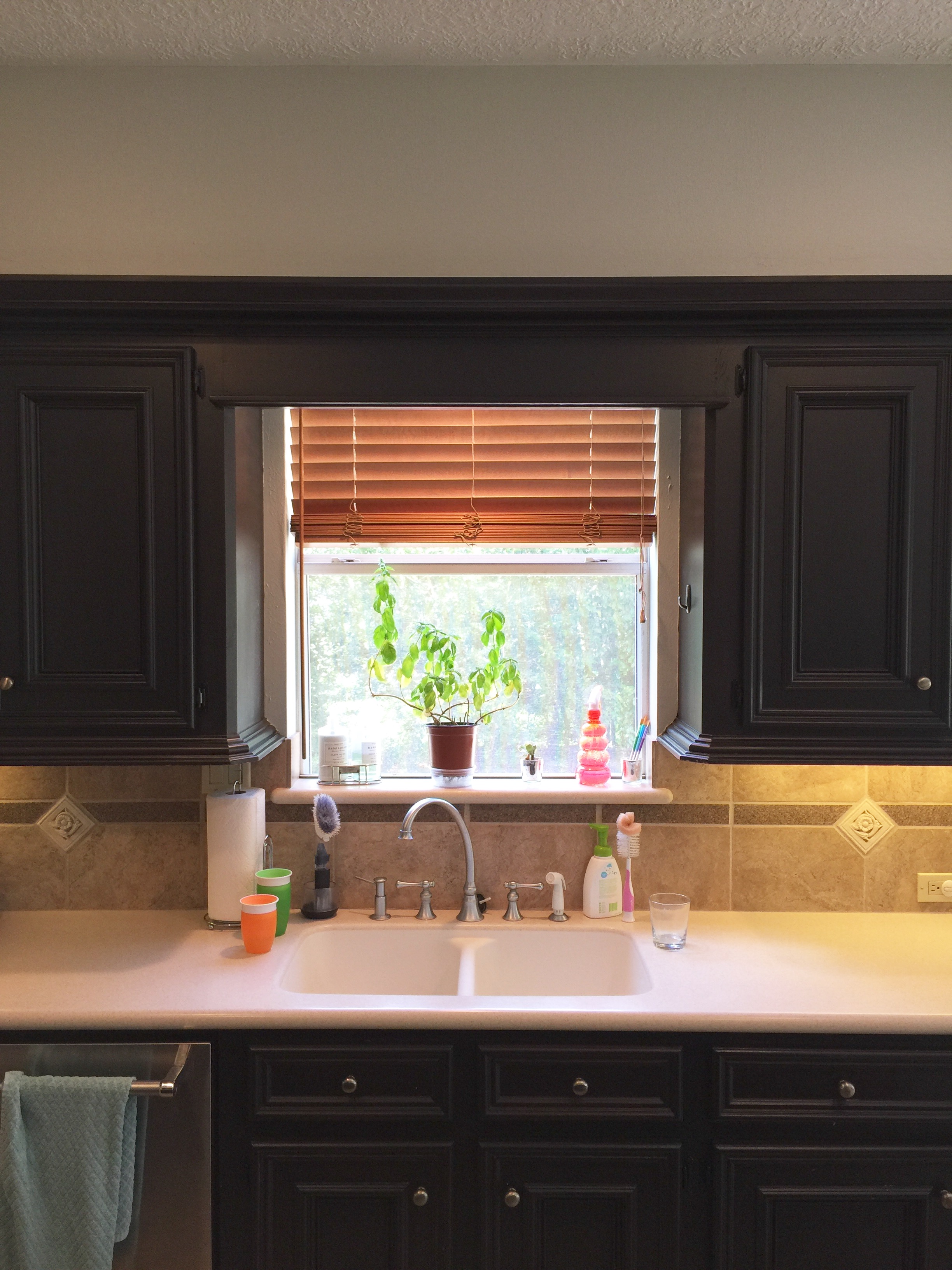
With this kitchen, there was a furr down ("was"....yay!) which was removed, that made space for the additional cabinets we added above. You can see how the dark cabinets with the furr down (or soffit) above, make for a long, horizontal boring wall with the feel of a low ceiling.
Before - Low cabinetry with furr down above
Before - Short upper cabinets with furr down above
We wanted this kitchen to feel light, airy, uplifting and fresh. We did that by creating more verticality in the cabinetry, especially by taking the furr down out over the window. That marries the window visually with the sink and creates a vertical divide in the long run of cabinets. Before, they were all connected visually in a horizontal band which felt low and oppressive.
We'll have a nice surface mount fixture there and hopefully a pretty valance or window treatment that will cover up that sheetrock and make the window appear taller.
Progress Shot - Kitchen Remodel, view at window removing furr down and building cabinets to the ceiling
Now, for those little things that are going to round out this kitchen finish out. We relocated the outlets and switches to be placed horizontally just above the countertop surface and we're adding in new LED undercabinet tape lighting.
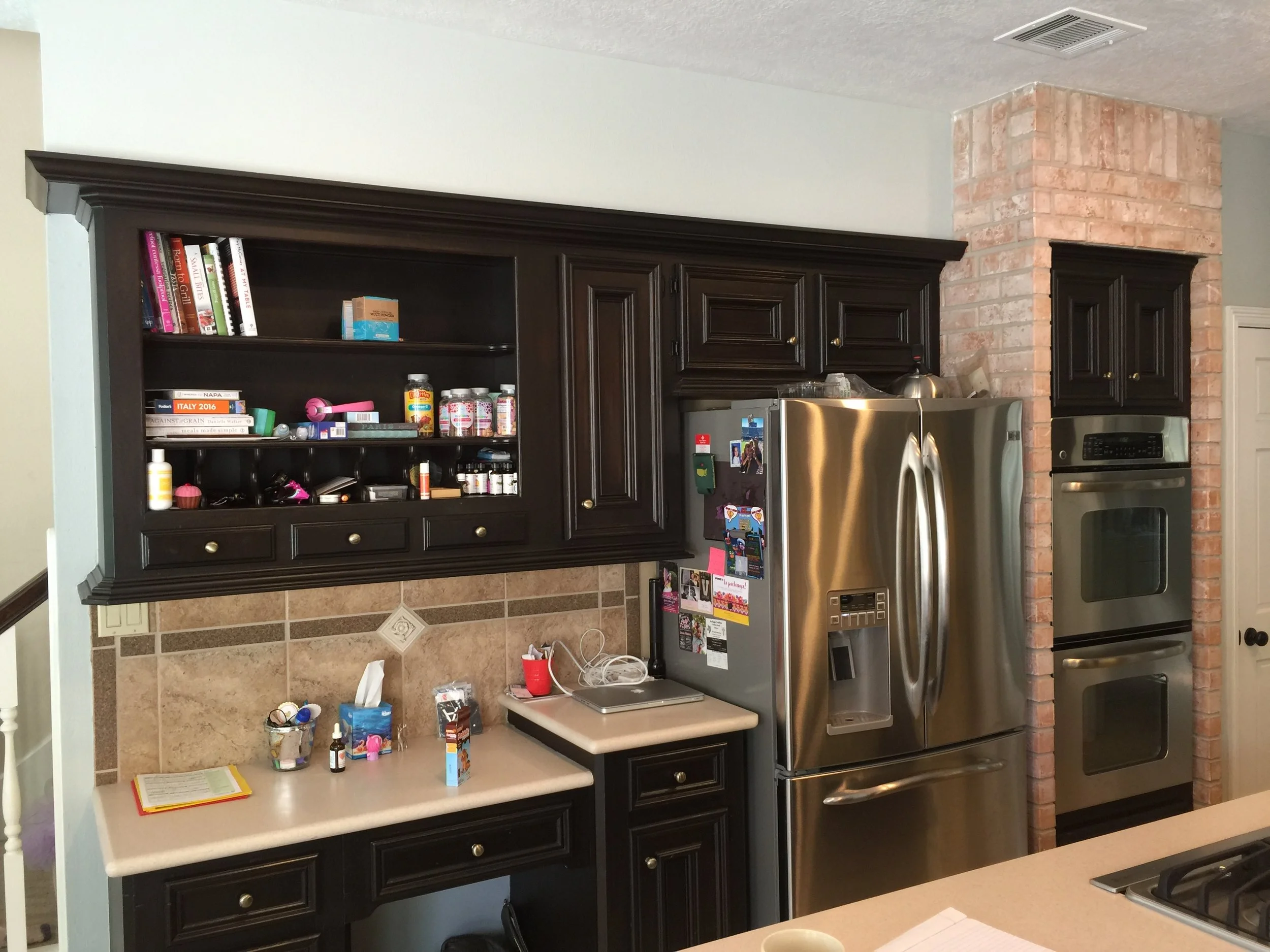
It would have been great to do all new cabinetry, but we pushed the budget here as much as possible. We've got lots of good stuff going in on the other side of the kitchen, a new cabinet to house the refrigerator that will go to the ceiling and a new base cabinet beside it, for an undercounter microwave (gotta get that off the counter). We'll do some cool open shelves there with some special sconces above to light the shelving.
Before - Refrigerator / Desk wall of kitchen
Look at those outlets we added in the pic below, just above the countertop. She didn't have any there before!
Progress Shot - New full height refrigerator cabinet to go in with new lower cabs and open shelving above
Everything's on it's way, to be done by the holidays. Painting is up next. We're going white on the cabinets to get a lighter, brighter space. We have this gorgeous Seapearl quartzite countertop material from Arizona Tile going in. :-)
Seapearl Quartzite from Arizona Tile


