One of my most favorite parts of remodel design is visiting job sites and seeing the progress made on my projects. I’m sharing a few sneak peeks of a beautiful one today, that is in the works.
This home was warm toned all over, and the homeowner was looking for a crisp, light, more modern style. I find many of my homeowners are looking for the same lighter touch these days. Something light, bright, open, with less curvy details and trim.
This remodel involved the kitchen and some other areas including paint, lighting, and some new flooring to match the beautiful wood floors existing in most of the house.
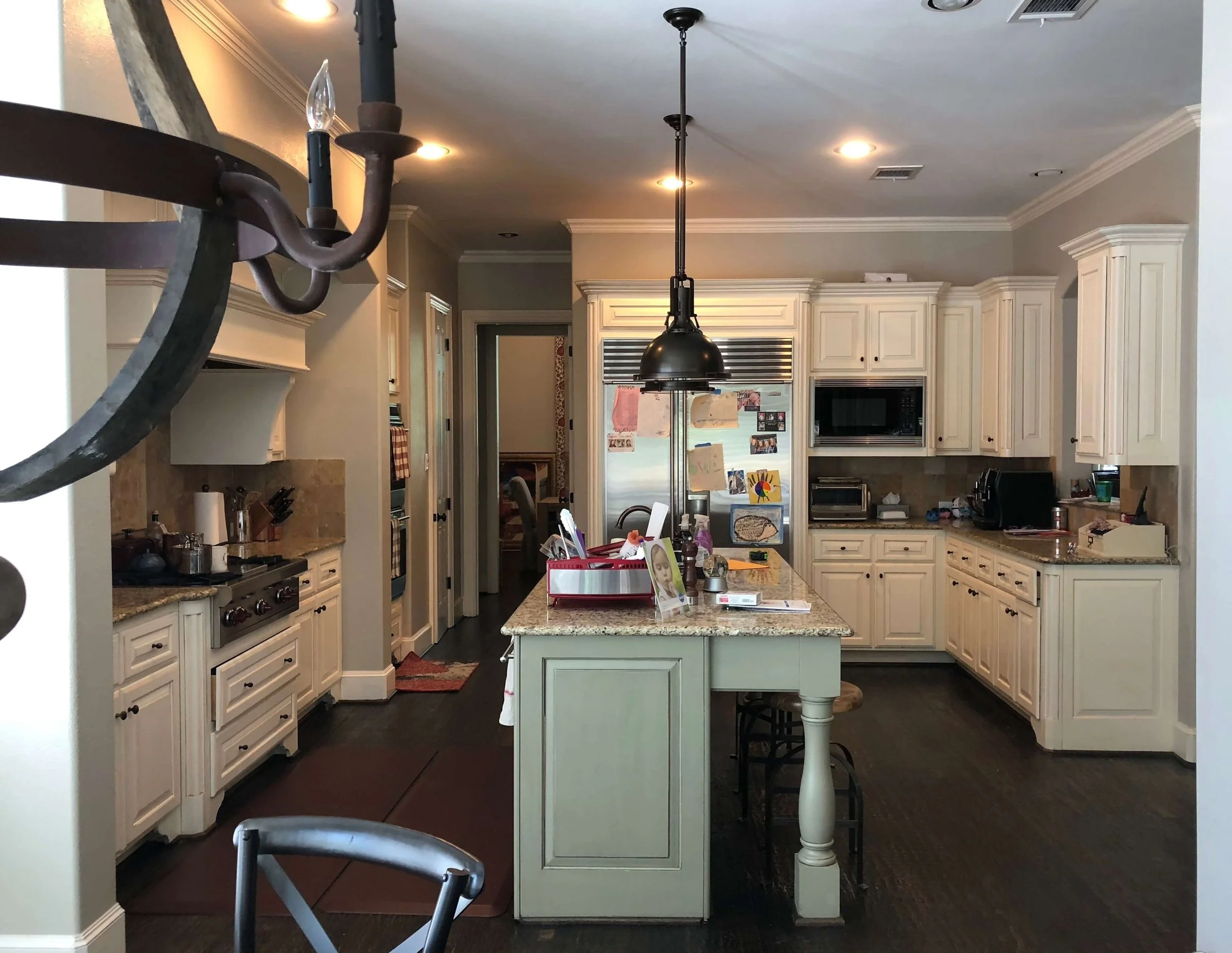
Here was the before pic of the kitchen to be remodeled.
BEFORE - The curved details and raised panels in this kitchen cabinetry created a traditional look that the homeowners wanted to update. #kitchenremodelideas #kitchenremodel
We opted for new cabinetry here to take them to the ceiling for more storage and to accentuate the 10’ ceilings.
Since the homeowner wanted a less traditional look, all those existing details were too overpowering. There were just too many rounded corners, raised panels and such, a simple shaker cabinet door would have looked inappropriate on top of these existing cabinets.
This wall at the hood, shown below, really felt oppressive to me and the whole elevation felt chopped up. I thought we could surely gain more useful storage and create a more uplifting feel by tearing out the sheetrock arch and the two end walls that framed it.
BEFORE - The heavy sheetrock arched enclosure felt oppressive and confining. Tearing that out made all the difference in this remodel. #kitchenremodelideas #kitchenremodel
The new cabinetry is going in now and I’m so glad we opted for new because they are making this kitchen look so much bigger, lighter, and more open!
I love that we took the cabinets to the ceiling, it adds visual height to this space and is going to make for such a dramatic focal point at the cooktop, where we have an amazing statement backsplash planned. :-)
It’s going to look sooooo good!!!
IN PROGRESS - The cabinetry looks fabulous here, crisp and light. Love the cabinets to the ceiling and the absence of the sheetrock arch. #kitchenremodelideas #whitekitchen #kitchenremodel
Here is the opposite wall, before pic, where a little arched window opened up into the adjacent hallway. You can really see the traditional cabinet details here.
BEFORE - Traditional cabinet details and arched window were removed in this kitchen remodel #remodelideas #kitchenremodelideas #kitchenremodel
That window and counter weren’t really doing anything except becoming a catch-all. It didn’t let any daylight pass through from either space, so I chose to close it up and fill it with some cabinetry.
It now makes the perfect place for a coffee nook.
IN PROGRESS - The cabinetry looks fabulous here, crisp and light. Love the cabinets to the ceiling and the absence of the window to the hall. #kitchenremodelideas #whitekitchen #kitchenremodel
More Remodeling Around The House
We have some other fresh details and design going in around the house and it is so fun to see the progress.
We did a grasscloth look wallcovering on the ceiling in this hallway with some cool ceiling mount light fixtures. This hallway had no a/c vents or anything mechanically in the way, so I thought it was the perfect place to add some texture and a little special feature.
Grasscloth wallcovering on the ceiling makes for a textural, interesting backdrop to some sweet shapely ceiling mount light fixtures. #remodelingideas #ceilingdesign #lighting
A beautiful white plaster chandelier was hung in the dining room with more of that wallcovering as a paneled backdrop. I love the traditional shape, but with a cleaner, edgier style.
White plaster chandelier with grasscloth wallcovering behind in dining room #remodel #remodelingideas #lighting
The powder room wallpaper went in, we’re doing lots of navy blue in this redo and it was carried in the powder room to cover the walls.
Powder room wallpaper in remodel #wallpaper #powderroom
Here was the existing built-in at the tv, below. It worked well, but I wanted to make the niche not feel so deep and to give the built-in a taller, more finished appearance.
BEFORE - tv entertainment center with lower cabinet only #tvcabinet #entertainmentcenter #builtin #cabinetry
Here’s the structure going in behind the paneling we are adding.
In Progress - TV entertainment center #remodelingideas
In Progress - TV entertainment center #remodelingideas
Here’s the finished cabinet. I love that the homeowners can go in and get a bigger tv if they ever want to, there’s plenty of room for that.
AFTER - TV entertainment center built-in cabinet with full height cabinet | Designer: Carla Aston #tvcabinet #entertainmentcenter #builtin #cabinetry
There’s a lot still to go, but I’m loving checking out this project every week! Kudos to the contractor, Shaun Bain, of Curb Appeals for making all this happen.
BTW, I’m having trouble with my email, carla@carlaaston.com right now. Some emails get through, some don’t. So, if you’ve emailed me recently and haven’t heard from me, you can call my studio, 281-364-6633, or leave a comment in Disqus at the bottom of any post. I’m getting those notifications. :-)


