Most people don’t like to overspend on their remodels and one way to do that is by partially remodeling instead of going in with a full redo.
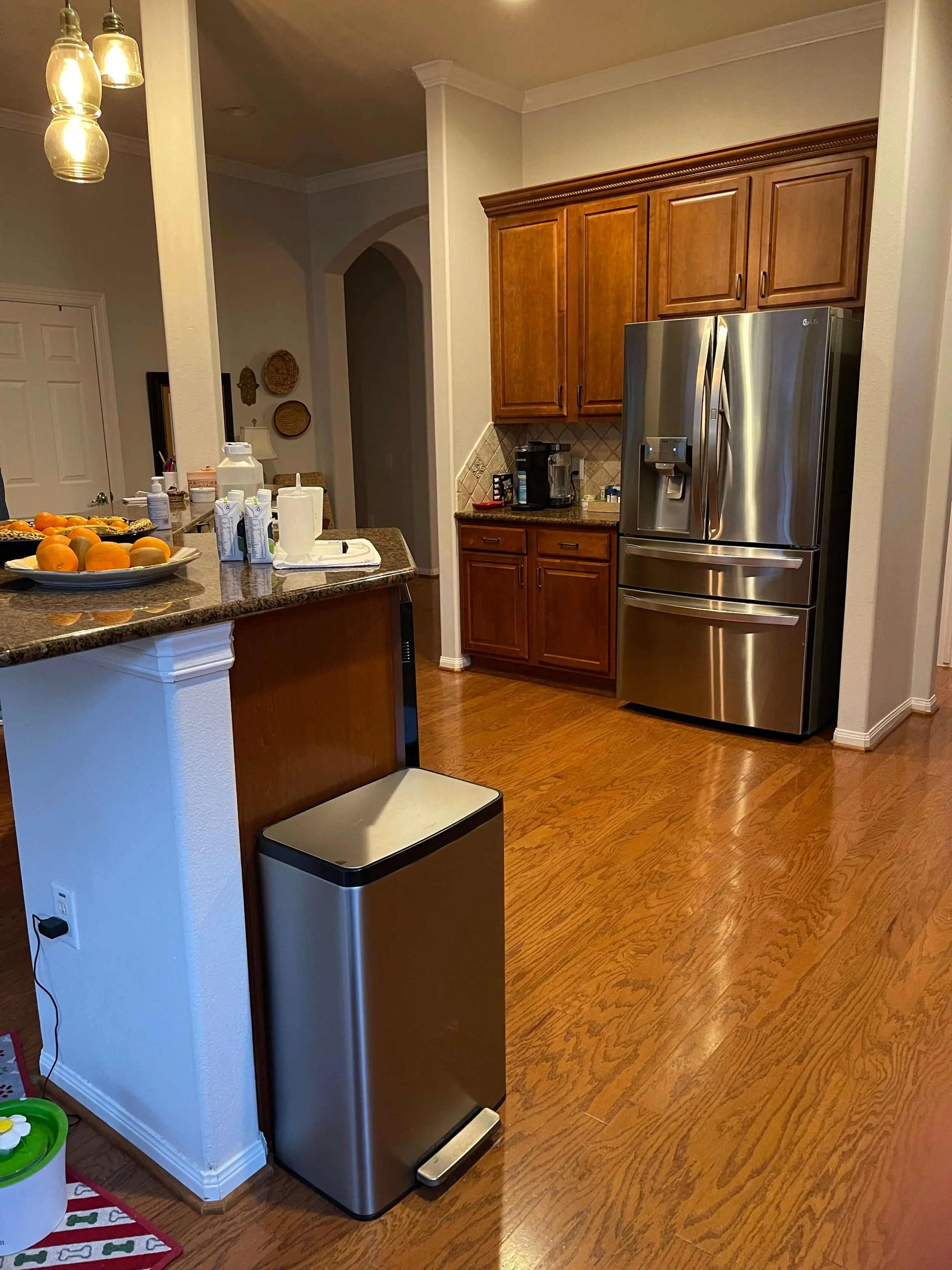
This homeowner liked her wood cabinets in the kitchen, but the island was rather driving her crazy. It had an awkward raised bar and dishwasher and she didn’t like the open space that she felt was wasted.
She also didn’t like the column stuck at the end of the island and had been told by one contractor she could get rid of it.
BEFORE REMODEL - Kitchen island and awkward column along with countertops and backsplash to be redone in this kitchen remodel.
BEFORE REMODEL - The raised bar with the raised dishwasher made for limited usable counterspace here.
BEFORE REMODEL - There’s a lot of unused space here in the middle of this kitchen plus the trash needs to be built in too.
The main priority in this remodel was the bathroom, which did need a full gut redo. I shared that accessible bathroom remodel here and it turned out to work really well for them now. They are so happy they made that investment.
The kitchen did get a partial redo though, without moving the column, and the tv wall was addressed too.
Once a new contractor was selected and the column was assessed, they did ascertain the column could not be removed without a big expense.
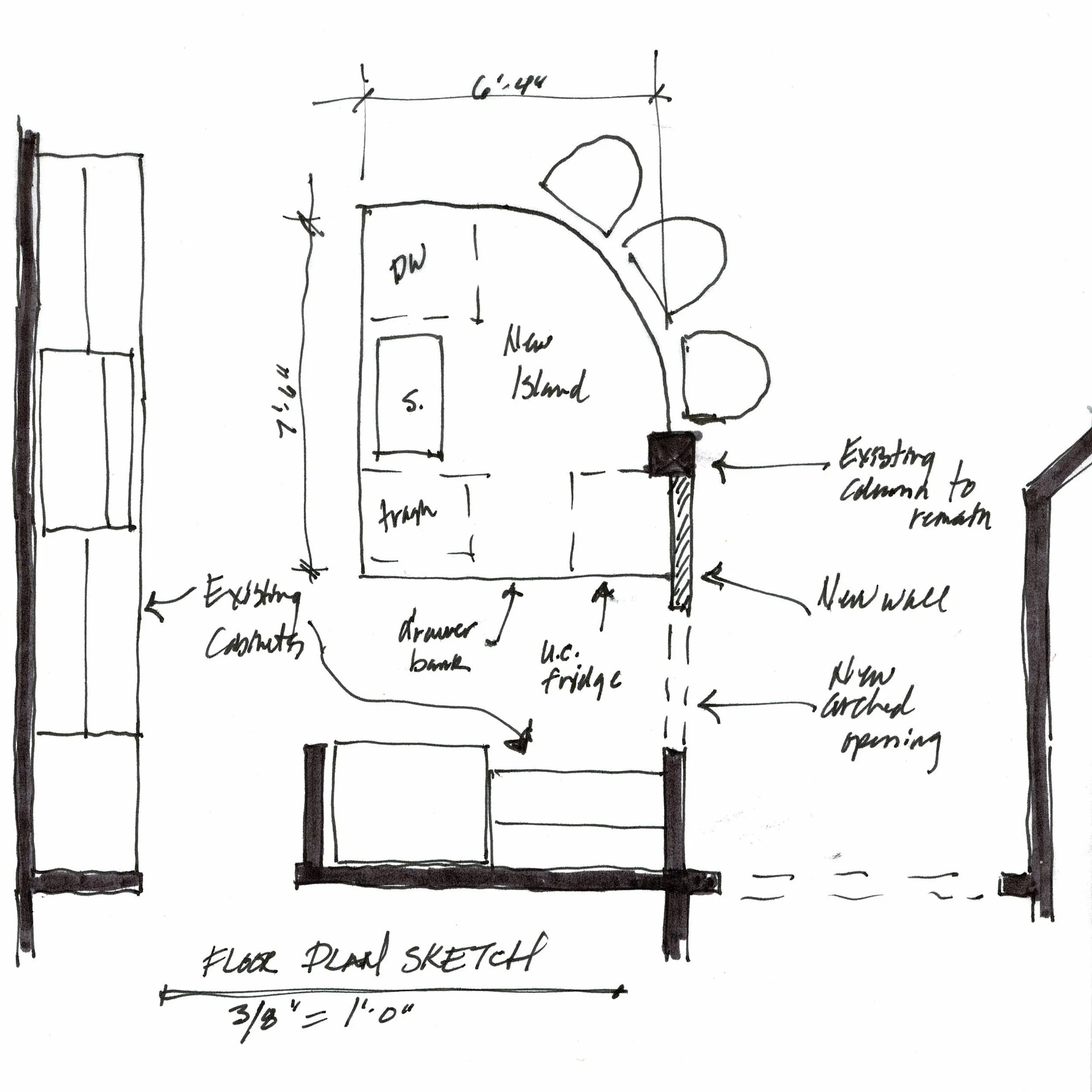
We ended up connecting the column with the wall there by the refrigerator wall with an arched opening and then having the island work as a sort of peninsula off that.
Floor plan sketch of new kitchen island | carlaaston.com
The lower bar made the space feel more open and the column no longer stuck out in the middle of everything. It felt more purposeful.
With some new lighting, pretty Taj Mahal countertops, a new backsplash and a new painted green island, the kitchen looks up to date and not so builder-standard.
The new LVP floors look just like wood (because they are high quality) and work so well for the wheelchair that needs to move around the house.
Partial kitchen remodel with existing wood perimeter cabinets combined with new island, counters, backsplash and pendants. carlaaston.com
Here’s how the column was dealt with. An arched opening and wall was built, connecting the island to the perimeter cabinets.
The column was kept in this remodel and an arched opening and wall built to make the necessary column feel more intentional. carlaaston.com
Pretty Taj Mahal satin finish countertops have a warm but neutral look and pair nicely with the green island. carlaaston.com
They also had a really large tv, as most people do, and it took up this whole niche area.
She wanted to have some kind of shelving to display some items collected over the years and the way the tv was now, there was no room for that.
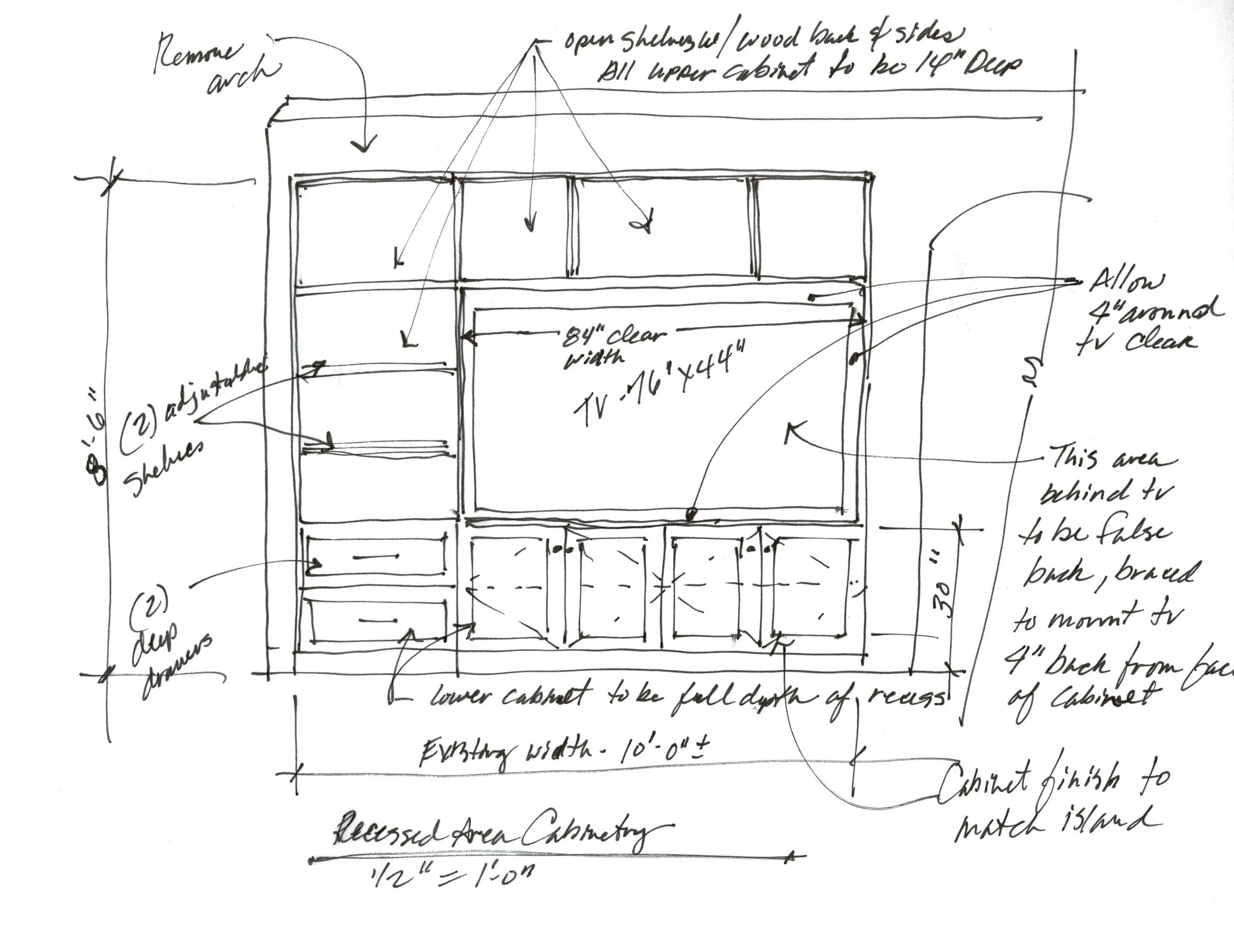
I designed this tv built-in with some asymmetry, as it worked to get the widest shelving possible for display and storage. It also actually shifted the tv more to the center of the room.
I love doing these false backs with a flat screen tv built-in, to push them forward to the face of the cabinet and make them fit the cabinetry better.
And here’s the finished product!
TV built-in with an asymmetrical position for the tv, working better for adding shelving and storage to this unit. carlaaston.com
It is painted the color of the island with new pulls that match the ones she did over in the kitchen so that it all feels cohesive.
I really love how this tv cabinet turned out!
The homeowner selected her own finishes and lighting here and she did a great job. The contractor, Knepper Enterprises, brought me in for consulting and planning.
Be sure to click over to the primary bath remodel of this home. It’s a lovely and super functional redo!
If you need more info on tv wall design, this is a good post for reference.


I’m sharing LOTS of ideas here for TV wall built-in cabinets. This is the grandaddy of all TV wall posts! I’ve also got a whole host of links to blogposts about tv placement, cabinetry and more. Check it out…..